Newshub 2.0 is Here!

17

Besides now having a much cleaner and smoother design that fits better with FAF, the new newshub comes with a couple more features! Such as no more slowdowns when opening the newshub, flexible image sizing for the news posts, adequate responsiveness and a new modern layout!
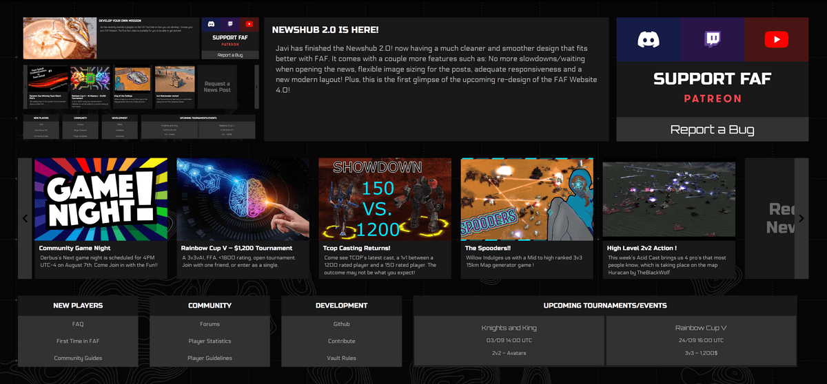
3ada80ef-a2fa-4b47-8e4c-0018582f6206-image.png

Long detailled changes of the new client newshub 2.0

No more slowdowns

The previous newshub was calling the API everytime a user came (as far as I understand the outdated techniques previously used) causing users to wait about 5 seconds for the page to load (both in client and on the website).

The new client newshub caches the newshub in a json file. Meaning users dont have to wait since all the data is already loaded in the website.

Image Sizing

Now all image sizes are supported! No need to make your images 145x97 or other cumbersome sizes. Now images are automatically re-sized.

Images with a 16:9 ratio (2560x1440, 1920x1080, 1280x720 or anything "rectangular") will fit perfectly. Other non-rectangular images will still adjust correctly but might receive a cut-off.

Unlimited Articles

Since now the articles are on a "slider", we dont have a limit with how many articles we can have without sacrificing design. So 5, 7 or 12 articles will all display equally well!

Responsiveness

This design has media queries and responsive unit sizes (such as vw) to always adjust to the users preferences. Therefore, the news will display adequately whether it's on a full screen window or 1/4 of the monitor screen.

More Information Less Clutter

The new design also provides more links for the user. With buttons for joining the discord, twitch and youtube FAF content being one click away, plus new sections for new players, community tools/spaces and development, plus a Support FAF button and a Report a Bug button all in one compact and clean design! Now Users can have an easier time accessing FAF tools and spaces from the client News!

Other

Many of the images inside the images folder have been moved to a logos folder in order to maintain a better order inside the folder (rather than having 40 images on one folder, have them on their own folders).

Small Changes After Feedback

After some feedback, certain changes were done regarding the placement of the social media buttons and the support FAF button (now being merged as one on the top row). Some small color changes were done along with a tweaks here and there to the padding.

A upcoming tournaments/events tab was also added, with space for two events/tournaments which can be changed on the wordpress with ease (through a post called Upcoming Tournaments/Events).

FAF Website Developer

Very cool

Nice work!

-Background is terrible
-Feels heavy and depressing
-Font looks broken somehow.


edit to merge post (done by moderator):

well its dark and grey and bold. something more colorfull and a modern font would be nice.
and btw. i have a background configured and its shiws up on every tab just not in the news. there is that strange psychidellic background

This post is deleted!

the background that you have set wont show on the news page due to how that page is set up and shows a webpage and it is not intergraded directly into the client.

"The needs of the many outweigh the needs of the few" - Spock

Please stay on topic. Constructive critic is welcome. I have cleaned every non-related post.

What have I just missed lol, @Biscotti @Sam-site thank you very much! It feels very nice hearing people like my work ❤

FAF Website Developer

@magge No the best approach as now my message has not context.

"The needs of the many outweigh the needs of the few" - Spock

Awesome!

Sorry for my English. I use translator

New newshub looks excellent !!!

@Femboy Do you have tools (like Google Analytics I guess) to see any in- and out-going events for that page?

How many people actually look at the news hub each day/week and are reading stuff there?


Some thoughts on that news hub:

At the moment, it feels more like a dedicated page to promote random links, not a classic news section where I can read it like a newspaper and comment on it, which I would expect with such a name. It acts more like a starting/home page for people who have just installed FAF and do not know how to change the default tab to Play.

I know this is mostly because of the missing resources of a dedicated Volunteer for creating news, but nevertheless the limitation of 200 chars for the news content (=fancy link description) makes it not easy to write an actually interesting article.

IMHO People just shift directly into the forum, discord or popular YouTube channels for any recent news to read, and in the end they can even interact with it.

The value for the click is too little on that page, that someone would look frequently at the news hub - Even with all the great work that was spent on that design, with all the other channels it will always fall behind.

Maybe it needs a different approach, like a very big news article every season with current growing stats about FAF (played games, amount of registered players), news from the moderation team (how many processed reports, etc), any open position to fill, results of the seasons and tournaments. Mixed in with some hot YouTube stuff.

And in the meantime, there will be a pinned thread for the last big article in its own sub-forum where people can interact. I have seen similar stuff on Reddit for TV series where people talk after watching it. (like a Post-Episode Discussion, example: Post-News #32 Discussion in our case)