Do not add new colors - discussion
-
@jip said in Do not add new colors - discussion:
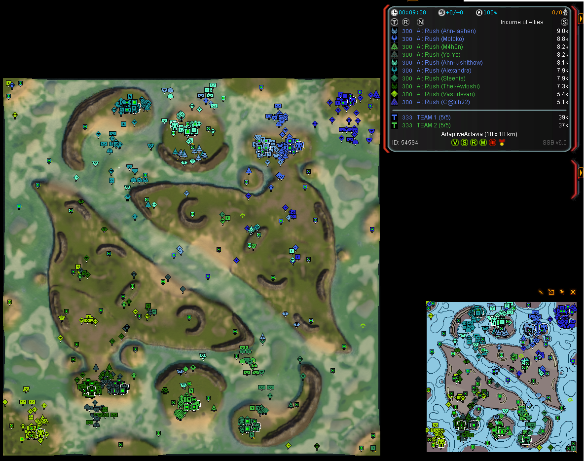
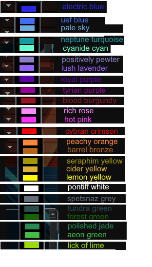
The problem is as Endrani describes - it is not so much about not adding them than it is about being able to know which word belongs to the color. As an example, in that image there's:
- two purple
- a teal
- a dark teal?
- yellow-isch
- no idea what color morax is if the other two are teal
- a dark green
two purple: "purple" and "violet"
teal/dark teal: "cyan" and "turquoise" (or cyan and teal if that's faster to type)
yellow-ish: mustard
the two pastel colors can be "sky" and "lavender"
"dark green" is fine if we don't have 4 different greens. dark green, light green, lime, that's easy to tell apart -
Lies, you are clearly an unmistakable shade of periwinkle
-
3000 games and I’ve literally never heard anybody refer to any of the colors with something more complicated than green, yellow, blue, etc and now people expect FAF players to gather the nuance between violet and purple, lavender, and light green vs lime lol
-
Please do not add new colors we have plenty of colors already. Adding more will noticeably reduce game quality and IS NOT a good idea.
-
Up to now i have thought the colors were cool, but after playing a few games with them, I personally think some of the blues and purples are too close together. So much so that I would find myself trying to select someone elses units thinking they were mine. I like the idea but def gonna make alot of people unhappy and decrease QoL.
-
@spikeynoob said in Do not add new colors - discussion:
Up to now i have thought the colors were cool, but after playing a few games with them, I personally think some of the blues and purples are too close together. So much so that I would find myself trying to select someone elses units thinking they were mine. I like the idea but def gonna make alot of people unhappy and decrease QoL.
Yeah the few games I played with them people chose different colors but watching some replays where there’s quite a few of the same it took some “double takes.”
Maybe add a few new ones but not so many.
-
Let us evaluate it for a few more days and then come to a conclusion about what we'll do with the colors.
-
I played a bunch of games on fafdevelop and I was basically unable to communicate by color since there are so many variations of the same color. I don't have the vocabulary to describe anything more advanced than light green or dark green, and good luck trying to impose a new collective vocabulary to describe these new colors, so when you can make lobbies like this with the new color scheme:
The game becomes much less readable and also much less communicable. It's hard to tell the colors apart: I can barely tell the darkest green and the slightly not-as-dark green apart (second and third from the left on the bottom team), and it's hard to communicate effectively when you have 5 greens and 5 blues. There is just no need for this change. These new colors as it stands are not fixing an existing problem, merely creating a new one.
-
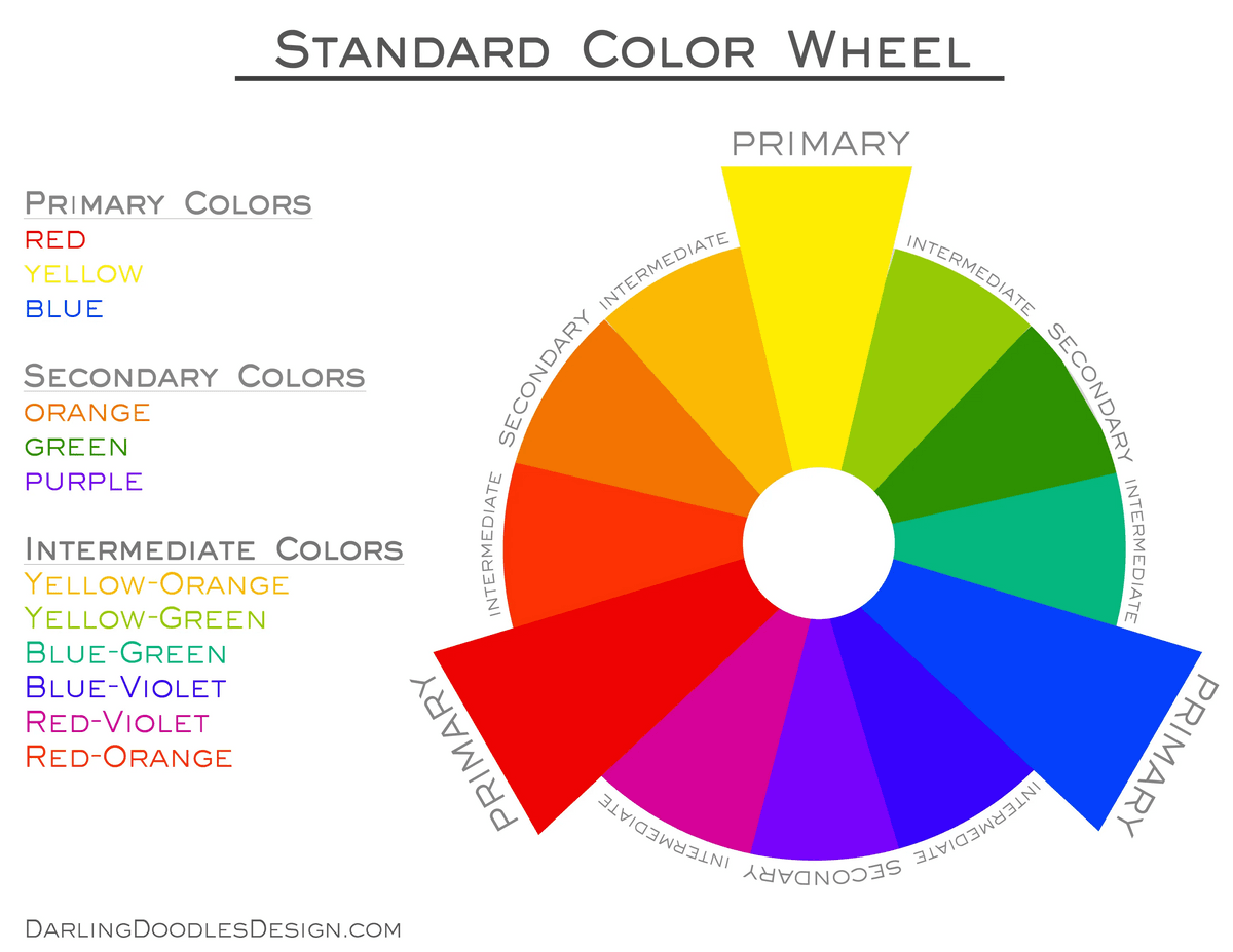
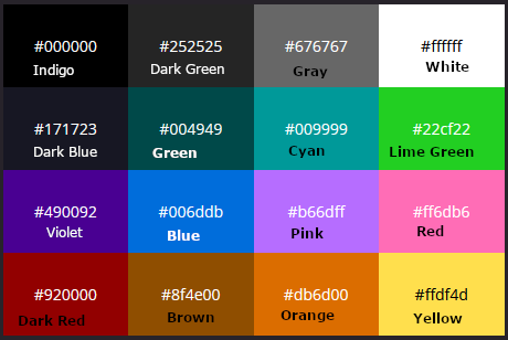
I'm proposing the following idea: we pick some primary, secondary or tertiary colors and then we have two versions of each color: a regular / light version and a dark version.
As an example:
- Red / dark red
- Blue / dark blue
- green / dark green
- orange / dark orange
- yellow / dark yellow
- purple / dark purple
- pink / dark pink
- white / grey
Then we have sixteen colors to choose from. The average game has at most twelve players. Therefore the last player in general gets to pick between five colors. These colors are well known to everyone - no issues with vocabulary. I'm open for suggestions on the exact hex codes of the colors.
-
Sounds cool, but the only issue there is that all the old colors will be replaced. That brings us back to the original dont change the old color argument.
-
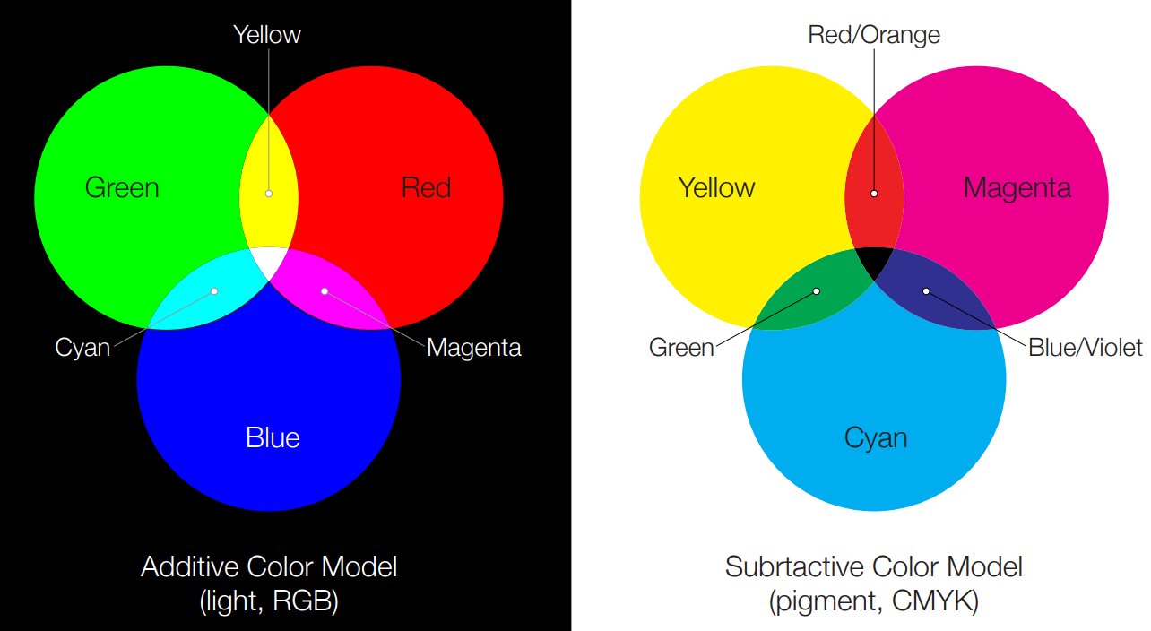
FYI, the primary light colors are Red/Green/Blue and the primary pigment colors are Cyan/Magenta/Yellow. While it is often mistaught, Red/Yellow/Blue is not a proper set of primary colors. Here is an explanation if you want.
Regarding limiting available colors to 2 per category; we have had 4 greens for years, and I've only very scarcely seen any issues from that, to the point that the benefits of having 4 greens outweigh the costs. So, I don't think we should limit colors like that.
I could investigate adding color names to the lobby if desired. That would probably be a pretty efficient way to inform people of color names.
-
Adding color names to the lobby will not help the situation. We are an international gaming community and some players do not speak English as a first language. The color names would likely reference the English names which mean little to non English speakers. Especially if they in the heat of the game need to think to reference them and then also expect all the other players to understand what they mean.
Seeing the name briefly in lobby doesn't help this case.
It also doesn't help casters communicate to their audience who may not have seen the colors before.
-
Hi again,
Since this is all seems very much up in the air still, I thought I would post again, my explanation may have been convoluted but I'm not sure if my proposal was really understood.
I'm not suggesting for there to be less colours possible - in fact the opposite, we could easily have 30-40 different shades where players can then pick one they like, I know this becomes part of player recognition in the games.
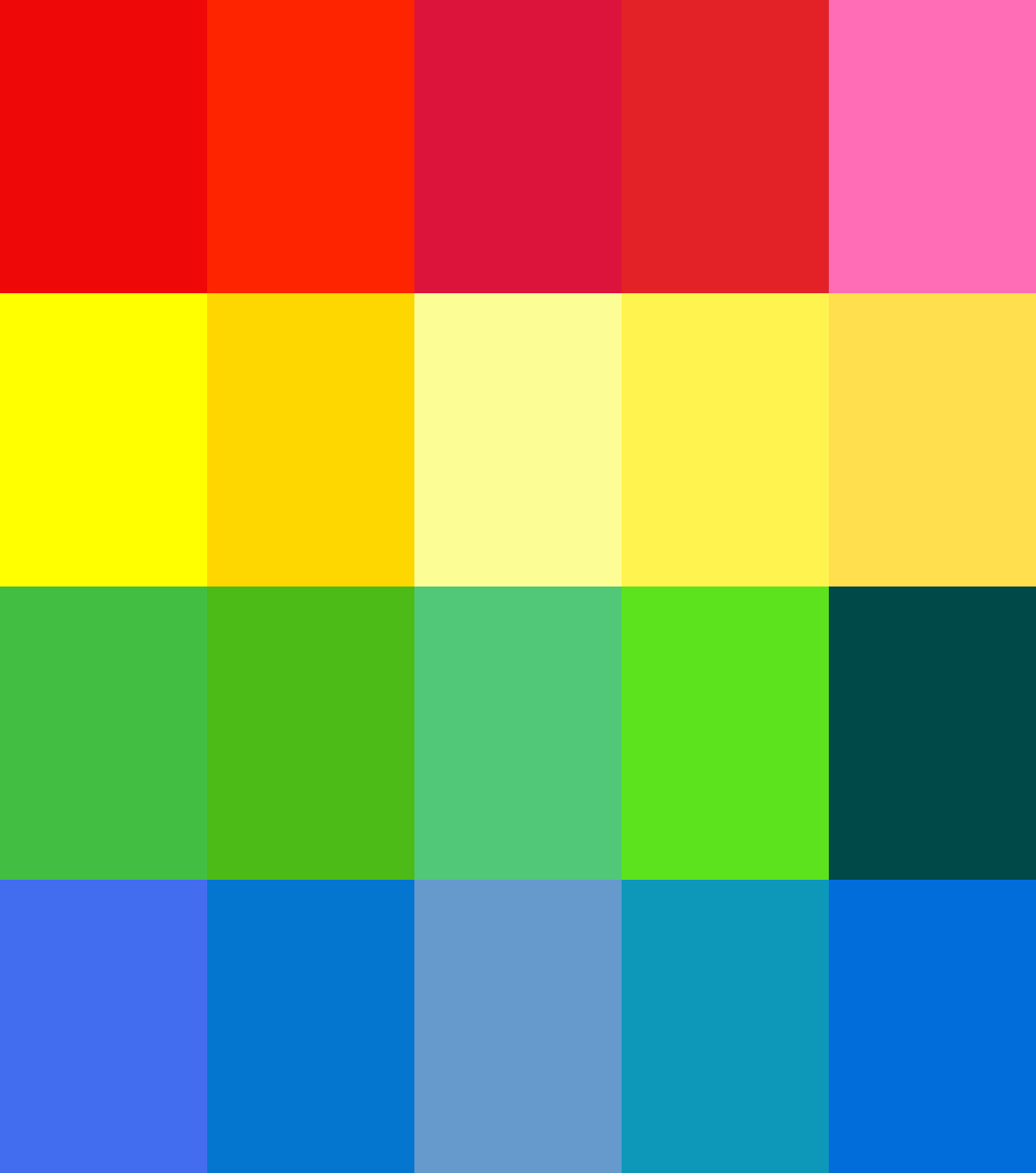
What I recommend is that we have 16 set colour 'categories' if you will, and then within those we can have some different tones and shades players can choose from - but still obviously a red or a dark blue so other players can refer to them easily.
Below I have the current red, green, blue and yellow we have now (or at least it should be, they are taken from a screenshot of the lobby). And then some different versions players could choose from.
The important thing is that, in any game there is only one 'red' or 'green' player so any similarity between the tones won't be relevant.
I would expect players could choose their desired preference order in their profile, for a custom game it would be first in best dressed, TMM could go on rank, highest player gets their first choice, and then so on.
As to accessibility for colour vision impaired players, I had a look at your links Uveso, and it seems we can get a rough equivalent by choosing specific tones which can be distinguished. I found a 16 colour palette at https://github.com/filipworksdev/colorblind-palette-16, which I have included below with a rough mapping to the colours I mentioned earlier.
Note the last column in the first image is of these colours which is why they may seem a bit off
 So this could be set as the default selection for these players, and they would soon be able to learn which colour players are referring to in-game.
You could definitely have some settings for defaults if you are casting for example so they stay the same - if playing you could choose if you want to show other players choices or only your own, it could be quite flexible.
One last thing I am wondering on, is if the strategic icons could show white unit symbols instead of black for the darker colours as this would be a big aid to visibility! Unsure if possible to load a reversed icon set based on team colour.
-
I understand your idea - but I'm not too thrilled about it. I also do not see the immediate value of being able to pick a slightly 'alternative' red over just a tint of
redand a tint ofdark red. This is a strategy game and it needs to be consistent.@black_wriggler said in Do not add new colors - discussion:
You could definitely have some settings for defaults if you are casting for example so they stay the same - if playing you could choose if you want to show other players choices or only your own, it could be quite flexible.
Up to the point where people ask
bluefor help and from the casters perspective there is noblue.I am fond of the idea to have better support for color vision impaired players. As long as we take the similar approach to other games that have support for color vision impaired players.
-
I feel like I'm losing my mind reading this thread unless I'm mixing something up. I can easily understand that similar shades of color are difficult to refer to in chat without confusion. That's a problem that needs to be addressed. But I have zero problems actually determining the differences between similar shades on the screen... unless you have colorblindness which I know a few people have.
Moreover, I have never had a single problem with the current selection of colors... why not just leave it as is instead of removing options?
-
I'm reverting the changes if we can not come to a consensus.
-
I like the new colors, I vote keep em.
-
Ok last suggestion from me, again forgive rough cut and paste here, seems I have spent enough time playing with this for now.
It seems to be the new colours are liked (by me too) but visibility and designation are the real issues, like the screenshot above from Arch shows (altho the choice of mex icons is not helping...)
so I propose a loose categorisation of the new icons if they go in - I know this would require more coding on the client so for now I would be in favor of reversion in the new patch until ready.
Below we have the new icons arranged into 16 categories, for 16 players, they will be distinct enough from the other categories in game - also easily referred to by English speakers at least IMHO - you have dark blue, blue, blue-green, purple, dark purple, dark pink, dark red, pink, red, orange, yellow, white, gray, dark green, green, yellow-green.
Also means we are not losing any old colours, and there is potential room for more down the track, and this would also easily allow adding a preset for colour blind players. I was surprised to learn even some regular vision pro players use the alternate set!
-
Me......
-
