• Categories
  • Recent
  • Tags
  • Popular
  • Users
  • Groups
  • Login
FAForever Forums
  • Categories
  • Recent
  • Tags
  • Popular
  • Users
  • Groups
  • Login

Caster UI Mod Functionality Brainstorming

Scheduled Pinned Locked Moved General Discussion
33 Posts 14 Posters 2.6k Views
Loading More Posts
  • Oldest to Newest
  • Newest to Oldest
  • Most Votes
Reply
  • Reply as topic
Log in to reply
This topic has been deleted. Only users with topic management privileges can see it.
  • C
    Ctrl-K
    last edited by 8 Nov 2021, 15:25

    As i can tell, getting information about army's units requires being observer for this army, so, it wont be that easy to make accurate

    “Be a yardstick of quality. Some people aren’t used to an environment where excellence is expected.”
    — Steve Jobs.
    My UI Mods
    Support me

    1 Reply Last reply Reply Quote 0
    • F
      Femboy Promotions team
      last edited by 8 Nov 2021, 19:39

      93b05b1f-21b5-49d7-9171-992b2ac6f424-image.png

      Currently I'm working with SamKenne's Casting mod. I believe it is quite amazing on its current state.

      It can inform you on when navy, land or air facs are first made, when a higher tech is achieved on either of these, mass invested into any type of unit (no more having to check ASF, t1 tank or frigate numbers! You get a clear picture of who has more or less mass invested into those units in REAL TIME), it also obviously gives you mass production, reclaim and total mass values! It needs some love on the UI department but functionally it's pretty crazy in my opinion.

      FAF Website Developer

      K 1 Reply Last reply 8 Nov 2021, 19:51 Reply Quote 1
      • K
        Keene @Femboy
        last edited by 8 Nov 2021, 19:51

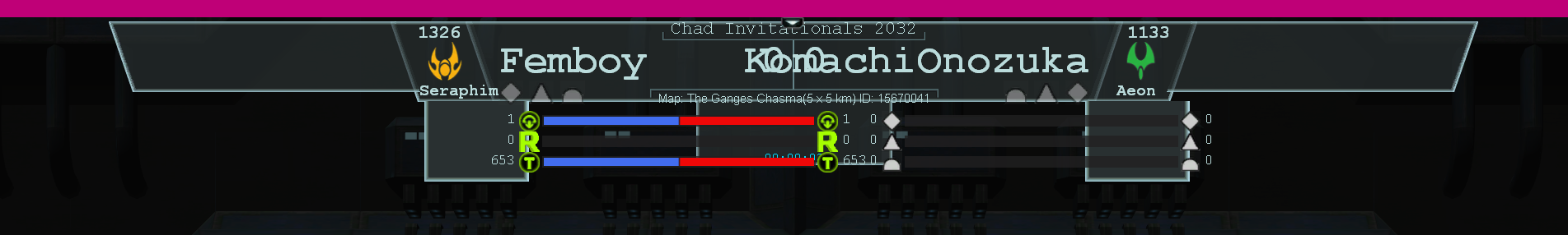
        @femboy Why you gotta post a picture of it looking like everything is fucked up (you on a tiny resolution or changed things up)? xd Here is its current state for reference:

        ce23c528-c175-42f8-976e-a84d6556a4de-image.png

        A 1 Reply Last reply 12 Nov 2021, 03:35 Reply Quote 4
        • A
          Askaholic
          last edited by 8 Nov 2021, 21:10

          What about team games?

          1 Reply Last reply Reply Quote 0
          • J
            Jip
            last edited by 8 Nov 2021, 21:18

            Lets focus on 1v1 for now.

            A work of art is never finished, merely abandoned

            1 Reply Last reply Reply Quote 2
            • A
              archsimkat
              last edited by 9 Nov 2021, 03:39

              I should have specified that this was to create a casting interface for 1v1 replays (live or from the vault) or the observer view. Teamgames will require a different designed and set of specifications so it's not included in this post.

              E 1 Reply Last reply 9 Nov 2021, 06:36 Reply Quote 1
              • E
                Eternal- @archsimkat
                last edited by 9 Nov 2021, 06:36

                @archsimkat If you divide the functionality, you will be able to use the developments immediately for team games

                Profile | Eternal MOD pack | Check new client

                1 Reply Last reply Reply Quote 0
                • A
                  Anachronism_
                  last edited by 9 Nov 2021, 15:31

                  I imagine it shouldn't be that hard to modify this to be usable for team games if it's sufficiently soft-coded...
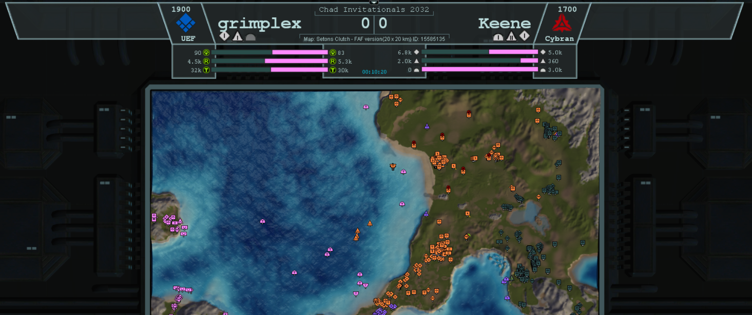
                  Perhaps a simple interface could be added for switching what is shown on those 2 displays mid-cast (in the above pic, grimplex is on the left display and Keene is on the right display). For example, there could be a button corresponding to each player in the game as well as a button for each team in the game. Then, when you click on the button for a player or a team and then click on either the left or right side of the display, it could display the relevant info on the clicked side of the display.

                  pfp credit to gieb

                  A 1 Reply Last reply 9 Nov 2021, 16:24 Reply Quote 1
                  • A
                    arma473 @Anachronism_
                    last edited by 9 Nov 2021, 16:24

                    @emperor_penguin said in Caster UI Mod Functionality Brainstorming:

                    I imagine it shouldn't be that hard to modify this to be usable for team games if it's sufficiently soft-coded...

                    Which is why creating the 1v1 version is the priority. If anyone wants to make plans, pitch ideas, or solicit suggestions for a team version of the caster UI, that should all happen on a separate thread

                    F 1 Reply Last reply 10 Nov 2021, 03:55 Reply Quote 0
                    • F
                      Femboy Promotions team @arma473
                      last edited by 10 Nov 2021, 03:55

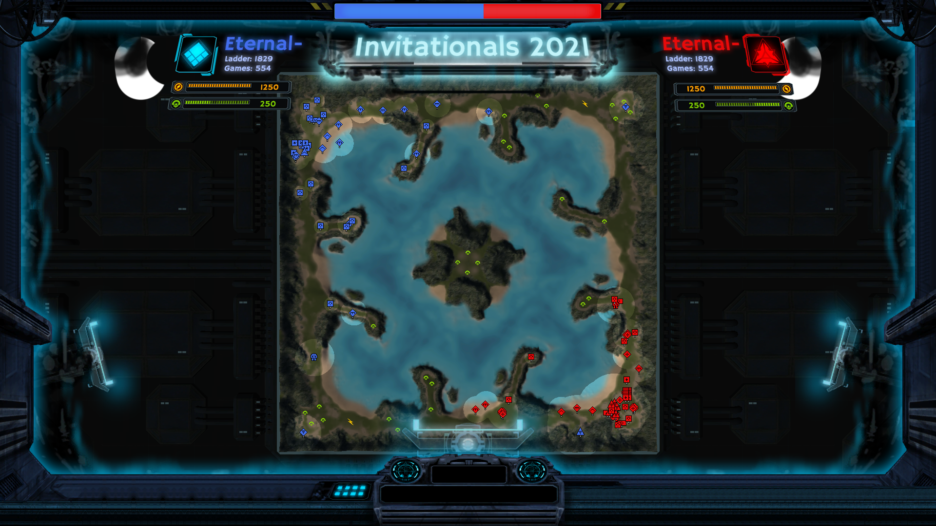
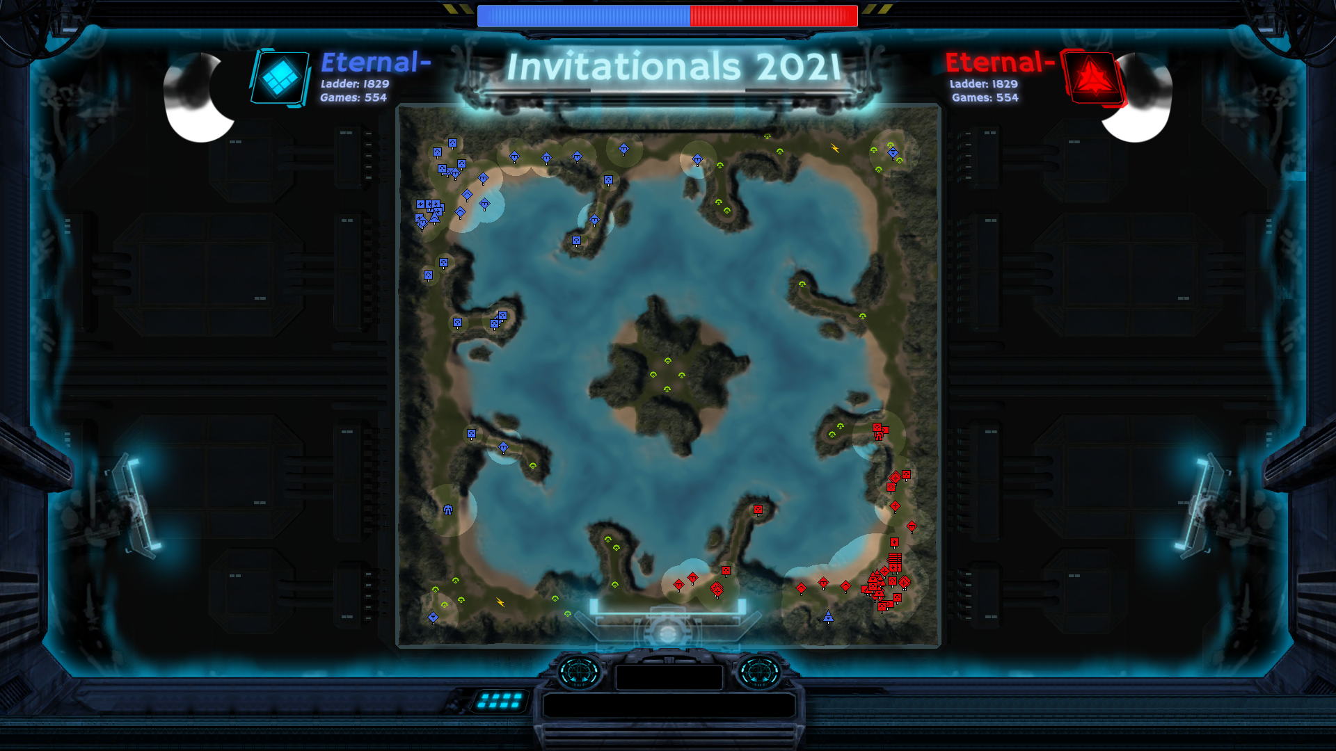
                      Well as of right now me and @Keene are working on this for 1v1. It is expected to be done in about a week. It is very functional right now, its just needs a few retouches here and there in the UI department. We'll post an image soon once I update the UI more
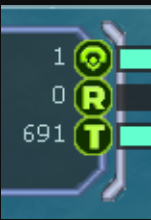
                      FAF Website Developer

                      1 Reply Last reply Reply Quote 0
                      • F
                        Femboy Promotions team
                        last edited by 10 Nov 2021, 17:40

                        53edf75a-8ae4-4646-a8ba-71642f23edb5-image.png

                        vs
                        8f0b740f-da80-4fa7-a209-edb10c016507-image.png

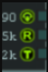
                        Would appreciate opinions on the green icons, currently the fonts are the only thing I'm going to change about them. But feel free to give your feedback

                        FAF Website Developer

                        1 Reply Last reply Reply Quote 1
                        • T
                          Tagada Balance Team
                          last edited by 10 Nov 2021, 17:47

                          The first one.

                          1 Reply Last reply Reply Quote 1
                          • J
                            Jip
                            last edited by 10 Nov 2021, 19:59

                            They're not at the same zoom level, I think?

                            A work of art is never finished, merely abandoned

                            F 1 Reply Last reply 10 Nov 2021, 23:05 Reply Quote 0
                            • F
                              Femboy Promotions team @Jip
                              last edited by 10 Nov 2021, 23:05

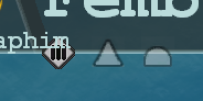
                              @jip Well rather than zoom its size, the bottom ones are 32x32 and the top ones are 48x48.

                              FAF Website Developer

                              1 Reply Last reply Reply Quote 0
                              • E
                                Eternal-
                                last edited by Eternal- 11 Nov 2021, 14:22 11 Nov 2021, 14:20

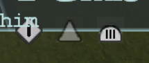
                                Most of the elements from the game. Also, I know this is not what you need, but I was wondering.

                                CAST UI2.png CAST UI.png

                                Profile | Eternal MOD pack | Check new client

                                1 Reply Last reply Reply Quote 2
                                • F
                                  Femboy Promotions team
                                  last edited by Femboy 11 Dec 2021, 02:46 12 Nov 2021, 02:35

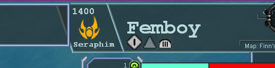
                                  This is the UI (Its off-scale, clipping and messed up because my FAF UI being scaled to 150% throws the mod off, it will probably be fixed to scale adequately with UI)
                                  854cbca1-e361-434b-9e2f-adc5b87ffa03-image.png

                                  a0f453a0-b425-47aa-8966-96e835d61f5a-image.png
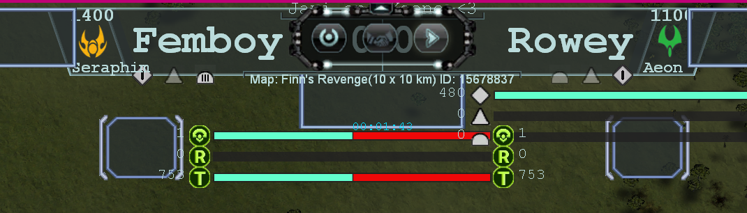
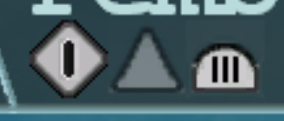
                                  I would like opinions on what looks better between the land icon's bars and the navy ones. This feature will tell the tier level in land, air and navy. I'm updating the icons and I want to hear opinions on what do you think the new one (T1 LAND) looks compared to the old style (T3 Navy). I still have to adjust the air and naval icons/00df3308-0a43-4600-b73c-b68a27d8957f-image.png
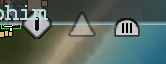
                                  this one above has darker borders, is it better?
                                  516c9240-316d-4c83-9892-cd19a9a52d09-image.png
                                  Also does T3 land's bars look like too much or is it good enough?

                                  FAF Website Developer

                                  1 Reply Last reply Reply Quote 0
                                  • A
                                    archsimkat
                                    last edited by 12 Nov 2021, 02:47

                                    @Eternal I like the stylization you've done! The areas around the side look too intrusive to keep on for the entire duration of the cast, but it looks really nice and might work well for an introduction.

                                    @Javi can you please fix the scaling issues before asking for opinions?

                                    F 1 Reply Last reply 12 Nov 2021, 02:58 Reply Quote 0
                                    • F
                                      Femboy Promotions team @archsimkat
                                      last edited by Femboy 11 Dec 2021, 02:59 12 Nov 2021, 02:58

                                      @archsimkat d1a60c32-2ca2-4593-af7c-e3b80b672437-image.png
                                      73ccfad1-742e-4402-a193-d941d3f7a9e4-image.png

                                      I just want opinions on the icons, my work is in the UI department not in the coding xdxd.

                                      FAF Website Developer

                                      1 Reply Last reply Reply Quote 0
                                      • A
                                        archsimkat
                                        last edited by 12 Nov 2021, 03:03

                                        They should all be the same size. Not sure why land > air > navy in terms of icon size.

                                        F 1 Reply Last reply 12 Nov 2021, 15:04 Reply Quote 0
                                        • A
                                          arma473 @Keene
                                          last edited by 12 Nov 2021, 03:35

                                          @keene I like it, but I think it needs a subtle marker showing the halfway point on the bars

                                          Because otherwise it's not immediately obvious which player has more or less than 50%

                                          I would suggest putting markers at the halfway point, and also 5/9 of the way and 4/9 of the way between the two extremes (because those marks correspond to one player having 20% more than the other player). Then it would be easier to see who has more and who has less.

                                          People shouldn't have to read the numbers at the edge of the bars or use their eyes to guess at which bar is bigger. Come colors "pop" more than other colors, so it might be if you're bright pink at 48% to 52%, it looks like your bar is bigger than your opponent's. If there's a subtle mark at the 50% point, that takes away the ambiguity.

                                          1 Reply Last reply Reply Quote 0
                                          15 out of 33
                                          • First post
                                            15/33
                                            Last post