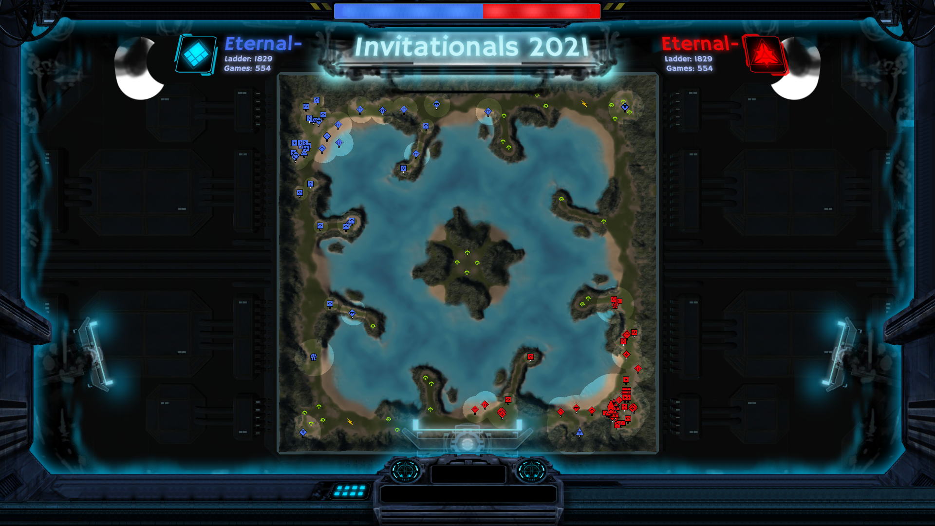
Caster UI Mod Functionality Brainstorming
-
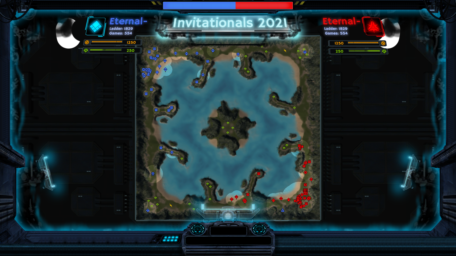
This is a concept draft of a Caster UI mod made by a contributor after discussion with Swkoll and myself that is, EDIT: fortunately, now being worked on! The goal of the UI mod is to create a casting interface in the form of a UI mod that contains a complete suite of tools that can be plug-and-play for any potential caster for any 1v1 replay or live game. The goal of this post is to create a complete set of specifications for a Caster UI mod with the help of you, the community, so that we can determine the proper scope and the most relevant features of the project.
I will start off by posting my current set of specifications, but it's almost certainly incomplete and some features that I currently have may not be desirable, so please post and list your desired features/which current features aren't desirable. I will update this post to maintain a list of the most desired specifications.
Caster UI Mod Functionality Specifications
Main view
The majority of the features here is already encompassed in the concept draft.
- Current mass/e in storage for both players
- Current mass/e income for both players
- Current total mass for both players
- Current total mass reclaimed for both players
- Player factions
- Player names
- Player clan names
- Tourney title
- Tourney round of ?
- Tourney best of ?
- Current game score
- Highest land/air/naval tech level (shown by a progress bar % if it's upgrading)
- Total mass in land/air/navy
- Current ACU HP
- Current ACU upgrades
Additional information panels
In addition to the main view, there should be additional information panels you can pull up. I think there should be two main categories of additional information panels. One category should cover the screen and display information over the course of the game, and the other should be a small side panel which displays current information. These panels should be opened using hotkeys.
Real time match timeline (covers the majority of the screen). This should be a live scrolling graph with information over time.
- Match timeline (when players reach key objectives like first t2 land, t2 mex, t3 air, gun upgrade, etc.) [this can information be overlaid on any of the following graphs]
- Live income graph (similar to the graphs of mass/e at the end of the game in the score screen)
- Live mass income disparity graph
- Live energy income disparity graph
- Live net unit disparity mass
Side panels (brings up a small panel with additional information)
- Units lost (mass/e lost for each player)
- Current air breakdown* (intie/bomber/gunship/transport/asf/etc. numbers for both players, and total mass in air, kind of like UI party's ECOntrol interface)
- Current land breakdown (once again broken down by number of units for each unit type)
- Current navy breakdown
- Current structures breakdown (mex/factory count)
- Current economy (number of t3/t2/t1 mexes, pgens, etc. exactly like ECOntrol's interface but for both players)
- Total units lost (once again broken down by number of units for each unit type)
- Net spending (broken down by spending into Eco/Production/Units)
- Current production
- Current/average APM (I don't know if we can track this)
- Current/average CPM
*Do we want to list land/air/navy current units and units lost in one tab or break down each one into 3 categories? If it's just one tab it might become too information heavy in the late game when there are many unit types.
Additional camera control options
- Toggle semi-free cam (keep casting interface)
- Toggle free cam (remove all UI)
- Toggle slow acceleration based camera movement (smooth scrolling)
- More cinematic camera features
Misc features
- Hero units (most units or mass killed by individual units - if you click it you go to the unit)
- Show energy reclaim of map
- Show mass reclaimed per engineer
- Average mass reclaimed per engineer OR
- Engineer efficiency ratio (total reclaimed gathered / total engineer time) [total engineer time increases by 1 for every second each engineer is alive, eg. if 5 engineers are alive simultaneously then it will increase by 5 every second]
- Eco efficiency ratio (total mass spent on economy / total mass produced by economy) [does not include reclaim]
- Hide player chat (in case some players get a bit... salty)
- Swap player colors (dunno if this is possible, mainly for when players choose very similar colors)
Last edited on 11/09/21.
-
So realy this mod needs to replace alot of the current Ui when in Observatior mod
-
@rowey if you follow the game architecture, you can create a new, 5th type of layout display, which you change via ctrl + arrows. But i think, it makes it much difficult
-
@eternal As of right now, I'm speaking with SamKeene to see if we can update his UI mod. I will bring updates soon.
-
Well this would 100% be better than having to adjust things in stream labs. Hope someone will take on the project to completion!
-
As i can tell, getting information about army's units requires being observer for this army, so, it wont be that easy to make accurate
-
Currently I'm working with SamKenne's Casting mod. I believe it is quite amazing on its current state.
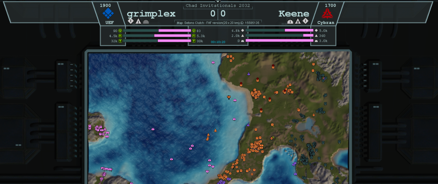
It can inform you on when navy, land or air facs are first made, when a higher tech is achieved on either of these, mass invested into any type of unit (no more having to check ASF, t1 tank or frigate numbers! You get a clear picture of who has more or less mass invested into those units in REAL TIME), it also obviously gives you mass production, reclaim and total mass values! It needs some love on the UI department but functionally it's pretty crazy in my opinion.
-
@femboy Why you gotta post a picture of it looking like everything is fucked up (you on a tiny resolution or changed things up)? xd Here is its current state for reference:
-
What about team games?
-
Lets focus on 1v1 for now.
-
I should have specified that this was to create a casting interface for 1v1 replays (live or from the vault) or the observer view. Teamgames will require a different designed and set of specifications so it's not included in this post.
-
@archsimkat If you divide the functionality, you will be able to use the developments immediately for team games
-
I imagine it shouldn't be that hard to modify this to be usable for team games if it's sufficiently soft-coded...
Perhaps a simple interface could be added for switching what is shown on those 2 displays mid-cast (in the above pic, grimplex is on the left display and Keene is on the right display). For example, there could be a button corresponding to each player in the game as well as a button for each team in the game. Then, when you click on the button for a player or a team and then click on either the left or right side of the display, it could display the relevant info on the clicked side of the display. -
@emperor_penguin said in Caster UI Mod Functionality Brainstorming:
I imagine it shouldn't be that hard to modify this to be usable for team games if it's sufficiently soft-coded...
Which is why creating the 1v1 version is the priority. If anyone wants to make plans, pitch ideas, or solicit suggestions for a team version of the caster UI, that should all happen on a separate thread
-
Well as of right now me and @Keene are working on this for 1v1. It is expected to be done in about a week. It is very functional right now, its just needs a few retouches here and there in the UI department. We'll post an image soon once I update the UI more
-
-
The first one.
-
They're not at the same zoom level, I think?
-
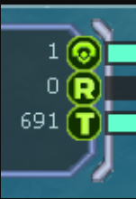
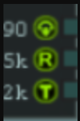
@jip Well rather than zoom its size, the bottom ones are 32x32 and the top ones are 48x48.
-


