Do not add new colors - discussion
-
Adding color names to the lobby will not help the situation. We are an international gaming community and some players do not speak English as a first language. The color names would likely reference the English names which mean little to non English speakers. Especially if they in the heat of the game need to think to reference them and then also expect all the other players to understand what they mean.
Seeing the name briefly in lobby doesn't help this case.
It also doesn't help casters communicate to their audience who may not have seen the colors before.
-
Hi again,
Since this is all seems very much up in the air still, I thought I would post again, my explanation may have been convoluted but I'm not sure if my proposal was really understood.
I'm not suggesting for there to be less colours possible - in fact the opposite, we could easily have 30-40 different shades where players can then pick one they like, I know this becomes part of player recognition in the games.
What I recommend is that we have 16 set colour 'categories' if you will, and then within those we can have some different tones and shades players can choose from - but still obviously a red or a dark blue so other players can refer to them easily.
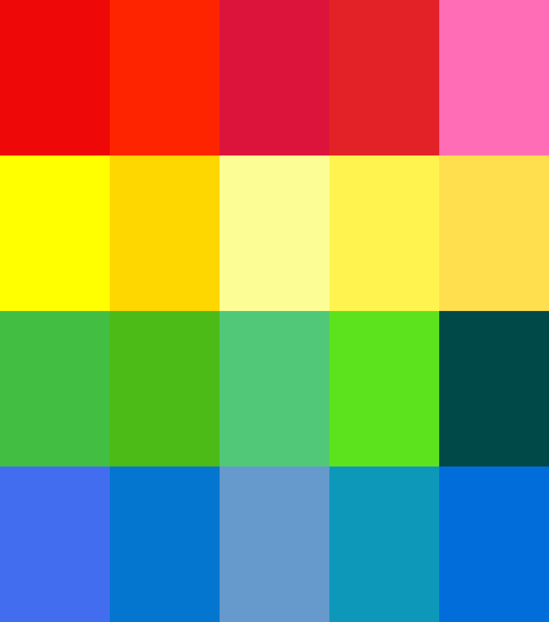
Below I have the current red, green, blue and yellow we have now (or at least it should be, they are taken from a screenshot of the lobby). And then some different versions players could choose from.

The important thing is that, in any game there is only one 'red' or 'green' player so any similarity between the tones won't be relevant.
I would expect players could choose their desired preference order in their profile, for a custom game it would be first in best dressed, TMM could go on rank, highest player gets their first choice, and then so on.
As to accessibility for colour vision impaired players, I had a look at your links Uveso, and it seems we can get a rough equivalent by choosing specific tones which can be distinguished. I found a 16 colour palette at https://github.com/filipworksdev/colorblind-palette-16, which I have included below with a rough mapping to the colours I mentioned earlier.

Note the last column in the first image is of these colours which is why they may seem a bit off
 So this could be set as the default selection for these players, and they would soon be able to learn which colour players are referring to in-game.
You could definitely have some settings for defaults if you are casting for example so they stay the same - if playing you could choose if you want to show other players choices or only your own, it could be quite flexible.
One last thing I am wondering on, is if the strategic icons could show white unit symbols instead of black for the darker colours as this would be a big aid to visibility! Unsure if possible to load a reversed icon set based on team colour.
-
I understand your idea - but I'm not too thrilled about it. I also do not see the immediate value of being able to pick a slightly 'alternative' red over just a tint of
redand a tint ofdark red. This is a strategy game and it needs to be consistent.@black_wriggler said in Do not add new colors - discussion:
You could definitely have some settings for defaults if you are casting for example so they stay the same - if playing you could choose if you want to show other players choices or only your own, it could be quite flexible.
Up to the point where people ask
bluefor help and from the casters perspective there is noblue.I am fond of the idea to have better support for color vision impaired players. As long as we take the similar approach to other games that have support for color vision impaired players.
-
I feel like I'm losing my mind reading this thread unless I'm mixing something up. I can easily understand that similar shades of color are difficult to refer to in chat without confusion. That's a problem that needs to be addressed. But I have zero problems actually determining the differences between similar shades on the screen... unless you have colorblindness which I know a few people have.
Moreover, I have never had a single problem with the current selection of colors... why not just leave it as is instead of removing options?
-
I'm reverting the changes if we can not come to a consensus.
-
I like the new colors, I vote keep em.
-
Ok last suggestion from me, again forgive rough cut and paste here, seems I have spent enough time playing with this for now.
It seems to be the new colours are liked (by me too) but visibility and designation are the real issues, like the screenshot above from Arch shows (altho the choice of mex icons is not helping...)
so I propose a loose categorisation of the new icons if they go in - I know this would require more coding on the client so for now I would be in favor of reversion in the new patch until ready.
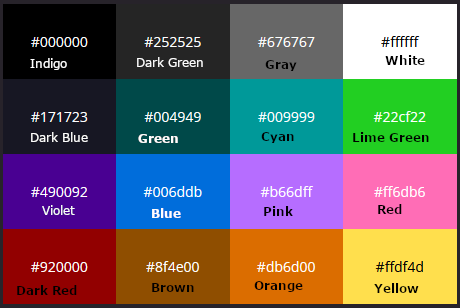
Below we have the new icons arranged into 16 categories, for 16 players, they will be distinct enough from the other categories in game - also easily referred to by English speakers at least IMHO - you have dark blue, blue, blue-green, purple, dark purple, dark pink, dark red, pink, red, orange, yellow, white, gray, dark green, green, yellow-green.
Also means we are not losing any old colours, and there is potential room for more down the track, and this would also easily allow adding a preset for colour blind players. I was surprised to learn even some regular vision pro players use the alternate set!

-
Me......
-
Here is my idea

-
Black got removed forever ago for making icons unclear.
-
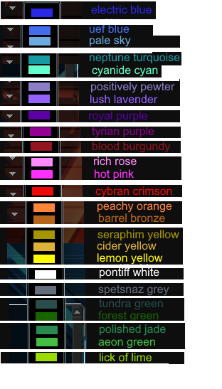
For months I have anguished over the decision on what color I want to paint my living room... But no more. Thanks to this glorious forum post I have now decided that 'positively pewter' is the color for me. If it weren't for this great sharing of ideas I would still be going to my local hardware store to spend $5 on paint samples.
-
Whatever you do, do not reduce the number of colors. People actively choose colors to not have similar colors side by side. Having three similar colors in 16 player game is not a big problem, if one is in left, another in mid, and last one in right. But having only 16 colors, means that last one can end up with very similar color to his neighbor. And that is a problem.
Also many players have their favorite color. And if that is not available, they choose similar colors. This makes it much easyer to memorise/remember players in 16 player games. Of course this is quite irrelevant in 2v2, but it helps a lot in 16 player games.
Also there is probably some other, personal reasons for some players. They chose a color, or similar color, that they see better or are more used to or like better etc. This does not mean, that they will deliberatly put two very similar colors side by side, but only that they have some choice. And playing a game rather than looking at tv is something to do with wanting to have choices, maybe.
And it is not like those games do not exist. 16 player survival was very popular lately, and some 8v8 maps are regularly played. too.
On the "color naming problem". People use names, half the name, first 3-4 lettres of the name. Or the spot of the player, if available. No need to invent special very long names for colors. People dont use those today and probably wont use those in the future.
-
@wikingest said in Do not add new colors - discussion:
And it is not like those games do not exist. 16 player survival was very popular lately, and some 8v8 maps are regularly played. too.
There’s 100 8v8 games a month if people want an actual number attached to it. There are like 3,000 6v6 games and 7,000 1v1 games a month.
-
@ftxcommando said in Do not add new colors - discussion:
There’s 100 8v8 games a month if people want an actual number attached to it. There are like 3,000 6v6 games and 7,000 1v1 games a month
Where does those numbers come from?
-
some of those colors are too good to not add, add new colors i think its great
-
@wikingest said in Do not add new colors - discussion:
@ftxcommando said in Do not add new colors - discussion:
There’s 100 8v8 games a month if people want an actual number attached to it. There are like 3,000 6v6 games and 7,000 1v1 games a month
Where does those numbers come from?
FAF api
-
I agree, if we cannot add more colors could we at least vote to replace some of the existing colors with a few of the new colors, there is a particular shade of teal that looks superior to the current one imo
-
@wikingest said in Do not add new colors - discussion:
But having only 16 colors, means that last one can end up with very similar color to his neighbor. And that is a problem.
The whole point of choosing only 16 colors is that you could choose ones that are NOT similar to each other. With 19 colors, you HAVE to have some colors that are similar to each other, because 19 is too many.
Since everybody keeps suggesting, here is mine. I modified Jips, because pink / dark pink combined with purple / dark purple will not work and we still have teal available as distinct, easy to call out color:
- red / dark red
- blue / dark blue
- green / dark green
- teal
- orange / brown
- yellow / dark yellow (mustard)
- bright pink / dark pink = bright purple / dark purple
- white / grey
Compared to what we have now (which is 19 colors):
- number of greens/blues/teals reduced from 7 to 5
- number of pinks/purples reduced from 4 to 3
The rest basically is still the same. If you want, throw in lime as an additional color, so the last person in a 8v8 can still choose between 2.
If those colors are properly chosen, they should be easy to distinguish and call-out for any non-color-blind person, and i am still in favor of giving color-blind people slightly (!) altered color sets, where only the problematic colors are changed. For example for the red-green-blind set you would slightly change greens and reds to have different brightness or mix in slight other colors.
-
@katharsas said in Do not add new colors - discussion:
The whole point of choosing only 16 colors is that you could choose ones that are NOT similar to each other. With 19 colors, you HAVE to have some colors that are similar to each other
Some people here really think that players are taking the time to thoughtfully consider whether their color is too close to the color of their neighbor
That's never going to happen consistently
The best thing is if every color is distinct from every other color
That is easier to achieve with fewer colors
-
@katharsas said in Do not add new colors - discussion:
The whole point of choosing only 16 colors is that you could choose ones that are NOT similar to each other. With 19 colors, you HAVE to have some colors that are similar to each other, because 19 is too many.
Definition of similar can depend from person who is looking, of course. But after looking at those 16 colors propositions above, I totally see similar colors. From my eyes, we do not have a proposition without similar colors jet. So it is pointless and harming to reduce the number of colors.
@arma473 said in Do not add new colors - discussion:
Some people here really think that players are taking the time to thoughtfully consider whether their color is too close to the color of their neighbor
Players totally consider neighbors colors (thoughtfully, I bet
 ) to avoid too similar color. There is even discussions and negotiations about this in lobby. There is no doubt about it. Now what is the exact statistic about it, or your definition of consistency, I do not know. But as I said, I have not seen 16 colors without some similar colors.
And if really there is a player who does not consider colors. He eather does not have problem with it or he will very soon notice that he should start considering about colors. This is not a reason to create a problem into the game for others (by reducing nombre of avilable colors).