4z0t's ScoreBoard
-

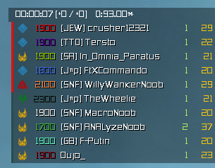
Decided to move color of a player closer to nickname, left one is team color. -
@mr-skill-issue
thank you so much for what you are doing! it's very cool that there may be a choice...have a couple of ideas or questions
is it possible to add:
a function to change the transparency of the background of this window or disable transparency.the functions of moving (with the ability to attach to the right place) of this window and turning it off (for example, you can always close the map window if it really bothers)
the functions of disabling unnecessary (for example, to exclude the display of opponents) I need the functionality of transferring resources and units to my opponents, and the names of opponents and who died there are not particularly important...
I hope I was able to describe the idea clearly. sorry if it came out messy, the matter of describing an idea is a thankless task, there are always discrepancies and interpretations.
-
@fractal thank you for your response!
Yes, there will be options to change alpha of background, to close scoreboard and to hide opponents. -
@Mr-Skill-Issue
looks nice!
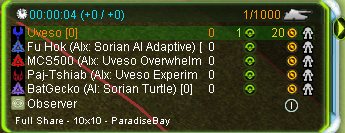
but the name field is for AI's way to small.
you used [AI: Easy] as example, its the shortest possible AI name.but, look at these AI names:

So you could have names like:
XShadowStormX [AIx: Sorian AI Adaptive]
Shun-Awloyeth [AIx: Sorian AI Turlte]
Thel-Aishashen [AIx: Uveso Experimentals]Does the window resize for those names ?
(you need to read the last part of the AI string or you can't identify the AI.) -
How large is this scoreboard compared to the traditional one or Supreme Scoreboard?
-
@Uveso thanks for suggestion, I will take a look, rn it doesn't even cut nickname, so it may overlap with income values.
@FtXCommando It is a bit bigger due to line spacing and larger font, but in future I would add some options for those I think -
@mr-skill-issue wut, it is bigger????
-
@eternal rn yes
-
Really like the minimalistic design, it's very nice!
-
A few bugs/suggestions ive noticed:
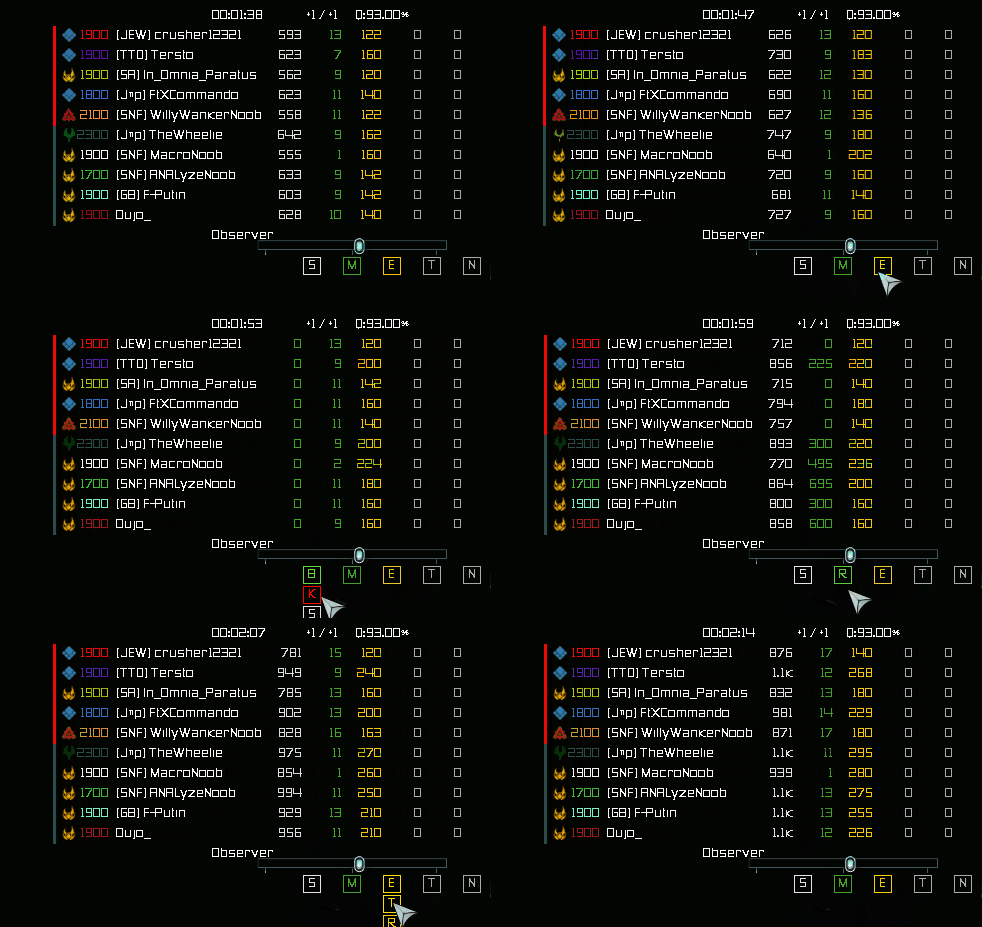
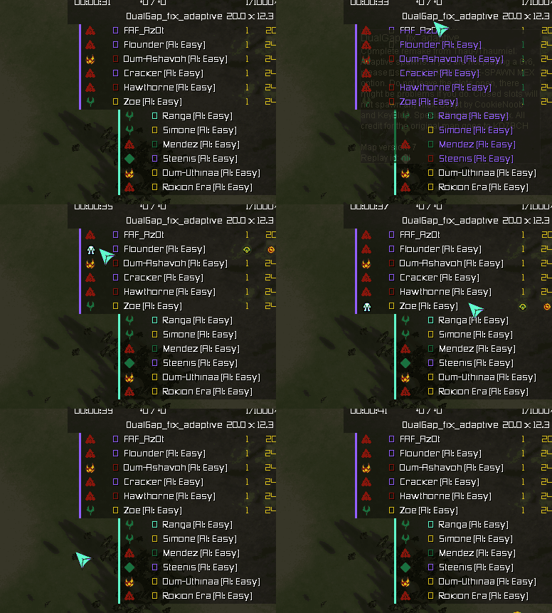
- When a game launches u need to hover over each teammate (everyone in replays) in order to set it to the correct position (https://imgur.com/a/8ltvxfl)
- I for sure think having player color on rating and the left bar being team color is the best idea. The branch im using has player colors on the left and its quite hard to read who is who.
- Very minor nitpick, some numbers have different sizes so as game time changes the game speed shifts back and forth. https://imgur.com/a/SGkYnKe
But overall small things aside i really like the cleanness of the mod. Thanks for your work!
-
@SpikeyNoob pushed some changes there. I am still working on it, so, those things are gonna be as intended.
-
Personally, not a fan of any UI element that moves when you try to focus on it. It just makes reading it more difficult for a moment for no real benefit.
Cool work though.
-
@sleepeater yeah, noticed that too, but I have some solutions for it
-

-
The project is frozen. If you want to try current scoreboard state follow link below
|
|
V -

-
@not-4z0t why does it feel like everytime there is someone creating a cool UI mod for FAF it just dies/dev stops working on it within a couple of weeks/month xd
-
Bruh
-

-
Version 1 released!!! Finally!