EternalStrategicIcons [UI]
-
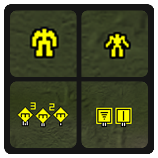
Current version - version 2
Search in vaults [EternalStrategicIcons]
Description
Eternity view of strategic icons. I think it is 150% scaled or 175%. I dont remember correctly xD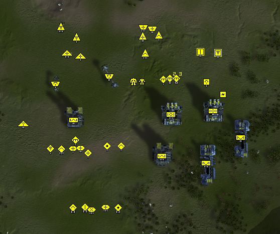
Also press to any TAG of this post and see another my works
-
Icons is not loading
I know only one solution -> remove game.prefs
and remove UI-Party
-
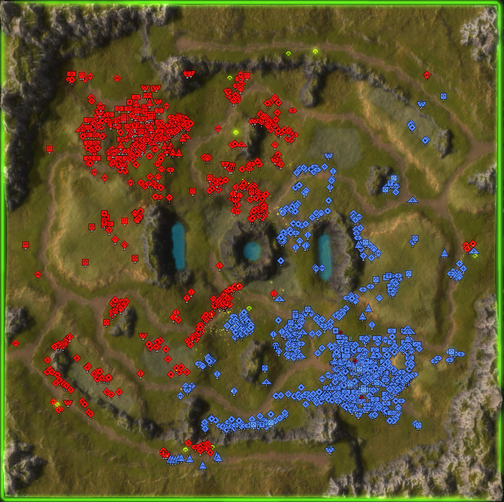
Nice use of the custom strategic icons pipeline we set up in patch 3721. Was it intuitive to use?
It worked right away for me. Make sure you active it.
-
is the size adjustable?
-
@rezy-noob resized by script and mostly finished by hands, so it is kinda hard to do
-
@jip Convenient enough, but I found some kind of problem. When game.prefs is changed by the UI-party mod, it stops loading. Can`t say what is the problem
-
Oddly specific, are you referring to the version in the vault? *
-
@jip can`t say the right version, but some of them used by HintHunter. And even on clear game.prefs after ui-party settings setup any icons mod stops to working
-
I'll investigate it

-
Props for this icon pack - it even includes the tech levels of engineers as part of their icon
 . The only thing I am missing is highlighting of TML, SML, TMD and SMD.
 -
Been using the mod for a few days now, just wanted to say I really like it so far, been struggling with default icons being to small for me at 1440p for a while now so this was a great improvement.
-
@jenstad I'm glad you liked it
-
@jip I will think how better highlight them
-
suggestions?
- ACU
-
Nuke
-

-
Anti-nuke
-

-

-
Experimenta unit
-


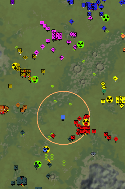
Only for view, on selection/hover they will be as original one
-
I think that is a tad much for the nukes - would be nice to have them in the same style, but just with highlights
-
Agree with jip that it breaks too muich with the style of the original icons, a more subtle highlight on the original icon is preferable I think.
Maybe something more along the lines of the acu icons you have there, where its the original icon, just a highlight that comes with it.
-
Small red out-line similar to the acu one would be more than enough. Same for SMD, just make it blue outline?
-
-
nuke

-
anti-nuke


-
-
Looks good to me!
-
Version 2
Due to problems with compression (losing pixel colors = game renders them with player color) i changed final colors.
- White - something dangerous, that should be destroyed
- Blue - something defensive
Added:
- TML
- TMD
- T3 Arty
