Opinions on minimap colors wanted
-
The minimap on mapgen maps uses different colors in an effort to improve the contrast, to make it easier to read the minimap. Do you like that or would you prefer if they used the same color as all other maps?
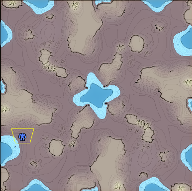
For reference this is a gpg map:
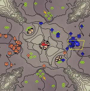
and this is a mapgen map
Further comparison can be found here https://forum.faforever.com/topic/6874/opinions-on-minimap-colors-wanted/14
-
How is that achieved
") ?
?I personally don't use the minimap or cartographic view in general, but the original appears to be clearer to me then the mapgen version. The contour lines are difficult to see in the mapgen version.
-
The scmap has settings for the colors as well as the spacing of the contour lines
-
And admittedly it was implemented when the textures of the mapgen weren't as precise as they are now
-
gpg map
-
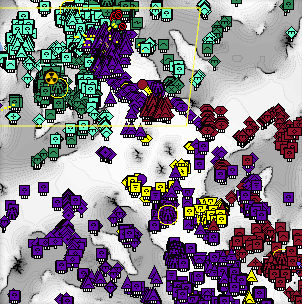
I think the comparison images are unfair because the second image has way more units/structures which obscure the terrain.
That said, I think I like the mapgen version better. The contour lines on the GPG map are more clear, but elevation isn't important to know. I think the mapgen version makes it more clear which areas are passable by land and which are not, and obviously higher areas are lighter. This is much better.
-
Mapgen 100% and yes the comparison is unfair
-
@FunkOff OK, that's true too
-
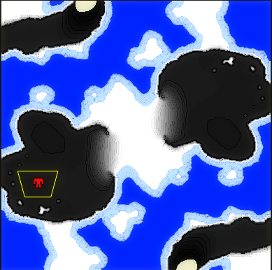
Thank you for your input. What I got so far is that the contour lines on mapgen maps make it easier to gauge the steepness of the slope. While trying to get better comparison screenshots I noticed that the terrain colors definitely need to be adjusted as they go from white to pure black. If a map has no mountains this happens:
I'll try adjusting the colors while keeping the contour lines and then I'll be back with some better comparison pics
-
It would be nice if comparison picks were taken on same map.
-
Check out the map of Loki here. It's so clear what is going on. https://forums.faforever.com/viewtopic.php?f=2&t=7573
-
The most important thing to show is unpassable cliffs. Height is just a bonus. Water is important too. If you have all that, contour lines are just noise.
-
I don't know, this loki map is utter garbage imo. Can't even look at it without having urge to vomit.
The Mapgen minimap from the OP is imo the best. Could use some tweaking to show unpassable terrain better, but it's hand's down the best one so far. -
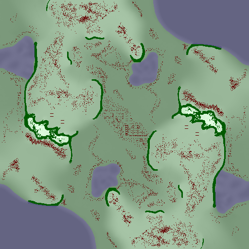
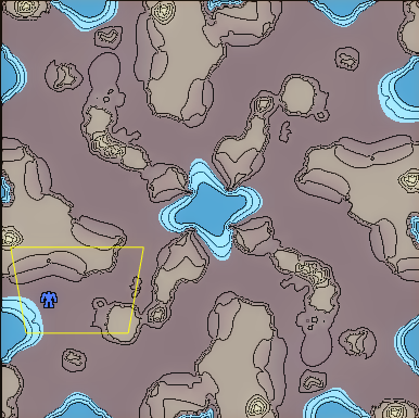
Here is a mapgen map with the water and ground color adjusted to fit the gpg maps:
And here is the same map with gpg contour lines for reference:
-
Mapgen looks significantly better to me based on the latest comparison; I’d suggest editing the op to link to that comparison as I was leaning towards the opposite view based just on the previous mapgen minimaps, and some people may not read the whole thread when responding
-
The change is now part of the latest mapgen release
-
@blackyps This shows that the mapgen preview is far better than the GPG contour lines. At least for FAF purposes. (If I were an engineering designing a large structure, I might prefer the contour lines lol)
-
That new preview is heavenly
Hello! It looks like you're interested in this conversation, but you don't have an account yet.
Getting fed up of having to scroll through the same posts each visit? When you register for an account, you'll always come back to exactly where you were before, and choose to be notified of new replies (either via email, or push notification). You'll also be able to save bookmarks and upvote posts to show your appreciation to other community members.
With your input, this post could be even better 💗
Register Login