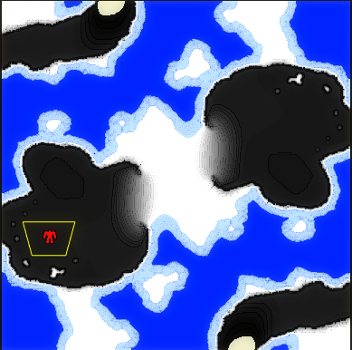
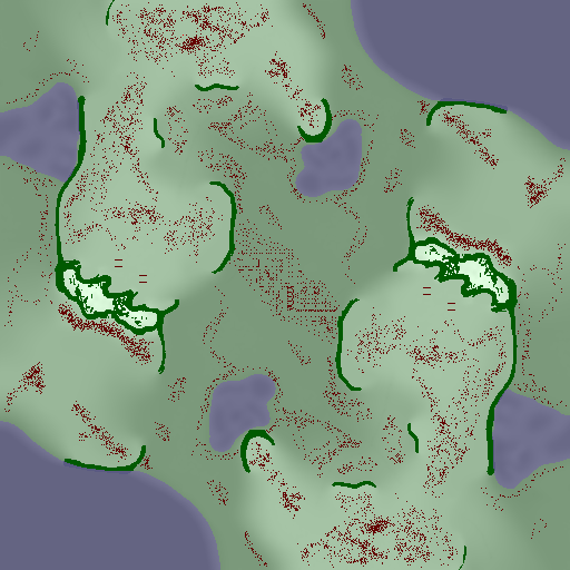
Opinions on minimap colors wanted
-
Mapgen 100% and yes the comparison is unfair
-
@FunkOff OK, that's true too
-
Thank you for your input. What I got so far is that the contour lines on mapgen maps make it easier to gauge the steepness of the slope. While trying to get better comparison screenshots I noticed that the terrain colors definitely need to be adjusted as they go from white to pure black. If a map has no mountains this happens:

I'll try adjusting the colors while keeping the contour lines and then I'll be back with some better comparison pics
-
It would be nice if comparison picks were taken on same map.
-
Check out the map of Loki here. It's so clear what is going on. https://forums.faforever.com/viewtopic.php?f=2&t=7573

-
The most important thing to show is unpassable cliffs. Height is just a bonus. Water is important too. If you have all that, contour lines are just noise.
-
I don't know, this loki map is utter garbage imo. Can't even look at it without having urge to vomit.
The Mapgen minimap from the OP is imo the best. Could use some tweaking to show unpassable terrain better, but it's hand's down the best one so far. -
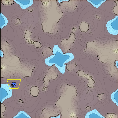
Here is a mapgen map with the water and ground color adjusted to fit the gpg maps:

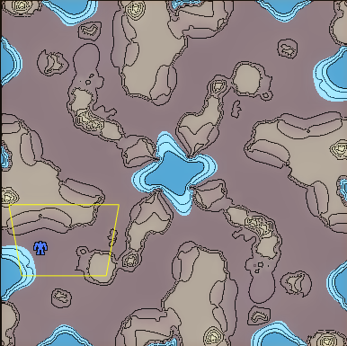
And here is the same map with gpg contour lines for reference:

-
Mapgen looks significantly better to me based on the latest comparison; I’d suggest editing the op to link to that comparison as I was leaning towards the opposite view based just on the previous mapgen minimaps, and some people may not read the whole thread when responding
-
The change is now part of the latest mapgen release
-
@blackyps This shows that the mapgen preview is far better than the GPG contour lines. At least for FAF purposes. (If I were an engineering designing a large structure, I might prefer the contour lines lol)
-
That new preview is heavenly