Do not add new colors - discussion


-
I really doubt there is a type of color blindness that would benefit from that selection of 5 colors but wouldn’t be hampered by the other 15 colors selected for instance.
There is a color mode that makes you/ally/enemy units 3 different colors already. Adapt that to a color blind mode and there you go.
-
Fair enough, its just only reason I can see why we'd have 4 more colours than alloted players (actually that a lie if we had a for people to 'jump' in any already started match that is reason #2 I could see but I also want pie while flying).
-
@femboy I like your list.
Consider modifying the final list
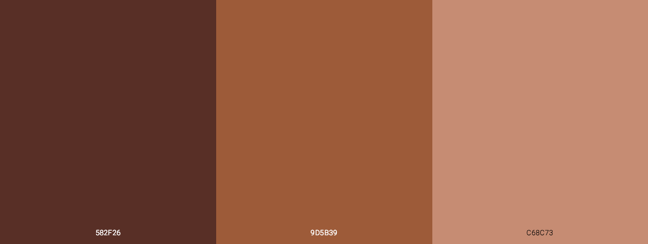
- Third item down --> more skin tone brown #743D2B
- Fourth item down --> more energetic cadmium orange #FF4700
-
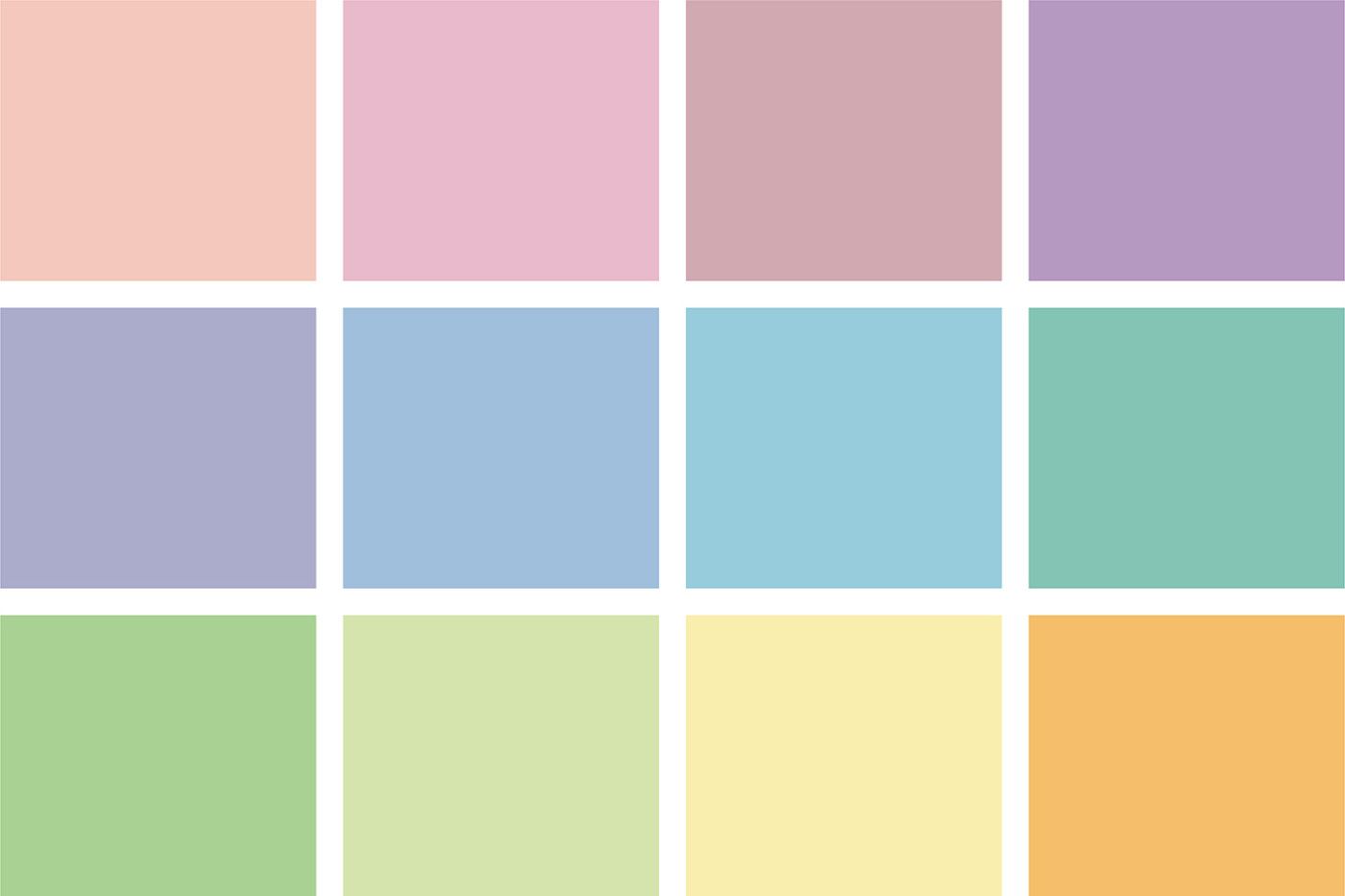
Another suggestion: most of the colors are neon type energy. We could have a neon set of colors and a pastel set. I do NOT mean add all these colors. Rather it is a strategy to have more contrasting colors.
-
Last suggestion, we could add skin tone colors. I'm sure there would be no problems in chat.!
-
There absolutely are types of colorblindness that could benefit from having more available colors by being able to selectively choose the most contrasting colors on the list for their particular form of colorblindness.
That concept of a larger color list enabling more people to pick and choose colors that offer more contrast for them is something that applies to non-colorblind users as well btw. Same thing with a larger color list allowing people to pick colors that are more aesthetically desirable to them.
That's in addition to the benefits of larger color lists giving people the ability to make more color-themed teams and giving them more colors to choose their preference from.
-
More colors means more options for everyone to pick the marginally less different version of X because they prefer it. It looks like it helps colorblindness due to options but people don’t operate by caring what a single colorblind person in lobby has to say about it over their personal joy at being off brand white
More options does not equate to more gooder.
Show me
A) the group of 15 colors that would work for various color blind variations
B) the group of 5 colors that would present a problem for these variations that they could choose between
C) the intended solution from these 5 colorsOtherwise, converting the green/red/blue mode I mentioned prior to a color blind mode is superior than adjusting these colors to fit everything.
-
Positively pewter and lush lavender are NOT the same color!? Please don't make it harder than it already is... ><
-
@femboy said in Do not add new colors - discussion:
Also @Uveso, sadly, being accessible isn't a possibility since either we'll run into very similar colors everyone can see or we can have different colors that the color blind cannot differentiate.
We should try our best to maximize accessibility, not claim it can't be done. What we can do is maximize the contrast or difference in hue between each individual color, and the way we do that is to minimize the total number of colors we have—to the amount needed for the largest amount of players, which seems to be 16 (as I have personally never seen a match greater than 8v8). That way the difference in hue between individual colors is, on average, maximized, and the game becomes easier to read for people with the most common types of color blindness (Red–green and blue–yellow), as well as people with normal eyesight.
I think we could all agree that the CURRENT color scheme is bad because it offers alot of greens and it's quite confusing
I agree that the current color scheme isn't perfect, and like I said in the original post, the focus should be just on improving them (perhaps by removing some colors), not adding new ones. By the way, the greens are not any better in the PR, if anything it's even worse:
-
Could we simply have a selection of different colour palettes that can be toggled between by the user? There are a few different kinds of colour blindness, so having a colour palette designed to provide maximum contrast for each kind of colour blindness would be ideal (it's not a one sized fits all thing).
i.e. there are 20 colours in the game now, have an option that swaps these colours like for like with a set of 20 high contrast colours depending on your kind of colour blindness.
-
I think ideally we have a few preset options for color blind users that change how the colors look on an individual level, so a preset for red–green color blindness and a preset for and blue–yellow color blindness. Someone will have to weight in on if that' possible to implement/if anyone wants to actually implement that.
-
Hey all,
Funny to see this thread and the other popup - I have spent the last couple of weeks trying colours from https://www.canva.com/colors/color-meanings/ to try and get the brightest and most contrasting highlights for a strategic icons mod.
I would have to agree that 16 colours is all that is needed, and having more just gives more descriptions to try and remember. While you can ping something of specific importance in game, being able to say 'red is all t3 mex' or 'yellow has no tmd' is of much benefit.
So below is my take on what these could be, forgive the editing i saw that someone had done the half work for me on Wikipedia and i just threw in the rest with Gimp
Now ideally, the colours are all simple to describe and identifiable to players regardless of background or language.
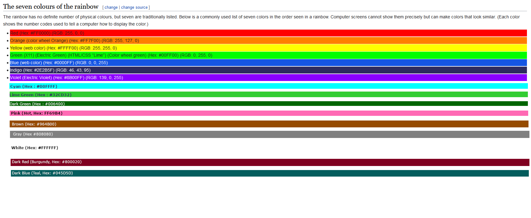
So we start with the rainbow colours, since this is a thing for FAF, and then we add some more which are distinctly different as possible (likely better choices for these!)
But whichever other ones are chosen, what you then want is for players to be able to tweak these somewhat to their preferred variety, of pink say. This could be done either with some preset options or by using set limits on the hex values which you can choose from within.
Either way, your version of 'pink' which your game displays is still instantly recognisable as that colour. This gives customization especially for players with colour vision impairments to help maximize the difference for them on their screen.
Then the team colours mode, with three colours to represent yourself, your allied team players and enemy players, should have free reign over which colours you can choose to maximize accessibility for those players with really bad eyesight....
Lastly, as well as customizing the colours, players can also choose a preference of the first, say 3 that they would like in game. Then the host would have free choice of their own player colour, and the others could be decided by player rank
")
Anyway my .02 or more, hope the ideas are helpful
-
I think for color blind presets it should just switch out the colors that are problematic for that preset's color blindness. This way the people using that color can memorize, when somebody sais "red please do x", that it maps to the replaced color from their preset. For this to work, as many colors should stay the same in all presets as possible. I'm not sure if just allowing people to choose from a range of "red" would enough for color blind people.
Alternatively, we could maybe have color replacements to chat, so when you type "/red please do x", the "/red" gets replaced with player's name automatically.
-
I am color blind and I very rarely have problems with the colors in the game tbh.
-
More colours = better
Type someone's name, or half of it you're referring to someone in a game, don't rely on their colour
Also, where is black?
-
POV: me and farm go back to naming ourselves variations of 271A5P3RG3R274
-
@yew said in Do not add new colors - discussion:
More colours = better
Type someone's name, or half of it you're referring to someone in a game, don't rely on their colour
Also, where is black?
Combine black with the strategic icons
. -
FYI for those reading; we plan to investigate the possibility of creating multiple preset color lists that people can choose from for different forms of colorblindness as well as for different aesthetic/contrast preferences. The idea includes having the colors be similar from list to list (so, blue in one list would still generally be blue in another list, just a different shade or smth). Certain technical hurdles would need to be overcome, so this is a possibility, not a definite, but it's something we'd like to implement soonTM.
-
Who's exatly "we" btw?
I would like to add my 2 cents,
Making those presets(if they get implemented at all) default is bad,a lot of players got used to what is currently available,please take us in consideration:)queuing with a newbie to show him the beauty of tmm and meeting tagada be like:
https://www.youtube.com/watch?v=yLcRpdZ0Xb0&ab_channel=Tomoko -
@rezy-noob
The people who plan to investigate the possibility of coding that are the relevant developers; likely being some combination of Jip, myself, maybe 4z0t, maybe Strogoo, etc. Others with relevant coding knowledge are generally welcome to try to help with improvements to the repository. Jip has even been doing instructional sessions and videos that can make it easier for others to get into helping FAF's development.
Hello! It looks like you're interested in this conversation, but you don't have an account yet.
Getting fed up of having to scroll through the same posts each visit? When you register for an account, you'll always come back to exactly where you were before, and choose to be notified of new replies (either via email, or push notification). You'll also be able to save bookmarks and upvote posts to show your appreciation to other community members.
With your input, this post could be even better 💗
Register Login