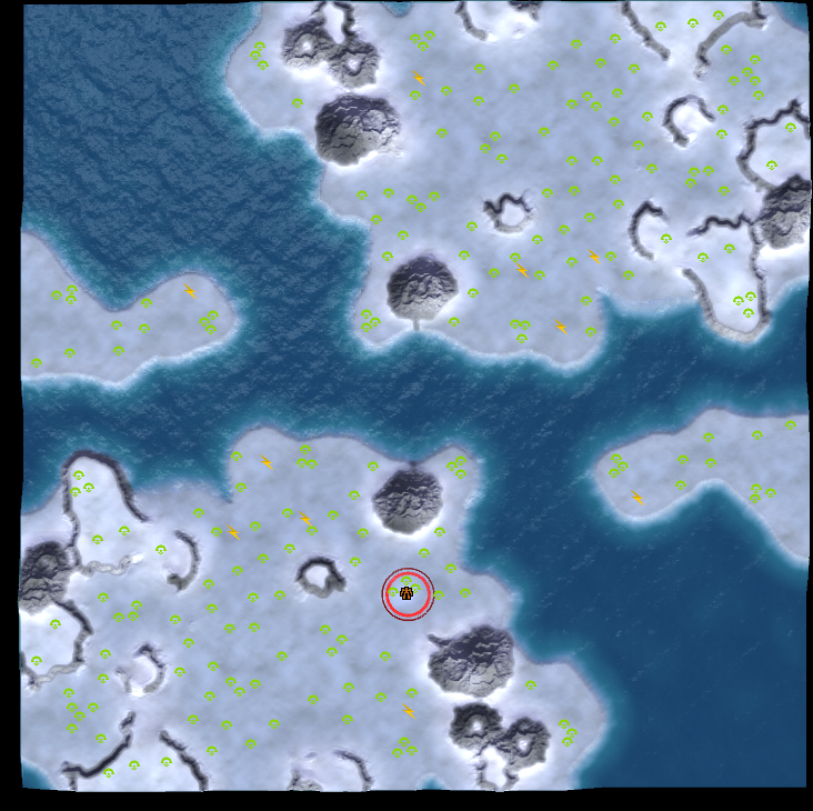
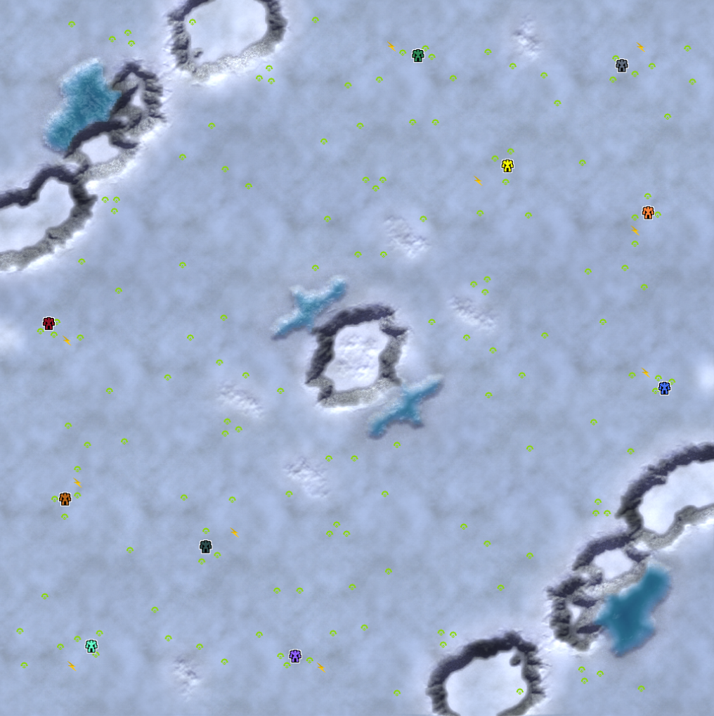
mapgen snow maps are too bright
-
Thank you new age thomas
-
What kind of monitor do you use and how much light is typically in your room when you play?
-
@blackyps said in mapgen snow maps are too bright:
I don't have time to deal with this right now, but I will get back to you. Ping me again if you haven't heard from me in a month
i very coincidentally remembered this exactly a month later

-
@waffelznoob said in mapgen snow maps are too bright:
i very coincidentally remembered this exactly a month later

@blackyps said in mapgen snow maps are too bright:
What kind of monitor do you use and how much light is typically in your room when you play?
-
My laptop screen, brightness can be adjusted. Usually a moderate amount of daylight, or just my lights. My room isn't extremely bright, but making it brighter or darker doesn't really make the maps any more pleasant to look at. I only have this issue with mapgen snow maps, by the way, other snow maps are fine
this is with fog of war disabled, and its quite difficult to see the mexes, especially if i have my laptop brightness down. i tend to up my brightness a lot when playing snow maps, when i'd rather not

-
Ugh, I'm afraid it's the screen that's the problem. The mexes are perfectly visible for me here and I don't even have that good of a monitor considering I opted for a fast nanoIPS. It really sounds like the issue here is the not the best quality of the laptop screen.
For example, when I switch this image to my secondary "office" quality screen the mexes do become harder to see, especially at lower brightness. And I bet OLED screen would just make everything extra crispy considering my experience with them.
So yeah, this really is a screen issue. The question is how can you deal with it when it's clearly a specific hardware issue.
-
Maybe the brightness could be reduced a bit. On my monitor it's to bright too.
-
Same for me btw
-
They are visible, but not clear, especially not if i turn my screen brightness down, and some icons are clearer than others. But again like i said, i only have this issue on snowy mapgen maps, not man-made snowy maps, and maps have a brightness slider that can be adjusted very easily. I think that's a better solution than having everyone buy a new monitor
-
Don't get me wrong. I'm not saying that it can't be fixed, but that it might not be as obvious to the person doing the code, as to them it looks fine, just like for me. That is compared to you and farms who seem to be suffering.
Though not gonna lie, if it get's darker I'm gonna be sad cuz it will again look all gray and boring. As if it was all snow mixed in with ash like on many of the maps.
-
i only have this issue on snowy mapgen maps, not man-made snowy maps
That's interesting, because the snow biome is made from the settings from Frithen. If other snow maps are okay, then we can do some tweaks to improve the mapgen snow maps. Is white fire okay? Feel free to name some maps that you think look nice and are readable, then I will take a look.
and maps have a brightness slider that can be adjusted very easily.
I thought your laptop has a brightness slider? Did you mean that?
-
No, when making maps there is a brightness slider that you can adjust to make a map brighter or darker. And yeah frithen is fine, because it uses dark textures underneath mex icons to make the mexes stand out more. It also uses a wider variety of mixed textures so the bright white colour isnt overwhelming. it might even use a lower brightness setting than mapgen, i dont know
If you'd rather not adjust the snow map brightness setting, you could code it so snow maps use darker textures around mex spotsI've just checked and noticed white fire is pretty bright too, but i guess it never bothered me because i know where all the mex are anyway, and its predominantly water and not the insanely bright white
-
Unironically I use the eye-saver mode and it drastically helps to reduce the brightness. Even though the first minute is a pain until you're getting used to it again, if it's possible to enable it with only one button as I can do on my monitor, I'd advice trying out that one.
I do agree that the brightness should be lowered a bit though, especially watching people play these with Bloom turned on it's just a pain -
Turning the overall brightness any lower makes the snow look like gray ash again. We could try to make the snow a little bluer to increase the contrast to the green mexes. That's why I asked for specific snow maps that are better for you. On my monitor the mapgen maps don't appear too bright, so I rely on your input for maps that do it better
-
niflheim, arctic refuge, frithen, polar depression, metir
what all of these maps have in common is that they mix a darker texture with the snow, or use a darker texture as the base while using the white snow as a decorative layer (mainly noticed on niflheim and polar depression) -
@blackyps
Making the snow bluer is not a good idea as this would likely increase eye strain when looking at the map. -
It's funny, but I had to surrender on a 1v1 neroxis snow map because my eyes said no.
-
@sheikah Yes, blue is high-frequency, more energy, there are solutions for all operating systems to reduce blue light when you are about to go to sleep.
-
Dr disrespect has the solution!
-
Adding to this thread, I also think that it's really hard to see mex locations on snowy mapgens.

I have to strain my eyes a lot more than other map types to see the mex spots and over time have noticed on multiple occasions that I, or someone I'm in a call with, miss a mex or two on these types of maps.