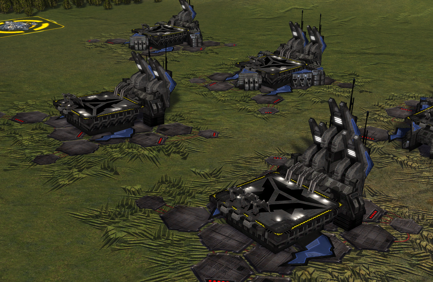
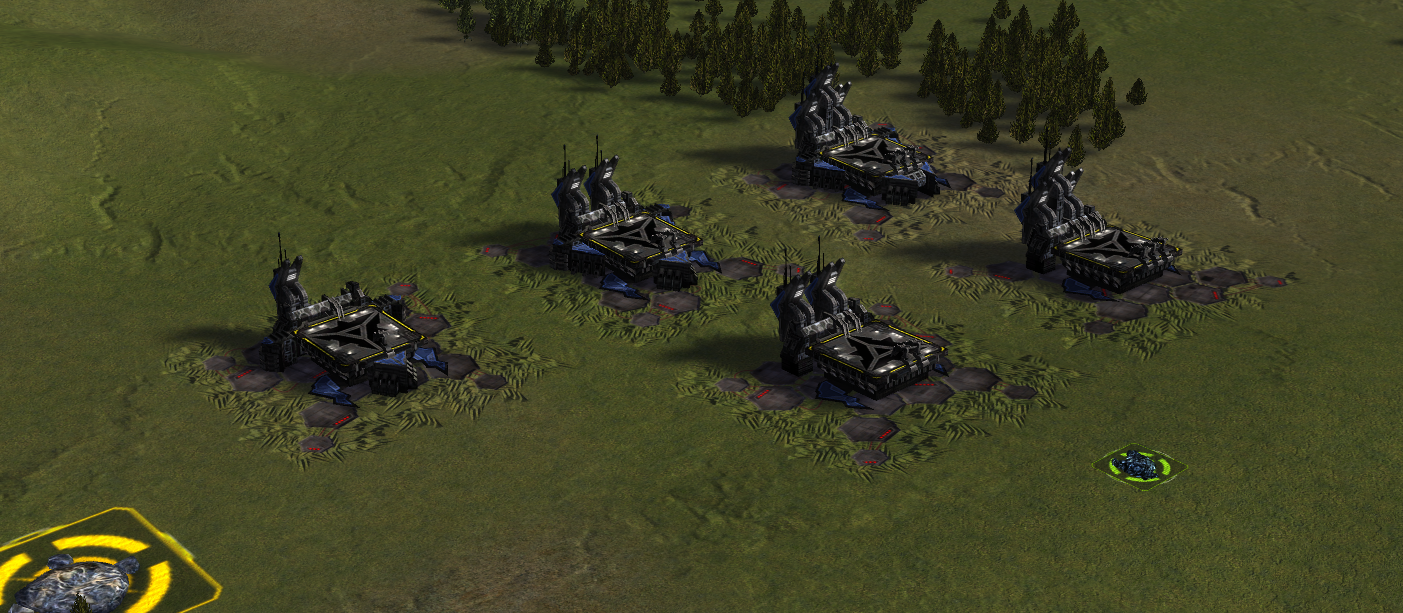
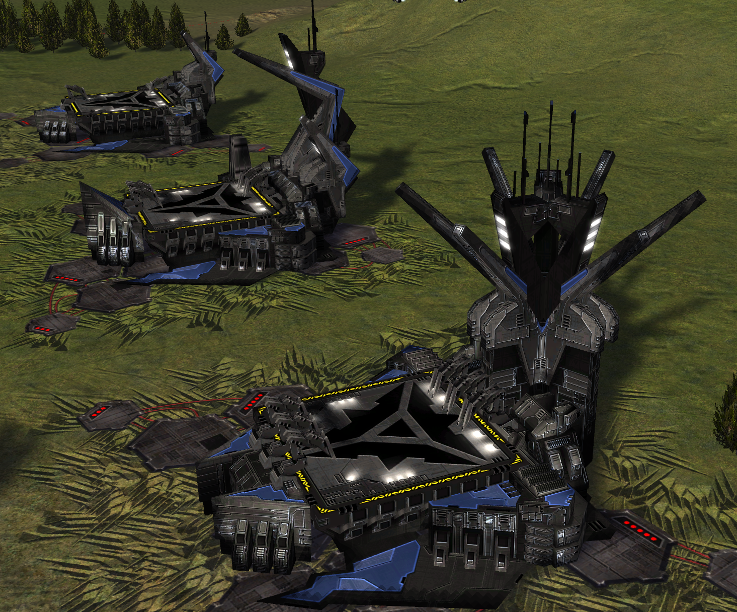
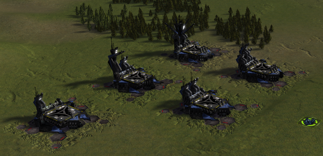
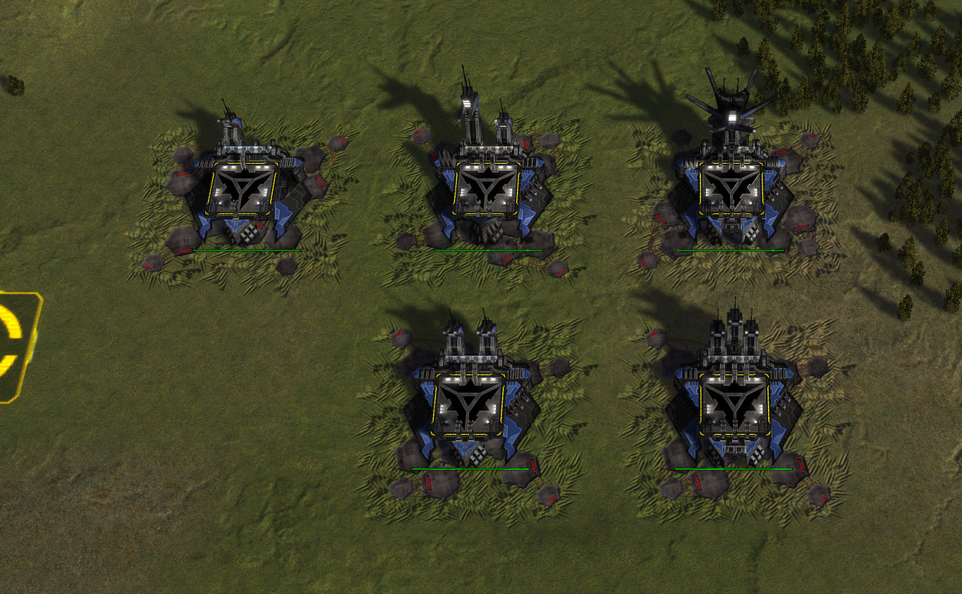
Redesign of the Cybran air factory
-
Not bad, but you cant distinguish the HQ from the support facs with just a glance.
-
I think the primary reason of that is because the back-bit is too similar. We could try changing that up to change the silhouette of the support factory. That would make it easier to identify
-
The old design was visually striking and original the new one is not.
-
What's the issue of retexturing the existing HQs? It should be very little work compared to the rest of the PBR project.
Animations are a whatever imo and the lack thereof causes much fewer issues than changing the factories.
-
@chenbro101 I Think the "distinguish by a glance" is mostly handled by icons at zoom IMO
-
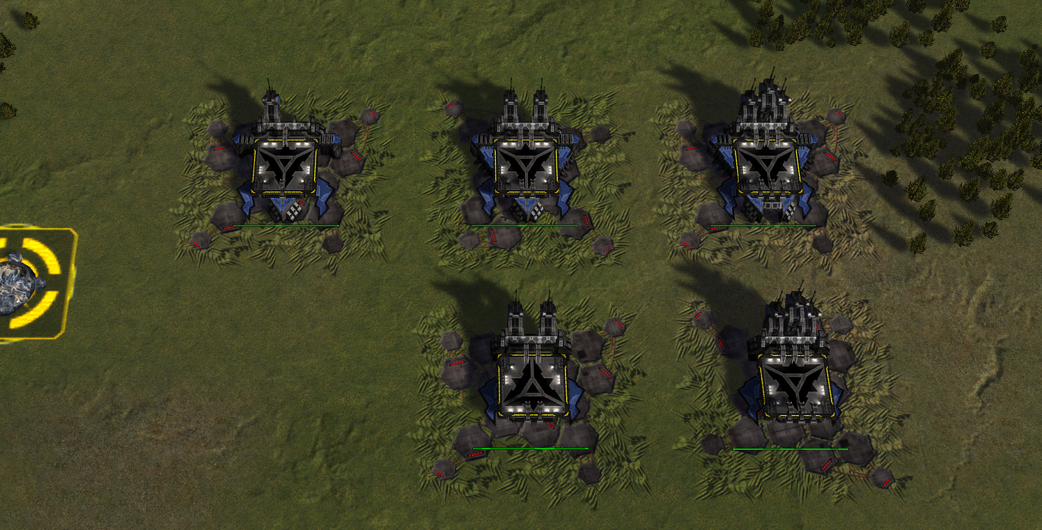
Take a look at this LOD level:
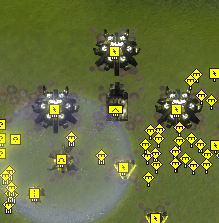
To my eye this doesn't look intended. It looks like there's a bug and part of the factory model is cut off. -
@krapougnak I think so too
-
The "new" cybran air support factories just look plain ugly. I won't call cutting part of the original air factories model a "new design". Looks rather like a half-baked piece of work. If you have to replace HQ factories (I personally don't see the need too) make new models, distinguishable and grandiose, they are HQ after all.
-
How come the Cybran symbol is right side up only on the T2 air support fac?
Also I think the new factory designs look better even if its harder to tell each individual factory apart. But there's always icons for that.
-
@zeldafanboy should be fixed now was a change i was trying out and it slipped through
Hello! It looks like you're interested in this conversation, but you don't have an account yet.
Getting fed up of having to scroll through the same posts each visit? When you register for an account, you'll always come back to exactly where you were before, and choose to be notified of new replies (either via email, or push notification). You'll also be able to save bookmarks and upvote posts to show your appreciation to other community members.
With your input, this post could be even better 💗
Register Login