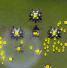
Redesign of the Cybran air factory
-
Not bad, but you cant distinguish the HQ from the support facs with just a glance.
-
I think the primary reason of that is because the back-bit is too similar. We could try changing that up to change the silhouette of the support factory. That would make it easier to identify
-
The old design was visually striking and original the new one is not.
-
What's the issue of retexturing the existing HQs? It should be very little work compared to the rest of the PBR project.
Animations are a whatever imo and the lack thereof causes much fewer issues than changing the factories.
-
@chenbro101 I Think the "distinguish by a glance" is mostly handled by icons at zoom IMO
-
-
@krapougnak I think so too
-
The "new" cybran air support factories just look plain ugly. I won't call cutting part of the original air factories model a "new design". Looks rather like a half-baked piece of work. If you have to replace HQ factories (I personally don't see the need too) make new models, distinguishable and grandiose, they are HQ after all.
-
How come the Cybran symbol is right side up only on the T2 air support fac?
Also I think the new factory designs look better even if its harder to tell each individual factory apart. But there's always icons for that.
-
@zeldafanboy should be fixed now was a change i was trying out and it slipped through
