Dark Mode
-
Wow, I pressed quote on my own message but it replied to SainseRow

-
I'm pretty sure that brutus doesn't know better than anyone else here how to edit forum themes. So everyone is welcome to make contributions
-
I can give it a shot if allowed. I used to host forums back in the day and am a software dev now.
-
Please do! The available darkmodes are pretty bad.
-
Is there a repo for the forums? I'm not seeing it
-
-
I meant for the FAF forum
-
That is the forum we are using. There are no modifications made by faf
-
Following this simple tutorial, I was able to setup a decent dark mode /w toggle in ~5 minutes of copy/pasting and figuring out where things were in the admin panel. There's a couple minor colors that could probably use changing, but it's much better than the skins we have access to right now.
https://community.nodebb.org/topic/17109/manual-build-a-night-mode-for-harmony/2Unfortunately it only works well for the Harmony theme, and we're using the Persona theme. So either we can switch to Harmony and use the dark mode from that tutorial as is, or we can tweak the CSS for Persona. If Persona, I just want to know if I go through the effort that it'll be implemented. Will someone take the time to add it in the admin panel if I provide the CSS & JS or give me access to do so?
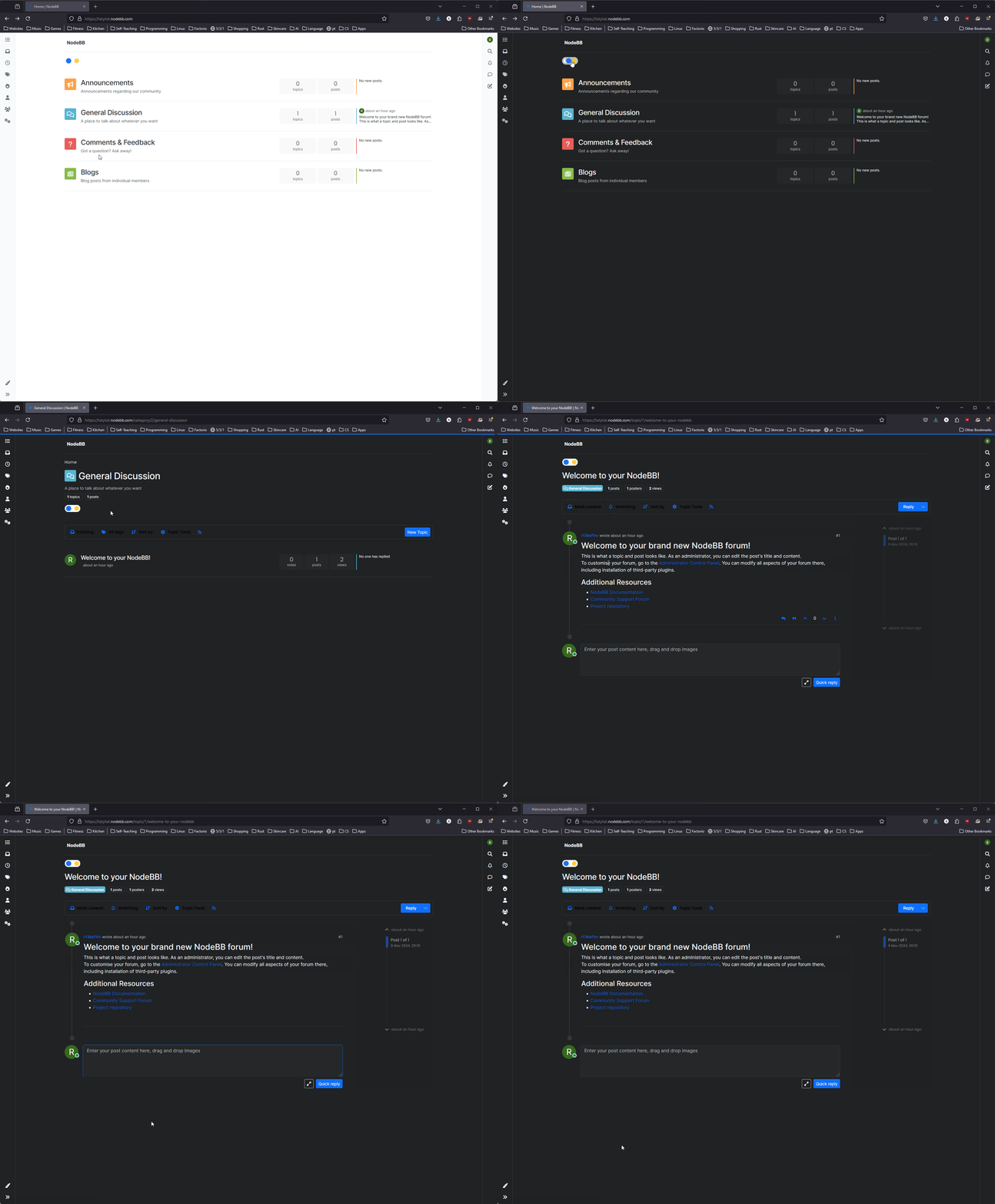
Demo:

Fun fact, that admin panel has a dark mode toggle already

-
Is it possible to modify the font size as well? Text is very small, both on mobile and desktop
-
Indeed, the default 100% zoom makes everything too small for the FAF website template, I have changed the zoom via my browser to 140% for the website. Font size can also be changed by your browser. You can change it in your settings or use CTRL+mouse wheel to zoom in.
-
Font size should definitely be modifiable, if not by an option in the admin panel then by custom CSS like the dark mode.
-
I've made some progress adapting to the Persona theme (which FAF is using). Not perfect but definitely useable.
-
I only have trial access to NodeBB for another few days. I don't know if one of the current FAF forum admins wants to implement the changes, or allow me to do it but if I don't hear anything I'll just post the custom css here for someone else to work with.
-
For the Persona Theme:
Custom CSS:/* css for night mode */ [data-theme="dark"] { --font-color: #e1e1ff; --bs-body-bg: #202124; --bs-body-color: #f1f3f4; --bs-body-color-rgb: 255,255,255; --bs-nav-link-color: #fff; --bs-border-color: #35363a; --bs-body-bg-rgb: 32,33,36; --bs-light-rgb: 32,33,36; --bs-secondary-color: #337ab7; --bs-navbar-brand-color: 128, 128, 128; --bs-emphasis-color-rgb: 128, 128, 128; } [data-theme="dark"] hr { border-top-color: #262729; } [data-theme="dark"] .active .chat-room-btn { background-color: #262729; } [data-theme="dark"] { .btn-outline { border-color: #b6b6b6; } } [data-theme="dark"] { .btn-outline.active, .btn-outline:hover, .btn-link.active, .btn-link:hover { background-color: #35363a; } } [data-theme="dark"] { .btn-ghost.active, .btn-ghost:hover, .btn-ghost-sm.active, .btn-ghost-sm:hover { background-color: #262729; } } [data-theme="dark"] .skin-noskin .composer { background-color: #262729!important; } [data-theme="dark"] .skin-noskin .bottombar-nav .dropdown-menu { background-color: #262729 !important; } [data-theme="dark"] .bottombar-nav .nav-text { color: #ffffff; } [data-theme="dark"] .composer .resizer { background: linear-gradient(transparent,#262729); } [data-theme="dark"] .skin-noskin .bottombar-nav { background-color: #262729!important; } [data-theme="dark"] .page-topic .pagination-block.ready { background-color: #202124 !important; border-color: #262729 !important; } [data-theme="dark"] .form-control { background-color: #262729; border: 1px solid #35363a; color: #b6b6b6; } [data-theme="dark"] .form-control:focus { color: white; background-color: #262729; border-color: #262729; box-shadow: inset 0px 0px 0px rgba(0,0,0,.075), 0 0 0 0.05rem rgb(27 115 249); } [data-theme="dark"] .dropdown-item:hover { color: white; background-color: #262729; } [data-theme="dark"] .tag-list .tag { background-color: #262729; color: white; } [data-theme="dark"] .breadcrumb .breadcrumb-item span { color: #b6b6b6; } [data-theme="dark"] .card { --bs-card-cap-bg: rgba(38,39,41); background-color: #262729; } [data-theme="dark"] .skin-noskin nav.sidebar { background-color: #202124!important; } [data-theme="dark"] .sidebar .nav-link.active { background-color: #35363a; } [data-theme="dark"] { .sidebar .nav-link:focus, .nav-link:hover { background-color: #35363a !important; color: white; } } [data-theme="dark"] .sticky-tools { background-color: #202124; } [data-theme="dark"] .text-muted { color: #b6b6b6!important; } [data-theme="dark"] nav-btn:hover { background-color: #35363a; } [data-theme="dark"] .btn-ghost-sm:hover { background-color: #35363a; } [data-theme="dark"] .btn:hover { background-color: #202124; border-color: #62656f; } [data-theme="dark"] { .dropdown-menu, .dropdown-item { background-color: #202124; color: #f1f3f4; } } [data-theme="dark"] .border-gray-300 { border-color: #35363a!important; } [data-theme="dark"] ul.topics-list li.selected { background-color: #262729; } [data-theme="dark"] .modal-content { background-color: #35363a; } [data-theme="dark"] .account .avatar-wrapper { border: 4px solid #262729; } [data-theme="dark"] .topic-list-header {background-color: var(--bs-body-bg); border-color: #35363a; } [data-theme="dark"] .topic-header {background-color: var(--bs-body-bg); border-color: #35363a; } [data-theme="dark"] .category-item .title {color: red;} [data-theme="dark"] .description {color: red;} @media (min-width: 576px) { [data-theme="dark"] .topic .pagination-block .scroller-container { border-left: 2px solid #35363a; } [data-theme="dark"] .page-topic .topic .posts.timeline>[component=post] { border-left: 2px solid #35363a; } [data-theme="dark"] .page-topic .topic .posts.timeline>[component=post]:first-child:before { background-color: #35363a; } [data-theme="dark"] .page-topic .topic .posts.timeline>[component=post]:last-child:after { background-color: #35363a; } } /* css for the switch a night/light */ .theme-switch { display: inline-block; height: 26px; position: relative; width: 55px; } .theme-switch input { display:none; } .slider { background-color: #ffffff; bottom: 0; cursor: pointer; left: 0; position: absolute; right: 0; top: 0; transition: .4s; } .slider:before { background-color: #1b73f9; bottom: 3px; content: ""; height: 18px; width: 18px; left: 4px; position: absolute; transition: .4s; border-radius: 50px; } input:checked + .slider { background-color: #262729; } input:checked + .slider:before { transform: translateX(28px); } [data-theme="dark"] [component="brand/logo"] { content: url(/link/to/logo-for-dark-mode.png); }Custom JS:
const toggleSwitch = document.querySelector('.theme-switch input[type="checkbox"]'); const currentTheme = localStorage.getItem('theme'); if (currentTheme) { document.documentElement.setAttribute('data-theme', currentTheme); if (currentTheme === 'dark') { toggleSwitch.checked = true; } } function switchTheme(e) { if (e.target.checked) { document.documentElement.setAttribute('data-theme', 'dark'); localStorage.setItem('theme', 'dark'); } else { document.documentElement.setAttribute('data-theme', 'light'); localStorage.setItem('theme', 'light'); } } toggleSwitch.addEventListener('change', switchTheme, false); -
@snoog I enabled it on forum.faforever.xyz, but where should that toogle show up? I do not see it
-
@Brutus5000 It should be in the top left corner, you can see it in the demo gif I posted above.
You added both the custom CSS & JS?
