FAF Website 4.0 on the way!
-
Please rework the header background image. It looks super odd. The picture is blurry and washed out and looks worse than the ingame graphics
-
@brutus5000 killing Gieb in one sentence (Gieb made that pic, I think it looks pretty nice)
-
@maudlin27 I do know only two boxes show, it was meant like that since if I had 6 boxes showing all at once, I believed it would add a lot of length to it. I'm not sure if I could make it scrollable, it could be tried.
I think I can just keep Forums in both community and at the top.
Yes! I have plans of adding a better image / animation to the 4 faction columns. currently they are a bit barebones. I'm thinking of adding a "Learn More" button after clicking one of them.
I'll give Co-op it's own tab then, thanks a lot for the feedback!
-
Just to Note All text and Content is Subject to Decisions Made at the FAF General Meeting. No content is final and wording may change

-
@brutus5000 said in FAF Website 4.0 on the way!:
Please rework the header background image. It looks super odd. The picture is blurry and washed out and looks worse than the ingame graphics
Ouch

It was a quick job. The blur is depth of field, to draw focus to the acu (and hide the ugliness of the rest of the scene). I'm impartial on it being on the website.Here is the original:
https://i.imgur.com/ARUEBAG.jpeg -
Yeah it's not your effects that make it horrible, but rather the background that looks like map backgrounds from Quake3 or UT in 1999

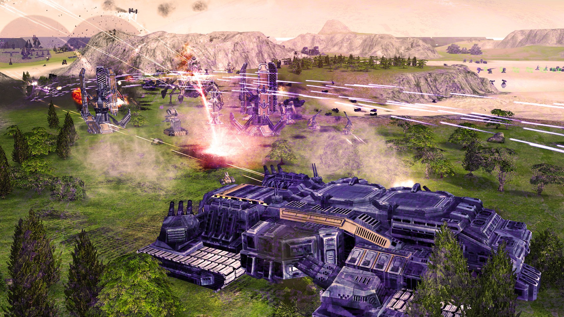
And I'm pretty sure we can argue which ingame picture looks the best. But I still believe the ones from Lidlsid look better.
These are the ones I'm using for the login (all unoptimized yet and hosted on content.faforever.com now):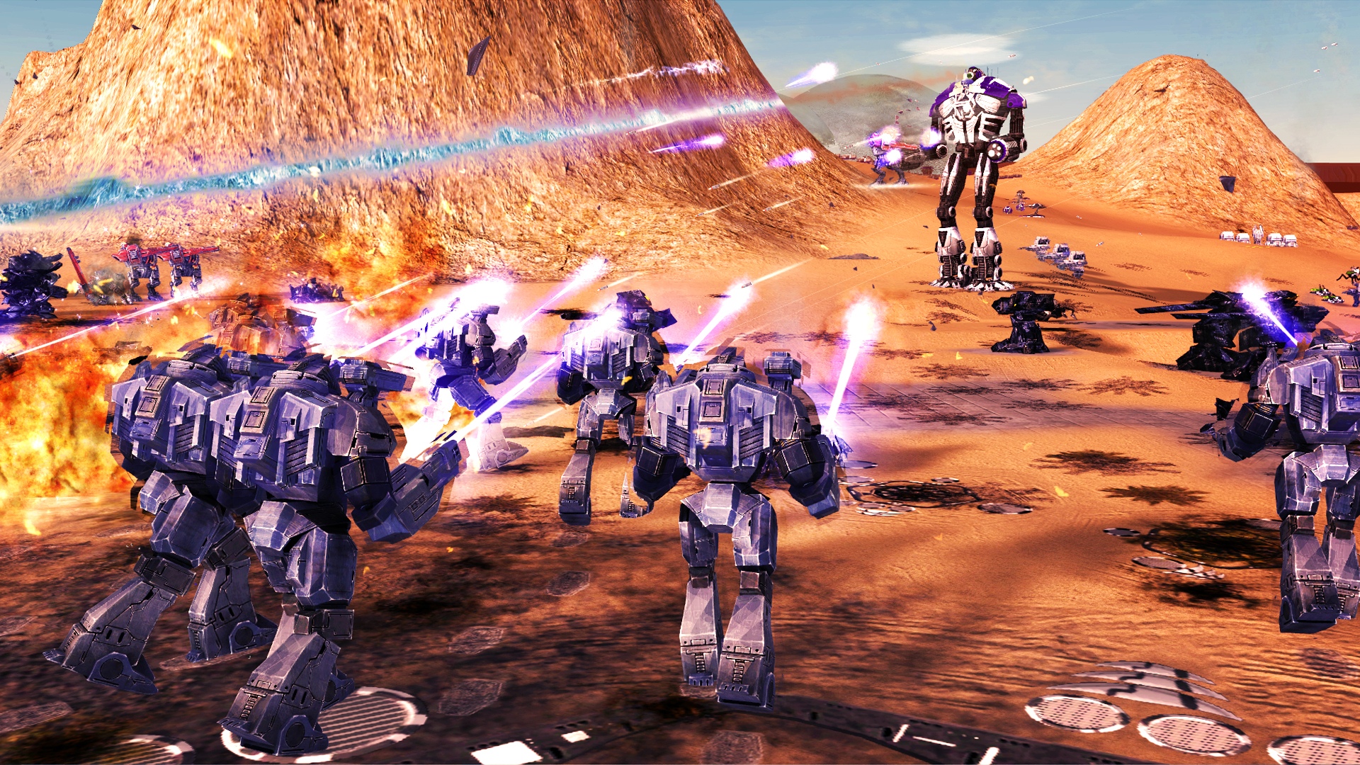
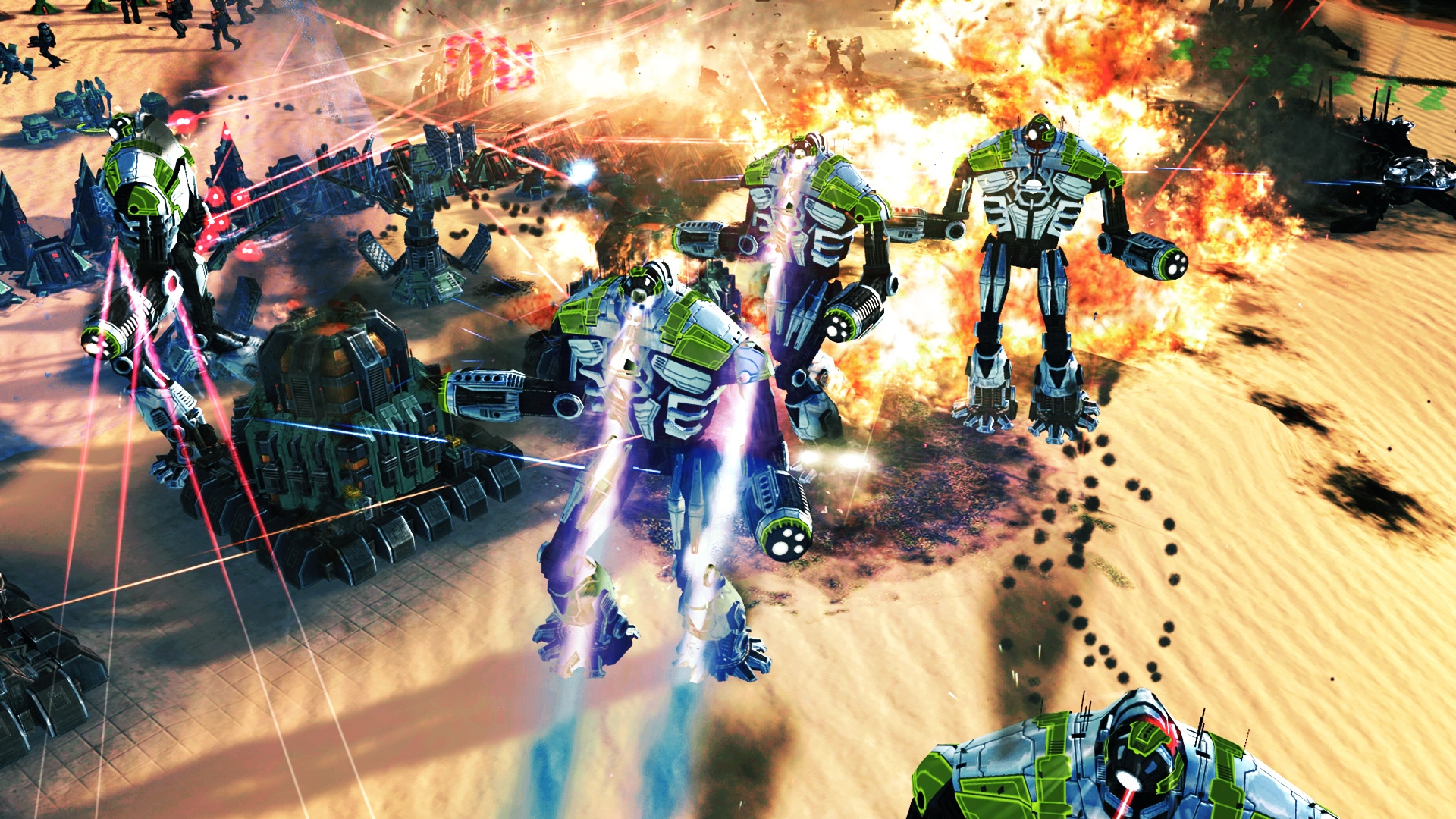
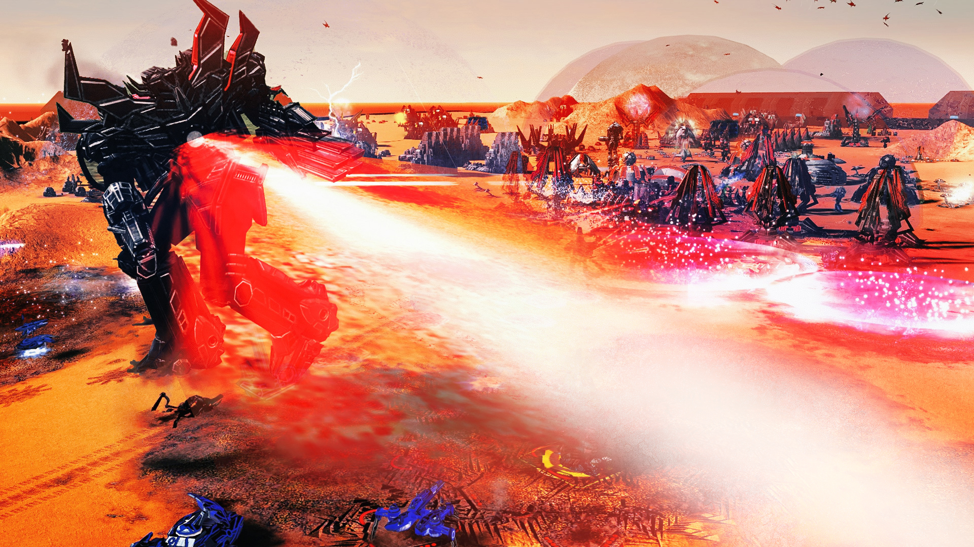
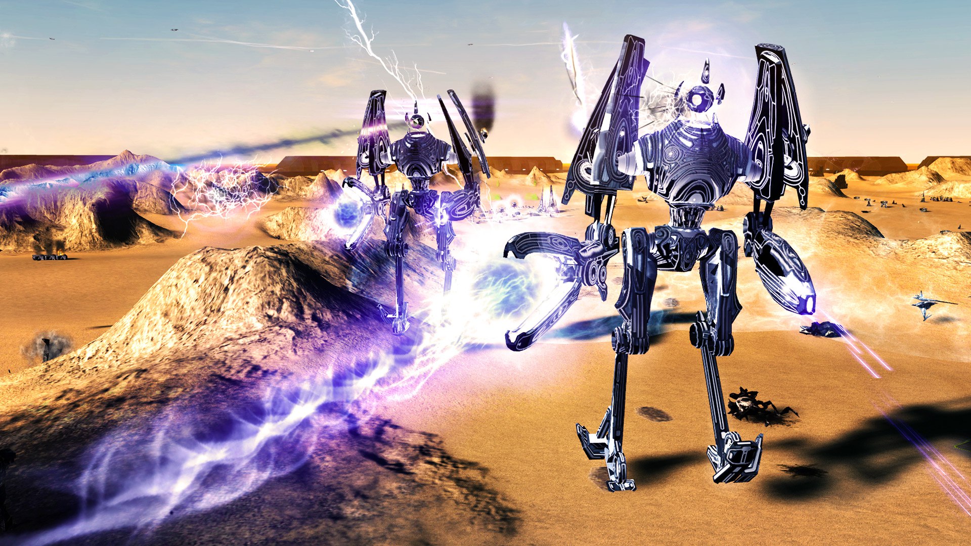
-
Ideas:
1
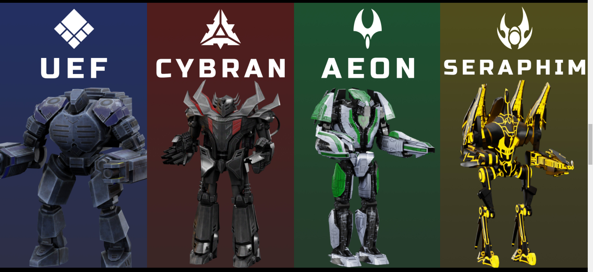
remake them as and can be added some gif previews on hover that will show the whole factions in seconds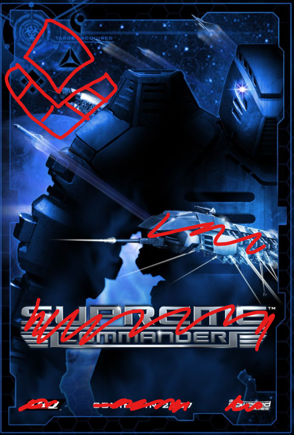
2
Rebuild this section with animated gif on scroll. That will show the affect of camera and rendering of icons and etc

3
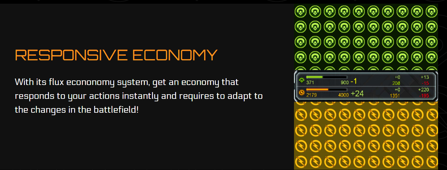
Same for this, static image cant say anything interesting,
4
Lack of examples of "TOTAL CONTROL
SUPREME COMMANDING"
5
AND WHERE IS NOMADS man
6
Strokes, they are everywhere


-
@eternal said in FAF Website 4.0 on the way!:
Ideas:
1

remake them as and can be added some gif previews on hover that will show the whole factions in secondsSure this may not be intuitive right now you can click on them and they display an image that would be better with a hover possibly.
@eternal said in FAF Website 4.0 on the way!:
2
Rebuild this section with animated gif on scroll. That will show the affect of camera and rendering of icons and etc

3
Same for this, static image cant say anything interesting,

Multiple GIFs on the same page can increase the load on the website as well as for people trying to load the page itself it they are on a metered connection.
@eternal said in FAF Website 4.0 on the way!:
5
AND WHERE IS NOMADS man
6
Strokes, they are everywhere


Nomads will not be added as a standalone faction on the website as it is not an OFFICIAL Faction that is in the base game of faf it is a MOD.
I've recently spoken with javi and the final version on the main website will be using the latest version of Bootstrap 5 and buttons will be using the base class from that with a few minor tweaks here and there
-
@rowey said in FAF Website 4.0 on the way!:
Multiple GIFs on the same page can increase the load on the website as well as for people trying to load the page itself it they are on a metered connection.
Well-optimized gifs (at the cost of the number of colors) can be quite low in size, especially when they are only a few seconds. It is worth experimenting with, maybe someone else has experience in this matter to help us out.
-
This post is deleted!