Please remove dark red from the color options in TMM
-
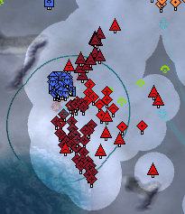
The dark red makes it impossible for me to quickly distinguish my own units. See attached image.
Also, I have perfect color vision, this is just a bad color. A lighter color should be used.
-
buy a glasses !
-
Wow, I'm actually agreeing with espi for once!
-
I have 20/15 perfect vision and perfect color vision. The color choice is the problem here.
-
One is very, very, very dark. The other is eye killing bright red. Maybe need to get new monitor?
-
if the game requires someone to buy a new monitor when they otherwise have no issues with their monitor its probably a game issue lol
that said i only struggle seeing what units are with dark blue or dark purple, unless i wear my glasses -
Dark purple is awful, especially trying to find AA in an opponent's army. But yeah I genuinely don't see how you'd have a hard time differentiating the 2 red colors. That said, perhaps you'd benefit from switching to team colors mode? That just shows all enemies as the same color and all allies as the same color.
-
Yeah, but those colours are nowhere close to each other. And considering he says he have perfect visions it seems like he is playing on some shitty laptop from 2010 or some fucked up monitor that needs replacing.
And yeah, I would be much more willing to agree about dark blue and dark purple as they are way closer to each other than those 2 reds imo. And look close to each other when using low brightness.
-
My complaint with dark blue/purple is not so much that they're close together (although I can see how that would be a problem) but rather that there's unsufficient contrast to quickly identify what a given unit type is. The unit type icon needs to use white lines instead of black for dark colors.
-
-
Woah I didn't know about the right-clicking on the team colors button. I probably won't use it, but it's really cool that it's there for those that may need it!
-
@endranii You are misinterpreting. I can tell my units apart from my ally's, what I can't do is tell my artillery from my tanks... at least it takes a lot longer than it should.
-
@funkoff said in Please remove dark red from the color options in TMM:
what I can't do is tell my artillery from my tanks.
Hang on, it's the enemy that's dark red, yes? Your artillery and tanks should both be blue.
I'm also failing to understand this, I think. -
No, in the snip, my color is dark red. Also, it would still be a problem if my ally or my enemy was dark red for the same reason that it's hard to distinguish land units from other land units.
-
@funkoff AH! I used ctrl+e to put team colours on...
That way, I'm blue, allies are light or dark green, and enemies are light or dark red. -
@funkoff said in Please remove dark red from the color options in TMM:
@endranii You are misinterpreting. I can tell my units apart from my ally's, what I can't do is tell my artillery from my tanks... at least it takes a lot longer than it should.
Oh, that makes way more sense. And while I don't have that problem while playing at over 10% of my screens brightness I do struggle a tad bit when it's all the way down. So it seems to be mostly contrast issue for some screens or brightness levels.
So yeah, now I fully get what you mean. Imo, instead of just removing the colour it might be better to maybe introduce a second set of "outlines" and "inlines" for the darker colours. So that instead of the black on dark colours we get something more visible for them.
-
I'm not entirely sure how the icons are rendered, is it possible that the lines could be made white for some darker colors? Or is that hardcoded/part of the engine?
-
The game uses the same set of icons regardless of color. There is no functionality to provide a second set for dark colors, so sadly this is not possible
-
There various mods with custom icons if you are having difficult distinguishing units
-
@funkoff said in Please remove dark red from the color options in TMM:
@endranii You are misinterpreting.
That's a funny way of saying "I didn't explain my problem clearly in my post, sorry."
Generally agree though, as well as with some of the other comments about similar colours.
"Design is an iterative process. The required number of iterations is one more than the number you have currently done. This is true at any point in time."
See all my projects:
