Update/Changes
-
@jip Just a small correction: the "Hover to Build" mod as quoted in the changelog is actually called "Hover over deposits". I think that's causing some of the confusion.
-
That would be confusing, I agree. I'll see if I can fix that one way or another

-
I agree with Jip that people simply refuse to read. It is impossible to miss that a patch has happened, because the patch notes are thrown in your face in the first lobby that you start. There is already a news item in the news tab. I don't know why you expect people to read patch notes if they were on the news tab, when people obviously don't read the news post that is right next to it on your mockup.
I don't think there is any more we can do, really
-
Include a popup on the play tab. The cold, hard reality is that most of the time there isn't new and useful information on the news tab, so people are trained to click by it without looking. People go the play tab. If you want important information to be seen, you need to put it there.
-
Why is the popup in the game not enough?
-
Reminds me of that time I had to tell someone in the lobby that there was, in fact, a patch notes button right there in the lower right ))
-
tbh this is just laziness on account of the people complaining, all they had to do was actually read what pops up when they play, they don't even have to click a link or anything.
-
this is just laziness on account of the people complaining
We can recognize that this is true while recognizing that A. it's never going to change or B. complaining about it in turn does nothing to materially solve the problem.
Why is the popup in the game not enough?
We can speculate on the flow of entering a lobby--you want to get in there, you want to make sure you're not in an observer slot, you want to pick your color, whatever--but a more robust way of looking at it is that, when a player is going through the steps to get into a game, anything that interrupts that pipeline is going to get rapidly clicked through.
So even an intrusive popup in the play tab wouldn't be that effective! But a notification, that the player can address at any time (but is not required to address at any specific time), takes the player out of the "getting in the game" pipeline and into an "evaluating notification" one. Is the notification to make people update the client not effective?
Main issue is that we shouldn't confuse saying "people are lazy and don't read the patch notes" with anything that materially addresses the problem.
-
Complaining that people should read the patchnotes will not solve any issues here I agree, so making patchnotes more accessible should be something to strive for, as people reading more is not gonna happen.
So making a shorter list of changes that players need to be aware of could be tested. for the last 2 patches you could make something like this.
3765:- Mobile Factories: now have a building unit at the back

- spread/distribute attack/move: now Distribute orders
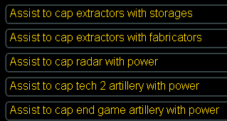
- assist to cap now only for mex+storages
- mex/hydro auto-select on hover removed -> use cycle templates hotkey or install hover over deposits mod
- Pausing engineers will also pause reclaiming
3766:
- assist to cap back, with more options

The shorter the patchnotes are the more likely people are to actually read the part they care about.
- Mobile Factories: now have a building unit at the back
-
I'm a programmer. People are welcome to contribute by trying to make more readable patch notes or by experimenting with alternative media. But I'm not going to spent more time on it then I already do; a dozen or so of hours just to make something representative for the Github release pages is what my primary aim is at the moment.