Update/Changes
-
So i have a suggestion that i hope could save quite a lot of fustration with frequent updates.
Currently there are links to information on changes to other sources in various places that i think from speaking to other players are poorly understood how to even check for updates and understand why when where those changes are being made.
Most people who are not invested into contributing to faf do not go the extra few clicks to find extra info
Speaking to other players after the most recent updates, most people did not realise that the mobile factories have now changed and are fustrated that they could not build from them any more as they didnt realise the changes that have been made, also the most recent change to ringing structures has confused a large amount of the players i speak to who have resorted going back to using the old templates to ring mexes as they dont understand the changes that have been made or understand why.
my solution to prevent the confusion is to place this info onto the newsfeed of the opening page of faf (not just a link) so that this can be very easily seen and understand what is changing, why its changing and when its changing.
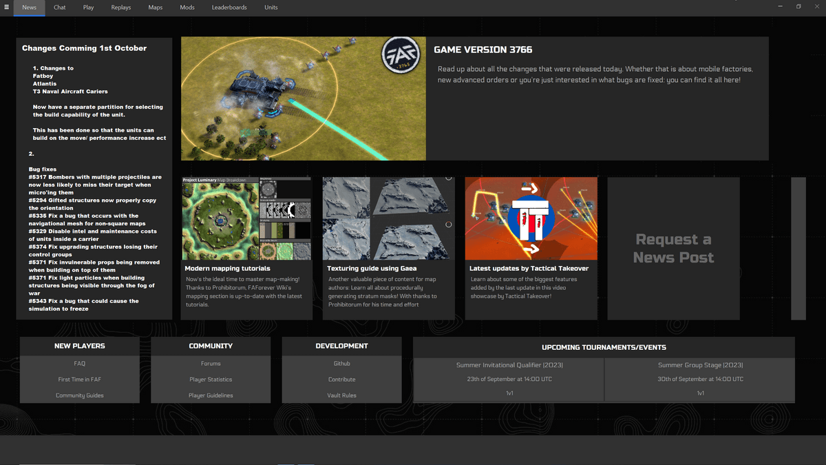
Or Even place all this information about changes that is on the forum but in another tab in the client.
-
What about sending a notification in the client (like, the little bell that shows up) whenever a commonly used feature is changed? Issue with putting anything on the news tab/another tab is that people will continue to click through it automatically.
-
The problem is not that people can't find the content. In my humble opinion, the problem is that people these days lack the motivation to read and try to understand anything. The main forum topic can be found here:
It has over 131 thousands views. Surely this number is inflated slightly, but even if it was only 10% of it (being about 13 thousand real, unique views) then we already have more than half the views then we have unique players each month. All the information is at the top of the topic, it also explains where to click (visually) and that it is now a separate module for the mobile factories.
Next to that we have the in-game changelog that is literally thrown in your face. Again, it is a lot of text and especially in-game it is a tough read which I acknowledge the full 100%.
And last on Discord we link to the Github release pages which you can find here:
These are reasonably readable. Github keeps track of some statistics:
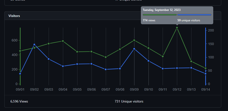
We have an average exposure of about 450
uniqueviews each day. That rounds up to roughly 6500uniqueviews in two weeks worth of time. Not everyone is reading the release notes however: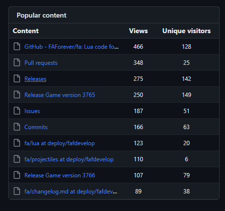
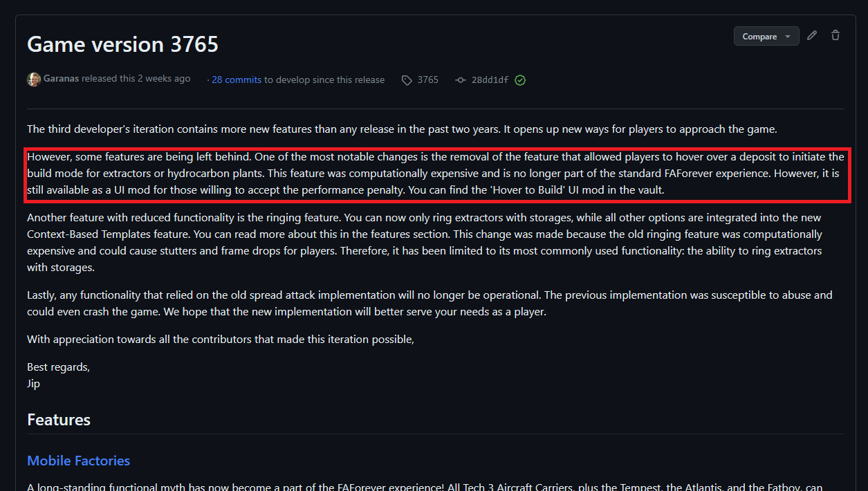
Regardless, again a large chunk of the people that knows where the content is. And to come back with what I started: people just don't take the time to read it through. We have tons of questions where to find the alternative for the hover-over-deposit-to-start building while it is the first paragraph of the in-game changelog and of the changelog on Github:
The only thing that I can imagine working is to have YouTube shorts and try and distribute those as much as possible. That would require new contributors though, because I lack the time to do that type of content in addition to everything else
-
@jip Just a small correction: the "Hover to Build" mod as quoted in the changelog is actually called "Hover over deposits". I think that's causing some of the confusion.
-
That would be confusing, I agree. I'll see if I can fix that one way or another

-
I agree with Jip that people simply refuse to read. It is impossible to miss that a patch has happened, because the patch notes are thrown in your face in the first lobby that you start. There is already a news item in the news tab. I don't know why you expect people to read patch notes if they were on the news tab, when people obviously don't read the news post that is right next to it on your mockup.
I don't think there is any more we can do, really
-
Include a popup on the play tab. The cold, hard reality is that most of the time there isn't new and useful information on the news tab, so people are trained to click by it without looking. People go the play tab. If you want important information to be seen, you need to put it there.
-
Why is the popup in the game not enough?
-
Reminds me of that time I had to tell someone in the lobby that there was, in fact, a patch notes button right there in the lower right ))
-
tbh this is just laziness on account of the people complaining, all they had to do was actually read what pops up when they play, they don't even have to click a link or anything.
-
this is just laziness on account of the people complaining
We can recognize that this is true while recognizing that A. it's never going to change or B. complaining about it in turn does nothing to materially solve the problem.
Why is the popup in the game not enough?
We can speculate on the flow of entering a lobby--you want to get in there, you want to make sure you're not in an observer slot, you want to pick your color, whatever--but a more robust way of looking at it is that, when a player is going through the steps to get into a game, anything that interrupts that pipeline is going to get rapidly clicked through.
So even an intrusive popup in the play tab wouldn't be that effective! But a notification, that the player can address at any time (but is not required to address at any specific time), takes the player out of the "getting in the game" pipeline and into an "evaluating notification" one. Is the notification to make people update the client not effective?
Main issue is that we shouldn't confuse saying "people are lazy and don't read the patch notes" with anything that materially addresses the problem.
-
Complaining that people should read the patchnotes will not solve any issues here I agree, so making patchnotes more accessible should be something to strive for, as people reading more is not gonna happen.
So making a shorter list of changes that players need to be aware of could be tested. for the last 2 patches you could make something like this.
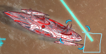
3765:- Mobile Factories: now have a building unit at the back
- spread/distribute attack/move: now Distribute orders
- assist to cap now only for mex+storages
- mex/hydro auto-select on hover removed -> use cycle templates hotkey or install hover over deposits mod
- Pausing engineers will also pause reclaiming
3766:
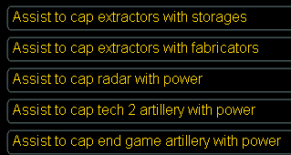
- assist to cap back, with more options
The shorter the patchnotes are the more likely people are to actually read the part they care about.
- Mobile Factories: now have a building unit at the back
-
I'm a programmer. People are welcome to contribute by trying to make more readable patch notes or by experimenting with alternative media. But I'm not going to spent more time on it then I already do; a dozen or so of hours just to make something representative for the Github release pages is what my primary aim is at the moment.