Screenshot of the week
-
@deletethis said in Screenshot of the week:
Amazing work as always!
What are those squiggly things in pic #3?
Thx, this is UEF shield.
-


-


-


-


-
Love #6, looks like it's wielding a light saber!!
-
Creating a scene and render: CoronaVirus_
Composing and color correction: lilSidlil
-
Amazing!
-
How's that for a mass gift!
-


-
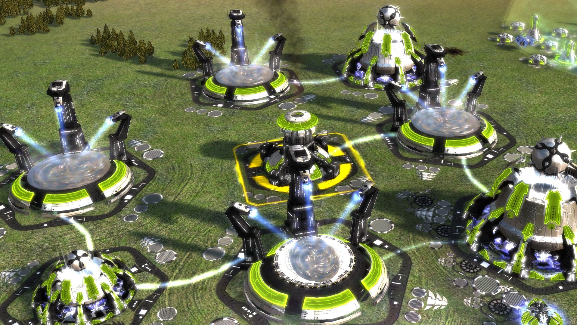
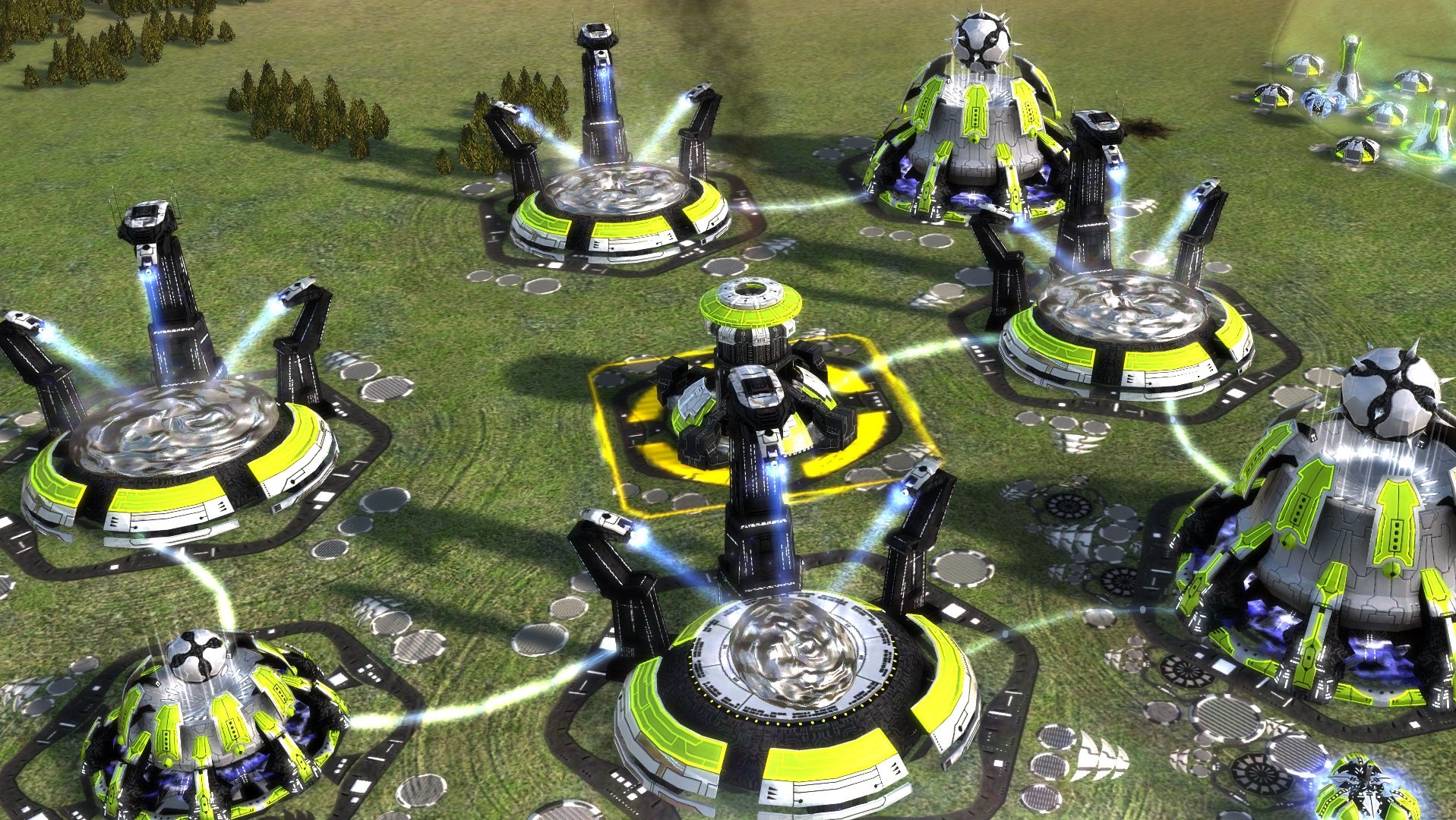
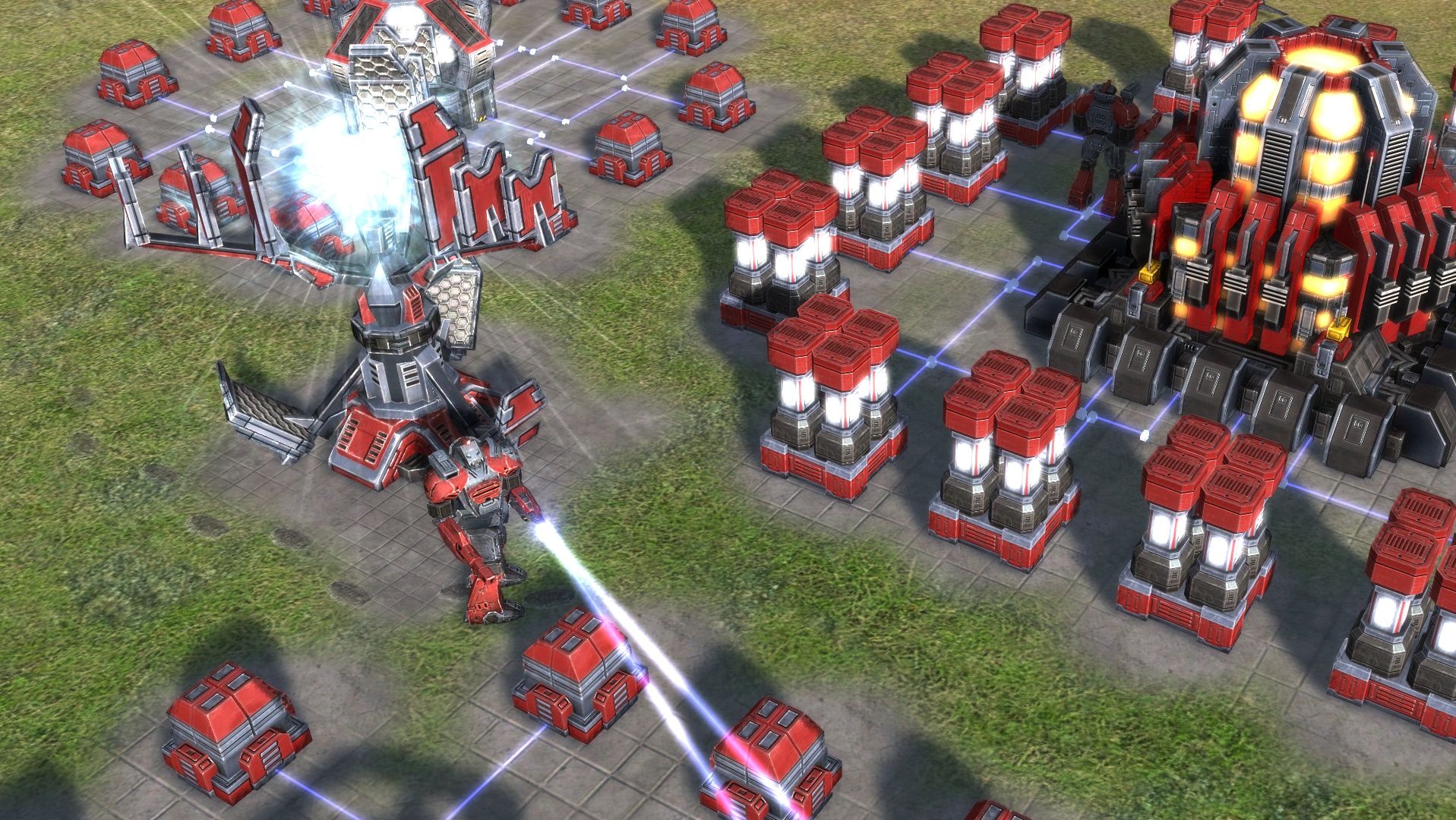
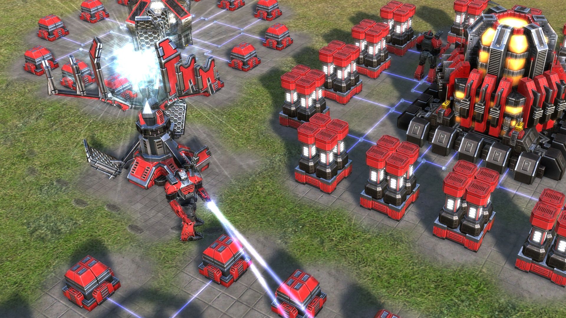
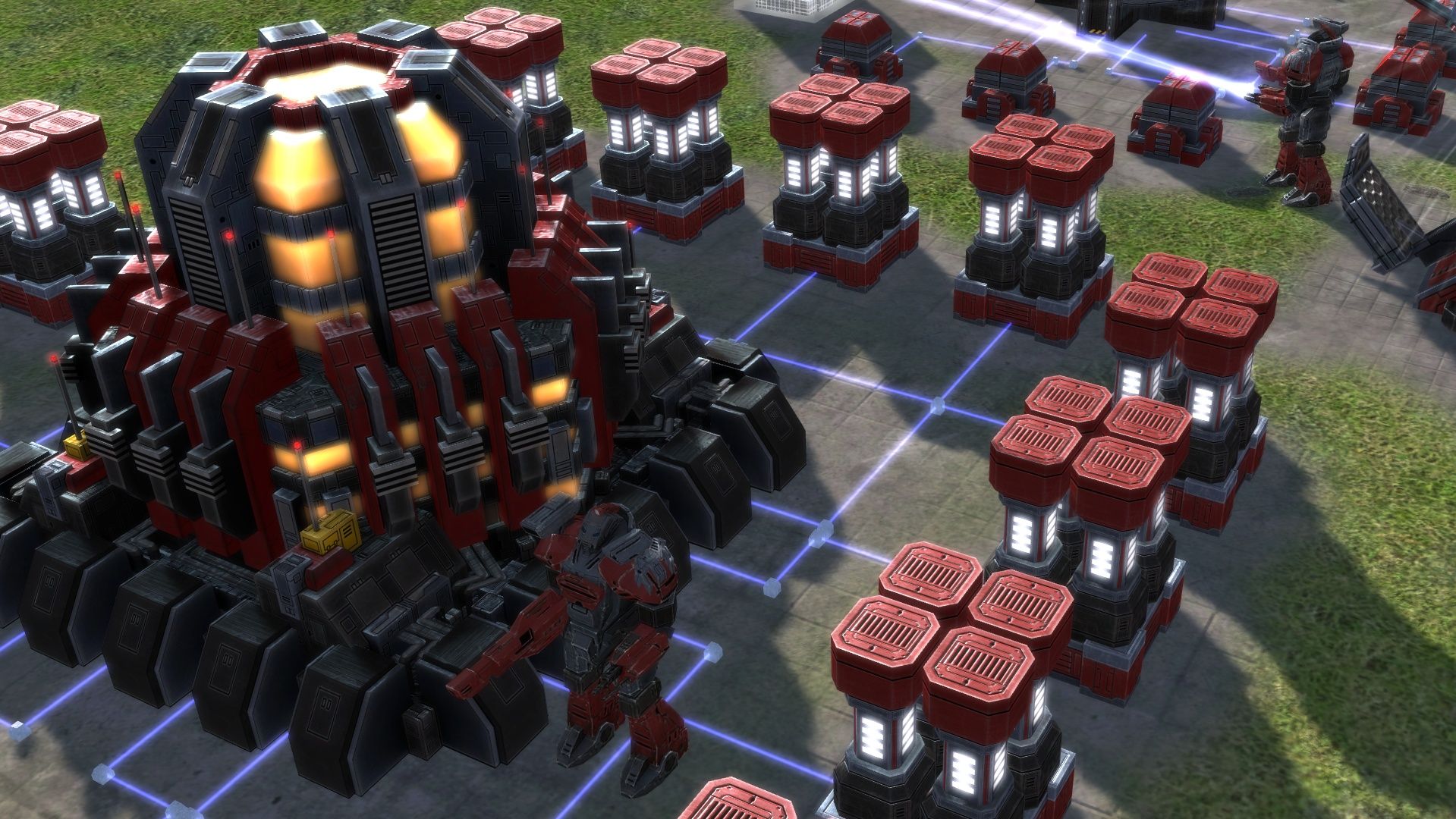
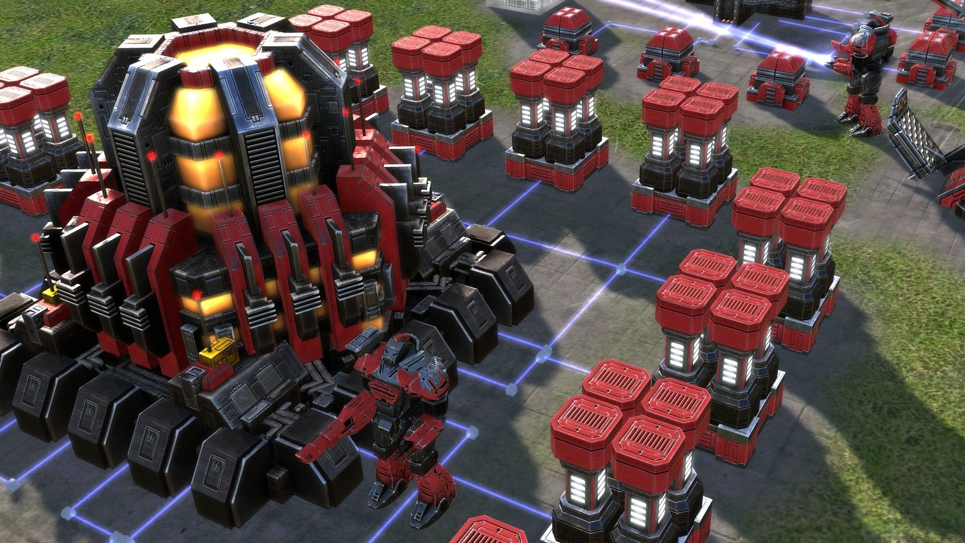
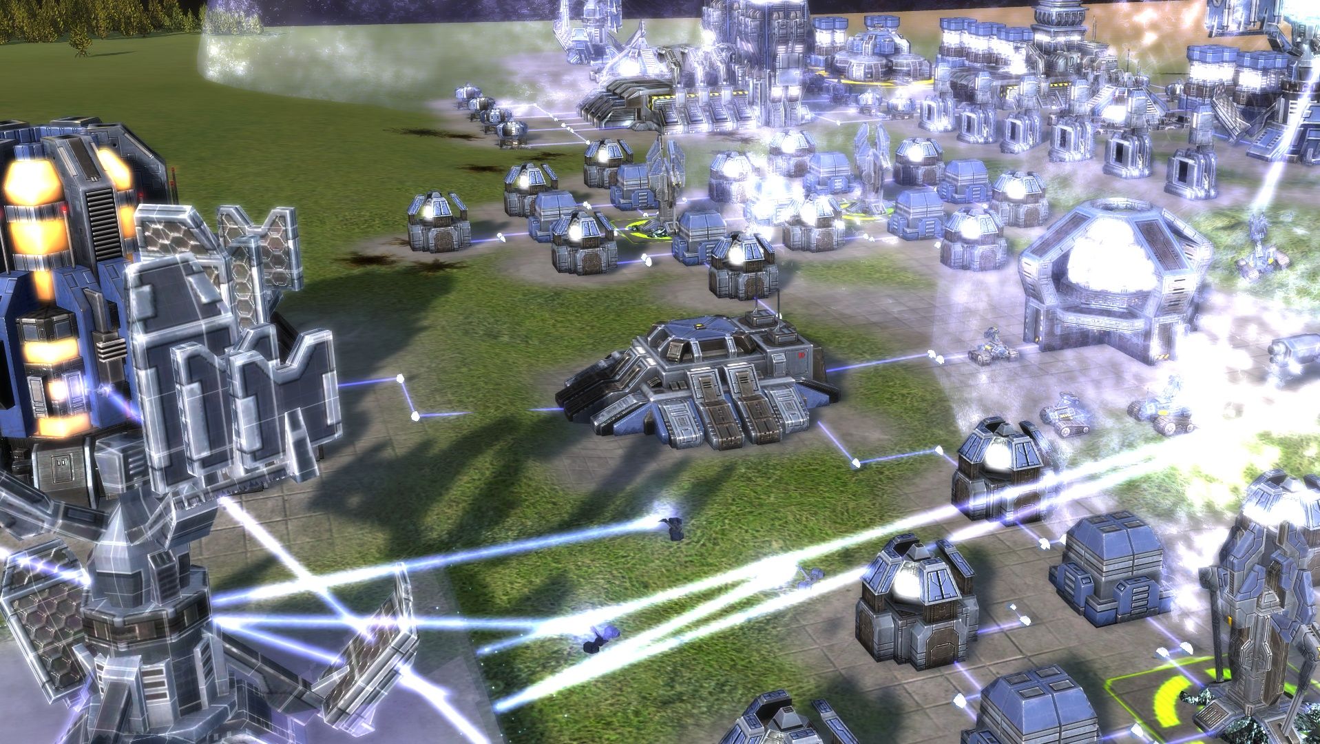
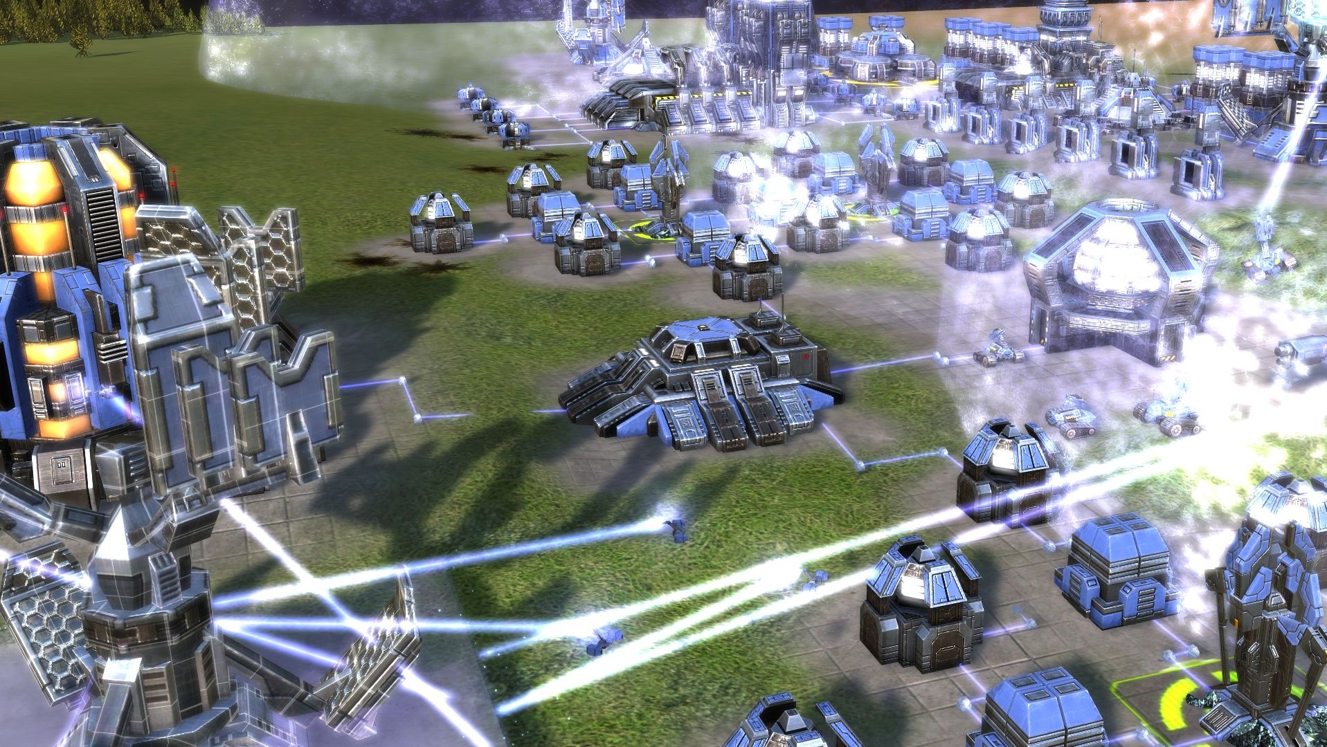
Here are some comparison screenshots of the new work-in-progress PBR shaders. The first picture is always the current shader, then comes the new shader. All screenshots are without any post-processing.
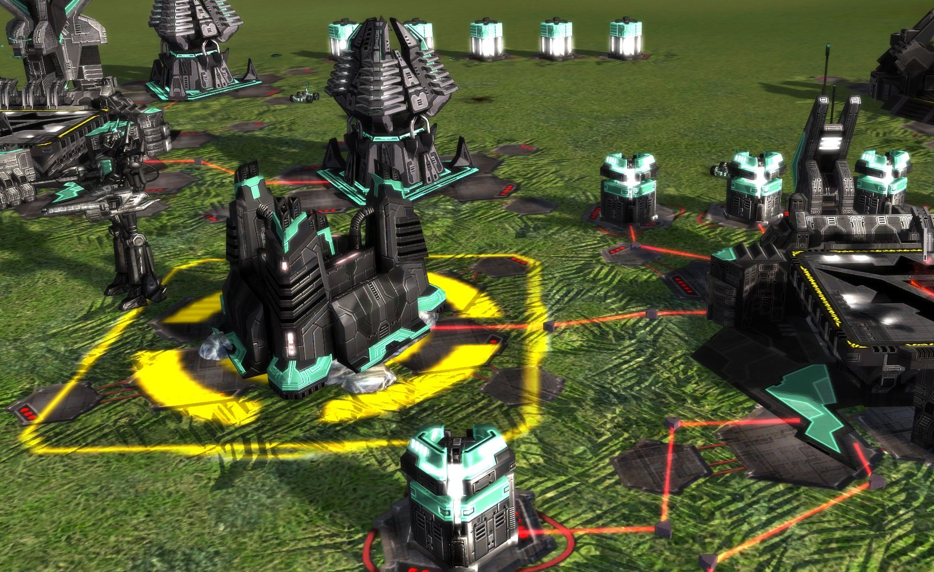
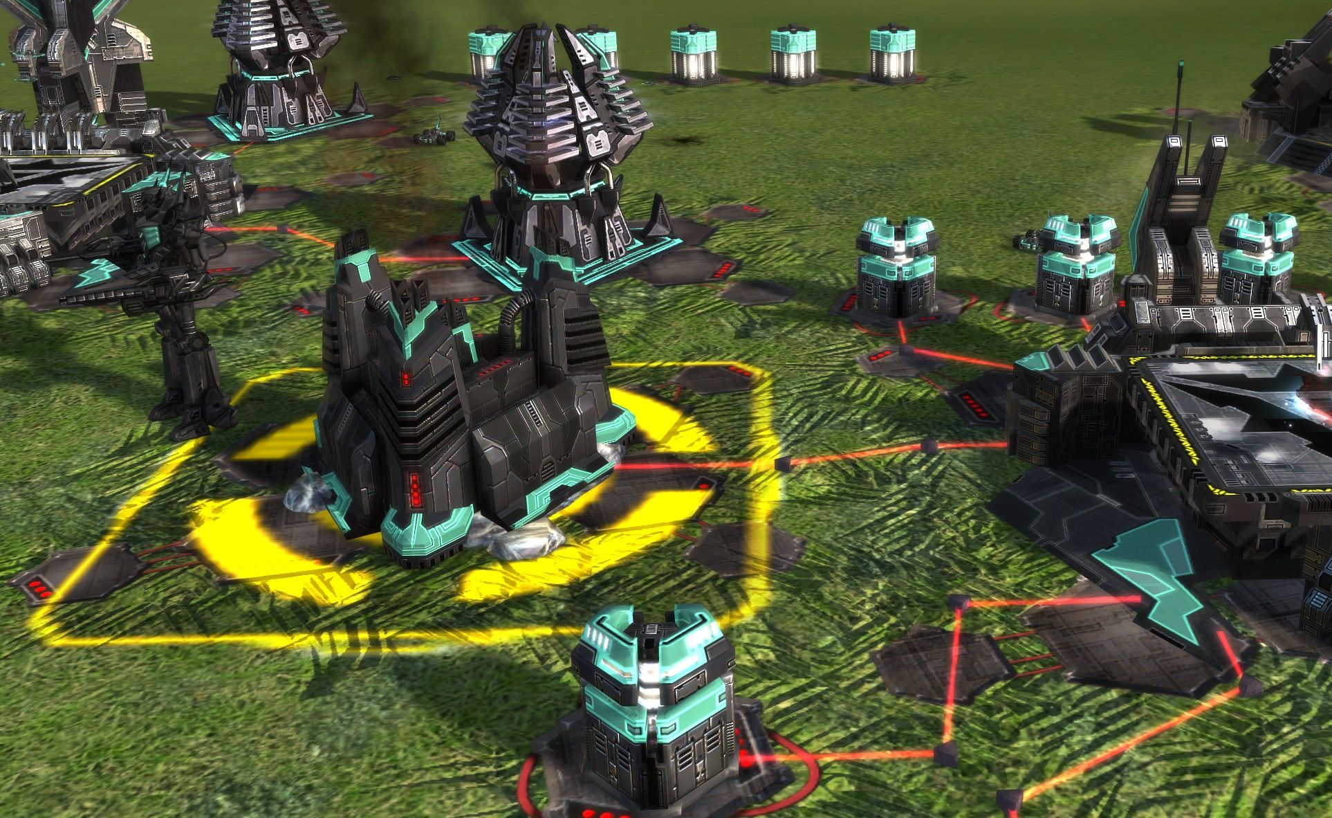
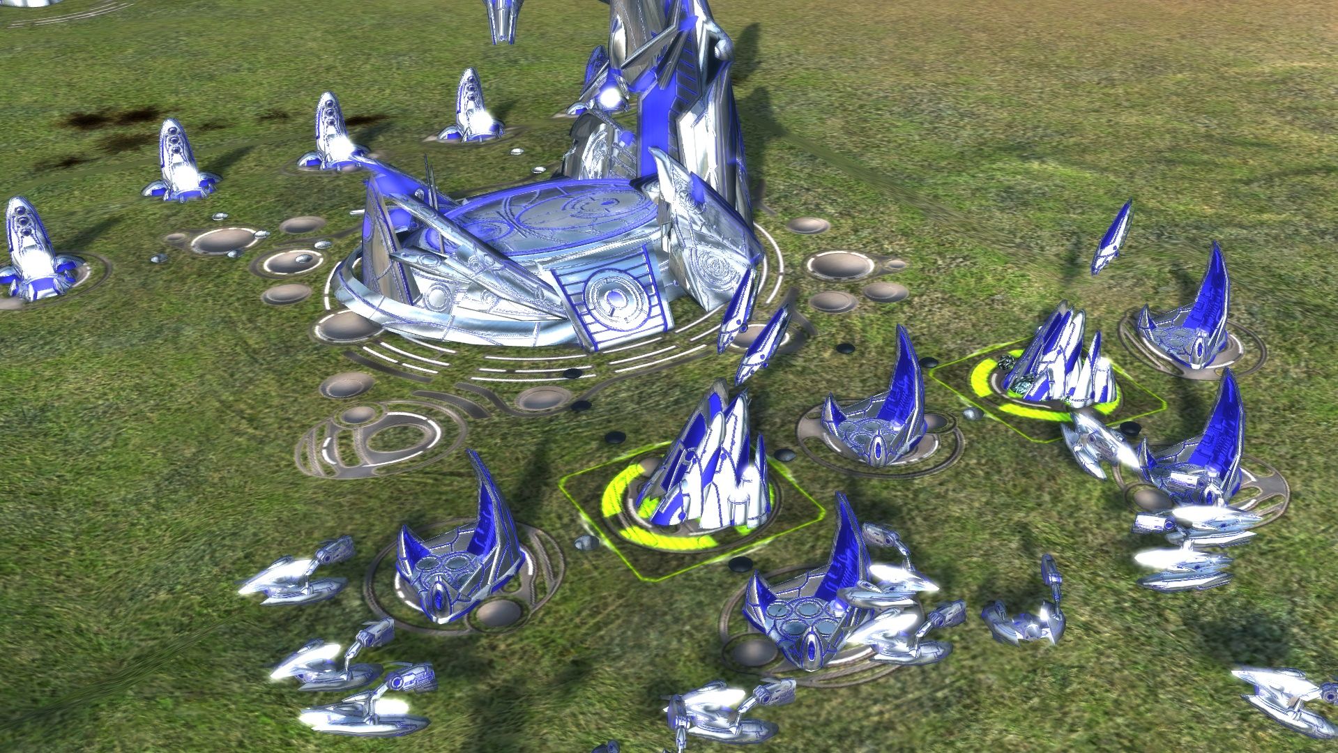
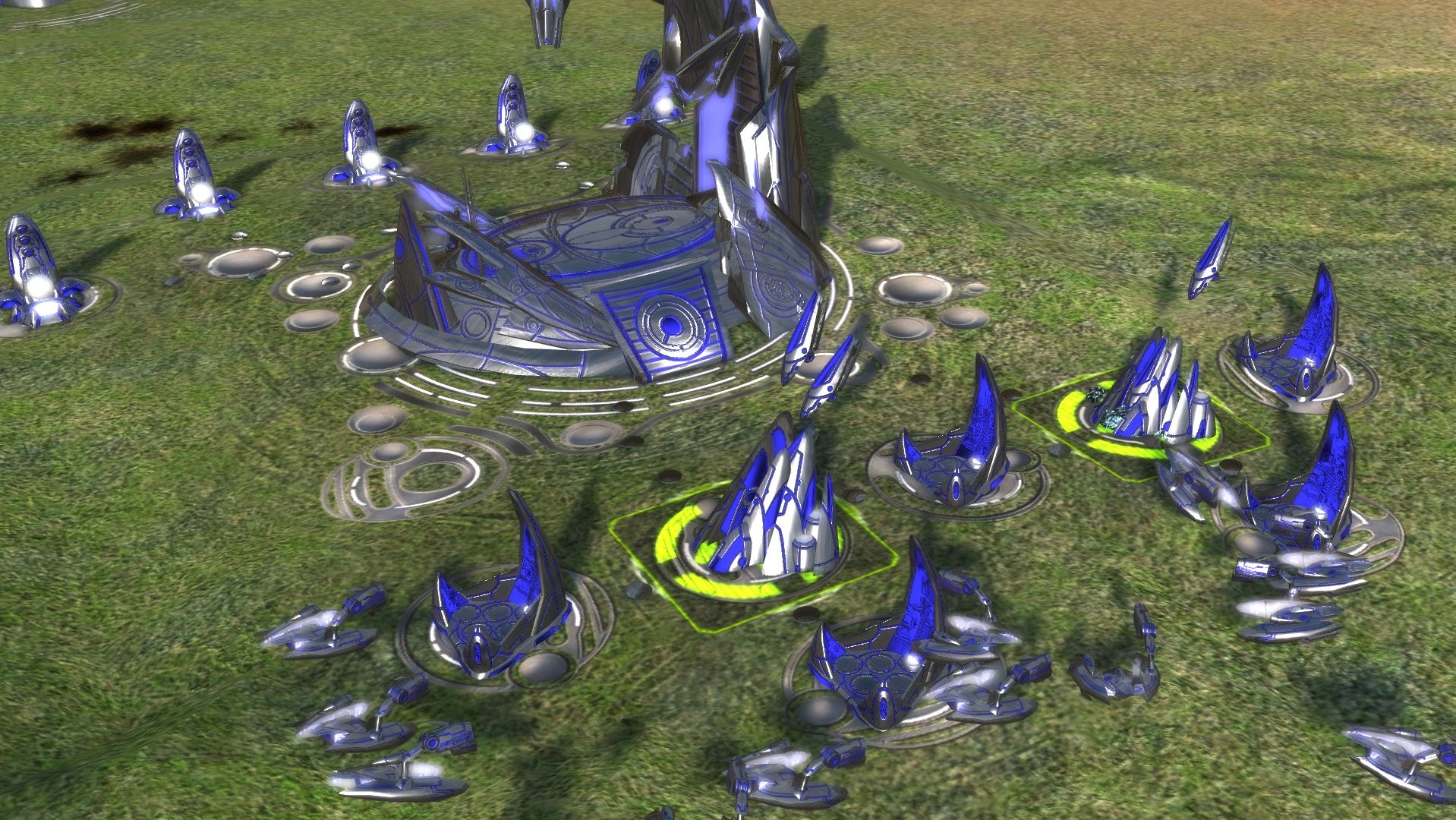
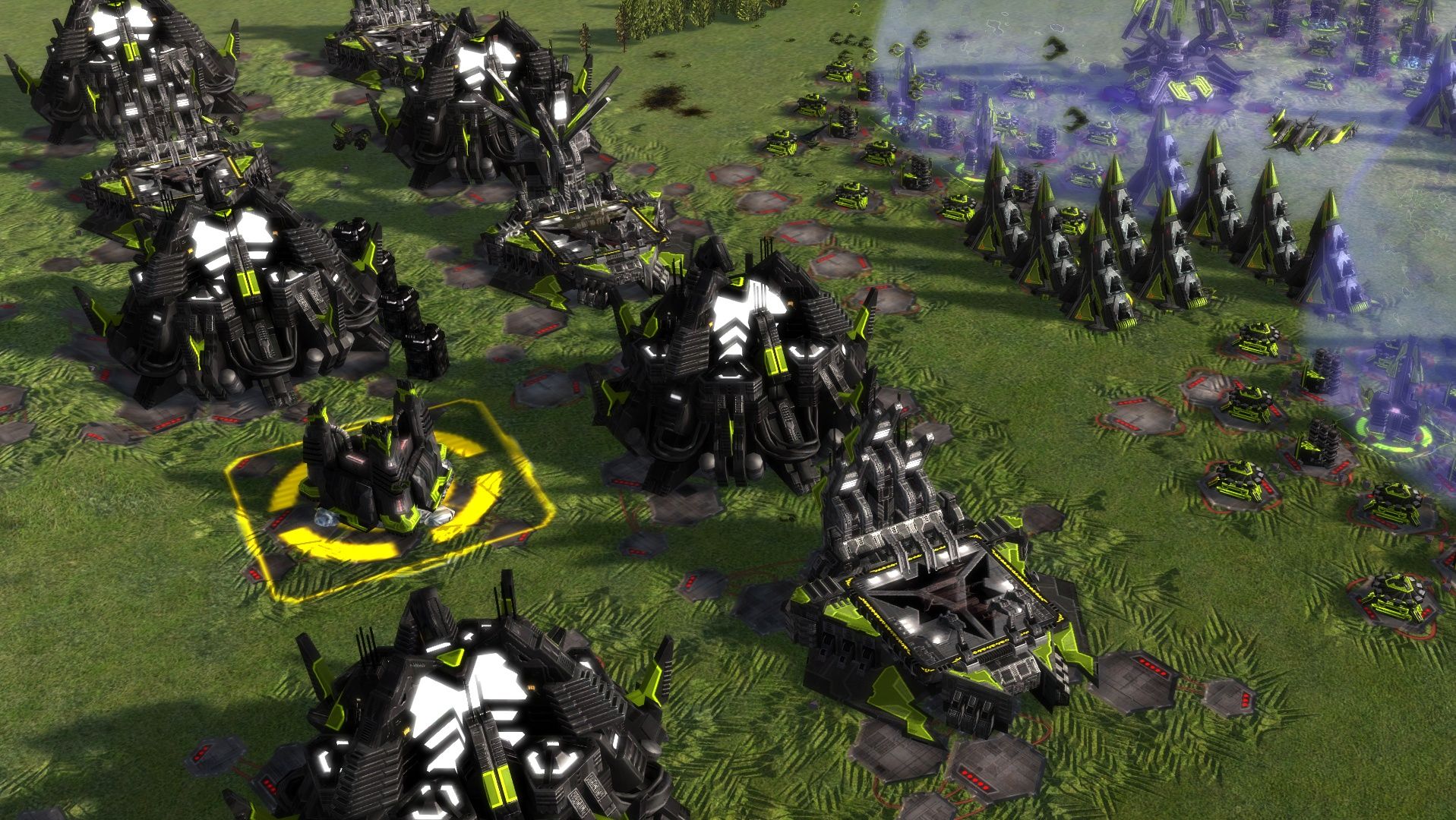
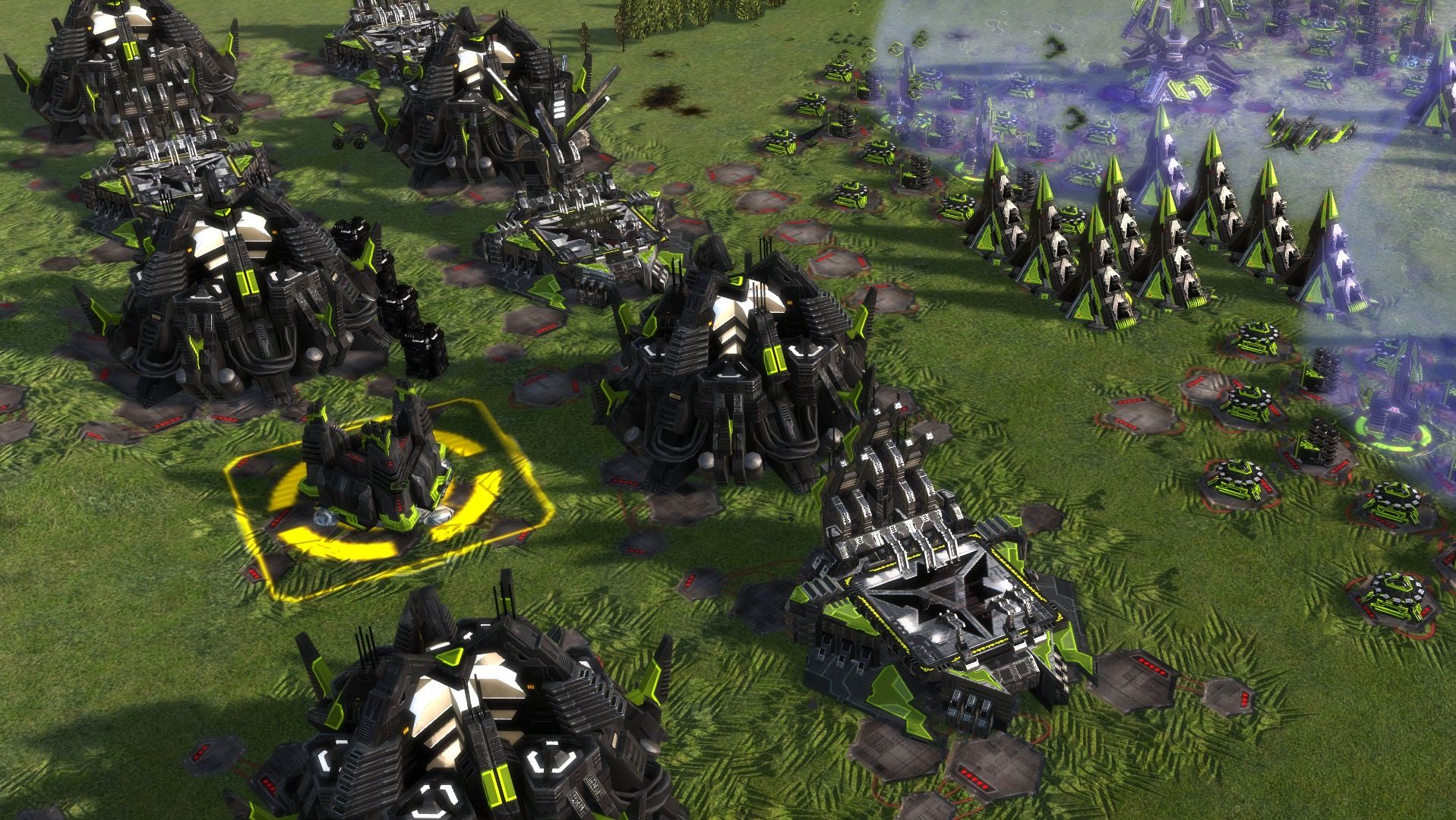
-
UEF looks better, as well as the liquid metal of Aeon construction animation, but the lack of bloom from light sources makes all lights on structures look worse. Cybran looks kind of washed out, and Seraphim is way less shiny.
-
@zeldafanboy I like it more mute than the super bright and shiny current versions. Gives it a better look
-
look very good
-


-


-
Some updates on the Aeon PBR progress. As usual, the current shader comes first, then the PBR one.
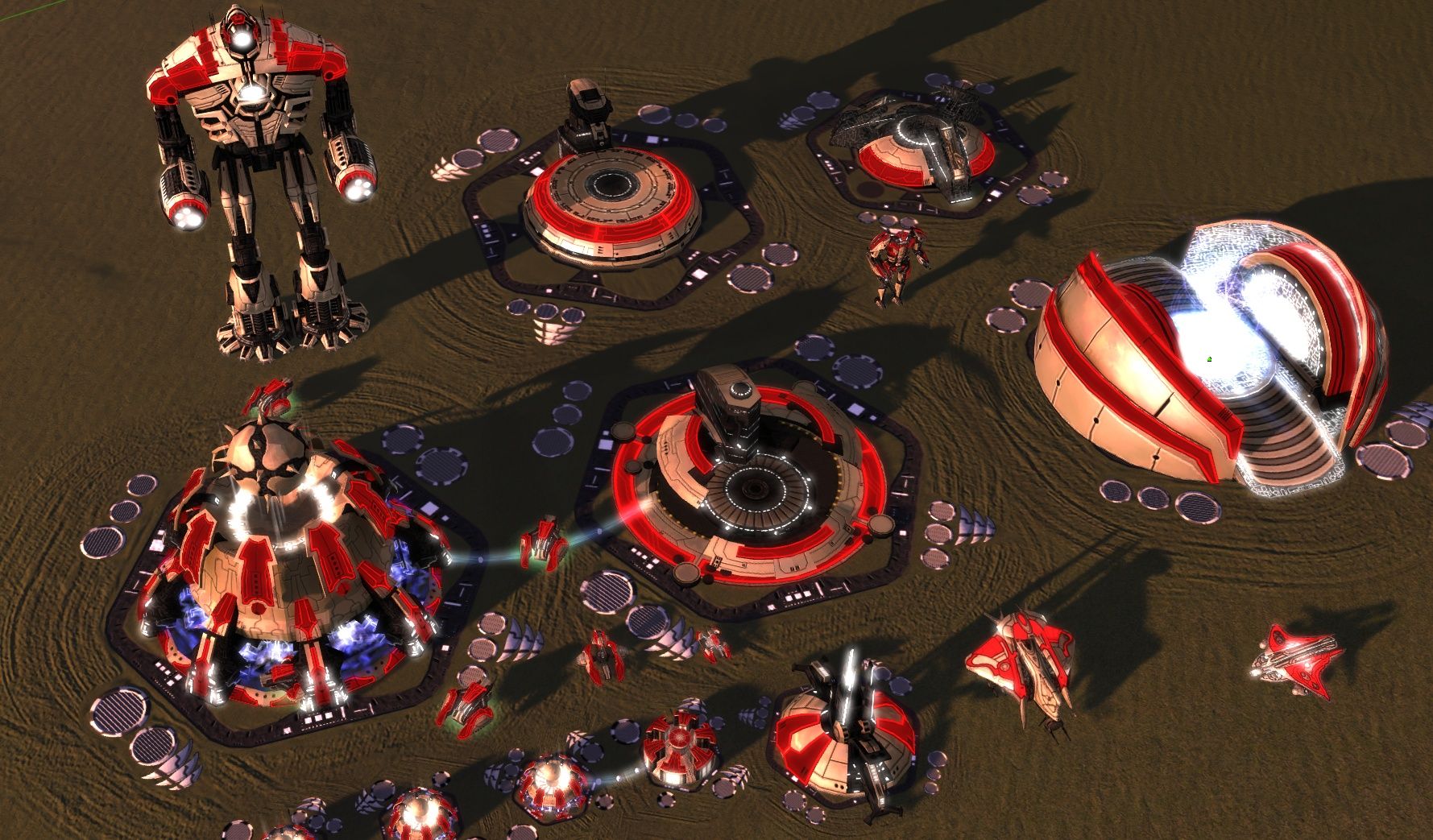
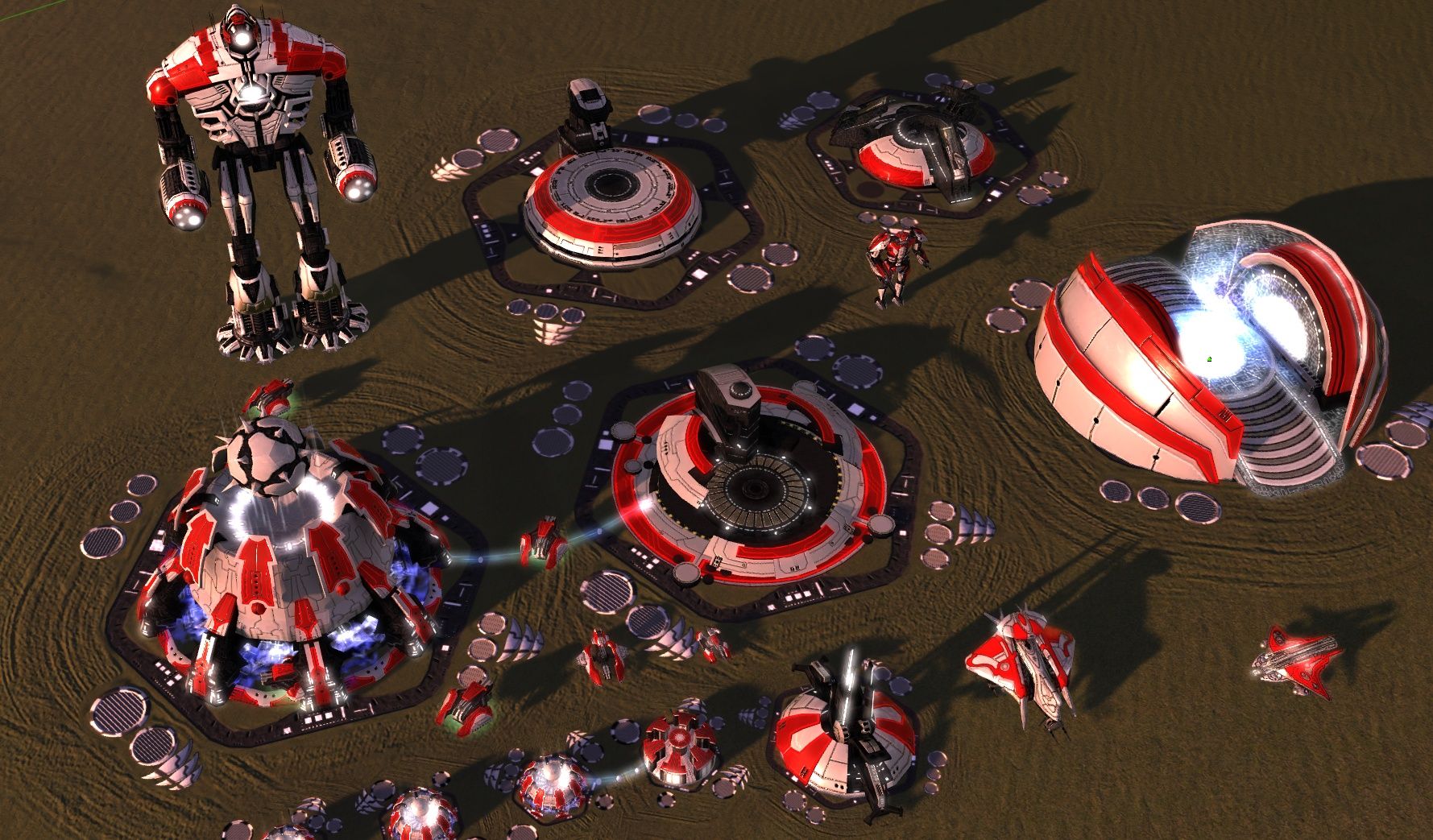
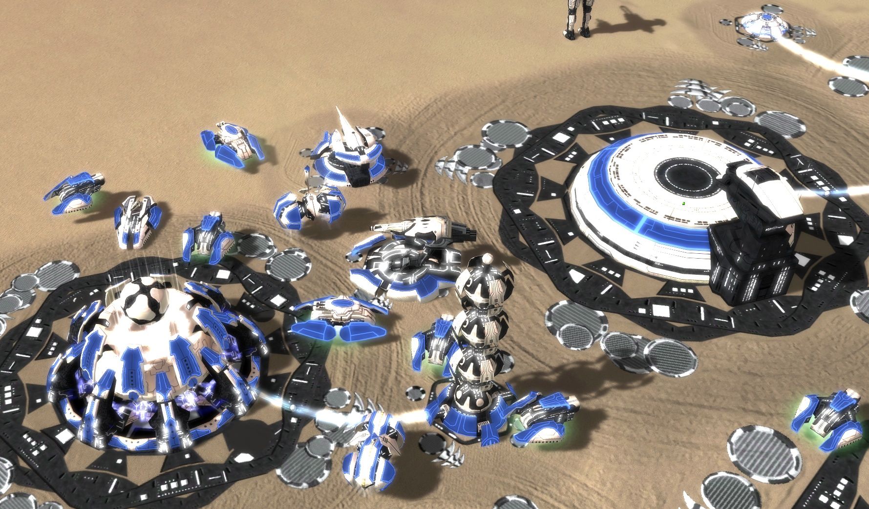
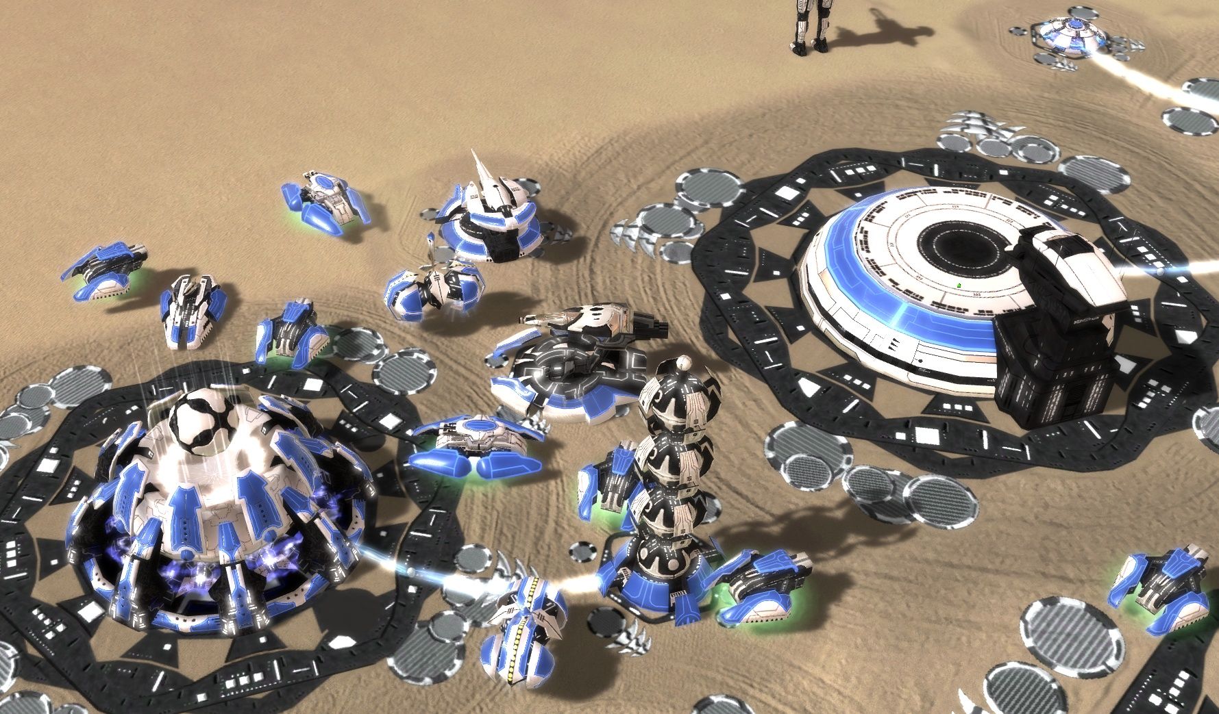
-
Some more screenshots: https://github.com/FAForever/fa/pull/4870 Note that the images there compare between before and after the pull request, there is no direct comparison with the current shaders that the game uses.
-
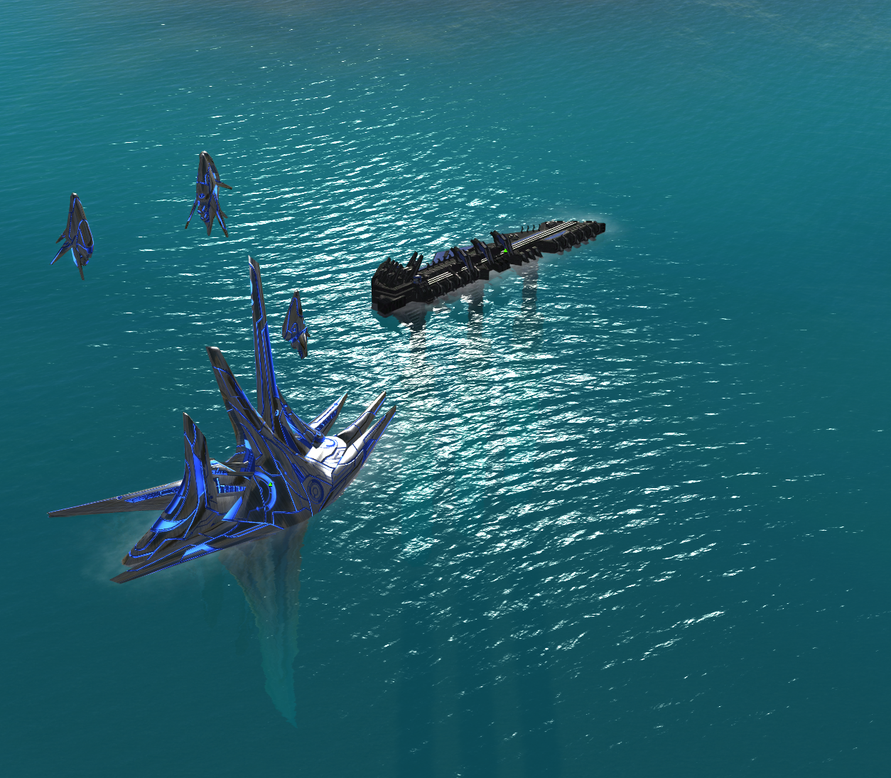
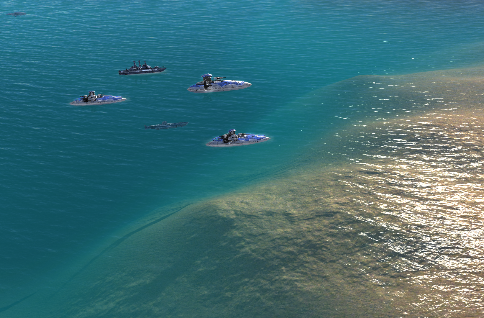
-
@blackyps hello I use the latest version of FAF, but the shadow of my naval units on the sea is not like your screenshot, but the shadow is on the sea bottom. The map I used was concord lake, the original map of the game