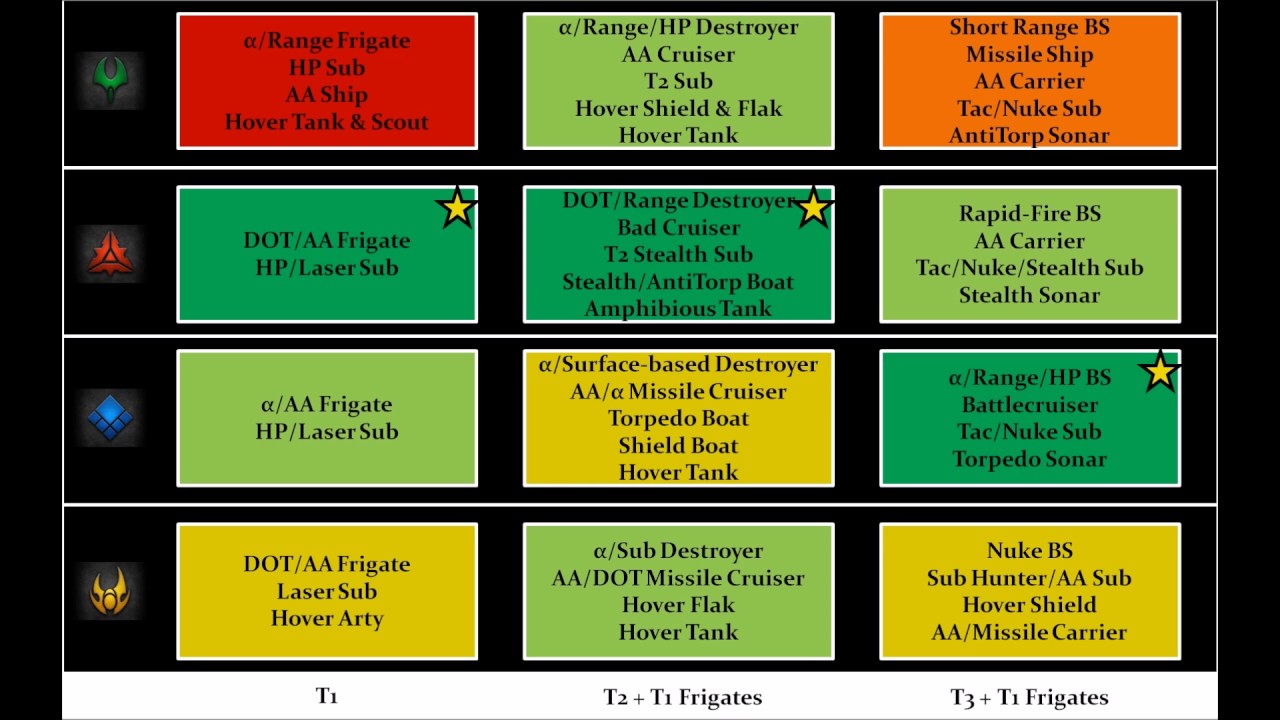
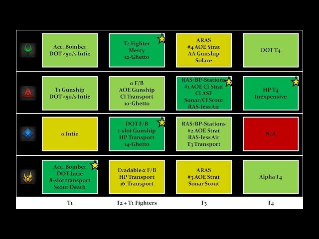
While discussing splash text for use on the FAF website to advertise the game, it was generally agreed that the current faction descriptions could use improvement. A few users posted text summaries that went over the aesthetics, backstory, and gameplay of each faction. As someone who likes to read the wikis of different RTS games and pore over unit lists and watch pros discuss the meta in various strategy games, I thought that other fans of the genre would be interested in something like a chart or visual guide to go along with the text and screenshots of each faction. Most of the written material you can find on Supreme Commander currently is an old wiki that goes over the vanilla Steam FAF, and the spookyDB unit database which is very dense with complicated info.
I've been playing the game for 7+ years at this point. The deep and subtle nuances between the different factions have always kept the game interesting to me. And after that long of playing the game and watching pros play and talk about it, the balance between the hundreds of units and buildings and strategies is remarkably well-tuned considering this is an all-volunteer project. Obviously, I am not in the highest echelon of skill but just from cultural osmosis, pro casts, and reading balance forum arguments one begins to understand (if not competently execute) the ins and outs of the FAF metagame, how it changes from map type to map type, and faction to faction. At least, one begins to think that they understand:
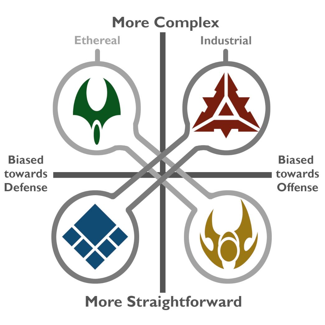
I posted this and the thread got immediately derailed by the responses to it, which was both good and bad-- obviously it's bad that the thread got pulled off topic, but it was good that people had a lot to say about it. I spent a little while polishing the aesthetics of the diagram, but I kind of regret that, because it made it seem like this is a finished and definitive thing that objectively tells dumb noobs how the game works.
The content of the chart is just my opinion, even though I spent a lot of time arguing in defense of it, really what I wanted to do was to see if the community could create A chart or visual guide that accurately (and not too didactically) displays the four factions in relation to one another. Maybe that isn't even a feasible thing. In hindsight, I do think that the words "Offensive" and "Defensive" are too prescriptive, so I've edited the chart to reflect the fact that the differences between the factions are mostly slight. 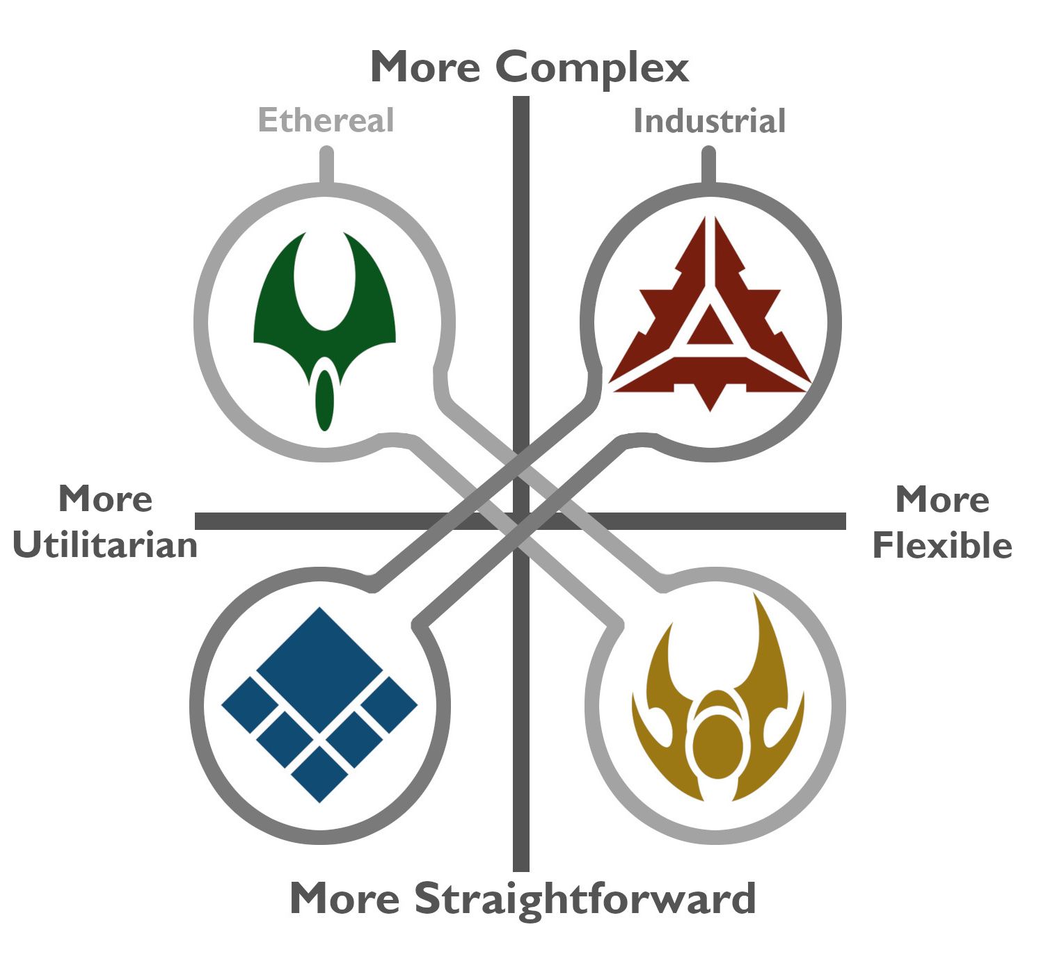
I am sure that this probably looks just as stupid, but that's why I want to see what other people think and potentially collaborate on improving it further. Also, maybe a 2 axis cartesian plane isn't the best type of visualization: frankly it's kind of a meme at this point because of how much the internet has been infected with political compass bullshit
Quickly, rationale for each placement:
UEF, with some exceptions, tends to have reliable, tanky, robust units that just work
Cybran, with some exceptions, tends to have mobile, stealthy units that reward trickery
Aeon, with some exceptions, tends to have specialized, minmaxed units that excel at their role
Seraphim is slightly harder to categorize, but after going through the unit list and comparing, they tend to have multifunctional, strong units that are slightly more inefficient