How should UI mod(s) change in-game icons?
-
A new patch is coming that should make it easier to make UI mods that change strategic icons (all in-game unit/structure icons) in FAF. With the ability to design new icons for any unit/structure in FAF, I think it would be good for the community to brainstorm and discuss potential icon changes to help guide our UI modders/icon designers to make desirable changes.
So, how do you think strategic icons should and or shouldn't be changed in FAF?
PS: Here is a link where people can share their icon designs/creations so that others may use them for UI mods in FAF
pfp credit to gieb
-
I've recently started using ASI small icons. I've become a fan of it even though at first I thought it was terrible. While it's obviously not perfect, I think it does go in the right direction. I'd also like to say there are multiple solutions and that I'm open to a lot of ideas on improving the icons from the default set.
For the most part, I think the default unit icons are fine. Though I also like ASI's unit icons.
When it comes to structures though I prefer ASI. I just like how it handles highlighting important structures to know about including SML, SMD, TML, PD, etc.
I'm a fan of the colored highlighting ASI makes use of.
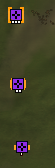
You can easily tell the tier of PD in this image. I do think the use of both the highlighting and the white bars underneath are too much though. There's no need for using two methods to show building tier at the same time. It should be one or the other. I also realize the colored highlighting can result in the icons taking up too much space and obscuring other information.I also like the unit icons it has for air units, as well as structures like the TML.

It's super easy to tell that this is a TML due to it's red highlighting as well as the simple icon of a missile.I know there's a lot of people against ASI, but I think it does have aspects that can be used in creating a new generation of icon sets.
-
Give ACU's a little yellow crown to distinguish them from SACU's.
I don't care what is done, but make SMD's actually recognisable.
-
We discussed this a bit one the other thread. TML, sacu and nukes are obvious choices.
I changed both the t3 gunship and t3 bomber to use the armored t3 bot x emblem instead of the + because it was easier to see at a glance. The T2 and t3 gunships are especially hard for me to distinguish zoomed out but this small change helps.
Making some icons, a pixel wider, while subtle helps to differentiate tech level.
I would personally like to have kennel drone engies be able to have different icon from default engineers.
I plan to test the default icon set to see what pixel size starts to cause overlap issues, and to test different sizes to increase visibility without adding clutter.
I would also like to point out that some of ASI issues is that the white borders are just too pronounced in some cases and making them thinner worked for me.
Cptant. I put a sash over sacu. Simple but easy to spot.
-
@cptant said in How should UI mod(s) change in-game icons?:
Give ACU's a little yellow crown to distinguish them from SACU's.
I don't care what is done, but make SMD's actually recognisable.
In my current setup, just from using Adv Strategic Icons (don't recall what size I use) the ACU is the same icon as the SACU, but it's about 2x as big. So it's very easy to tell them apart. I don't know if that works for everyone. Maybe it's bad for people with lower resolution. But it's definitely working out for me.
Perhaps we should have different sets of the optional higher-vis icons depending on resolution. As in, it's not just a size difference, but some of the high-res icons are designed differently than the low-res icons.
-
It would be nice to have control over scaling as you zoom out, but no clue if that is even possible. Sometimes i feel like I just want some icons to scale while others i know i just need to zoom in.
I'll post images of my changes later for debate.
-
@macdeffy said in How should UI mod(s) change in-game icons?:
It would be nice to have control over scaling as you zoom out, but no clue if that is even possible. Sometimes i feel like I just want some icons to scale while others i know i just need to zoom in.
I'll post images of my changes later for debate.
Probably they shouldn't scale up when you zoom in, because one of the big complaints about the advanced icons is that they can crowd each other out. If you want to know exactly how many tanks/arty/scouts/LABs/MAA are in a group of units, best to keep icons the same size when you zoom in. If they're not the right size to be perceptible, then that's the flaw you need to fix. You wouldn't fix that by dynamically changing icon size based on a factor like zoom level. Just pick a size that works and stick with it.
-
I meant more that i don't want some icons to get bigger and overlap. Just stay small size when you zoom out, except maybe i do want to see that TML etc.
-
Nukes, smd, sacu vs acu are the only things that need to change imo. Unless SACUs looking like ACUs to hide them is a feature not a bug
Edit: Maybe tml being more distinct too would be nice
-
Scaling the icons dynamically is not possible.
-
From the other thread discussing the (small) Advanced Strategic Icons mod I took away the following common critiques:
- Many people say that the ASI icons are loud, noisy or just plain ugly.
Having discussed and stared at them in quite some detail now, I think this is actually something were a new icon set can improve on a lot. Stylistically, the ASI icons strongly clash with the base icons and, even though I don't really care about it, it's a huge deal breaker for lots of people. - ASI icons sometimes emphasize the wrong information.
To quote Blackheart again: "If a mod makes the simple situations even simpler to tell apart, but obfuscates the relevant situations with complex army comps in an unordered base, its absolutely useless."
An often mentioned example is the mex icon, which is emphasized so strongly that it's now much harder to read if the mex itself is ringed and that the big green icon draws your eyes away from often much more critical information. Making the status of the mex, a structure which doesn't move, easier to read is for many not worth the tradeoff. - In densely build bases the ASI icons can overlap significantly enough that it can lead to information loss, e.g. here.
Mostly this seems to be the fault of icons like the ravager which increase in size and gain a colored border around them. Mainly this matters for the pro scene, but for them it's an absolute deal breaker. - Most people seem to agree that SML, SMD, TML and TMD are worth highlighting as missing a single one can result in a game loss. Even some of the pros that certainly wouldn't use ASI seem to agree with that [1], [2].
- Making the ACU icon distinct from the SACU icon seems to be a common wish among regular joes while I haven't seen a pro care for it.
The likely reasons being that sacus are much more common in large, slow team games and that, once you are good enough, you always roughly know where the enemy ACUs are cause you never left their eyes off them. As such changing the ACU and SACU icons are fair game, as long as all the caveats above are considered. - Seemingly there is a parameter called "StrategicIconSortPriority" that allows you to choose the ordering of overlapping icons.
Choosing this ordering correctly will make a huge difference for any icon mod and at all skill levels.
- Many people say that the ASI icons are loud, noisy or just plain ugly.
-
The patch emperor is referring to is in and stable - you can now adjust all the icons through a ui mod. See also the patch notes and this forum post on how to start working on it!
-
@emperor_penguin having worked in proces automation and HMI this springs to mind... High Performance HMI https://youtu.be/5GEvFF8pGlc?t=238
In particular in regard to color. There is something to be said for:
- Baseline everything is gray unless it matters
- Enemy icons are higher contrast gray lines vs background
- TML, SML and experimentals use red lines instead of gray
- PD, TMD and SMD use green lines instead of grey
- Highest tech units currently in the game use light blue instead of gray backgrounds until there are more than 20 of that tech level
- Dangerous units like Mercy, Fire Beetle, strategic bombers and maybe T2+ gunships and bombers use blue lines
- Player color is shown as a circle underneath icons and this never overlaps the real icons.
Hello! It looks like you're interested in this conversation, but you don't have an account yet.
Getting fed up of having to scroll through the same posts each visit? When you register for an account, you'll always come back to exactly where you were before, and choose to be notified of new replies (either via email, or push notification). You'll also be able to save bookmarks and upvote posts to show your appreciation to other community members.
With your input, this post could be even better 💗
Register Login