A community effort on a map layout
-
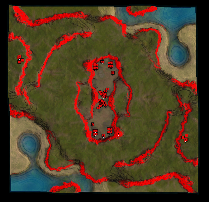
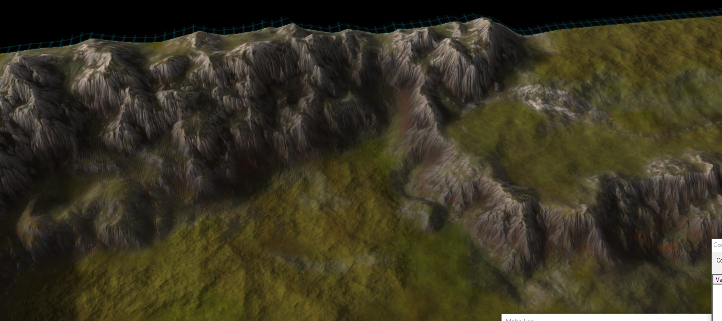
I like the colour cue height map. I wish all maps were like this / the engine did this / a mod could do this. A long time ago I proposed making a decal with colour based of height, making walls with red, embedding it in the map, hiding it until you were completely zoomed out. Did a period of concept that worked: just needed to rewrite the map vault.
-
@nine2 said in A community effort on a map layout:
I like the colour cue height map. I wish all maps were like this / the engine did this / a mod could do this. A long time ago I proposed making a decal with colour based of height, making walls with red, embedding it in the map, hiding it until you were completely zoomed out. Did a period of concept that worked: just needed to rewrite the map vault.
I'll see if I can make a small template for that in World Machine
")
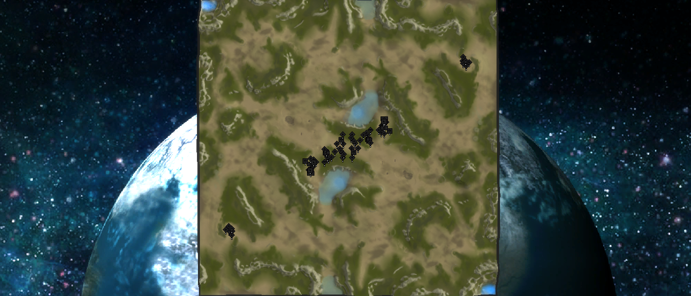
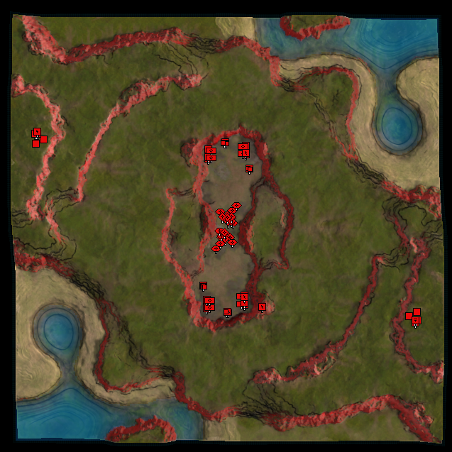
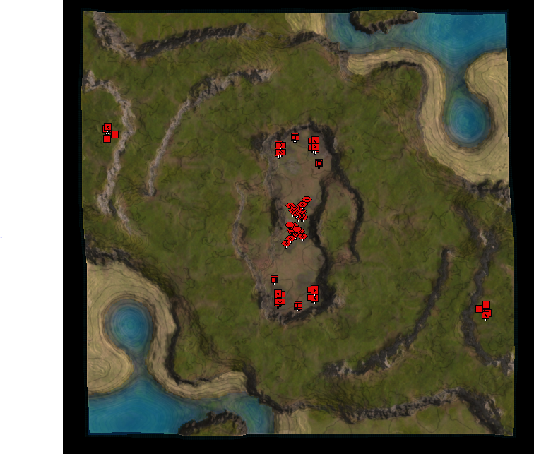
A quick update on the design of @Leto_II ! I've been able to tick-off a lot of the things I still had to look at. Later tonight we'll have a short chat about the progress to allow Leto to provide some feedback into the process.
Yesterday I've had the opportunity to talk to Blodir and it was a good conversation! Something about erosion
 . Throughout the week I'll be working more on the implementation of Blodir's design - this weekend the aim is to look at Leto's map .
 -
New coast looks cool
-
I like the thread. I hope it produces some good maps. I like the concept of Leto's map and his intention is well-thought out and explained. Hopefully 10x10 is big enough to allow numerous strategies to play out. If not, I hope with testing and feedback, maps will be iterated to find the optimal meta for both fun and longevity. I don't have enough experience to offer constructive technical comments right now. I hope others will try the maps and comment here.
-
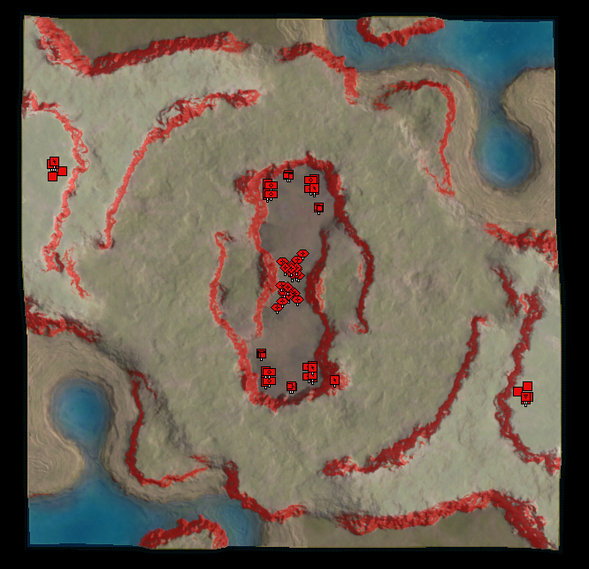
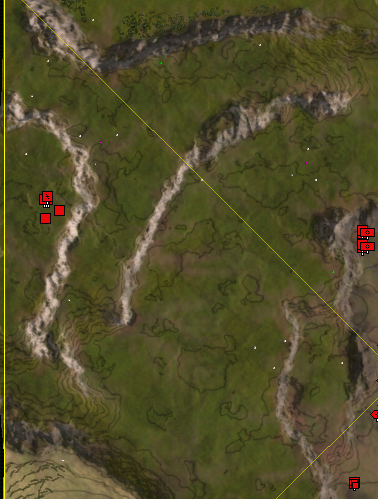
This is where i was discussing the strategic overlay idea
https://forum.faforever.com/topic/17/neroxis-map-generator/14?_=1615247693516Basically we would generate a decal that shows
- whiteness based off height, showing hills and valleys
- redness based on impassable terrain
The decal would only show when you are zoomed out. This would allow the user to digest a new map quicker.
-
Oh. You already replied to that thread ages ago. Oops
-
@nine2 How about this:
Completely zoomed out.
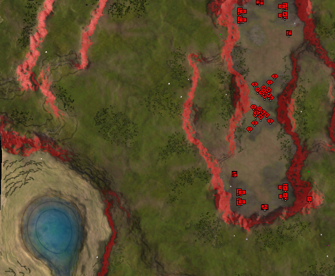
Zooming in, starts disappearing.
More zoom, almost gone.
Even more zoom, all gone.
edit: it is far from perfect since I can't compute the 'supreme commander approach to doing it', yet.
I think in practice you'd want this to be two separate decals:
- One for the unpathable bits
- One for the heightmap lines
The idea is that the heightmap lines can be longer visible.
-
Looks great. Don't need heightmap "lines". Just set
white-opacity = heightmap-y-percent -
On half transparency
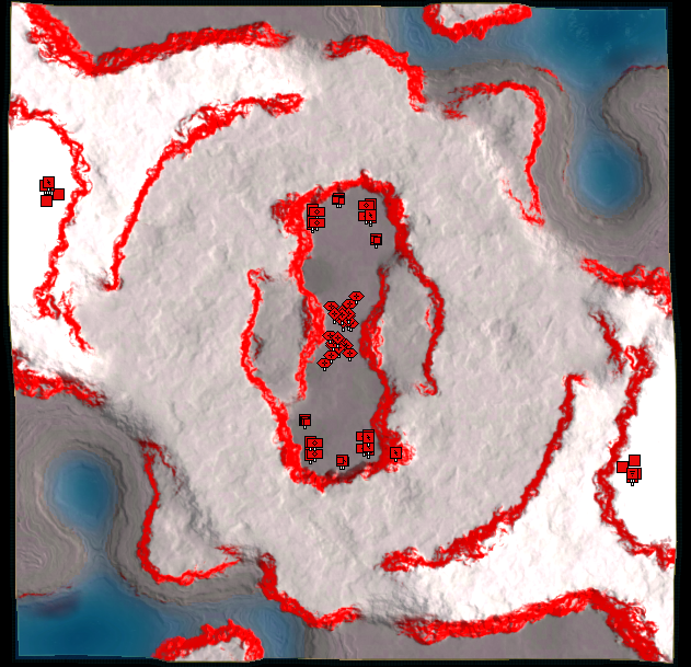
On no transparency
Zoom in, slightly
Zoom in, more
Zoom in, mooorre
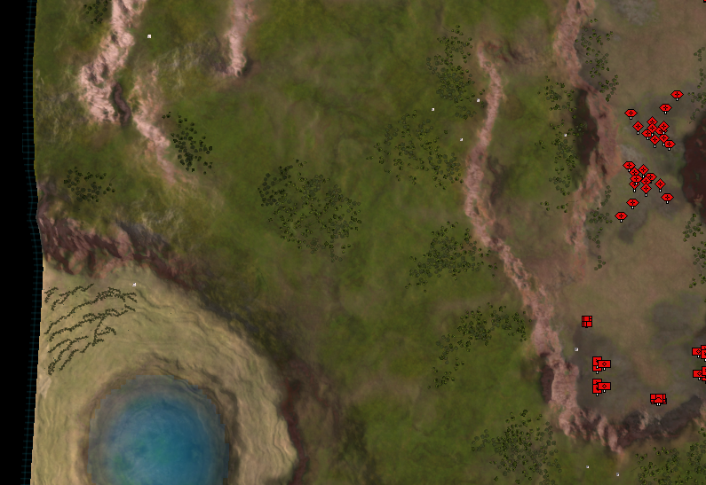
What do people think, in comparison to:
- Having nothing
- Having just the impassable terrain displayed
- Having impassable terrain + cartographic feeling (the height lines)
- Having impassable terrain + heightmap feeling (more white = higher)
Having half transparency (to have some of the aesthetics to remain visible) is no-go in my opinion. Its the bad bits of both worlds.
-
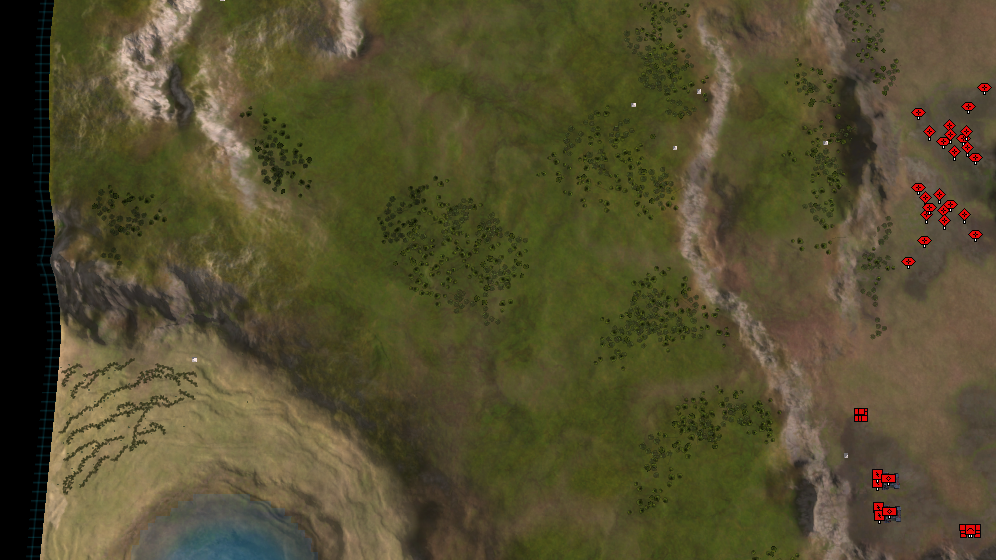
Tbh most of these look pretty awful aesthetic vise and I wouldn't use them even in tourneys since it would just hurt my eyes in the long run (personal preference). The one I really like is the Impassable terrain + Cartographic feeling (the height lines) but with the red tuned down a lot (Visible but only slightly so it doesn't hurt the aesthetics so much).
-
@Tagada how about this:
-
And another question: should it be visible throughout the entire game, or just the first few minutes? And is that for the impassable terrain, the height lines, or both?
-
I don't like the red lines, they are too obtrusive and the unpassable terrain can be identified from the rocky texture anyway. Heightlines might be interesting but they need to be very subtle (much lighter than in the pic). I think the heightlines could be part of the map no LOD or timers.
(Jip requested me to post my opinion on the thread)
-
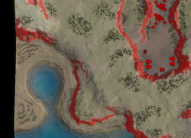
After speaking about it with a bunch of people I agree that the red hills are too hard on the aesthetics. While at the same time the rock texture (or any other similar texture that clearly depicts the impassable terrain) is already having a similar function.
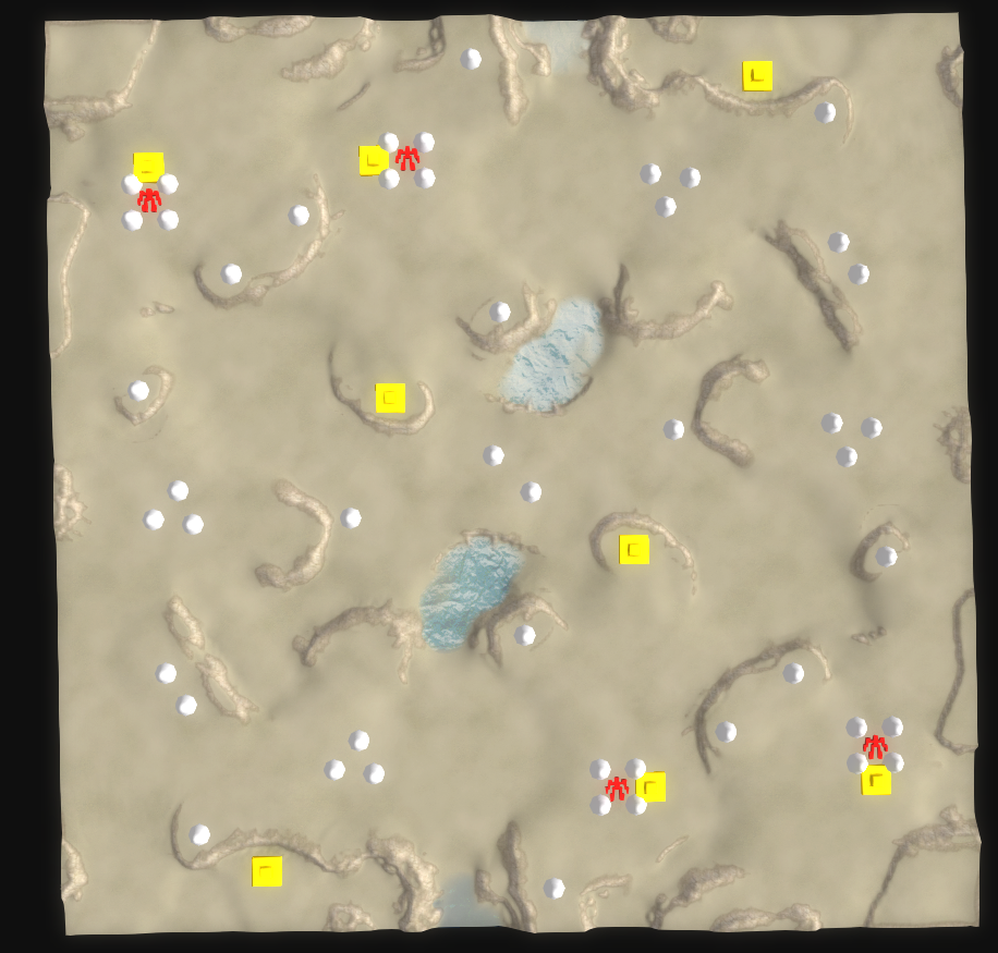
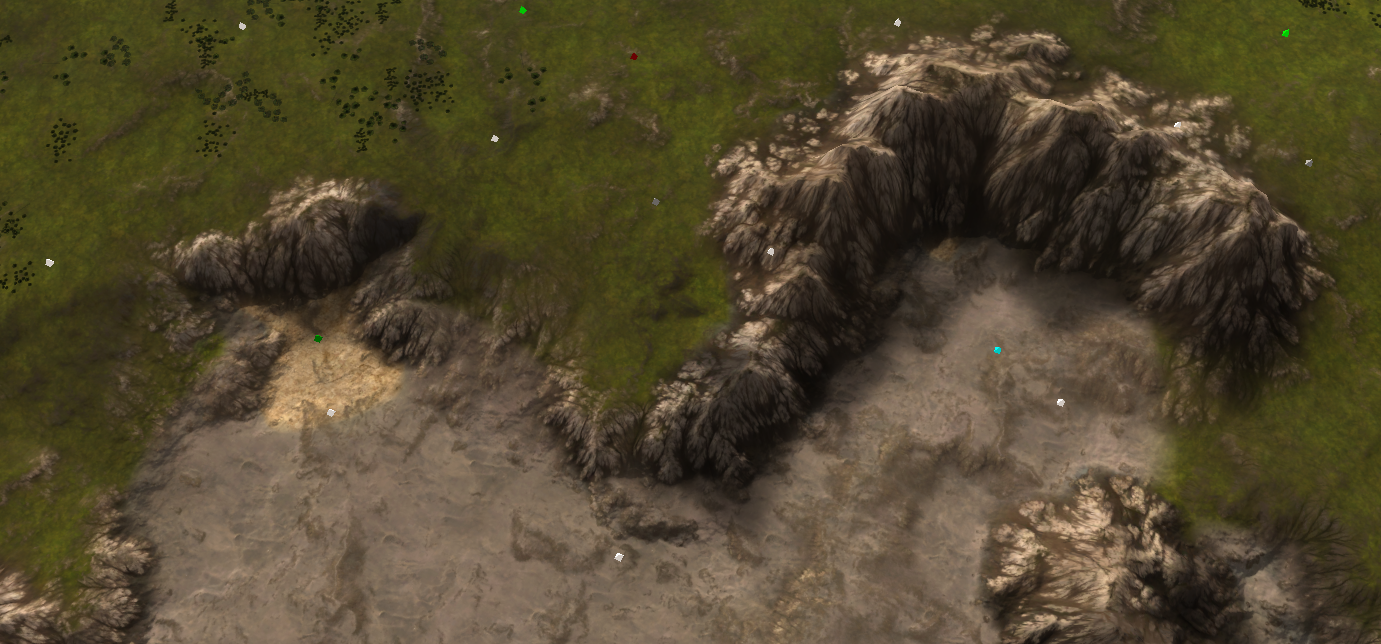
I would personally find something like this useful - just to indicate where the terrain is bumpy and to determine whether there is a slope. It is only visible when you are completely zoomed out.
It is a bit hard to see due to the resolution of the image, but once in-game it is well readable while not taking away too much attention.
edit: more screenshots
fully visible
partially visible
and gone
Another edit:
Excluding the hills, to keep them as bright as teeth
-
Is there a way to toggle these red lines? As in: I could press "F10" and the red lines come on, press it again and they disappear? Or alternatively, when I hold down F10 I can see the red lines, and when I let go of the key, they disappear? Better if they fade in and out smoothly, over time, even if it's just half a second.
I wouldn't need to see these red lines all day long. I would probably only need to see them once or twice during the match.
If I had to choose between never getting red lines, or they are always in my face whenever I zoom out, I would prefer never seeing them.
And if they were toggleable, we could see them even when we are zoomed in more. You wouldn't have to zoom out just to check if a passage was walkable.
-
In my opinion the best one is the "no transparency" one. I realise it is ugly, but it is very functional. The idea is that people would glance at it, then turn it off. Decal visibility would be toggled by code ... there could be options for
- when it is visible, what is the opacity (default to maybe 80% or whatever)
- only display it at a certain user defined zoom distance (or never)
- keyboard shortcut to toggle it on or off (in which case it would be on at any render distance).
with these settings anyone who didnt like it could basically get rid of it, or bring it back on demand only. For me I would experiment by having it on when the game starts then i'd dismiss it manually after a few seconds.
where the Strategic Overlay idea will shine is in mapgen where its not possible to know the map in advance, and also perhaps the map itself isnt that clear since it was generated not hand crafted for visual clarity.
but here's the hard part -> it would be nice if this feature was available for all maps. I don't know how (at runtime) create a decal based off a heightmap. I guess the java client could do it... it would read the heightmap, inject an image into the map folder, then rewrite the map file to include the new decal. That should be totally doable. Or, if someone was very clever maybe they could rewrite the cartographic shader to do everything we talked about it. It does have the heightmap after all.
-
" For me I would experiment by having it on when the game starts then i'd dismiss it manually after a few seconds."
If the system is built to support it, you could probably even set up a UI mod to have it on by default iff it's a mapgen map.
Perhaps the map generator itself could generate the decal. Custom maps shouldn't need this. People should just make them with legibility in mind.
-
If the goal is to dismiss it manually in the first few seconds of the game then there is no need for a toggle. I can just make the decal disappear after a given time, say 30 seconds, while you're building your first factory.
Having a toggle is possible if I make a PR for FAF that on pressing some key combination it checks the map folder for the decal in question. If it is there, it creates it. If not, it ignores the keyboard combination and adds a message in the logs indicating that it doesn't exist. One issue here is that a typical decal would be visible for everyone. E.g., an opponent toggling it to annoy the enemy. Creating a decal for person A and not person B will cause a desync. There are UI decals, but I haven't worked with them before.
Generating a decal at startup is something @Sheikah could do, especially for map gen maps. The node network is not complicated and is done in under a second. Generating and inserting them for non-map gen maps is a bit of a stretch in my opinion.
-
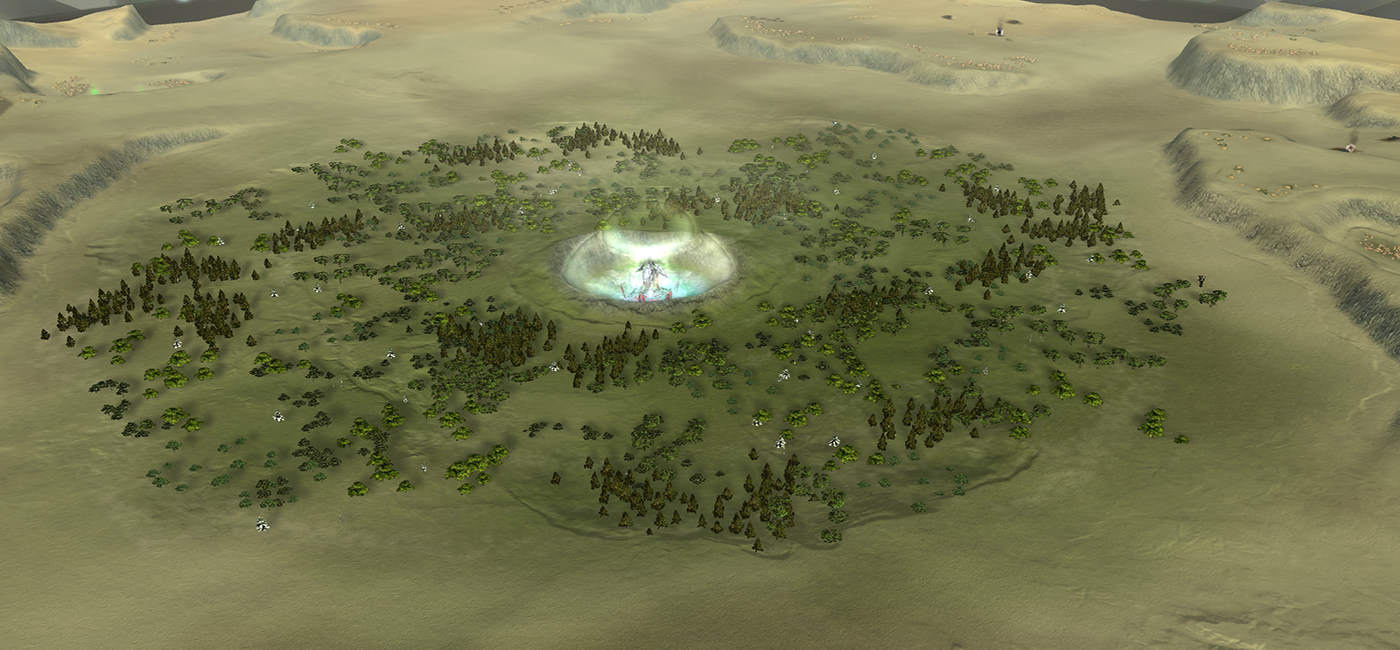
Update 4.0:
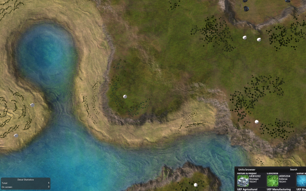
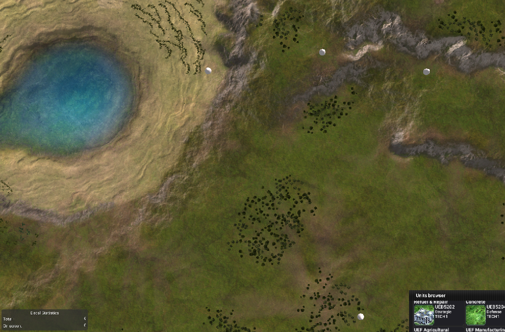
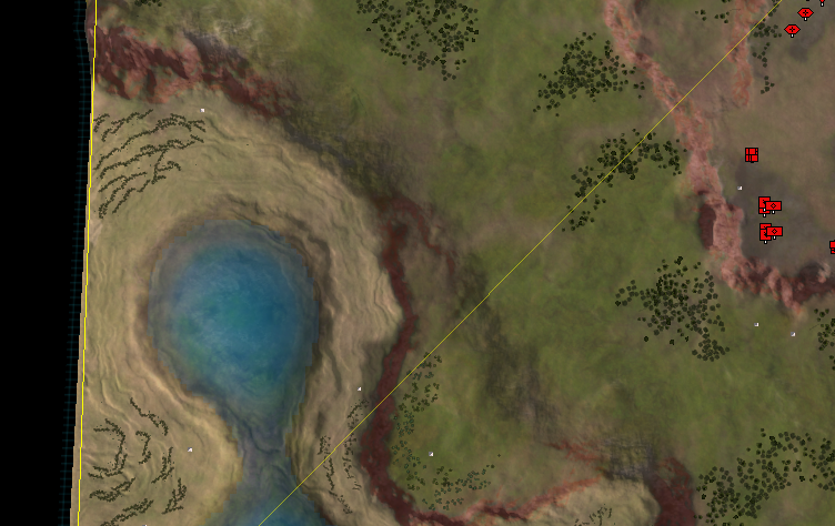
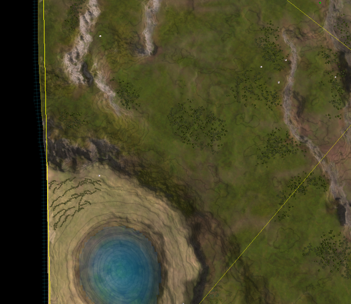
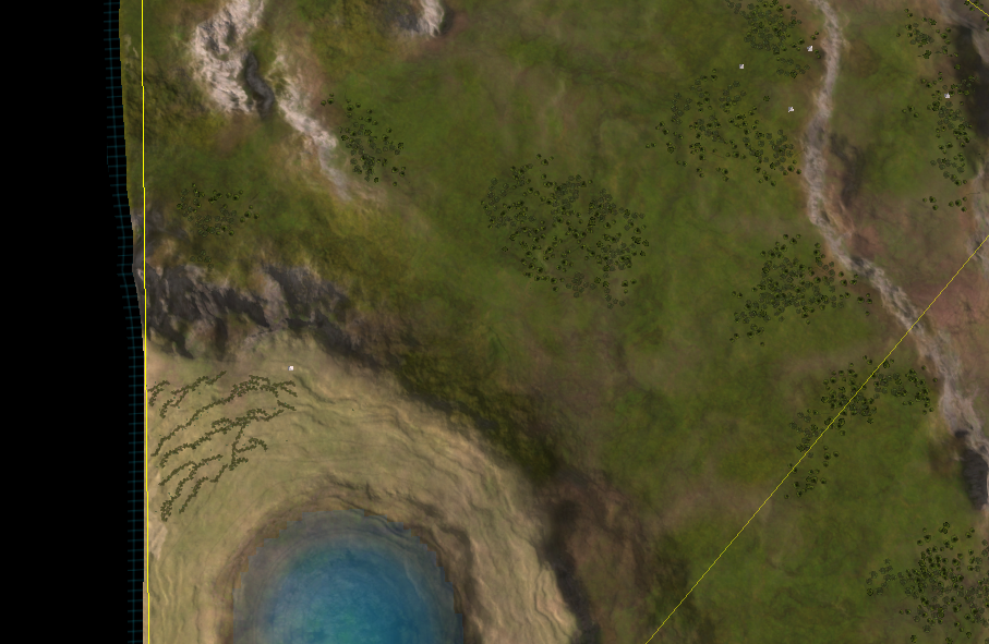
Meanwhile I've been working on both maps. Mauve is waiting on the final checks - after another discussion with @Leto_II the map will shortly be available in both the FAF and LOUD map vault. Once that happens there will be another post with all the PR pictures to make it shine.
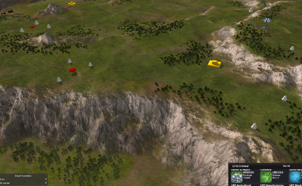
In Autumn, the map of Blodir, I've been studying the color nodes of World Machine. Add some experimentation to that and we have a breakthrough.
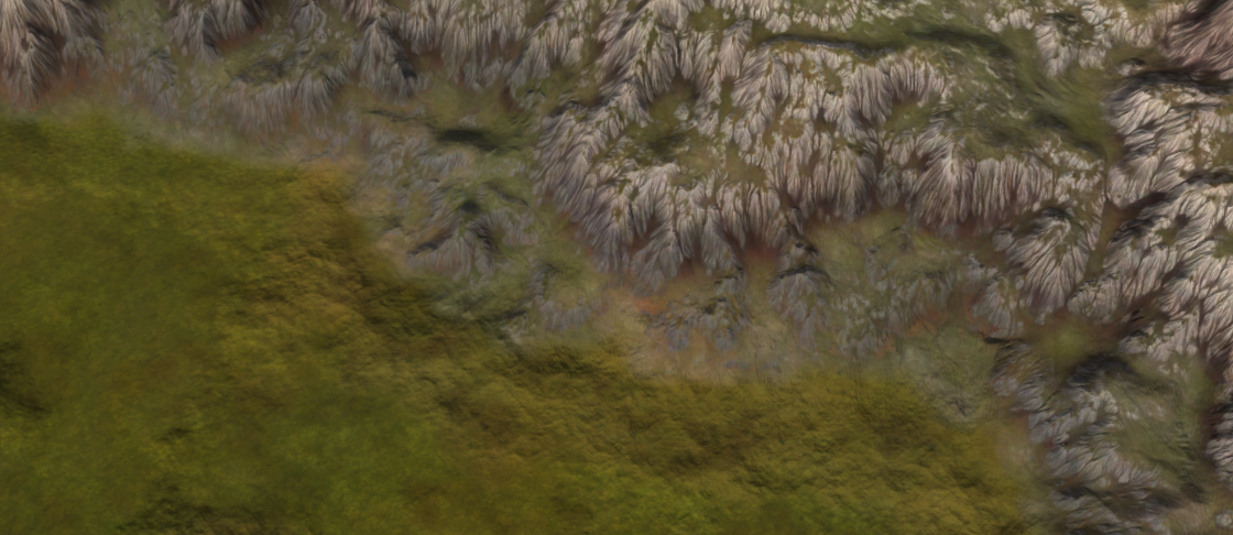
My understanding has increased a lot - these rocks are made out of a new color network that provide more control and flexibility. It is now a lot easier to fine-tune the colors. Throughout the week I'll be experimenting with various other places to add in colors such as for area's with rocks, trees, or roads.
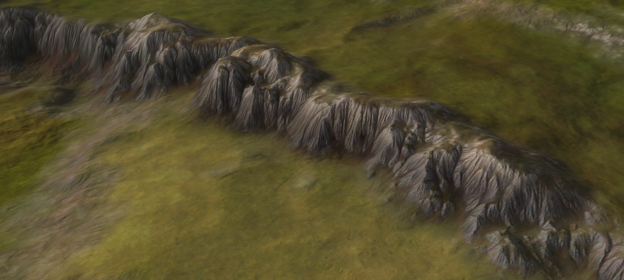
This will allow me to tune the map a lot more - area's that have trees on them will have a different color pattern / properties than area's that had rocks on them. It will be easier to add visual cue's to critical gameplay elements, such as ramps.
edit: all the images taken are from the GPG editor, not the Ozone that makes them look slightly better.
-
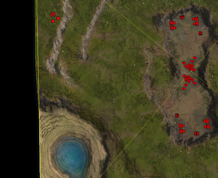
absolutely gorgeous results. this is earth under it's best light.
Hello! It looks like you're interested in this conversation, but you don't have an account yet.
Getting fed up of having to scroll through the same posts each visit? When you register for an account, you'll always come back to exactly where you were before, and choose to be notified of new replies (either via email, or push notification). You'll also be able to save bookmarks and upvote posts to show your appreciation to other community members.
With your input, this post could be even better 💗
Register Login