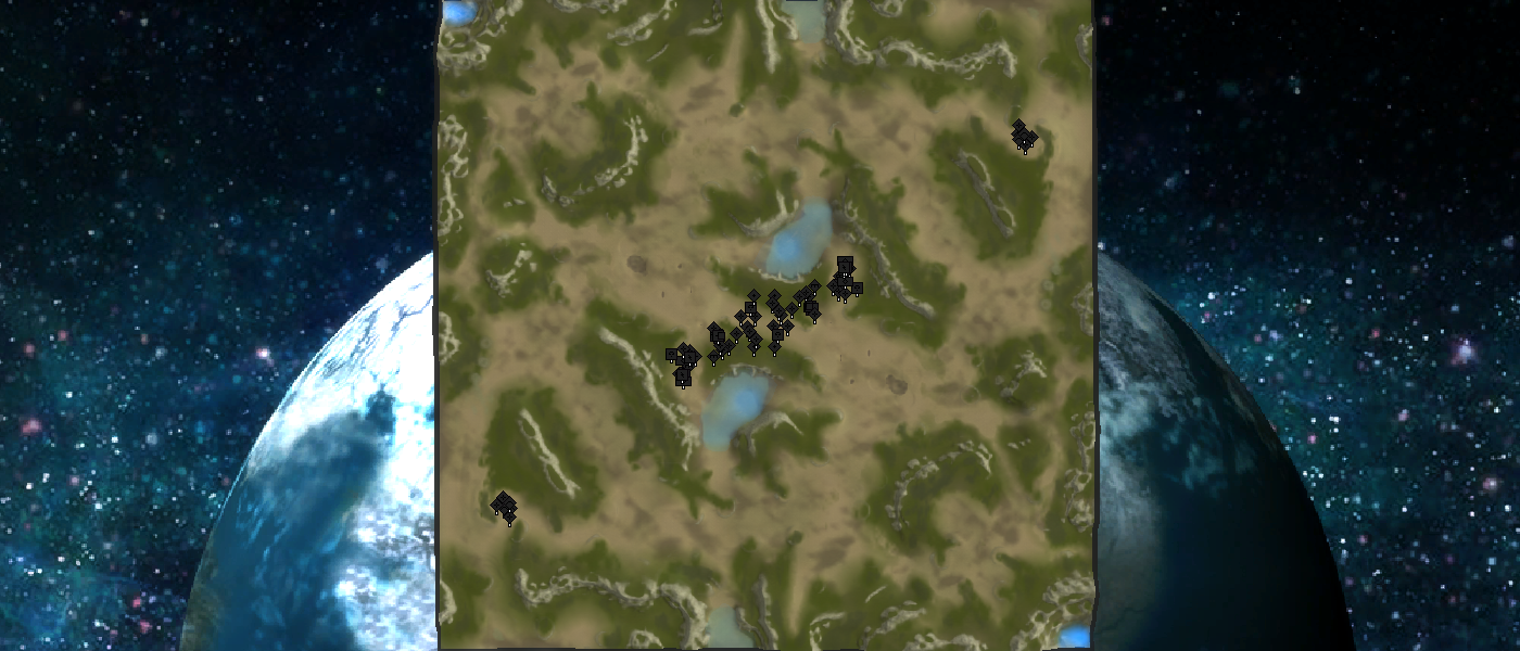
A community effort on a map layout
-
And that is what this topic is about
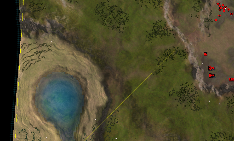
") . I do like how navy is - as that is typically either extremely dominant, or irrelevant on a map of this size. But in this case it feels it matters, but doesn't necessarily mean you win. Could you re-look at the layout of your map and come up with another version? Perhaps look at:
. I do like how navy is - as that is typically either extremely dominant, or irrelevant on a map of this size. But in this case it feels it matters, but doesn't necessarily mean you win. Could you re-look at the layout of your map and come up with another version? Perhaps look at:- Mass / hydro layout
- Reclaim (trees, rocks, wrecks)
- Amph ramps (where can amph units get in the water?)
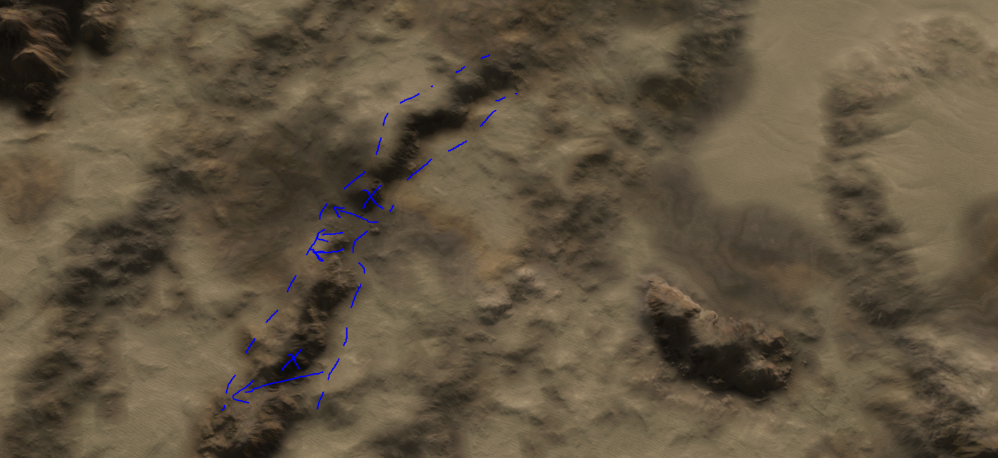
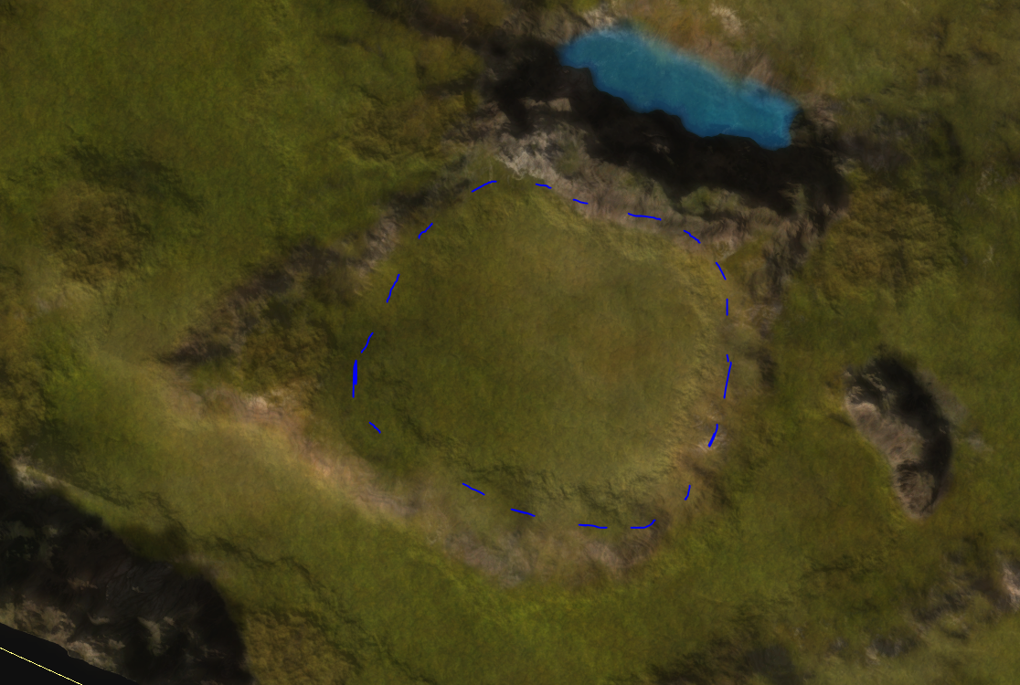
After looking at the map again, I do think some of the ramps are too small. They'd become a tad bigger, but that doesn't hurt the complexity of the map.
-
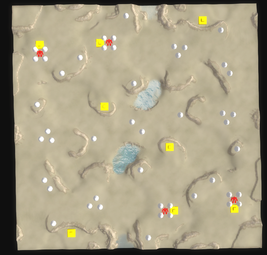
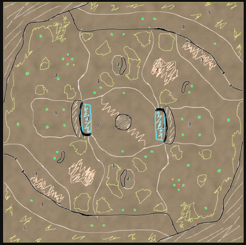
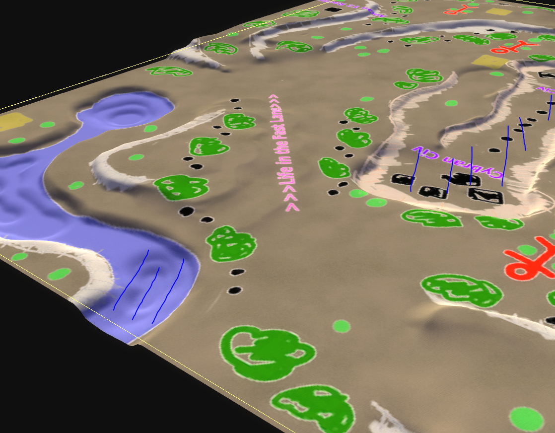
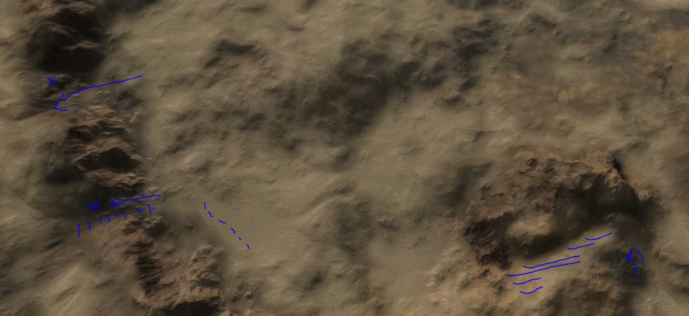
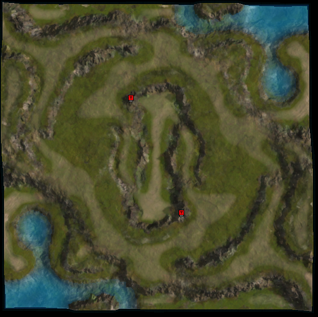
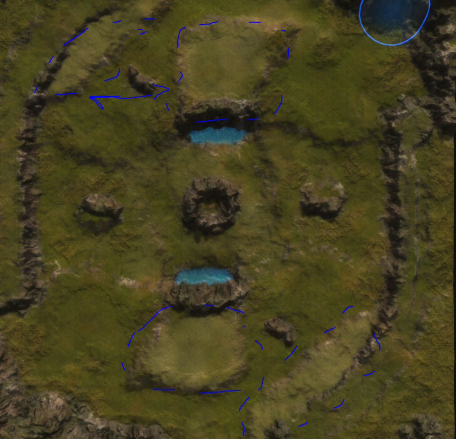
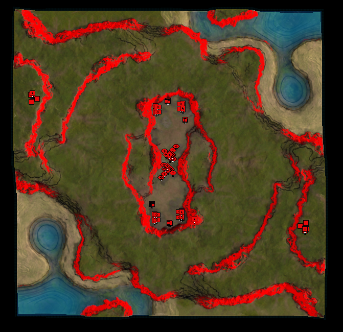
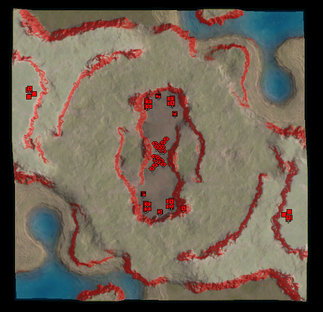
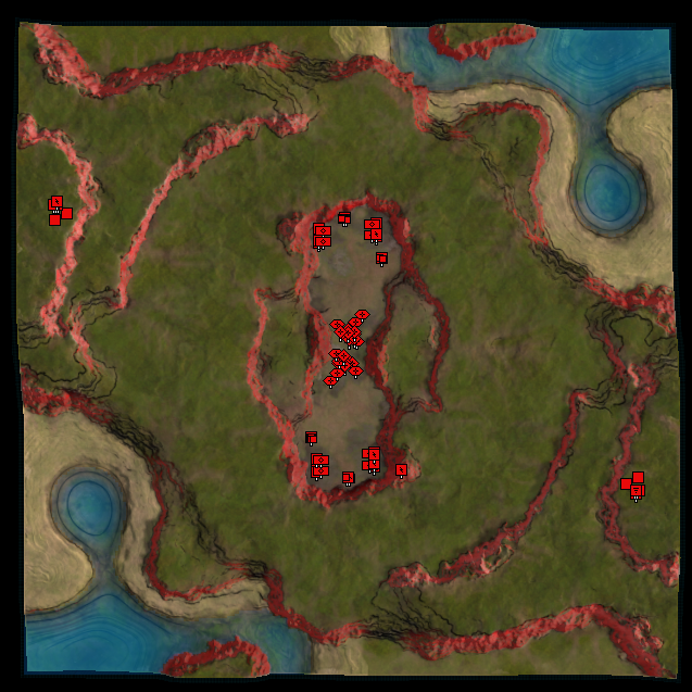
Legend:
- Pink lines: high cliffs blocking most attacks
- White lines: level 2 cliffs (safe from direct fire like T3 battleships)
- Grey lines: level 1 cliffs
- Yellow lines: beach suitable for amphibian units
- Blue diamonds: mass point
- Yellow lightning: hydrocarbon
- Red cross: commander spawn
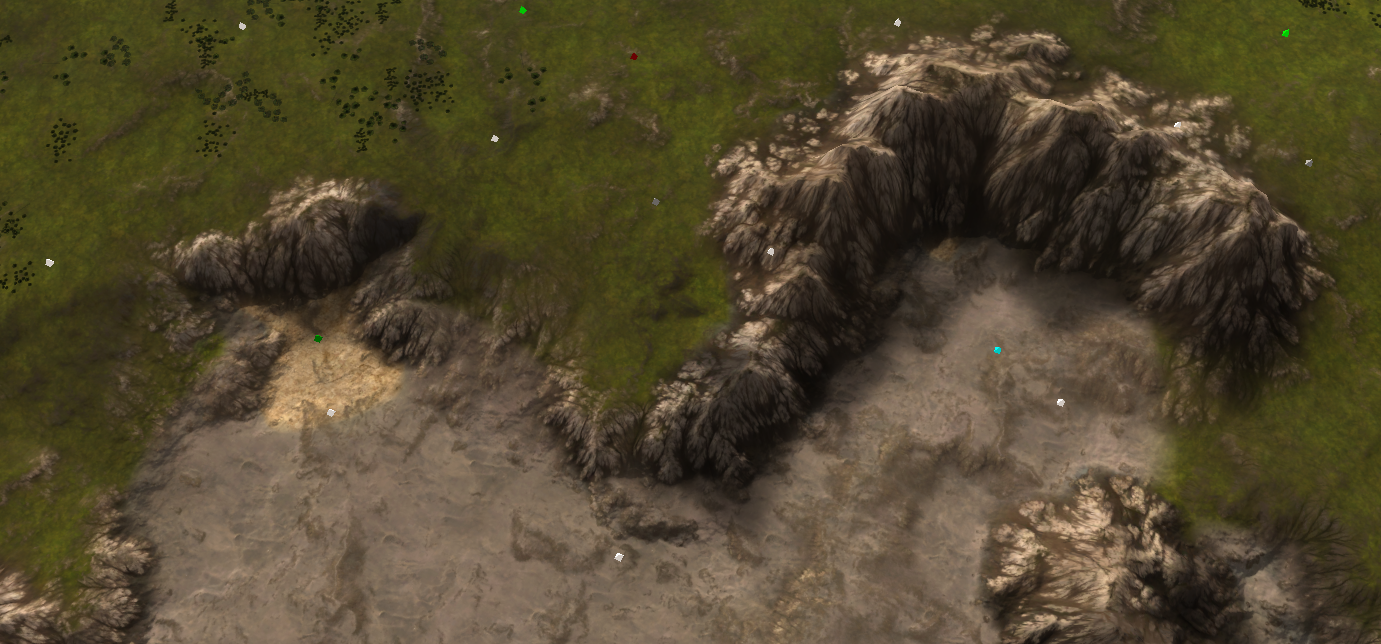
- Black explosion: wrecks reclaim worth fighting over
- Green capsules: trees
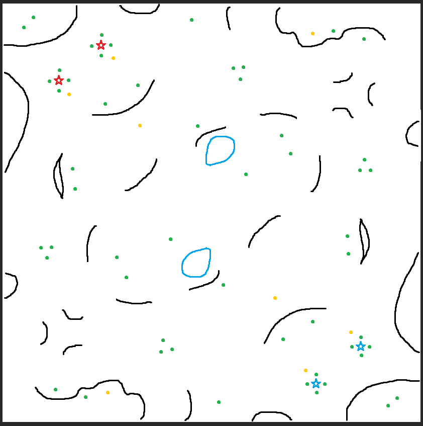
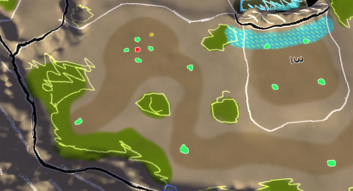
Mass significantly reduced. The big challenge for the desired meta is that expansion sites need to somehow stay relevant as discrete expansions to fight over, despite having little mass. Expansions are now:
- Main base: 3 mex
- Natural expansion: 1 mex but rich reclaim to get battle going
- Forward expansion: 1 mex 1 hydro
- Back expansion: 2 water mex 1 hydro, good for early eco but requires defense vs navy
- Side expansions: 2 mex but vulnerable to T1 frigates
- Corner expansions: 2 mex and protected with ramps and from T1 navy
- Bottom/top beach expansions: 1 mex, long land route from closest players
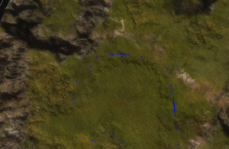
Ramps should be enough to choke the gameplay, but yes, very small now, impossible for supcom pathfinding now

-
@archsimkat thanks for the feedback!
yeah it probably shows that I know utterly nothing about mapmaking
-
You can no longer submit a design. Archsimkat and I will look over them and we'll make a choice or two this weekend
. -
I'm happy to announce that I'm going to try to make three of the four remaining designs, of which one is under condition.
Throughout this week I'll be making at least two preliminary designs. This will have all the fancy bits you'd desire, including prop placement, markers setup, etc. Over the weekend (6th and 7th of March) we'll discuss the progress.
I hope to talk to @Blodir and @Leto_II during that weekend. Feel free to send me a message on the forums or on Discord to make an appointment for a meeting. You can also find me in the creative channel if you prefer talking over Discord. I live in Amsterdam which I believe is GMT + 1. Please keep that in mind.
The last design is from @Valki and the reason it is under condition is because it is not your design. To avoid conflict I'd like you to contact the original maker (from Starctaft II) and ask for permission to use his design in a different game. I hope to receive a written confirmation on it, can be in any format that you desire as long as I can read it
.There are two reasons for this:
- It is not your design
- The finest form of flattery is imitation
As a fellow content creator I'd love to hear if my content is used for another game in a non-profit manner. Just to be aware of it and the impact that the content apparently had. When this happens it is a compliment and that is always nice to receive. Whether or not you agree to it being used is another matter - one that I'd like confirmation on in this case
.And last but not least: please keep in mind that all of this is best-effort. That entails that if anything happens that has to take priority the process will either slow down, or in the worst case, will be halted indefinitely. I will always inform you if that happens.
I'd like to thank everyone for their inspiration and the short discussions in this topic
. -
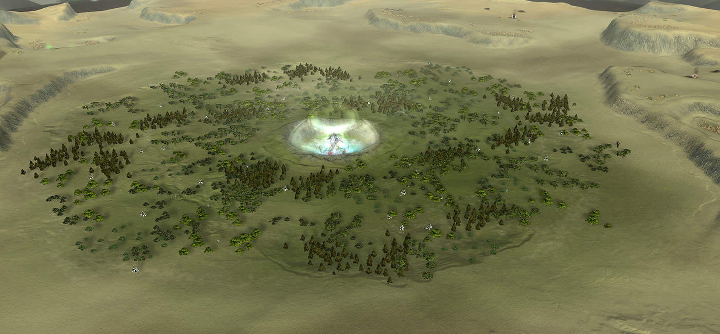
Update 1: 'Initial commit', here we go
For those that have not opened the editor before: I've turned the design into a decal to ensure I stick to it as truthfully as possible. Of course - edits are welcome and the design is not written in stone. But as an initial setup this works pretty nicely.
From this point onwards its about generating the rough version of the map where I 'abuse' the ozone editor to create a symmetrical heightmap and 'paint on' properties that I can use in the procedural pipeline. I can paint properties via the stratum layers - these are masks that you can export. A few common properties are:
- Where you want more or less natural noise (think of mountains that need to look natural)
- Where you want more or less blur (think of expansions that need to be flat)
- Where you want more or less erosion (think of mountains that need to look epic)
- Where you want an erosion sink for sediment (to prevent the piling of sediment)
- ....
A technical note on the decal:
The designs are generally white where nothing is expected. In turn, I can use that as an inverted mask. White becomes black and black means its completely transparent. Via the decal templates templates for the GPG editor I can position the design exactly over the entire map without me having to manually fiddle with it. -
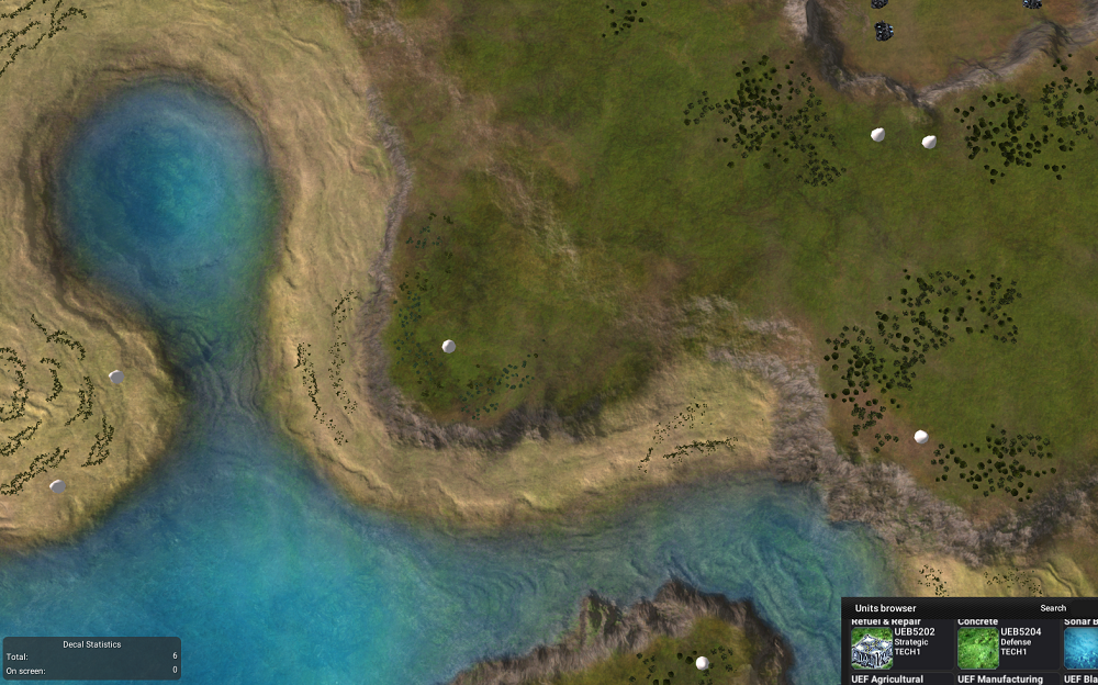
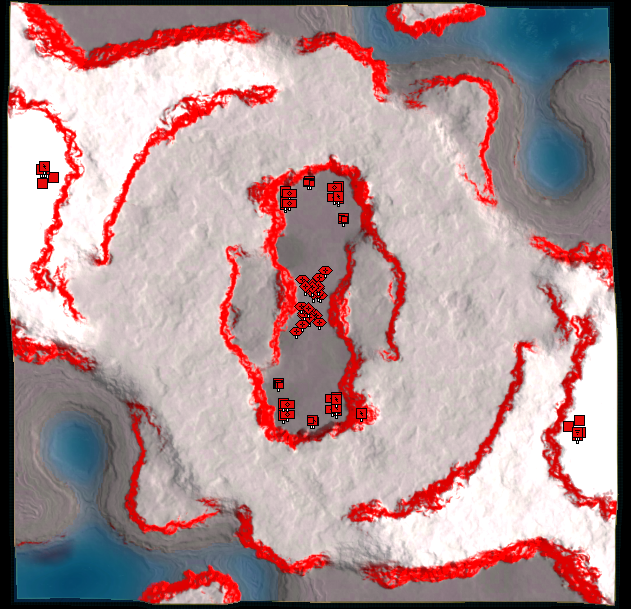
Update 2: An initial heightmap
An initial interpretation of the heightmap! In the case of Blodirs map everything was quite smooth. Due to the height numbering it was easy to interpret and make an initial draft.
Ironically it also shows how hard it is to make a design that works out of the box. In the case my interpretation of Leto's design I ended it with the center being underwater. There are a few easy fixes to this, but it requires more ramps to be introduced.
@Leto_II I am hoping you could make a design similar to that of Blodir with numbering at what height you expect something to be at. Otherwise Archsimkat and I will make an interpretation that may be different than what you intended. Specifically we're talking about the center here
. -
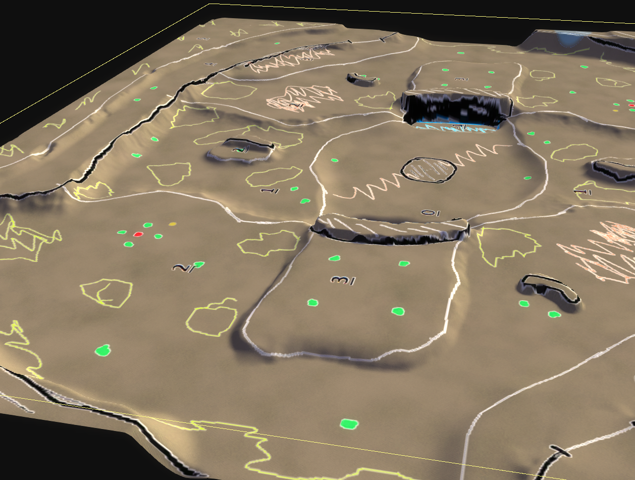
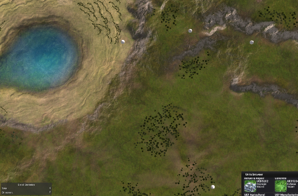
Update 3.1: An initial draft
An initial draft of the procedural content of the world machine template for this map. I've (ab)used the ozone editor to paint properties on the map which is input for the template. Can you guess which is what?
In turn, the template chews for a bit and spews out three decals: an albedo, normal and lighting decal. The specular decal is a bit more tricky and is not part of this draft yet. However the main idea is already there. There is still loads to do:
- Generate sane masks for the stratum layers
- Speaking of stratum layers - determine what textures to use for what layer
- Improve the hardness mask as some cliffs are eroded a tad too strong
- Improve the erosion mask as some parts have sediment piling up
- Change up the coloring of the mountains
- Add tree area's into the main decals
- Add road / flat area's into the main decals
- Add color cue's for terrain height
And last but not least the typical map things like props, extractors, etc. Looking forward to the discussion this weekend @Blodir.
I intended to have an initial draft for the map of @Leto_II too but that is postponed to tomorrow
. We had a short chat and the design has been adjusted to account for height differences.On top of that I've had contact with @Valki and I hope to hear from the original author soon so that I can start the progress on his map too.
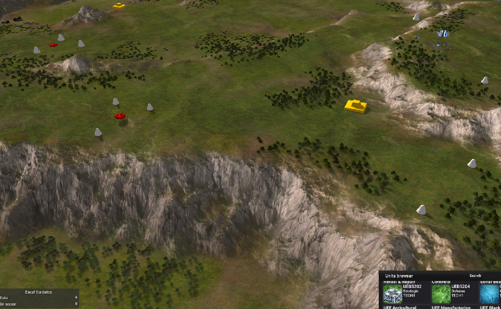
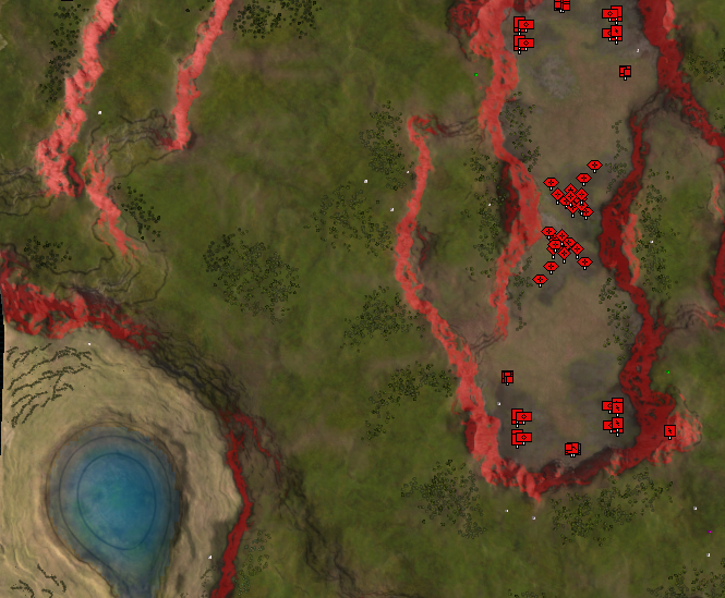
And to give an idea of the process - a few images of me just starting at the terrain to look for issues. There area a few, some are easy to fix and others require some semi-manual (read: more procedural) tweaking to fix.
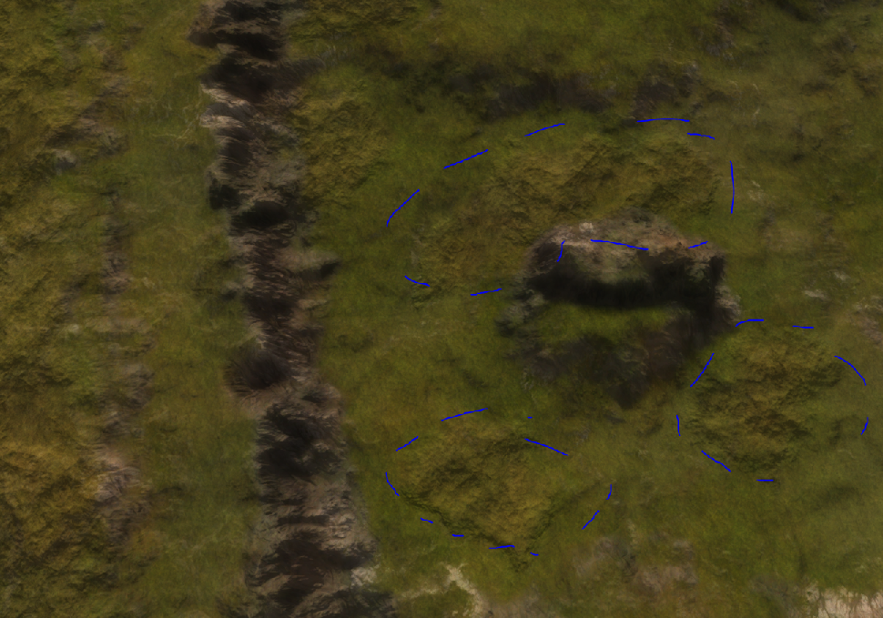
Typically the issues are:
- A ramp that appears
- A ramp that disappears
- Plateau's that disappear
- Piled sediment
- Rough pixels in the transparency channel of the decal
-
Update 3.2: More work on that initial draft
A bit later than anticipated! Started working on the design of Leto. We had a short chat and he changed up his design to take into account the ramps.
One particular aim for Leto's design was to create 'dunes' near the coast This didn't work particularly well yet, but the results (on the last image) are a promising start.
Things to still look at:
- The hills are a bit flat, e.g., the normal map is not showing up nicely.
- The normals in the water are waaaaayyyy so strong
- The dunes are not visible enough
- Use more stratum layers
- Fix up the albedo decal: its too shallow / invisible near the mountains
- props
- units
- markers
And to tip it off: I ran into what I think (and still think) is a bug:
Luckily, I've already started working on the first issue with normals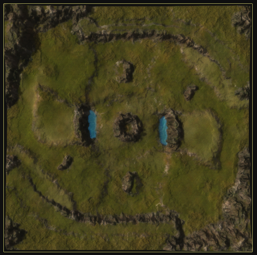
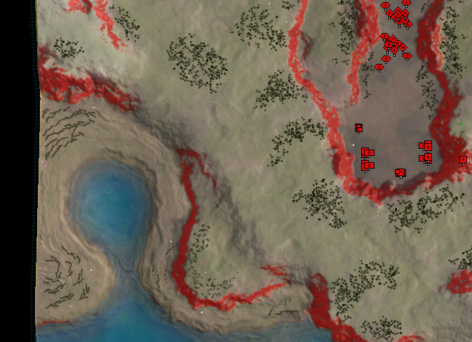
One experiment on this map was to clearly identify area's that are flat for buildings. The last two screenshots depict this progress.
Another experiment was to clearly identify where trees are. I tried to do this via the normals decal at the moment, but I've got work in place to embed them via the color decal too and in a much more realistic manner.
And last but not least - as part of a misinterpretation I've tried to color-cue the various plateau heights. Ironically, the result is actually quite good and it allows you to understand the map a lot better at a glance.
One major difference between both maps is how artificial their design appears to be. Especially the design of Blodir may work very well for the desired gameplay, but it is hard to get aesthetically 'right'. Especially the plateau to the right / left of the bottom / top spawn is hurting my eyes a bit.
The more I work on both maps the more I start running into hardware limitations. As I type this my computer runs at roughly 5 fps causing all kinds of weirdness to happen. Luckily, I'm working on scripts to automate even more tasks so I don't have to click anything anymore. At some point the ideal pipeline is of course one script to rule all scripts, but we're not there (yet).
For now I've automated the creation of stratum layers, decals and other kind of magic - all with the help of a script and some inspiration from other people in the faf creative discord.
-
I like the colour cue height map. I wish all maps were like this / the engine did this / a mod could do this. A long time ago I proposed making a decal with colour based of height, making walls with red, embedding it in the map, hiding it until you were completely zoomed out. Did a period of concept that worked: just needed to rewrite the map vault.
-
@nine2 said in A community effort on a map layout:
I like the colour cue height map. I wish all maps were like this / the engine did this / a mod could do this. A long time ago I proposed making a decal with colour based of height, making walls with red, embedding it in the map, hiding it until you were completely zoomed out. Did a period of concept that worked: just needed to rewrite the map vault.
I'll see if I can make a small template for that in World Machine
A quick update on the design of @Leto_II ! I've been able to tick-off a lot of the things I still had to look at. Later tonight we'll have a short chat about the progress to allow Leto to provide some feedback into the process.
Yesterday I've had the opportunity to talk to Blodir and it was a good conversation! Something about erosion
 . Throughout the week I'll be working more on the implementation of Blodir's design - this weekend the aim is to look at Leto's map .
 -
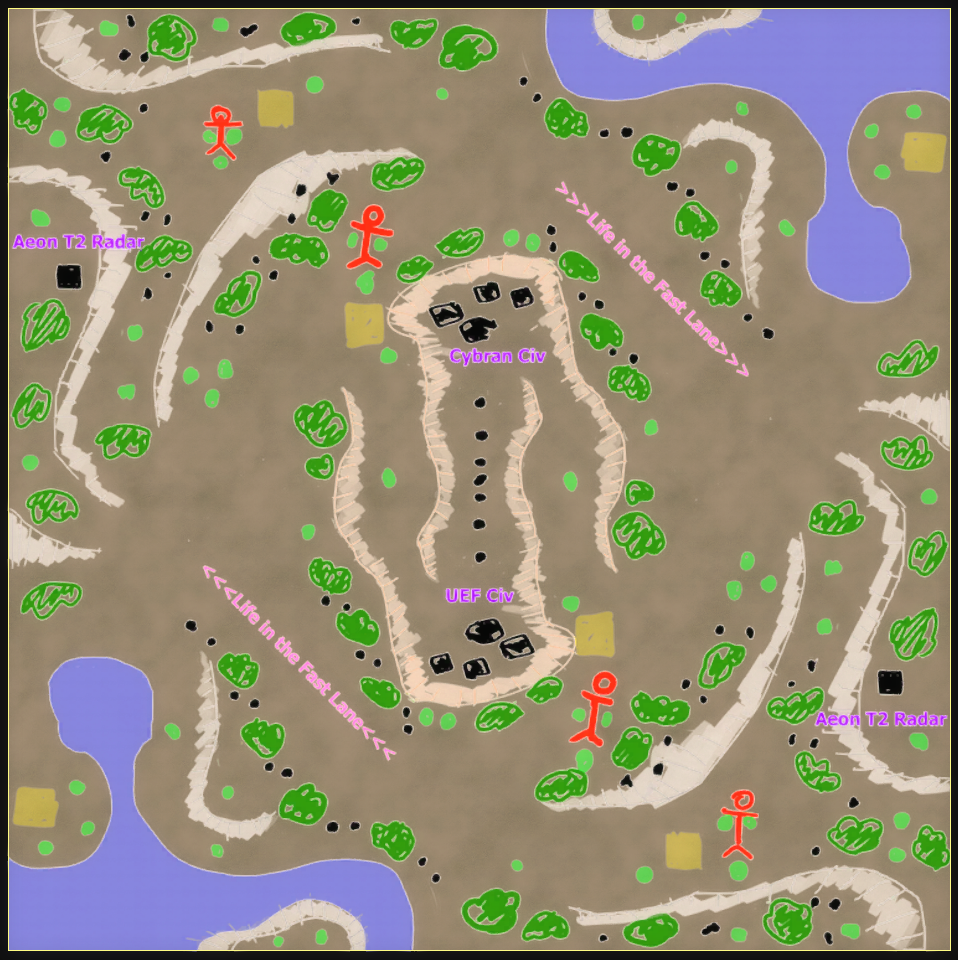
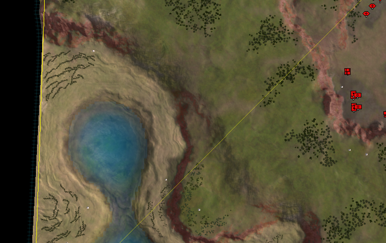
New coast looks cool
-
I like the thread. I hope it produces some good maps. I like the concept of Leto's map and his intention is well-thought out and explained. Hopefully 10x10 is big enough to allow numerous strategies to play out. If not, I hope with testing and feedback, maps will be iterated to find the optimal meta for both fun and longevity. I don't have enough experience to offer constructive technical comments right now. I hope others will try the maps and comment here.
-
This is where i was discussing the strategic overlay idea
https://forum.faforever.com/topic/17/neroxis-map-generator/14?_=1615247693516Basically we would generate a decal that shows
- whiteness based off height, showing hills and valleys
- redness based on impassable terrain
The decal would only show when you are zoomed out. This would allow the user to digest a new map quicker.
-
Oh. You already replied to that thread ages ago. Oops
-
@nine2 How about this:
Completely zoomed out.
Zooming in, starts disappearing.
More zoom, almost gone.
Even more zoom, all gone.
edit: it is far from perfect since I can't compute the 'supreme commander approach to doing it', yet.
I think in practice you'd want this to be two separate decals:
- One for the unpathable bits
- One for the heightmap lines
The idea is that the heightmap lines can be longer visible.
-
Looks great. Don't need heightmap "lines". Just set
white-opacity = heightmap-y-percent -
On half transparency
On no transparency
Zoom in, slightly
Zoom in, more
Zoom in, mooorre
What do people think, in comparison to:
- Having nothing
- Having just the impassable terrain displayed
- Having impassable terrain + cartographic feeling (the height lines)
- Having impassable terrain + heightmap feeling (more white = higher)
Having half transparency (to have some of the aesthetics to remain visible) is no-go in my opinion. Its the bad bits of both worlds.
-
Tbh most of these look pretty awful aesthetic vise and I wouldn't use them even in tourneys since it would just hurt my eyes in the long run (personal preference). The one I really like is the Impassable terrain + Cartographic feeling (the height lines) but with the red tuned down a lot (Visible but only slightly so it doesn't hurt the aesthetics so much).
-
@Tagada how about this:
Hello! It looks like you're interested in this conversation, but you don't have an account yet.
Getting fed up of having to scroll through the same posts each visit? When you register for an account, you'll always come back to exactly where you were before, and choose to be notified of new replies (either via email, or push notification). You'll also be able to save bookmarks and upvote posts to show your appreciation to other community members.
With your input, this post could be even better 💗
Register Login