Change TMM colors to be more legible
-
I disagree with the notion that the current colors TMM are bad. Reds+warm colors are team 1, blues and cold colors are team 2. It's pretty clear that way. Distinguishing between the individual player colors might be harder, but it's also a lot less important than distinguishing between their team allegiance.
-
I'd argue we still want to change the default colors to be more distinguishable as imo it'd just generally improve the default experience.
Changing player colors only on your end also has the downside of making communication slightly harder as e.g. "lets attack red together" doesn't make much sense anymore if everyone sees "red" as a different player.This was discussed and also my reason to reject it. But the entire idea of the change in question was to add support for color blindness. And once you do that the colors change regardless. So here we are

I also disagree with changing the TMM colors by default - as it is a never-ending slippery slope: the next color set may work for you, but not for someone else. And then the cycle repeats.
-
@xayo said in Change TMM colors to be more legible:
Distinguishing between the individual player colors might be harder, but it's also a lot less important than distinguishing between their team allegiance.
I disagree: Even w/o colors team allegiance would be pretty easy to tell at a glance from where units are, how they behave and from the fact that they don't provide vision.
Distinguishing between allied units is harder because all of those differences don't apply anymore, but still crucial because you can only give orders to some of them.
For me, the current color scheme fails especially when multiple armies meet at the same spot, as it's really hard to distinguish between a bunch off tanks in slightly different shades of blue, when you need to make quick decisions about how to micro them.
@jip said in Change TMM colors to be more legible:
I also disagree with changing the TMM colors by default - as it is a never-ending slippery slope: the next color set may work for you, but not for someone else. And then the cycle repeats.
Now that I know the local color change feature exists, I'll first see if it solves the legibility problem for me and the other people I've talked to.
If it doesn't, some research into color theory/Ui design on my part may be needed to find a 'better' tmm color scheme.
-
-
@deletethis said in Change TMM colors to be more legible:
There was already a huge (by these forum's standards) debate on this whole issue, so please do your research and then post if you actually have something to add.
I'm aware of both topics and they are about adding/changing/removing colors for selection in custom game lobbies, not directly about the adjustment of the tmm default color scheme.
While certainly related and valuable discussions in their own right, they differ from this topic in a significant way:
In a custom lobby you can choose whatever color distinguishes you from your allies/enemies the best. This is not possible in TMM.But again, I'll first check if the local color change mode fixes the problem for me before making any more suggestions.
-
This post is deleted! -
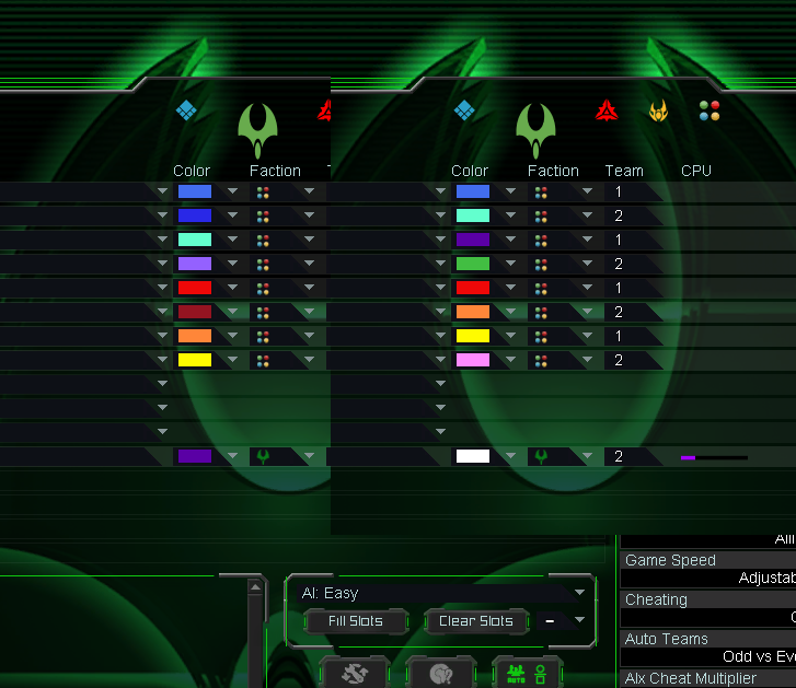
My attempt at trying to remove the most confusing colour combinations while maintaining a 'team theme' -
There was also relevant discussion here. FWIW, here was my suggestion for the color order:
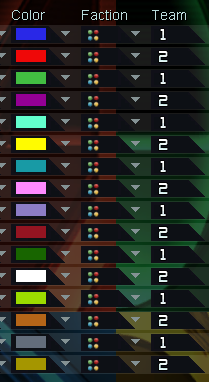
-
And no one can't do a normal color schema comparison by order =(
-
@penguin_ I miss all these good colours
-
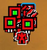
Images from a few games I've had recently... both showcase two different players.
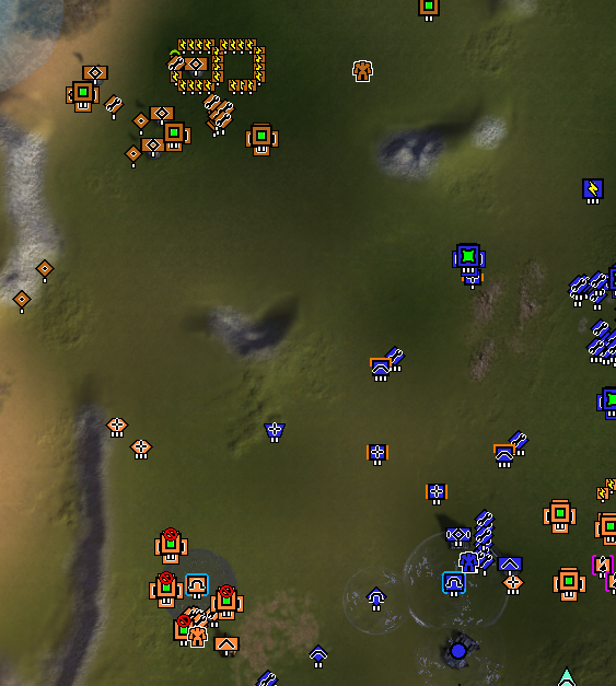
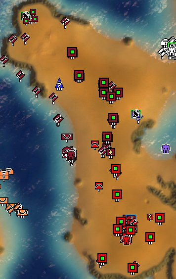
As you can see, it is quite difficult to see who owns which unit or structure, at a glance
I can only imagine it being worse if you are of a similar color as your opponent.
On another note, I once had a game in which this happened, but not to me.
I thought it was my teammate's units yet they weren't.
I know... a skill issue on my part.
~ Stryker
-
-
 C Ctrl-K referenced this topic on