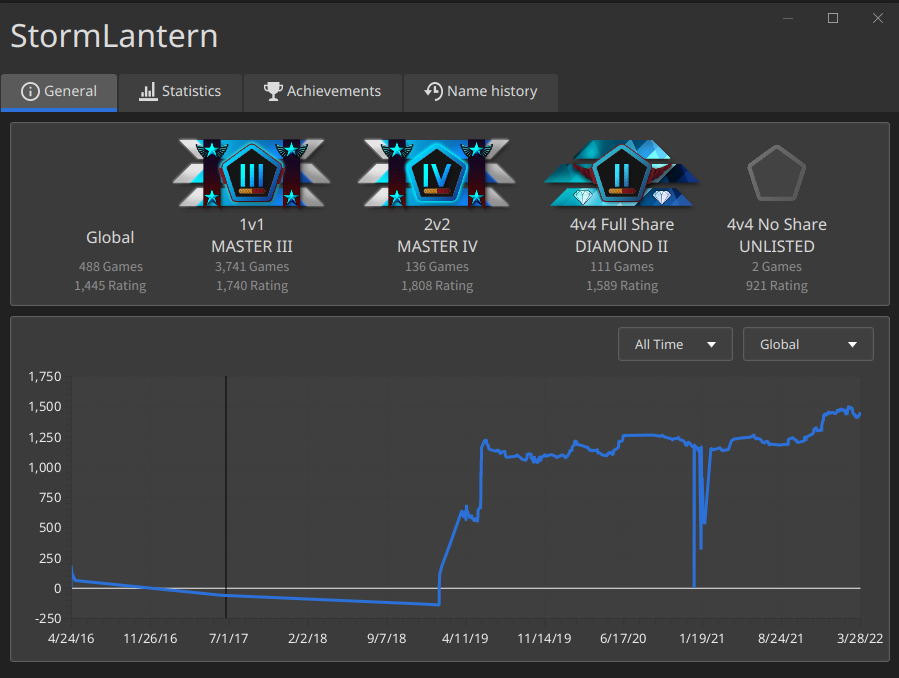
Divisions in player info window
-
The list of leaderboards is fetched from the API, so to alter the order we would either have to hardcode that or change the id of the global leaderboard. Changing the id is probably not feasible, hardcoding it is still a bit unelegant.
We were thinking about renaming global, but now that global also gets influenced by all the matchmaker ratings, it seems to be fitting again. -
@blackyps Add globe/earth icon to global rating
-
@eternal said in Divisions in player info window:
@blackyps Add globe/earth icon to global rating
Why?
-
I agree that having no icon there is kinda weird. Maybe put the placement icon on the matchmakers that the player is not in a league for?
-
I'll try to do that for the queue leaderboards, but the global leaderboard is not associated with any league
-
Not fully related to the original topic but we should absolutely the player's highest currently achieved rank like an avatar. https://forum.faforever.com/topic/271/tournament-avatars-ideas
I am not sure if it should be a selectable avatar (to be used in place of existing ones) or just in a new spot for matchmaker ranks.
This was DerpFAF's idea btw

-
I'm not sure what you mean, Arch. Can you elaborate?
In the meantime, here is some progress:

-
He means make your highest division symbol a selectable avatar in client.
-
Actually he said that he is not sure if it should be that and I am not sure what he considers to be the alternative
-
@archsimkat I think currently FAF is not supporting league avatar as selectable by user. Of course locally you have abilities to change it, but none of user will notice, as workaround devs can add switcher, that changes old avatars with league avatars for all users in client locally
-
Looks quite nice now I think.

-
@blackyps
Please keep the games/rating text white. That faded gray that you're using is harder to see/read against the dark background.Also, global should be in a line with 1v1, 2v2, etc; not centered halfway below it.
I think scaling down the division icons closer to what they were in the OP's image would be better as well.
Also, I agree with the suggestion that this would look better with an Earth image for Global, as that could look nice and more consistent.
-
It's called visual hierarchy. I can make the text a bit lighter, but it won't be white. If I put global in a line with 1v1 it floats too high. It is now visually in the middle of the leaderboard and division name of the others. As there is no league for global I think it fits to indicate that.
Why do y'all want an earth image? It's a global rating in the sense that it is affected by all other ratings. Not because it is valid in the whole world. Putting a globe there only encourages that misunderstanding. It is supposed to not be consistent with the other ratings as global has no league associated with it.