Factory models
-
I like old models better too. New ones are not doing it. It is a downgrade in terms of visuals not an improvement.
-
The new models are terrible. They look like they were deliberately mutilated by haters of aeon and cybran.
-
There are several reasons we're looking into the HQ / support factory models, I'll list them here. Before I start: note that we'll also be tackling the UEF and Seraphim factories. We just didn't find the time to do them yet.
- (1) The old HQs have no upgrade animations
Simple as that, they use the upgrade animation of the support factory and the HQ-bits just pop into vision as the factory is finished. That breaks with what other structures do and it breaks immersion for those that notice it.
- (2) The old HQs are poorly made
A lot of the assets of the base game have baked in normals and baked in ambient occlusion. If you're unaware what these are, read through these articles:
- Normal map: https://learnopengl.com/Advanced-Lighting/Normal-Mapping
- Dynamic ambient occlusion: https://learnopengl.com/Advanced-Lighting/SSAO
Note that the game does not have dynamic ambient occlusion, it is baked into the albedo texture. If you're unaware of what that is, read through this article:
- Textures / diffuse / albedo: https://learnopengl.com/Getting-started/Textures
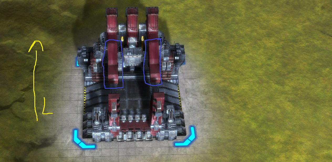
The HQs were made by improperly re-using bits of texture and mesh and as a result they look bad. We'll look closely at a few factories for a comparison.
As an example, note the light direction (in yellow) and the shadow. The light should fully lit the blue marked areas, but they're ... not quite fully lit. There's dark spots and specular lighting where it doesn't make any sense
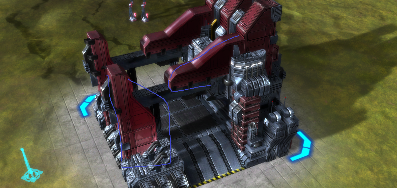
The same applies to the side of the factory, see the blue marked areas. These should be equally lit, but there's all sorts of dark areas, light areas and again specular lighting where it doesn't make sense
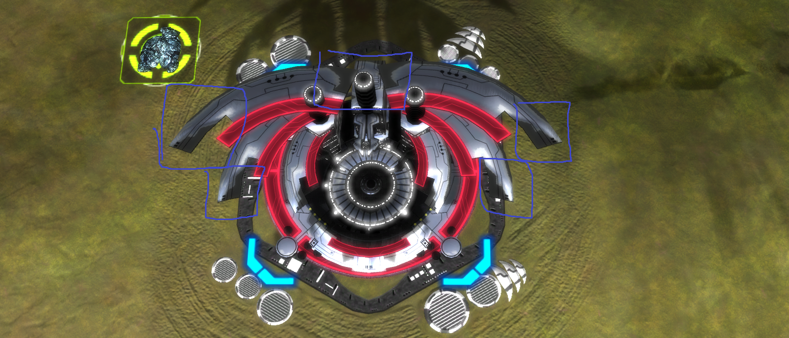
The dark bits are skewed because the normals are
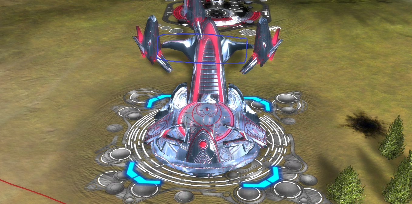
The reflection at the top is all skewed, because the normals are skewed too
Let alone the back of this mesh, which is stretched up
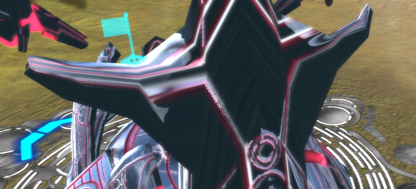
And the albedo / normals are skewed here
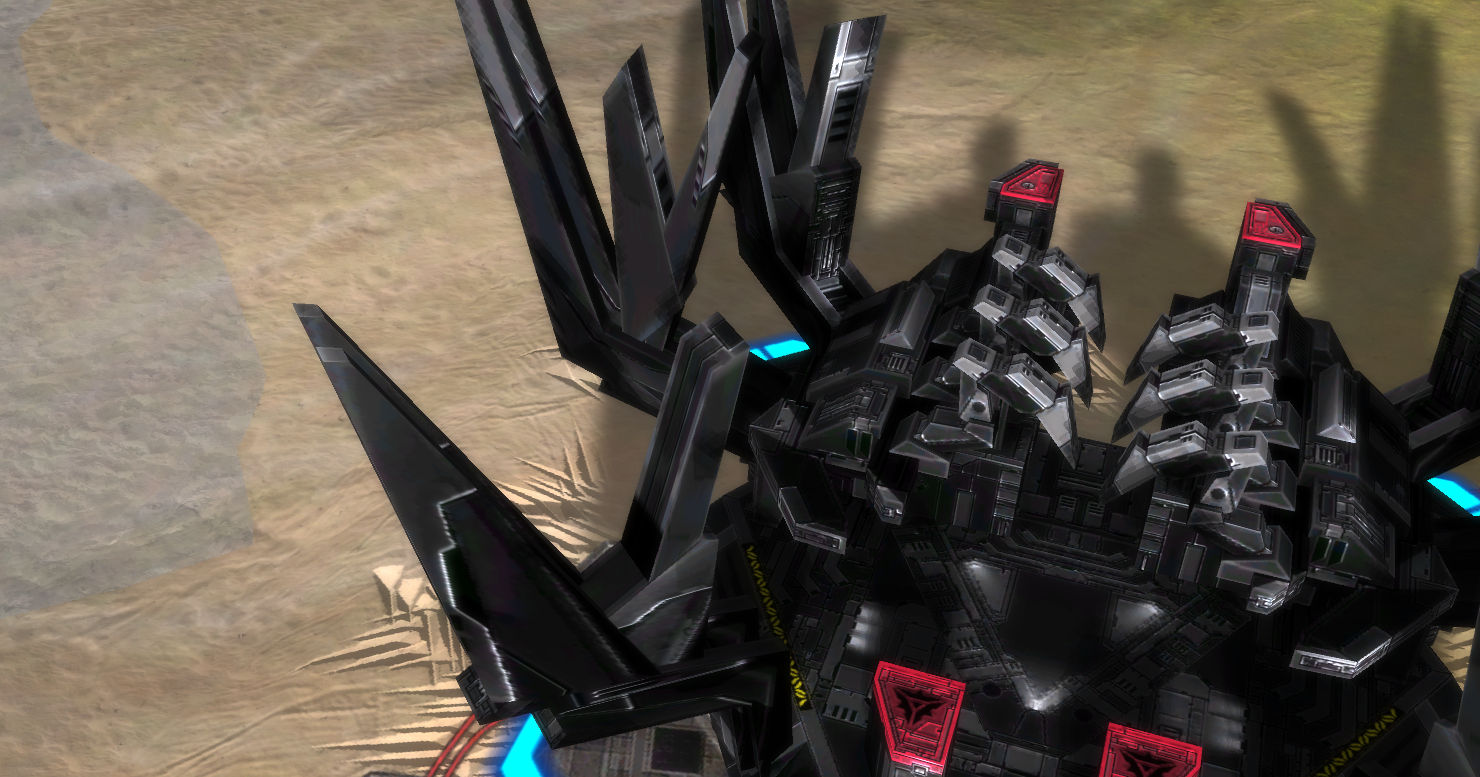
And we can't fix any of these issues because they re-use bits and pieces of the texture, fixing it here would make the model look bad at another location. All of the factories have issues such as these, which will be made a lot more prominent as we migrate towards PBR shaders.
- (3) The old HQs are not compatible with our intention to introduce PBR shaders
See also:
We've asked people, a lot has shown interest, not many turned up. And I'm not blaming them: you'd be working with old tech with no easy to understand workflow. This is an example of how a unit would look like with PBR shaders:
Left is current shaders, right is new shaders
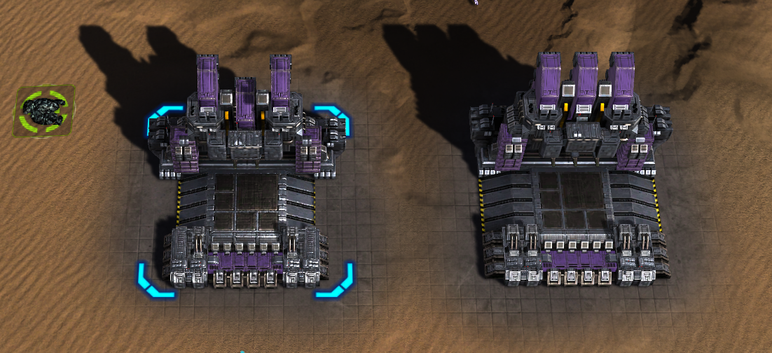
I think that it looks a lot better, and this topic is the proof that people look at the game up close. The old HQs would outright prevent us from being able to push this as they'd look bad-bad, see also:
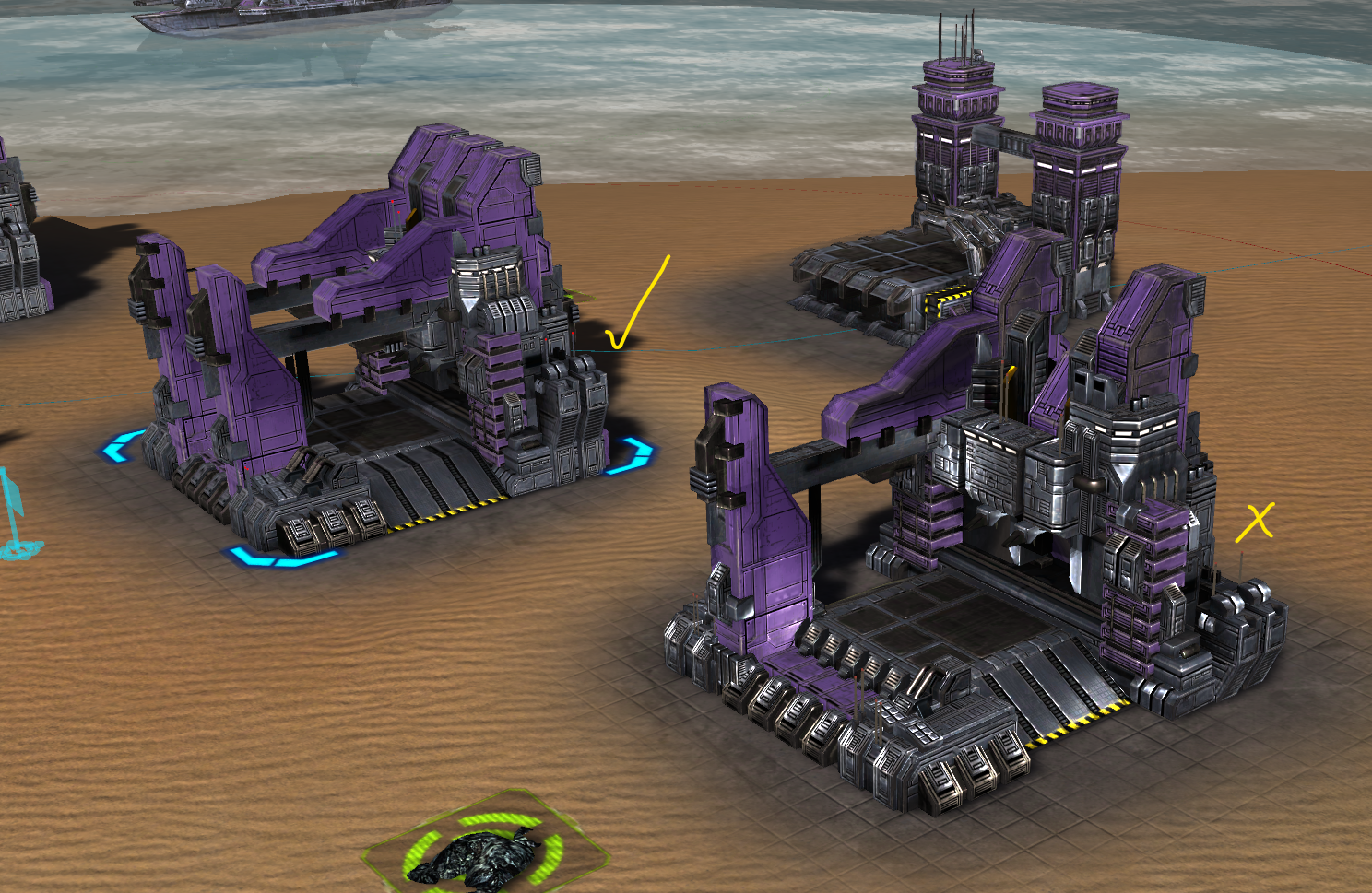
Where the same shading issues apply but they're a lot more noticeable using PBR shaders.
With all of that said - I'm not against better alternatives for factories that are compatible with PBR shaders. But it involves quite some work:
- (a) Make meshes for individual factories
- (b) Make textures for individual factories
- (c) Make build animations for individual factories
- (d) Make upgrade animations between the factories
Which can take up dozen(s) of hours to get right. Therefore we choose to take the 'normal' factory that ships with Steam FA and trim it down slightly. Not all factories have a lot to work with though. In my opinion the Cybran naval factory and all of the Aeon factories are quite good, people just need to get used to them.
And we're open to improvements. For example I agree that the Cybran air factory lost a bit too much on average. You're welcome to step up and see if you can do better.
The changes, as far as I could see, were barely communicated to the community. I found this in the change log:
"We're slowly but surely preparing the game for a significant visual improvement. [...] (#4456) Re-create the Cybran land factories. [...]

Only 16K people that looked at the topic. It was also promoted in the news hub and by Gyle.
We also have a separate discord section:
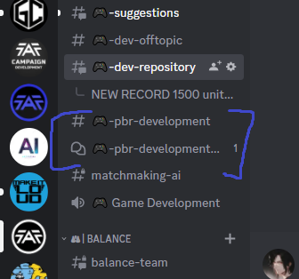
Where the forum has over a thousand posts at the moment.
-
@Ninrai it appears in your first screenshot that the support factory and the hq factory have the same mesh, that is of course not intended

-
https://forum.faforever.com/topic/5061/looking-for-help-to-edit-textures-for-pbr-shaders
This thread does not mention anywhere that the factories needed to be redesigned, only retextured. The only place I could find it was an initial idea in modding general which was complaining about the models (nothing about actual plans to change them) and then in the pbr-development (which as I assumed was about shaders development I didn't have any interest or technical skill in)
In addition, the animations on these new factories is by far worse then the old ones. Especially look at the animation for engineers rolling off the cybran t3 air support factory.
https://clipchamp.com/watch/NywNfsXUZiV -
I agree the new HQ factories are harder to differentiate from the standard factories now
However i have a solution for you, check out my HQ factory Icon mod.
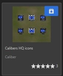
It only changes the icons of the HQ factories by highlighting in white the T2 HQs and also gives a white Highlighted crown to T3 factories.
-
This thread does not mention anywhere that the factories needed to be redesigned, only retextured. The only place I could find it was an initial idea in modding general which was complaining about the models (nothing about actual plans to change them)
Initially we thought just fixing the textures would resolve it, but:
And we can't fix any of these issues because they re-use bits and pieces of the texture, fixing it here would make the model look bad at another location.
We ran into this issue, so we had to make a decision. Which we did: we're going to need to re-think how we tackle the HQs / support factories. The models have been on FAF Develop for months and we received no feedback on the factories during that time.
and then in the pbr-development (which as I assumed was about shaders development I didn't have any interest or technical skill in)
The shaders are already complete, it is just a matter of adjusting the assets by fixing all sorts of weird issues with them. That is also the purpose of that channel
In addition, the animations on these new factories is by far worse then the old ones. Especially look at the animation for engineers rolling off the cybran t3 air support factory.
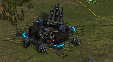
You're correct - it escaped our attention. Luckily we are already on it:
https://github.com/FAForever/fa/pull/4713
Which is the same bug that causes all the factories to look like an HQ as in the screenshot of Ninrai.
And as a side note - stating that they are 'far worse' than the old ones (while they had no proper* upgrade animations at all) and then nit picking just one example while they are 'all far worse' is ... odd
 . If they're all that much worse, then show an example of how bad each animation is right now. And don't forget to include the HQs we did not touch yet.
All factories now have proper upgrade animations, as far as I am aware at this point they all work fine except for this one build animation.
-
@Jip
I understand the desire for more lighting realism and matching upgrade animations, but it seems like the new result is less desirable than the old result for general users in normal use. There are many other cases in FAF where we forego increased realism for a better gameplay experience. I think I'd rather have the old factory versions (with or without the pbr shading) than have the new ones. I'm not inherently opposed to new factory designs, but I think this should be reverted and potential changes such as this presented more publicly in the future. If you initially set out to change the textures and tell the community that, but end up wanting to change the models as well, I think that should be shared with the community too in time for feedback.PS: A subtle problem can easily be on FAF Develop for months yet noticed very quickly on regular FAF. I think FAF Develop is played about 1% as much as regular FAF. So, while it certainly can be useful for testing and noticing things, it would theoretically take something like 300 days on FAF Develop to get the same amount of player-game exposure that something would get in like 3 days on regular FAF.
-
People are insane if they’re blaming Jip for some lack of proper communication. He went above and beyond what basically any change would do for communication as it is. The reality of FAF is that nobody cares until it’s dumped on them and even if 3 people did care, the change would get pushed anyway and assume it was just a biased sample of feedback.
-
this is a bit spewing yeah? how about you actually advertise this change and make an effort to reach out for community input. I hate to be the one to tell it to ya but most people have no interest in playing faf develop or joining the faf develop discord and that's a you issue unfortunately. However, the team needs to find better ways to survey community opinion in a way that doesn't force their preference on everybody else. You's need to remember you were voted into a position by like 10 people and have the power to upset thousands of players so how about instead of having a moan about nobody giving you direct feedback, revert the fac models, figure out better ways to reach out to the community, then go from there. Try the news page? try more regular posting in main chat in official discord?, try promoting in Aeolus? lets be honest you guys didnt make much of an effort to get feedback on the models you's just like it personally, right?
-
Funny you mention "promoting in aeolus" and "more regular posting in the official discord (that's where the development discord you think exists is)"
I actually tested out all the feedback methods available to FAF and both of these are resoundingly terrible for reaching anybody that is not a 1500+ regular user of these mechanisms. So really what you mean is "use the communication things I pay attention to and assume everyone else on FAF actually uses."
Jip went to the extent of getting it promoted on Gyle's channel. The only possible way to do a BETTER form of communication is to do a public broadcast that sends a message out to everyone on the client that they need to close out of. Doing that for a change to a model? Yeah, right.
-
Iirc Gyle told the community Jip was looking for volunteers - I don't remember him mentioning a remodeling of factories though. I did not see it having been advertized anywhere either. I did read about shaders, but I don't think that is the same as remodeling.
I appreciate the work of developers. These changes just make it an overall worse game experience imo. Identifying the HQ by quickly looking at them is much harder now - forcing the player to zoom out more often in order to see the icons.
Improving shaders only to end up forcing players to zoom out more (and hence not look at the facs in detail) seems non-sensical to me.
Not a fan of the "they'll get used to it" attitude in this case. Overall, the changes feel like a net-loss to me. -
I mean I think they're worse in terms of recognizability, but I pretty much never use the visual queues besides icons to identify HQs in games so I personally just don't care either way.
My problem is more people expecting 10x the effort in communicating than what the change actually does to the game. If this was applied to every single change we would lose a ton of motivation because there are changes put in monthly to FAF that are a bigger deal, in my opinion anyway. It's just the typical thing people always say when anything remotely controversial happens on FAF, of course people are going to be unaware of things, FAF internal communication sucks because there is no centralized platform to reach everybody that everybody pays attention to. There was even a news post about this thing that was up for a month IIRC and that still isn't enough, apparently.
Like honestly, this change is less relevant to the game than the change that was shipped with it to make terrain deforming less present, but that didn't require a weekly discord ping, a month long news post, a gyle shoutout, and some FAFLive in depth interview that was posted on the Twitter, Facebook, and aeolus did it?
-
Part of the issue has to do with the expectations based on what was communicated not matching the reality of the changes. For perspective, the structure terrain interaction stuff was posted and discussed on the forums by mid January, with pictures and details. If that level of communication had been done for the proposed new factory designs, I think the result would've been a lot clearer and there would've been enough negative feedback to prevent the factories from being changed to this new version, without so many complaints about a lack of communication. Additionally, it probably would've resulted in more feedback and more interest regarding the factory changes, and it might've even resulted in additional volunteers to make better new versions of the factories.
-
I understand that this is late, but I wasn't aware of when the designs were finalized and ready for feedback. Anyways, here's some:
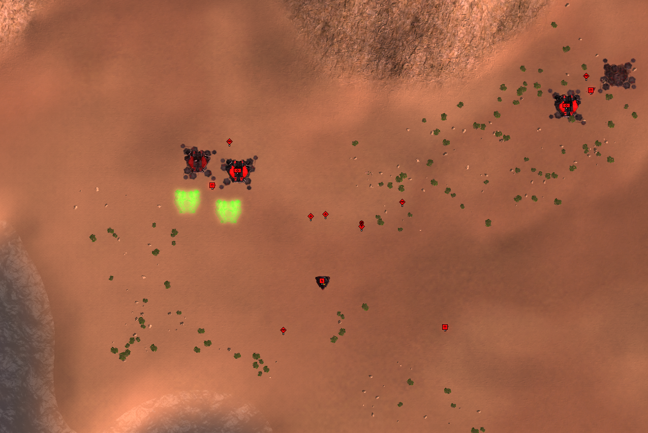
This LOD level has very dominant team colors and it looks odd.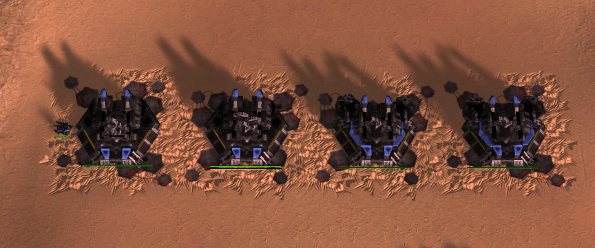
Which one of the factories is t2? The factories on the right have more visual emphasis (larger, more impressive, size), but they are significantly less powerful than the t2 support factory on the left.Ie. The t1 factory is the least powerful, it should have the smallest visual footprint, then in order: t2 support, t2 hq, t3 support, t3 hq
However I don't think the stripping away parts route is the right one, because the stripped away versions look strictly worse than the old counterparts. The worse looking models simply have a much bigger negative visual impact than the transition from Blinn-Phong to BRDF, fixed textures and tech up animations have a collective positive visual impact.
I also think that the (cybran land) factories are harder to distinguish from each other, even with the stripped down support facs.
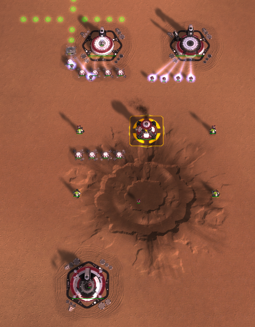
Aeon factories and pgens appear too bright. They stick out compared to other factions. The pgens look overexposed. This is probably easiest changed in the aeon specific shader since the issue seems to apply across the board (@BlackYps )
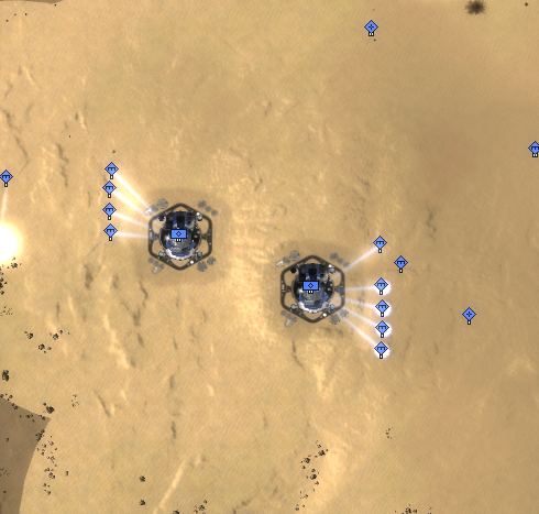
Aeon t2 support fac: this LOD level looks weird. T1 fac LOD levels look fine.Aeon facs also have the problem as cybran facs with the support fac models being stripped versions of the hq model.
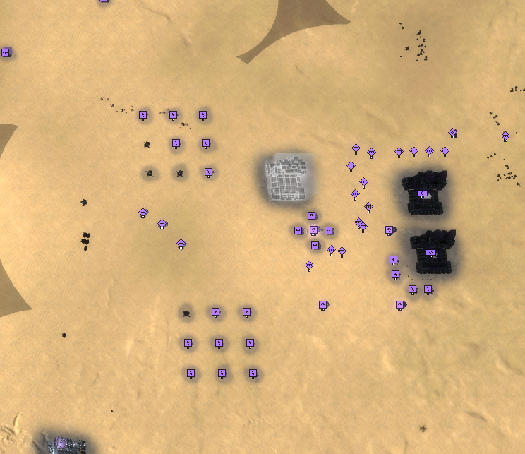
This bug (black factories) occurs sometimes when zooming from very close distance (looking somewhere else, not at the facs) to where the LOD changes. Can't reproduce 100% of the time though.
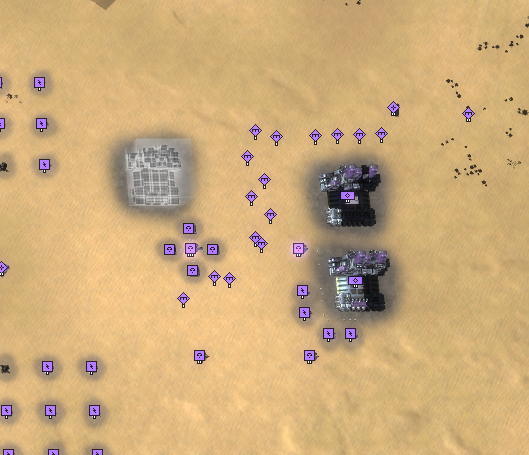
Similar issue when zooming top-down rather than bottom-up. Replay: https://replay.faforever.com/19388204As a sidenote, despite the many issues the original art was made by the pros at gpg and they look pretty damn good. I don't want to be too discouraging in saying that the change was a net negative (when playing aeon/cybran, uef looks sick), at least in its current state.
-
the new hq's are the original factories made by gpg the only changes made to them were to allow for proper anims to support facs and stripping parts away for the support factories the only real change was adding some spec team to the cybran land hq's and t1 to differentiate them
-
@jip said in Factory models:
I think that it looks a lot better, and this topic is the proof that people look at the game up close.
This is in my opinion not an entirely correct conclusion.
The thing that worked really well in terms of design for some of the old HQ factories, is a distinct change in silhouette (the outline). Silhouette is really important when designing anything, because apparently humans are specifically good at recognizing different silhouettes expecially at larger (!) distances.
Im speaking mostly about Cybran/Aeon Land and Cyrban/Aeon Air here, were the old ones were notably better in this regard. For the rest, they are on a similar level, including both good outline changes and ones were outline changes are severly lacking.
All in all i think you guys did incredible work and im looking forward to PBR, and of course my tip for designing better distinguishable HQs in the future is to think about the outline at larger distances. Of course, changing the outline is more animation work than just adding "details" (like additional arms for UEF), but that is imo what moves or would move HQ designs to a professional looking level.
-
There is a bunch of different issues to unpack here:
Communication
Yes, the pbr work in general was communicated basically everywhere. The plan to change the factories specifically a lot less. I can see that it could easily be missed. I think nobody of the involved people expected such a strong reaction to the changed models, so they got the same attention to advertise them like most other changes did.
Of course there is a certain responsibility to communicate planned changes, but there is a sentiment sometimes where people simply refuse to keep themselves in the loop, but then are up in arms that we are "forcing" unwanted change on them. That's a bit unfair. If you feel so strongly about the game, please play some faf-develop once in a while or at least read the planned patchnotes. In general we make it really easy to get involved into testing upcoming changes. Almost nobody does, so it feels like wasted effort to speficially promote all kinds of changes as the turnout simply isn't there.I don't want to dwell on who is responsible for the communication problems too much and I would rather talk about the
Factories
Yes, the original HQ models have a lot of technical issues (no animations, stretched textures etc.) and it is necessary to change them. I think during the development process we made the mistake to to conflate these technical problems with the concept of adding elements to the models. So we tried to only remove elements for the support factories and leave the "normal" models as the HQs. While it was worthwhile to explore this direction, reality showed that this is extremely hard to pull off with good results.
It has worked really well for the aeon air facs, but for others not so much.
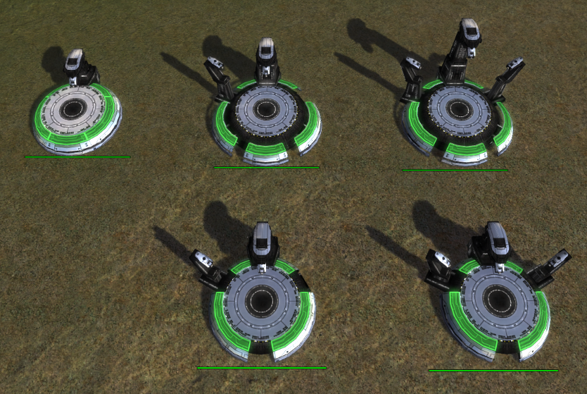
It's challenging to come up with good solutions, as we can only reuse the exisiting textures, so we have to kitbash something out of the existing parts. And it gets even more complicated because the ambient occlusion is baked into the textures. Which means when we move parts they can look out of place. However, we will still have this problem to an extend when we remove parts of the model. At some point we will have to make compromises.
I think the way forward is to experiment more with adding or removing elements to find something that works best for that particular factory. We learned from the feedback that it is important to easily distinguish the factories, so we should have an emphasize on changing the outline of the factories to make this possible. Again, the aeon air facs do a good job here in my opinion.
We should also work with closer feedback loops, as creating all these changes does take a lot of effort, so we should seek fast feedback on model ideas even before all the animations are done.
A lot of people participated here, so I expect you to provide that feedback, so we have something to work with and this situation doesn't happen again in the next patch. -
The reasons of the changes were:
(1) The old HQs have no upgrade animations
(2) The old HQs are poorly made
-> "HQs were made by improperly re-using bits of texture and mesh and as a result they look bad."Correct? It was a mere cosmetic reason? Even the animations do not matter that much, yeah (I say that as a sucker for animations)?
In other words: what would have happened if you had not changed the HQs/factories? People like me who zoom in to the max would be like "hm, texture seems off when looking up close"? Is this the reason, the motivation behind the change?
I think in 10 out of 10 times I would prefer a super easy to recognize factory - no matter how clumsy the ONE TIME animation - for the rest of the game over a shiny new perfectly aligned model which makes me either zoom out in order to see an HQ icon or get frustrated and annoyed with the game for missing the HQ when looking up close.
It's as if the Cybran ACU looked almost identical to the Cybran SACU models. Total nightmare trying to click on the right unit when zoomed in (kinda like finding the ACU icon when SACU icons look the same when zoomed out).
Maybe I am missing something bc so far I fail to see the trade-off working in favor of this change.
My ideal solutions would be:
- leave the old models but with new shaders (not sure if that works)
- new shaders with newly build models (looking like the old ones - not sure if/how that works)
- roll back the changes/allow for players to play with the old models
@blackyps said in Factory models:
If you feel so strongly about the game, please play some faf-develop once in a while or at least read the planned patchnotes.
I cannot remember a visual change that was THIS drastic. I think what you ask for would work better if there was an initial kick-off making this a hot-topic. I do read patch notes, but did not see this piece of information since it was "lost" in a t4 level wall of text (which reflects the hard work you guys do!):
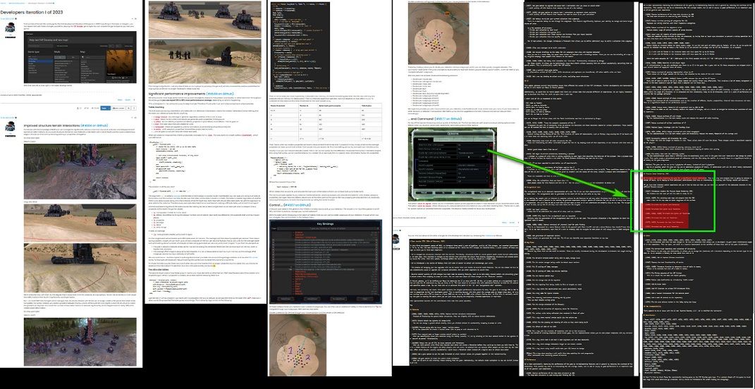
I read the initial notes - and saw all the images about the terrain. I think such drastic changes to models would be easier detected when getting a top spot when presenting planned changes. This time, it was put almost at the end of the list.
-
I think this is just a case of a well intentioned improvement going the wrong way. I saw the pbr shader posts and all but it didn’t mean anything to me and I would not have known it would lead to this outcome like many have expressed their dissatisfaction for. Sadly we can’t judge the pudding til we taste it… The question is what should be done now? Make the pbr shaders into a mod like RKX explosions for those who like it, or force people to make a mod to undo it who don’t like it? What about ladder players who don’t have the choice to play modded games?
I think ladder players are not concerned about shadows looking nice while playing but do care if they can tell an HQ apart from other buildings without having to use yet another mod that highlights HQs… -
 J Jip referenced this topic on
-
 J Jip referenced this topic on
-
 J Jip referenced this topic on
-
 J Jip referenced this topic on
-
 J Jip referenced this topic on
-
 J Jip referenced this topic on
-
 J Jip referenced this topic on
-
 J Jip referenced this topic on
-
 J Jip referenced this topic on
-
 J Jip referenced this topic on
-
 J Jip referenced this topic on
-
 J Jip referenced this topic on
-
 J Jip referenced this topic on
-
 J Jip referenced this topic on
-
 J Jip referenced this topic on
-
 J Jip referenced this topic on
-
 J Jip referenced this topic on
-
 J Jip referenced this topic on
-
 J Jip referenced this topic on
-
 J Jip referenced this topic on
-
 J Jip referenced this topic on
-
 J Jip referenced this topic on