Jip's maps and others

I figured a lot of people just think "I want to make a map for this video game" without understanding that it is a very difficult and complex game design problem with dozens of different factors to consider. I don't think being good at the game or playing in tournaments has much to do with being a good game designer. I could try making a checklist but I don't know how much good it will do because people on FAF are constantly disagreeing with even the ideas I consider to be the most simple and least controversial. This is partially my fault since I am at times trolling about things and other times very serious and people do not know the difference.

I am so passive-aggressive about it because I've spent years playing maps on ladder that I do not think are very good. It seems like anyone can throw together a map with little effort and it is guaranteed to go into the pool and I am forced to play it for months. I feel like the people choosing maps don't know what makes good maps, the people making maps don't know what makes good maps, and the players don't even know what makes good maps. There must be some level of standard game design principles that can be applied to judging maps so that maps with unclear mechanics, too much complexity, or have nothing valuable to offer can be excluded.

I think you spend a lot of time on your maps and try to consider most of the things you should be considering, more so than most other mappers, and I appreciate that. Mauve happened to become a particularly unfriendly map to play due to the multiple inconsistent and "hidden" edge building locations, the complexity introduced by civilian structures in middle, hostile flak next to the base, the large amount of tree group reclaim that needs to be incorporated into the build order, and unusual mex layout in general. All of these factors combined means a player will often not understand the map or severely mess up their start and be out of the game. I think it would be a good practice to limit yourself to just a couple of these things per map rather than including them all in one map because it quickly becomes overwhelming. (don't include edge building, significant tree reclaim, civilian bases, hostile units, and weird layout all in one map, just pick one or two factors).

All of this only applies to ladder maps which are made for competition and players are forced to play them. If people want to design maps outside of a ladder context then they can do literally anything and I will not be bothered by it.

@ludmilla

About your first paragraph: I think you're right. That is exactly how I started making maps. I'd still love to have that checklist, not because people may or may not agree with it but because it can provide perspectives that a (novice) map maker may otherwise not be aware of. A few examples that I learned the hard way:

  • Water deeper than 25 units is unpassable for amphibious units that walk across the ocean floor, like (sub) commanders.
  • Tech 1 artillery tends to not fire when it is on a slope.
  • Tech 1 artillery tends to be poor at firing at something when the height difference is significant (see also this post).
  • Terrain that is bumpy is aesthetically nice but terrible for gameplay.

And these are silly mistakes that are obvious after they have happened - but then it is already too late and you (as a ladder player) are going to have to deal with them for the remainder of the pool rotation.

About your second paragraph: I understand. This is a common issue in development overall: being a good player doesn't indicate you are a good designer. Or, being a good artist doesn't indicate you are a good designer. They are different jobs for a reason. I don't have the source at the moment but I recall some interview with StarCraft players that were asked what they thought was good about the game or could be improved. In general their suggestions were terrible, causing all kinds of inconsistencies. And I think this is what you are referring to here too. With regard to the design principles: again, as with the checklist, I think it is a solid idea that certainly deserves a pinned post on this forum.

About your third paragraph: thanks. I can only add that Mauve was a bit of a special map. It originated from this topic where the idea was that the community could provide feedback on the designs provided. In general the idea was that some design principles may see the day of light as people would discuss various the designs and adapt them. However, as you can see, that discussion did not really trigger and that is reason B of my previous post. It is on general difficult to get the expertise together for not just making maps, but also for learning about what makes a map good for a certain audience.

And last but not least: people want their maps in ladder / TMM because that is the only place they will get any plays at all. Regardless whether the map was aimed for a competitive audience. The custom games list is dominated by roughly five maps and if you decide to host your own then you could easily wait more than an hour to get a lobby going.

A work of art is never finished, merely abandoned

community could provide feedback on the designs provided. design by community almost never works out

Vault Admin / Creative Team / Map Guru

Yeah - that was my point 🙂

A work of art is never finished, merely abandoned

@Jip Not sure if this is something players need to deal with or something for the mapmaker...

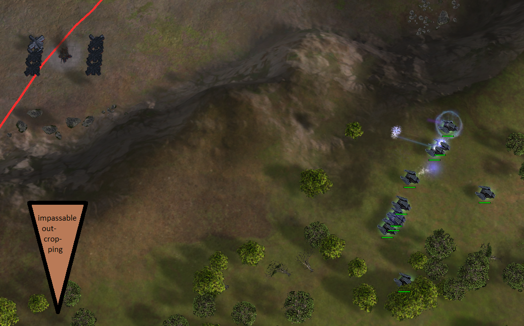
So this is just for your consideration. Feel free to say "L2p nub" if you disagree. (Picture made in sandbox)

Mauve attack move.png

It bothers me that T1 tanks can get indefinitely stuck if you execute an attack move around the center on Mauve. Ideally the terrain would have an impassable outcropping so that (T1) units that path around the center never get into a position where the structures are in range. However, units can still get into range of the center if deliberately moved to the edge between outcroppings.

Interesting issue. I think you could take it into account when designing your map. It is something you don't want if it is in the center for example, as in Mauve. But I'd say it is also on the player: you could navigate them less close to the edge or not use attack move.

edit: especially because now there are neutrals there, but it could've been a mass extractor too.

A work of art is never finished, merely abandoned

@jip said in Jip's maps and others:

Interesting issue. I think you could take it into account when designing your map. It is something you don't want if it is in the center for example, as in Mauve. But I'd say it is also on the player: you could navigate them less close to the edge or not use attack move.

edit: especially because now there are neutrals there, but it could've been a mass extractor too.

After playing Mauve a few times, I did learn that, maintaining some distance or using moves. However, the first few games on this map had some frustrating moments. It may improve the player experience if there are fewer of these pitfalls, but it is primarily the players responsibility off course.

Well - it is a bit of both. If a map requires too many specific things (like Thomas hinted to) then I think the map is trying to do too much.

A work of art is never finished, merely abandoned

I've made a small mod to make creating cinematics easier. It is a UI mod and it can be found in the vault with the name 'Cinematics'. It is a UI mod that can be enabled before you start a replay.

Feedback on what you would like to have is welcome! If you have issues or feature requests you can either report them here in this topic, or report them on Gitlab: https://gitlab.com/supreme-commander-forged-alliance/mods/cinematics/-/issues

edit: A quick example to show what it can do:

A work of art is never finished, merely abandoned

I have been having a lot of fun on Rainmakers as single-player, it is quite a challenge! I have to set the settings low and then turn the speed down, there's just so much to do. Absolutely my favorite survival map. Also great to see the cinematics mod, I'll try it out soon.

Find myself coming back to this thread to just look at the pictures. Imagine if these maps were the standard! Truly excellent work!

Thank you for the appreciations!

I've updated the Cinematics mod:

  • You can now close the window and it remains closed.
  • It uses the Dear Windowing library for creating the UI, more about that in a bit.
  • You can ignore the decal LOD via hotkey
  • The UI is adjusted and a tab bar is introduced for easier navigation.

A lot of the work done is 'under the water' specifically in creating the Dear Windowing library. It allows for an intuitive manner to creating UI such that you only need to focus on what you want to be seen in the UI. All the layout is done for you by the library.

Introducing a new mod: Dear Windowing. As mentioned above it is a library that should make it easier to make small UI mods and / or debugging mods. Currently a lot of the debugging is done through the console or by renaming units. It quickly becomes quite cluttered and hard to track. the library is based on Dear ImGui and it attempts to have similar features within the scope of Supreme Commander.

A work of art is never finished, merely abandoned

Updated the cinematics mod:

  • You can now adjust the Field of View (FOV) and Pitch of the camera at a near and far altitude.
  • Minor bug fixes.

Changing the FOV / Pitch is permanent and I have not found a way to not make it permanent. Make sure to reset the camera before you join an actual game (CTRL + 1).

Updated the Dear Windowing mod:

  • Supports Ratio-charts
  • Supports callbacks on sliders (for cinematics mod)
  • Supports colored text
  • Full Visual Studio code-snippets support (copy the .vscode folder to your workspace)

With thanks to @chp2001 for sitting down for a test session yesterday. Examples on how to use the Dear Windowing library to help make the UI for your mods are up next.

A work of art is never finished, merely abandoned

Updated the cinematics mod:

  • Refactoring of how the model part of the Model View Controller works.
  • Added panning: you can slowly pan the camera in a direction
  • Added spinning: you can slowly spin / zoom the camera in a direction
  • Added selection box toggle: disable selection boxes
  • Added ignore decal LOD toggle: allows decals to be always rendered
  • Added shadow LOD / resolution slider: allows you to tune the shadows of the game
  • Added ease in / out toggle: allows you to disable the 'smoothness' of the camera (aka, bezier or linear interpolation)

The last toggle doesn't always appear to work - I don't why at the moment.

Updated Dear Windowing library:

  • The docked-left window now scales dynamically with the content.
  • Added a button element.
  • Added a checkbox element.

More SoonTM, I need to practice ladder first 🙂 .

A work of art is never finished, merely abandoned

@jip I downloaded your mod, but I don't have the mod's console menu running on the replay Hello. What am I doing wrong? Can you please tell me how to install the mod correctly. And on what keyboards do different functions of the mod work.

If you are referring to:

  • Battle Royale
  • Cinematics
  • King of the Hill

Then you need the Dear Windowing UI mod and you need to enable it separately.

A work of art is never finished, merely abandoned

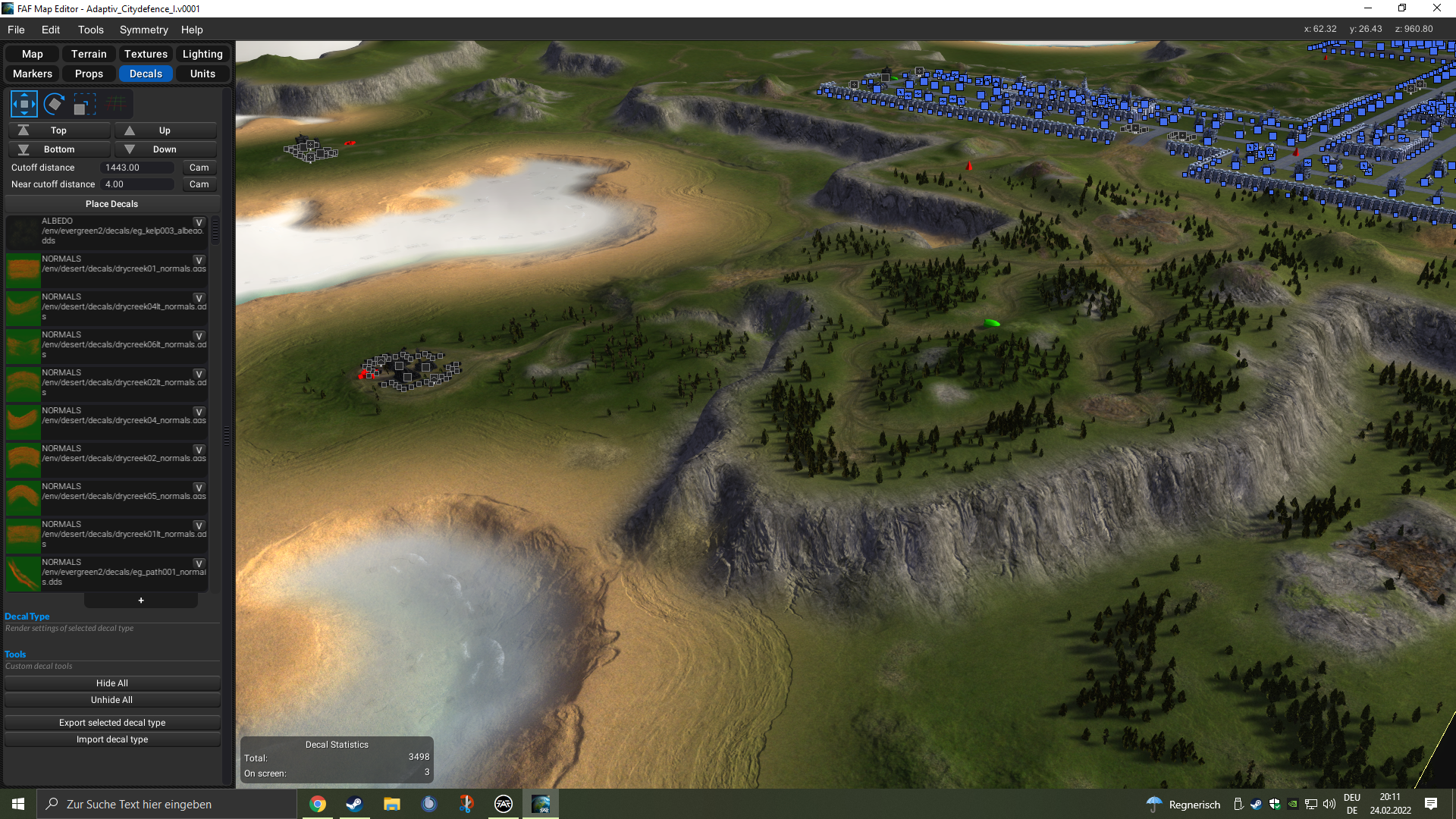
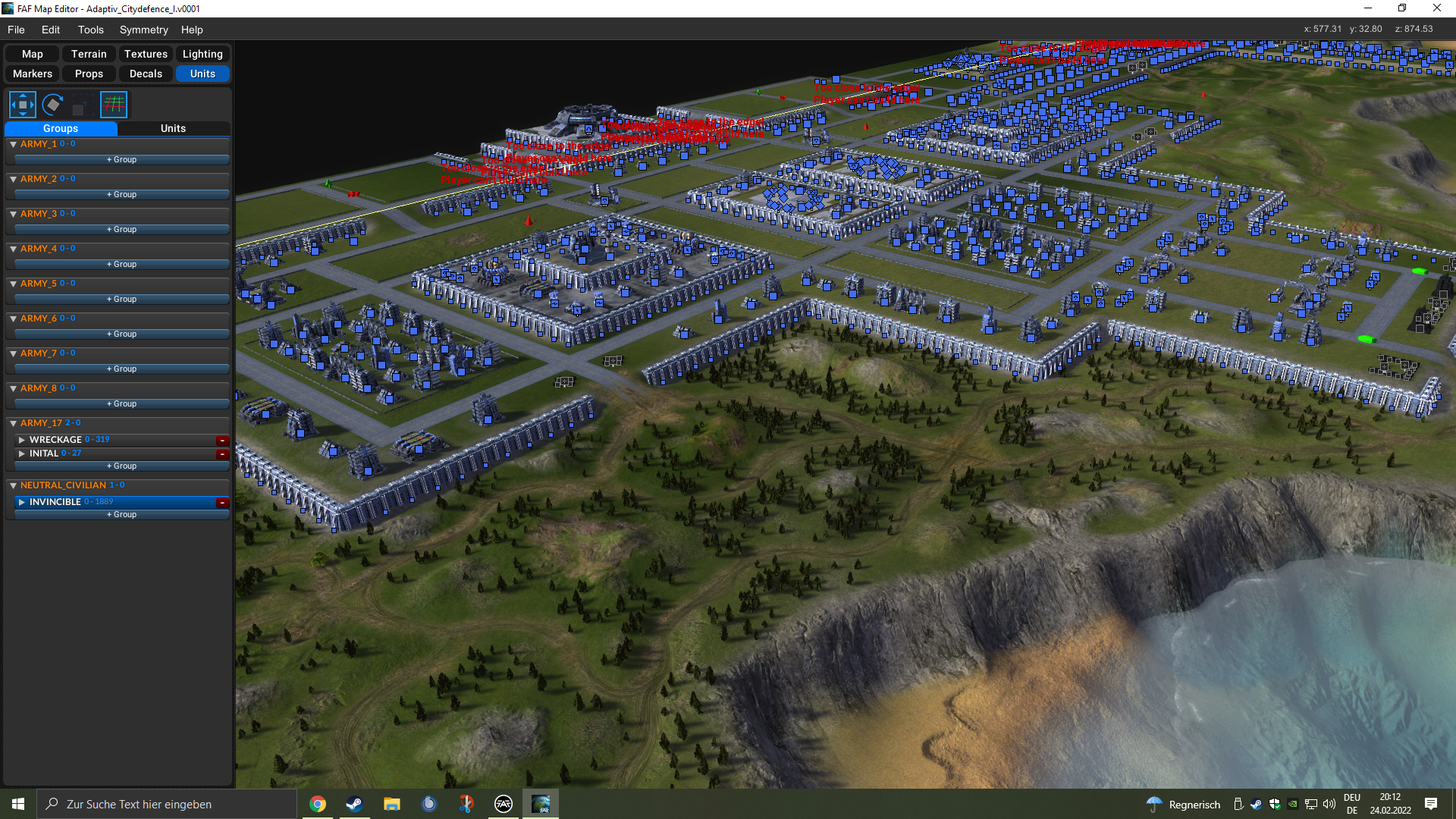
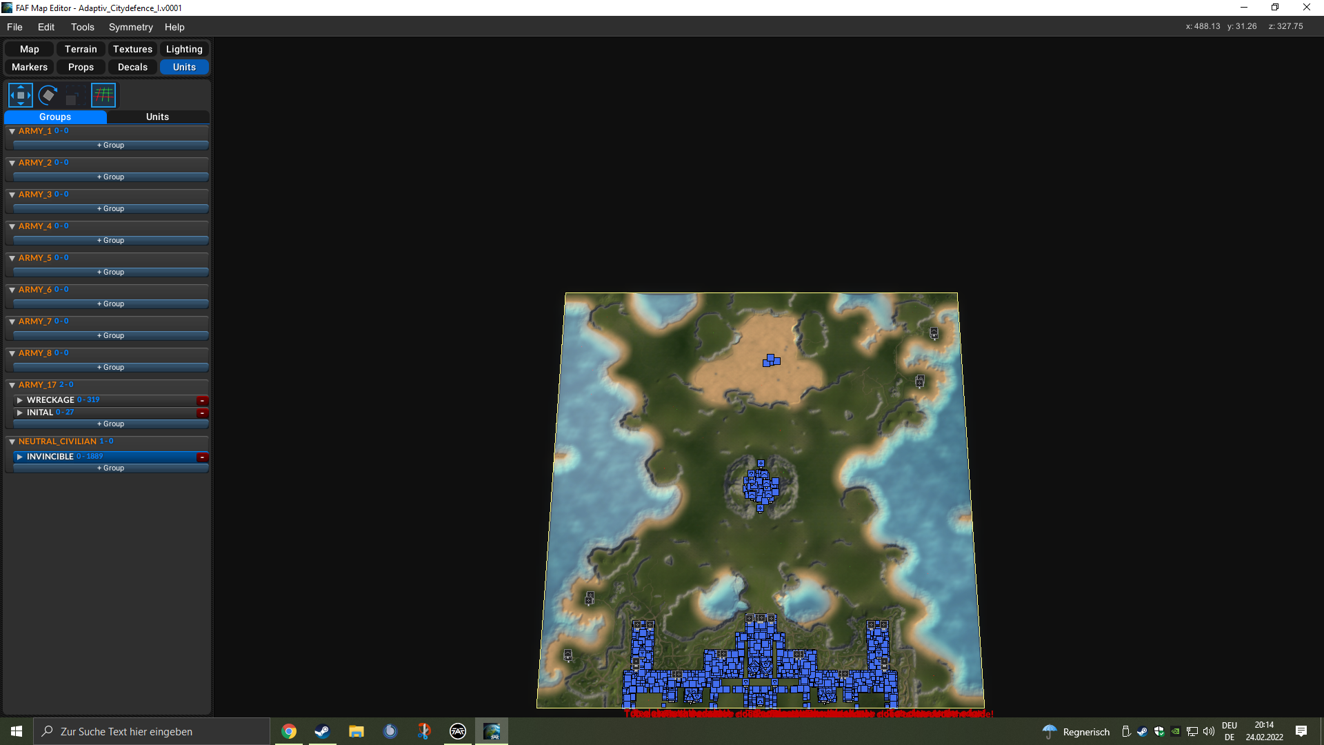
Hi Jip, I find it shocking how good your cards look. WOW I'm working on a team map that's about defending a city. Only I read in the post that no more than 3000 decals should be used in a map. Unfortunately, my card is only 25% complete and I already use 3400 pieces. The map is 20x20 in size. 8a765980-88ea-49d1-a575-3840e55ddf5d-image.png bc5016d2-a051-4ad7-b479-b4c998e664f5-image.png 2e8b6127-17ad-4acc-be9d-b26056f87576-image.png
can it still run properly despite the decals?

Yes - it is important that no more than ~ 500 decals are rendered at once, your map can have a lot more. Therefore make sure to set the LOD cutoff of the decals accordingly.

edit: looking great, especially the second image 👍

A work of art is never finished, merely abandoned

Oh ok, thx and thx for your work