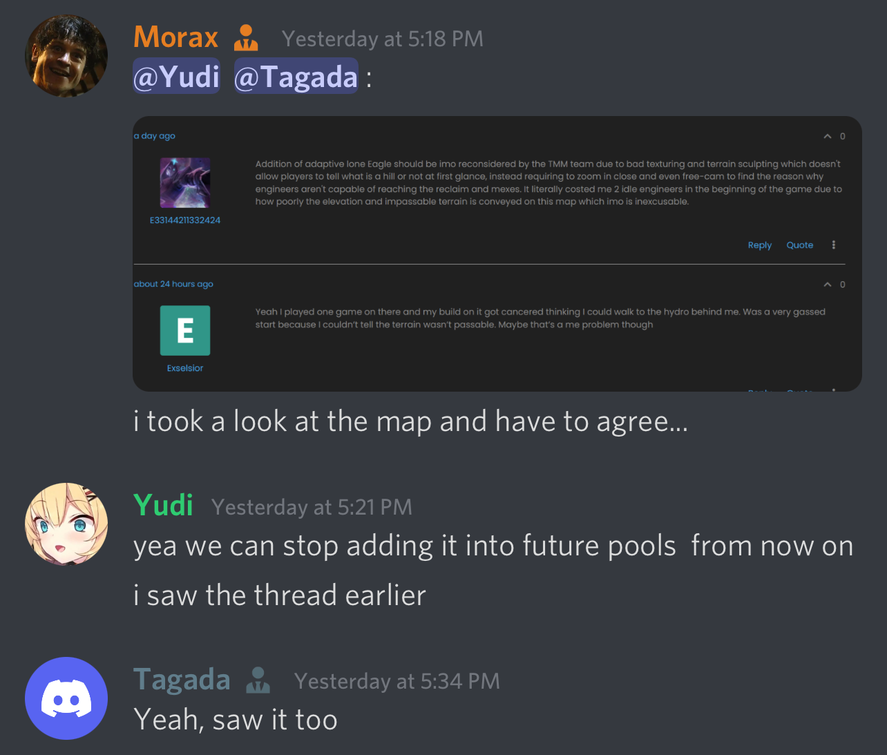
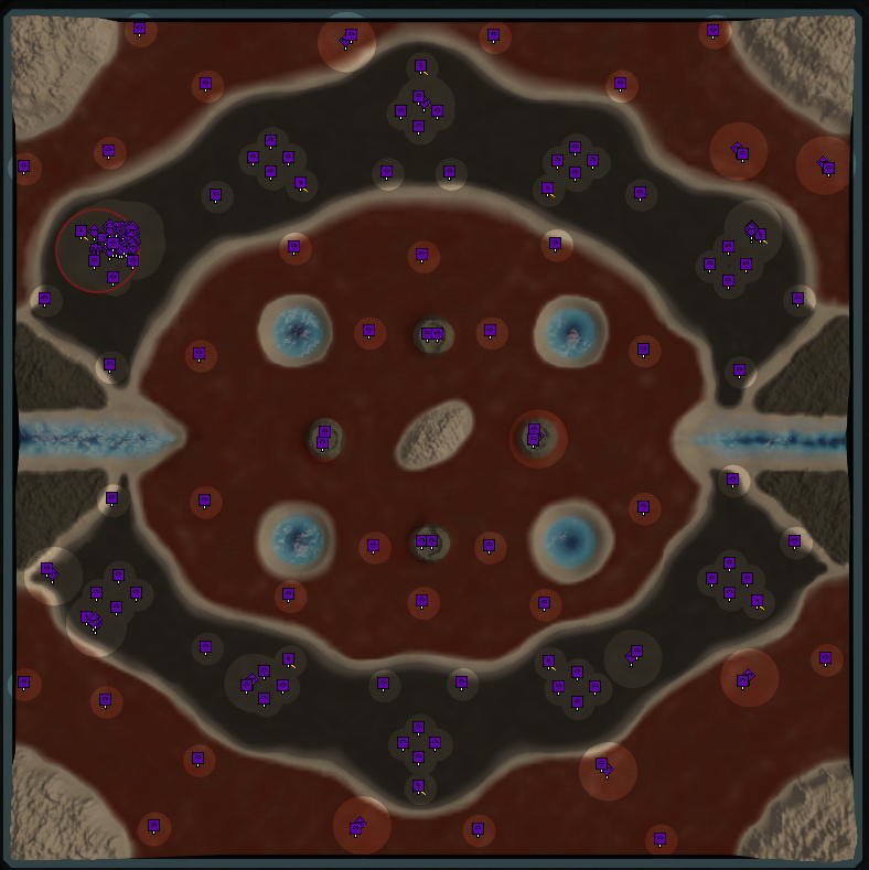
@E33144211332424 @Exselsior FYI:

We will be removing it from future pools until the author updates the map.
@E33144211332424 @Exselsior FYI:

We will be removing it from future pools until the author updates the map.
The Bjarg map is not one i like, very misleading unreclaimable wrecks that should be removed from the map, or map removed from pool
that's just part of the Maps aesthetics it take you 1 game to know that certain wreck arent reclaimable + if you just one quick Ctrl+shift you can clearly see that they have no mass value
"The needs of the many outweigh the needs of the few" - Spock
No other map I have ever seen has this. It is just needless, unfriendly and unintuitive. Seems very silly to introduce this mechanic for a single map. The it takes 1 game argument does not hold up.
There was a large amount of feedback regarding visuals of the map being difficult to read as well, so it likely won’t be in folding pools until it is updated a bit.
I will mention this to the author as well.
I would enjoy a reduction of the percentage chance that I get a map gen pool map whilst searching in the competitive mode, I have been experiencing, through bad luck or whatever other factors are at play, 3/4 map gen matches in succession. Seems a bit much. I thank you all, much love
Hi, was playing 2v2 ladder and got the map Xellaria. The map is way too dark to play on and is really difficult to see the terrain changes. Also with fog of war and radar pings it basically blends into the background, When the game ended and put us into obvs view it was actually a lot brighter and easier to see. any chance it could be made to that light level permanently
sorry, just seen the map is already being removed for next pool ect
@xerxesgrondnoob said in Matchmaker Pool Feedback Thread:
I would enjoy a reduction of the percentage chance that I get a map gen pool map whilst searching in the competitive mode, I have been experiencing, through bad luck or whatever other factors are at play, 3/4 map gen matches in succession. Seems a bit much. I thank you all, much love
So I have been playing ladder quite a bit recently and have not noticed this, myself. 3/4 matches sounds really, really high. Has this issue persisted for you?
@dukes said in Matchmaker Pool Feedback Thread:
Hi, was playing 2v2 ladder and got the map Xellaria. The map is way too dark to play on and is really difficult to see the terrain changes. Also with fog of war and radar pings it basically blends into the background, When the game ended and put us into obvs view it was actually a lot brighter and easier to see. any chance it could be made to that light level permanently
sorry, just seen the map is already being removed for next pool ect
UPDATE: When was this map in the pool? I do not see it in any pool within the past few months??
Just checked and yes: it is absolutely awful to look at the very dark textures... I will make a note to the team and reduce its aesthetic score until addressed so it does not show up again.
Thank you for your report.
Just had a game on Moonlight swamps. Very dark texture, so it's impossible to see the height differences, and also that there's a lake in the middle. Checked the reclaim, which is imbalanced under water, and also not symmetrical on land.
How often is the maplist changed? I've noticed a lot of variety lately, including quite a few maps I've never even seen before like Adaptive Fate and Adaptive Sin. Also Salem Bay is pretty neat, wish that came up more.
That said, I had a match on Re Requisite FAF Version and honestly wouldn't mind never seeing that map again. Way too much for a 4v4 and way too much empty space. Such a slow and boring map.
I thought the map list for 4v4 had 15x15 maps for the generated map? I just got a full-on 20x20 map (Corner spawns). Are there weird settings for the map generator? The map I got was on neroxis_map_generator_1.8.5_zsjc2pa7g4kpm_baia
Coincidentally, I never want to see a 20x20 corner-to-corner map again 
i can attest to not being able to easily tell moonlight swamps had a lake in the center, i know its kind of in the name but it doesnt look like one.
has there been any conversation about a veto system? i know there are maps in every pool that people dislike. cant avoid them forever but i think a properly implemented system would help mix up the variety a bit, especially in 4v4 where the <500 rating maps are more likely to be selected in the 0-1000 brackets.
sidenote; i didnt see pina coladas in the june 4v4 map pool post, but when i logged in and looked at the map pool it was there. was kind of annoying when i was hoping that map would be pulled this month. im sure its a great map with plenty of options at higher ratings, but <1000 its nightmare.
thank you to the matchmaking team, i deeply appreciate the efforts made into making this all work. been enjoying learning a game i never bothered to learn. just wish it was more populated so us americans didnt have to be up so early for some TMM games. looking forward to future adjustments.
Been conversations about vetos since 2014. Pina Coladas is trash at high level, I thought it was there for new players 4head.
hopefully vetos can find its way in at some point. i cant fucking stand pina coladas as an ~800 4v4 player.
In the 2v2 pool, Therum is way too dark to see.
I've enjoyed 5v5 Pina Coladas but 4v4 is horrible. If the opposing team's player knows how to play when he doesn't have an opponent in his channel, and your team's player doesn't, the game's over at the start.
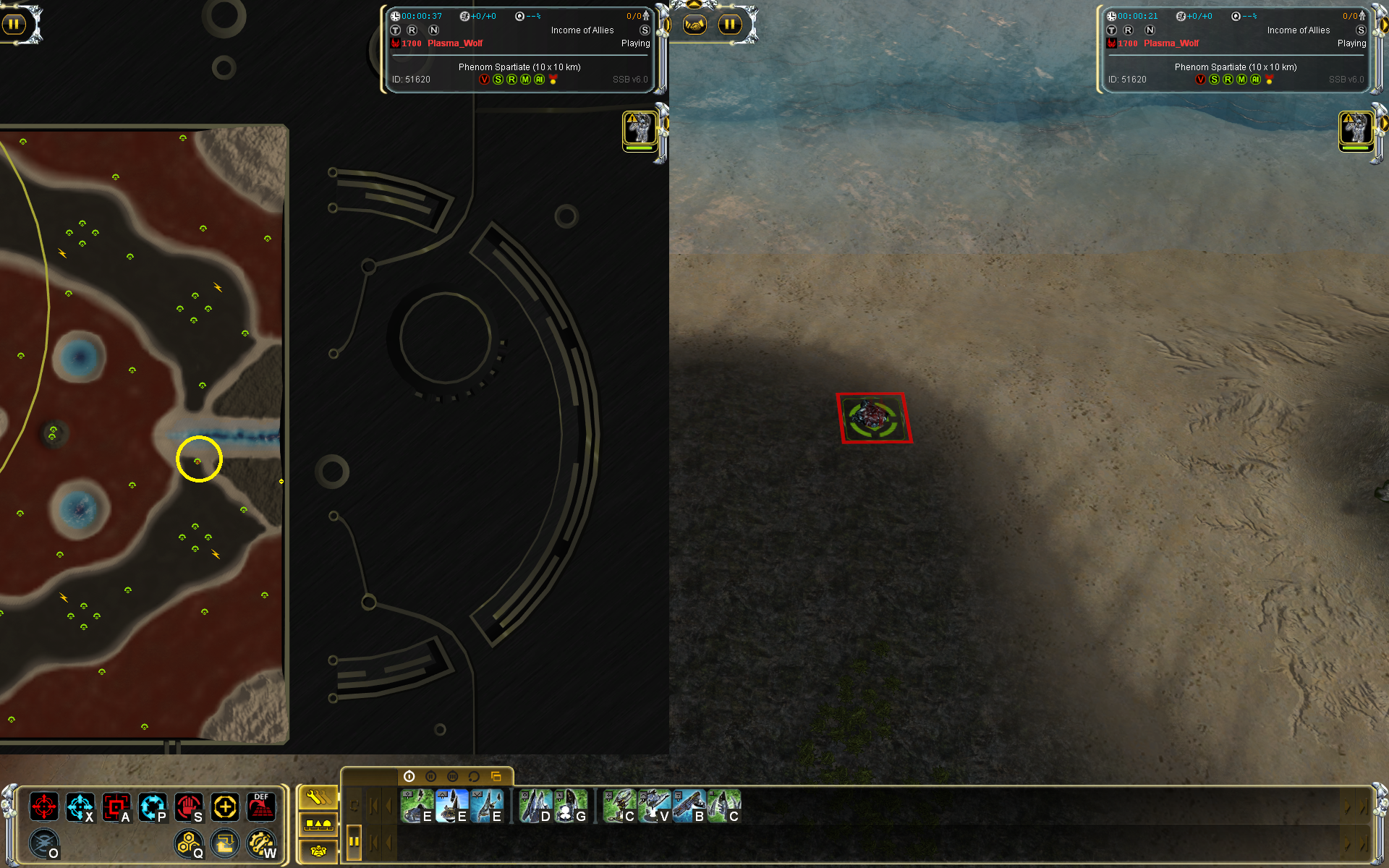
Edit: Phenom Spartiate is imbalanced with the mexes. There is one mex that is not placed symmetrically (might be more, but this one can be noticed right away).
Left, just above the line of water, vs right, just below the line of water. The one on the right side is placed closer to the water and can't be built because the hill is too steep.
Overall, Phenom Spartitate is not symmetrical in the textures, so it's very difficult to judge if the mexes are placed symmetrically, but I've got the impression they're bad.
(The mex icons are also not aligned to the build grid, but this is just visual)
@plasma_wolf Thank you for your feedback. I kinda forced therum into the pool despite some voices in the team pointing out it is too dark. I did not want to neglect this artstyle completely but I guess many peole dislike dark maps. Not completely sold to not include them at all anymore but the counter evidence is piling.
I didn't know phenom was asymmetrical despite playing more then 20 games on it. I would assume that it is not game deciding.
I'd put Phenom in the category of game-breaking because of the mex that can't be built. It's mirror on the other side of the map can be built. Other than that, the asymmetry is not noticeable until you take a careful look at it. So the only things that need to be done is to relocate the mex that can't be built, and align the mex icons to the grid.
As for Therum, maybe some trick in the lighting settings could change it. Other than that, a change in the map textures should do it. With more visible terrain, the map can definitely work (both as 2v2 and 4v4). Depends on if the map author is willing to do this (if they're still around).
You guys gave me a cold sweat about the tourney map pool. I have no problems building every mex on phenom?

Sorry, I haven't checked this for a while. Which version of Phenom do you have? The current version in the map pool for 4v4 doesn't allow this mex to be built:

This map is 'Phenom Spartiate', marked as v3, has this unbuildable mex, along with all the misaligned icons that make it annoying.
The other map is 'Phenom Spartiate v2', which is marked as v4. That map is ok. But the map in the map pool is the one where it's all wrong.