Redux Strategic Icons
-
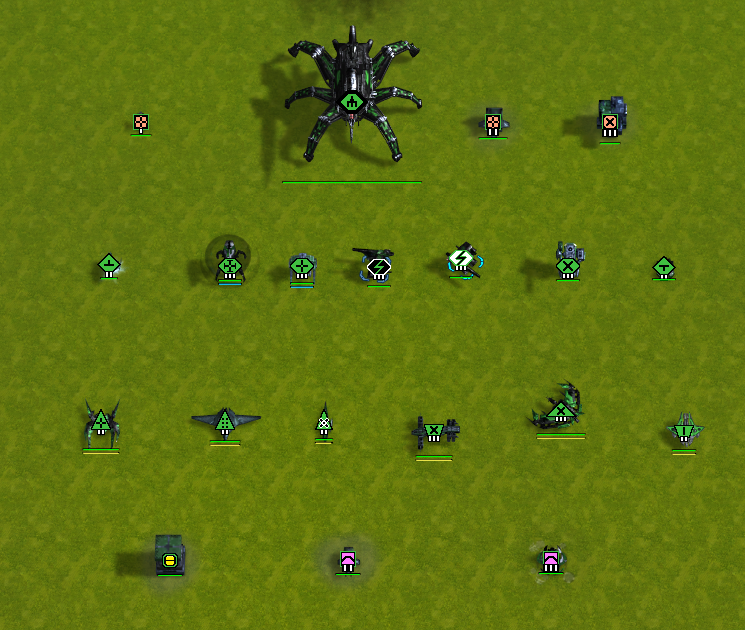
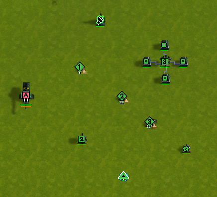
Slight changes with a few more unique icons added. Default FAF, and larger sizes.
Unfortunately the larger unscouted icon sizes via Advanced Strategic icons.nxt is longer allowed, but you can still use it in offline mode, just not on the FAF client. So I've left those in the zip files.


Readme instructions are in the download.
The Following includes versions with black and white selection icons, if you want to distinguish unit selections even more. There are two variants each for Default and 2k sizes.
Black and White EditionEasy enough to experiment with different combinations by moving versions around.
Icon mods don't always seem to load the first time you select them. Usually closing and reopening does the trick. I have seen where selecting the icons in offline mode works, and then you have to repeat the procedure in FAF client before they start loading there.
I've been asked by a couple of people if they can use my icons. I have a feeling most are only interested in the ACU icons. Consider this a blanket authorization to whoever wants to use them.
-
Any time someone posts an icon set, they should include at least one picture. A screenshot or a picture listing out various icons. Show us what they might look like in-game. You can't expect people to download and install icon sets just to find out what they look like. Ideally there would be a side-by-side comparison shot showing what your icons look like against some other set (against default icons, against "Advanced Strategic Icons" if you're competing with that set, etc.). And maybe at least 1 sentence describing the theme behind your icons. As in "same as the default icons, but scaled in size" or "StarCraft-themed icons" or whatever. All I know about these icons is that they are the MacDeffy re-dos and they come in different sizes.
-
The fact that each faction gets their own ACU icon is very cool
-
I obviously didn't install properly because the only thing that works for me is the SACU icons lol. I'll figure that out (I hope lol) but what I don't like is that they are outlined in white so it appears as though they are selected when they are not. NIce contribution nonetheless. Thanks for spending the time on such a thing.
-
This post is deleted! -
Yes. I've had the same thoughts as well. It's somewhat of a carryover of how ASI did it, and it does make them stand out, but perhaps i'll mock up an alternative.
You should download the mod from the mod vault for the rest of them, and enable them in mod manager. If you copied over the files already, you still have to enable them like any other mod.
-
Reworked, and reuploaded. You can see some of the changes in top post.
-
These icons are great! And the best set for 4K in my opinion

I'm curious - why do some of them (like the T1 PD and AA structures) have colours in them which are separate from the player colour (as can be seen in the images at the top)?
I find that concept a little confusing, I prefer a 'colour = player' consistency so that I have less to think about when playing.
I looked into the .dds files in the mod folder to see if I could tweak them myself, but the icons don't seem to have this colouring directly in the files - at least not when opened in Paint.NET, so I'm not sure what causes them. -
this is partially preference. I prefer to be able to see Antiair and Point Defense at a glance. It is less of a concern which enemy they belong to, and more ( don't fly your asf's over the pink sams, they do have the player color as an outline ).
I have tried similar approaches that other mods do, with simple color outlines, but the issue that I find is that due to how the icons are compressed, the colors will look funny, or bleed into each other, OR they look great on one player color, but not another.
or they work great at larger size, but terrible at another size. It's a balancing act. I find that more pastel colors, such as lighter pink, and light tan for PD's do not look overpowering, but are prominent enough to show up. Some colors such as RED, i ran into issues using, or they don't contrast well when you have 16 player colors across the screen.
I don't have the best eye acuity, so having to zoom in just to see a tac, PD, antiair, etc was an issue for me.
For editing, consider using GIMP with dds plugin, or Photoshop. If you don't edit the channels/mask properly, you can wind up with artifacts that won't show up in the file, but will when the file is converted, depending on how you saved/edited/converted.
It took me too long to figure that out.You would preferably want the uncompressed versions, and use a conversion program to go to bc3/dxt5 after the fact. If it's gray, that is placeholder of player color. If you want an actual gray color, there is a RGB value that can be used, but i forget it at the moment.
If anyone wants the uncompressed files in various sizes, i would be happy to provide them. This is a blanket permission to use any of my icons how you see fit, but provide credit where credit is due. The T4 icons are from IKIT, so those are credit to him, with a few exceptions of my own.
-
Hey macdeffy. I really like how you have created original and distinct icons for the Commanders. I was wondering, if it were possible to change the colour of the surrounding Commander icon corners from white to red? As this would look similar to the highlighted red surrounding the Commander icons in campaigns. I also sometimes think that I have selected the Commander when I haven't, due to the white surrounding corners. If white is still the preferred colour, then perhaps an alternative to have the red colour, or if others want other colours? Thanks
-
which size were you using? i thought i had made them all gold for non selected, and white for selected, but perhaps i only did that on the 1440 size. But let me know which size regular, 1080, or 1440 and clarify if you wanted the selected to be red, or the non selected icon to show red, or both. Can't swear i'll get it to it immediately, but i'll throw up a link when i do.
-
Sorry, I should have specified which of your mods I was using. I'm only using the default "Redux ACU Icons" from the Vault, as I'm trying different creator's mod icons that incorporate different mods. So the red outline is only applicable to ACU's, whether its selected or not. When you select any unit, the blue default FA corner selectors are highlighted anyhow The mod in particular only contains ACU icons anyhow. Thanks macdeffy
-
My issue with this mod is that it is a bit hard to see if a structure on the minimap is dead.
-
I'll have to take a look as I'm not sure what you mean. I didn't notice anything myself. I wasn't even aware anything changed on the mini map.
If it is a size issue then using the new link above rather than vault uses default size as opposed to what is in vault.
If you mean something else i need to know what that is.
-
@macdeffy said in Redux Strategic Icons:
which size were you using? i thought i had made them all gold for non selected, and white for selected, but perhaps i only did that on the 1440 size. But let me know which size regular, 1080, or 1440 and clarify if you wanted the selected to be red, or the non selected icon to show red, or both. Can't swear i'll get it to it immediately, but i'll throw up a link when i do.
To reiterate, and make it easier to understand what I mean, I'm only using the default "Redux ACU Icons" from the Vault. As far as I can tell, you only have that version in the vault, and not listed above in a link. I was hoping to change from default white selected and unselected ACU icons, to red selected and unselected. Thanks
-
 J Jip referenced this topic on
-
Maybe there is another way to scale icons for unscouted units? At high screen resolution they are extremely small.
How Advanced Strategic icons mod scaled them? Looks like Inside the .nxt file only the icons themselves. There are no other parameter files there. -
You will have to use ui_strategicscalesize command. Can no longer use nxt files.
I'm not sure if this affects un scouted icons though.
-
Yes it does

-
It works, but the icon borders look like an 8-bit game. Apparently the Advanced Strategic icons mod takes a different approach.
Interesting fact that this command does not scale the flying nuke icon. But it was scaled when the nxt file worked.