UI mod guide for the improving player
-
just putting here the list i made on the old forum, it covers pretty much the same ui mods : https://forums.faforever.com/viewtopic.php?f=41&t=19207#p183852
-
Can somebody explain to me how Advanced Strategic Icons "blinds out" information? I have it set to the lowest size and the icons are not really covering anything more than the default icons. I agree that the other settings are too big and result in too much overlapping, but i mean thats why its a setting?
-
Any thoughts on Supreme Economy?
-
Playing mainly Aeon, I strongly disagree with your evaluation of selection deprioritizer. It serves at least 1 fundamental purpose : not lose your f***ing land scouts when moving your army of aurora or early labs !
") The same can be said about shields going way faster than some other units and therefore not protecting them always, but I find this is less of a problem.
The same can be said about shields going way faster than some other units and therefore not protecting them always, but I find this is less of a problem.I do agree it adds a bit of micro to your play : you need to give scouts/shields an assist order, but once it becomes a habbit, i wouldn't qualify that as "taking too much apm/brain energy".
On the contrary, having to manually micro shields/scouts so they don't charge in their death is quite an apm-intensive process.Now it may not be as relevant for other faction, or at lower level, but using this since I started ladder in May, I find it quite relevant.
-
@Katharsas Idk about all the settings, but all screens ive seen change for example the size of mex icon which is horrendously bad. Can you post a screenshot of an average game (1v1 or also teamgame) of your settings?
@Wainan Dont recommend it. Same argument as for idle engy mod: Clutters your screen with information thats easily given without mods.
@cocAurico The underlying idea isnt bad, the execution of it is bad. It fucks with plenty things and you give up easy unit control. I would also not recommend the assisting thing in the typical 1v1 scenario (exception is stuff like extremely static twin river pd style shit like you would have in teamgames, which is why i wrote the part about teamgames) due to too much micro cost. Yes, you can also type "banana" every 10 seconds and it stops taking brain energy eventually, still costs time.
-
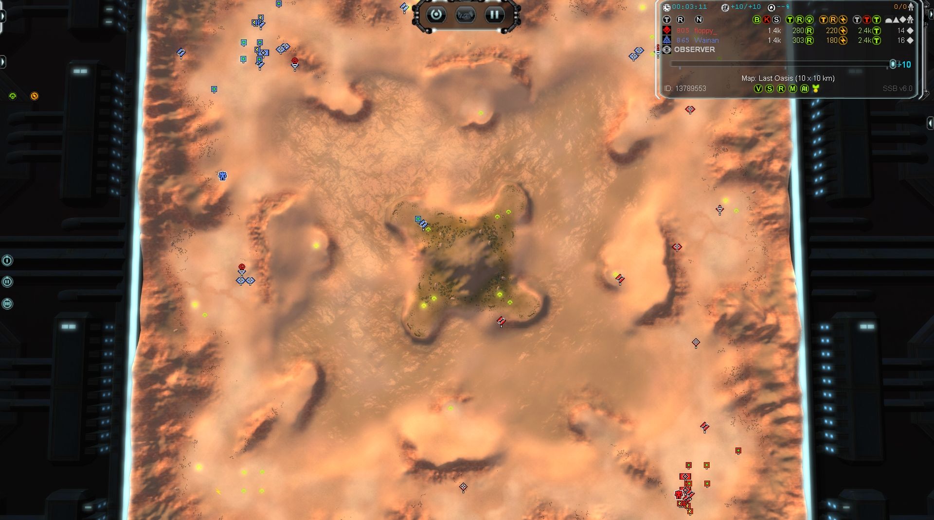
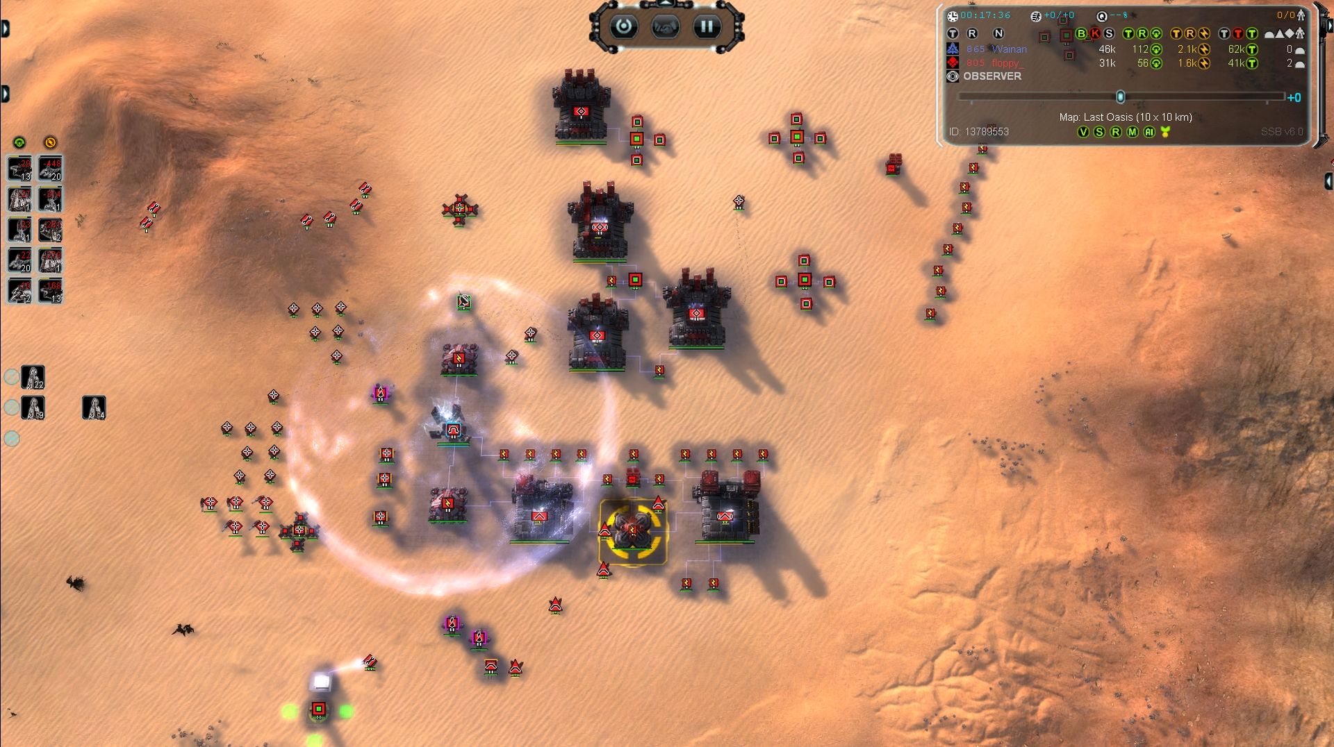
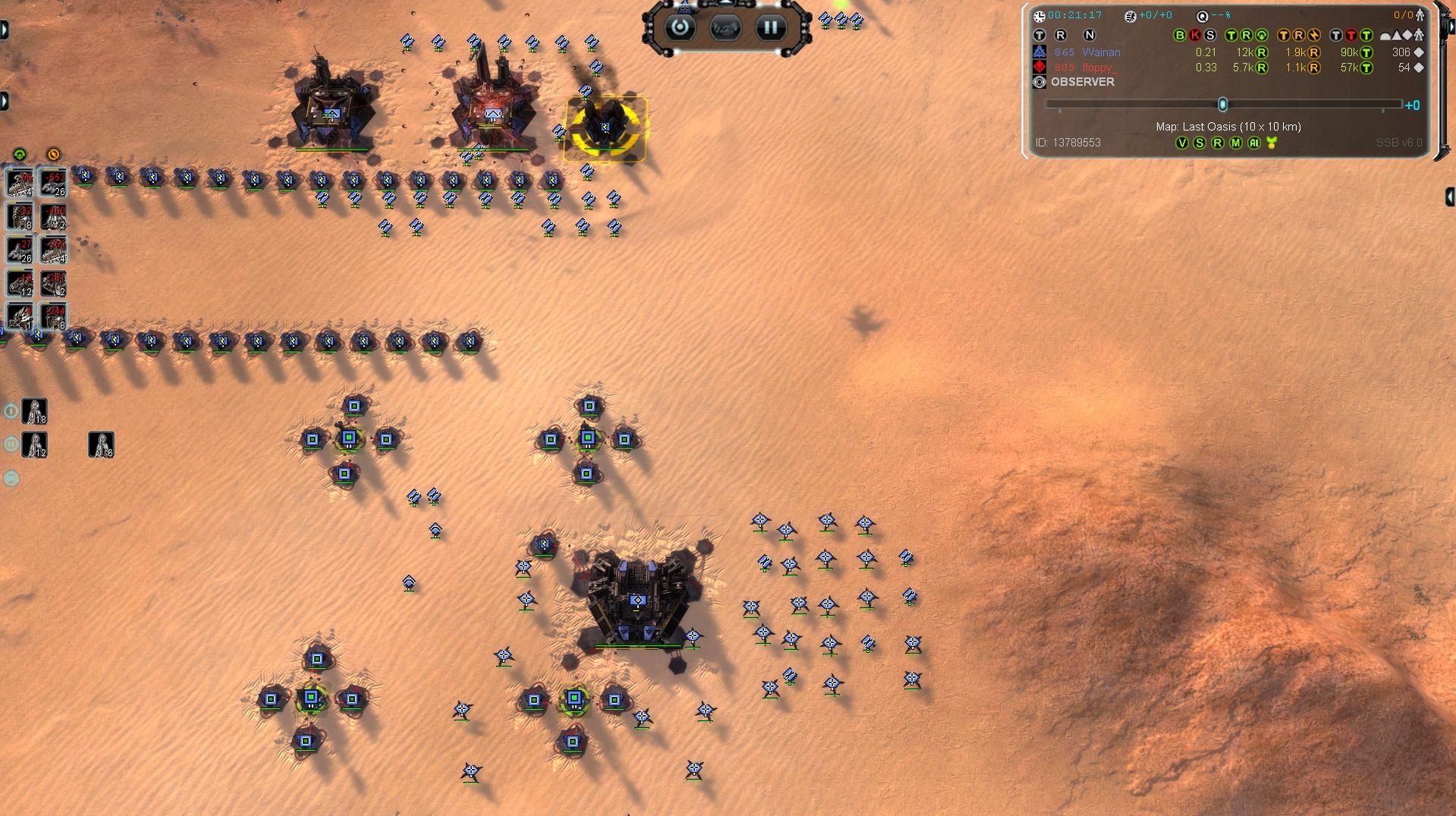
Here's small version of the advanced strategic icons. And yes you are right that many people just want SML/SMD + maybe TML icons from this mod, me included. -
@Blackheart That's interesting.
I have never learnt to play without the mex display, how do top players keep track of their mex upgrades?
Also I swear by the strategic icons mod as well, I find it reduces fatigue by helping me spot what I need to spot quickly.
-
I completely disagree with your position on strategic icons. It highlights high impact info like nuke, smd, tmd and therefore makes it less likely to not see a nuke, and makes it easier to detect unprotected areas. It is therefore a risk reducer and time saver, time that can be used elsewhere to improve play. The negatives "clutters screen" are not true when used on small icons settings. Maybe give it a try bh on small settings.
-
@RandomWheelchair, looks like you have a different version to me. One thing this version does is add a white line around each interior symbol so that team colour doesn't affect readability.
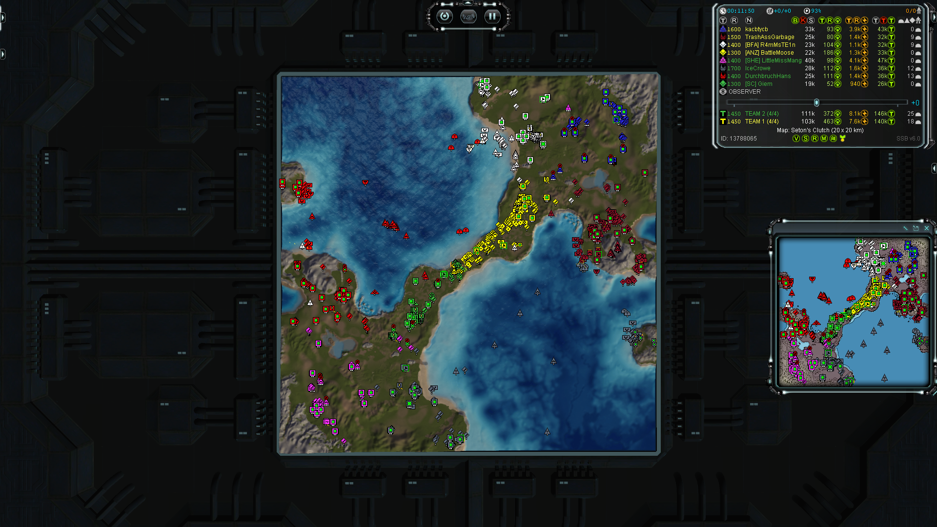
@blackheart, here are a few examples of the mod in my game (I think these are the medium size icons, at 1080p). I find they make it so much easier to tell what's going on. Also you can see the Supreme Eco UI and it's the most useful thing.
Apologies for JPG quality, couldn't work out how to link PNGs.
-
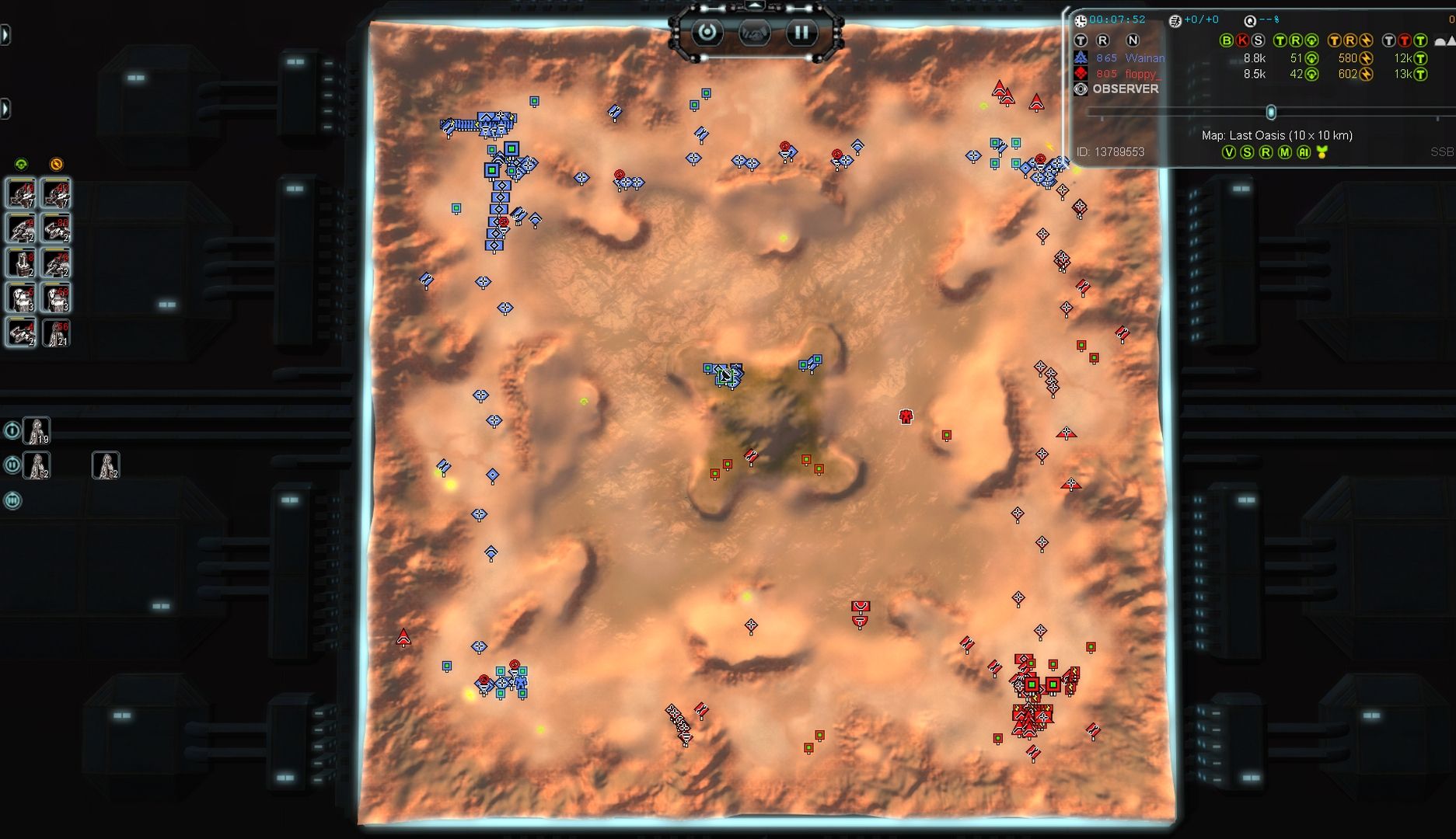
Well, this is a perfect example why its so bad. Take the 2nd pic as an example: You cant reliably and easily tell what and how many units are in those weird clumps on the right top corner, or in the main base of red player. Normal icons you would fully see every single unit and therefore get a correct reading on the game.
The way top players keep track of eco is memory. You know that you put some mex to upgrade so thats where you get the info from. Each upgrade is a deliberate decision and its important that this is the case.
-
@Blackheart said in UI mod guide for the improving player:
The way top players keep track of eco is memory. You know that you put some mex to upgrade so thats where you get the info from. Each upgrade is a deliberate decision and its important that this is the case.
I would say it isn't bad to have a visual feedback from time to time (this mexx is still upgrading, this one upgrade smh didn't start etc). But i agree that those mods may not be the best for beginners that will get bad habits, and won't learn what's crucial in this game to become good.
-
@Blackheart I just don't have the mental capacity it seems. If I want to know what a clump of units is then I'll zoom in, regardless of what icons I'm using.
As for keeping track of mex upgrades without a visual indicator? How do you remember how long it's been since you asked for the upgrade , taking into account any stalls along the way? As well as doing all the other things you need to do to manage your army? I can't believe that the icons don't make it easier for anybody.
-
I use Supreme Economy just to quickly glance at sudden income sucks in order to rectify misplays faster. I don’t really use it for the mex UI at all. I upgrade mexes when I have the mass income to do it without stalling and I don’t feel like additional tanks will provide much utility in the next few minutes.
Actually don’t think I even understand the mex ui, like why are there 3 different columns for mexes?
-
While I agree that the standard Advanced Strategic Icons mod is pretty cluttered and generally not pleasant to look at, I think with some changes, it looks far better. What I did was use all default icons except for mex, structures related to missiles (for example tml), and intel structures.
I feel these modifications I have made greatly reduce the clutter while still allowing one to gather more information in a single glance than with default icons.
-
Radar is decent as is sml/tml, but mexes still look totally obnoxious and I can't tell when something is ringed or not. I'd rather get tmd with obnoxious icon.
-
@Wainan: "If I want to know what a clump of units is then I'll zoom in, regardless of what icons I'm using." - that habit alone will stop you improving. 100% guaranteed.
"How do you remember how long it's been since you asked for the upgrade , taking into account any stalls along the way? As well as doing all the other things you need to do to manage your army?" - the point is to get a feeling for the eco, its (at some point) easy to tell just from the way your mass income behaves how your upgrades/eco is progressing. There is no strict formula (except if your senton air slot or something) when to upgrade/how to spend your stuff - you must develop a sense on how much you can afford, how long it takes, what the impact is like after some minutes. Anything that hinders this is bad for improvement. Imagine learning chess and using an opening book to look up all the moves every game - you will grow dependent on it and wont commit the moves to memory properly because you arent forced to.
@Box: While this is better than the original mod, the mex icons are, as Ftx also said, still horrendously bad. There is zero point to highlight mexes that much, because they always are in the same position (due to no random map gen unexplored games). Just stops you from seeing whats close to them -> bad. As I said already, stuff like SML/SMD highlighted is acceptable but any common structure should not have some bizarre icon priority like this.
-
@blackheart it's all approximations with units though isn't it? I can judge that that group of T1 units is going to beat that other group of units without needing to know the exact composition of each group, and I can't believe that the top players are able to make specific counts of specific units on both sides before engaging. Even if you've got the mental capacity to do that it would be energy better spent elsewhere.
I was wrong about zooming in, I don't really go more than 50% at any time unless I'm positioning some fiddly buildings.
What I do do is use lasso select all the time and select the specific units I want from the bar at the bottom. This is partly why I find Supreme Economy so essential because finding and clicking individual mexes is not easy for me.
The three levels on SupEco don't quite make sense. It's meant to show unringed, ringed and upgrading for each tech level and I'm not convinced it works 100%. But double click the unupgraded icon, choose which of those mexes is in the safest place to upgrade, and get back to what you were doing. So much easier than have to devote time to finding the damn things and clicking in just the right place.
-
@Wainan No. Instantly being able to tell that you have 5 tanks vs 4 or 10 vs 8 is essential. If you have your own opinion on that matter thats fine, though as I wrote im fully convinced this is extremely detrimental to improvement. I dont think there is value in discussing this further (what I dont understand is the following logic: No top player uses this mod -> they must all be wrong. Are you also telling Magnus Carlsen that his opening choices are bad because you prefer the Bongcloud opening? Just food for thought.)
For finding and clicking individual mexes use select nearest idle mex hotkey.
-
@Blackheart Of course I'm not saying they're wrong, in fact I'm trying to learn what I could do differently to be better by understanding the methods they use to solve problems. For my way of playing (which obviously is not optimal), these mods solve more problems than they cause.
I had completely forgotten that there's a closest mex hotkey. I don't use closest engineer either, I just double click all and then manually select the one closest to what I need. I think I need to try using those keys.
A related thing that I would love to learn about but I've found too overwhelming is the vast number of additional hotkeys that are available under F1. If you or anyone else would be willing to make some kind of guide to that that's easy to follow and understand (particularly including reasoning behind choices) that would be very gratefully received. Particularly the hotbuild stuff: at the moment I click for everything I want to build, and when I've looked at the hotbuild options it both removes some of the keys I'm used to and fries my brain because I can't follow the logic of it.
-
Advanced strategic icons are actually 3 entirely different set of icons in different sizes. The middle and bigger setting lead to overlapping symbols.
The mex symbol gets overriden in my case by the EcoManager (which i only use for the mex symbols, no other funcitonality), so i dont get to see the mex icons from the icon mod.
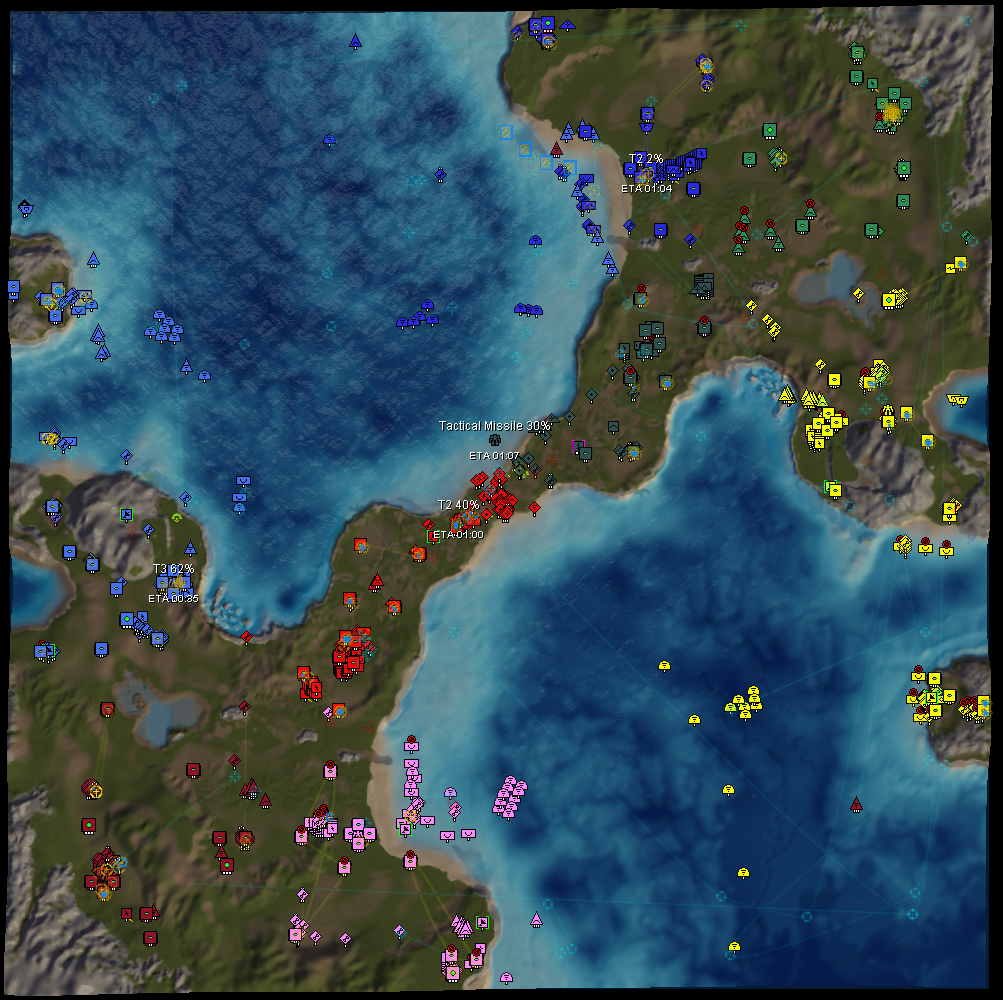
I have a video here but its only campaign gameplay, not even trying to play competitive here:
https://www.youtube.com/watch?v=1xCMVlqNtGgIn general i dont think that small strategic icons are too bad. It not gonna become a better player by swicthing to default icons. I will just die more often to nukes or defences i wanst able to see because default icons look all the same.
Hello! It looks like you're interested in this conversation, but you don't have an account yet.
Getting fed up of having to scroll through the same posts each visit? When you register for an account, you'll always come back to exactly where you were before, and choose to be notified of new replies (either via email, or push notification). You'll also be able to save bookmarks and upvote posts to show your appreciation to other community members.
With your input, this post could be even better 💗
Register Login