Downsides of the Advanced Strategic Icons mod
-
@jaggedappliance For me it was about half a year without it and then a bit less than a year with some version of the mod.
-
when my eyesight went to hell
-
Also with regards to resolution people could be right and it’s the one area I can sympathize with using the mod. I just don’t really know any top players that play on anything bigger than 1920x1080, which is what I also use, and everything is totally fine there with base icons. I have no frame of reference for supcom on anything bigger.
-
Yeah I think I said this in an earlier post but I liked using the icon mod when I was briefly using my 4k display because my 1080p one died. Played like that for a few months with the mod before I got tired of trying to play games in 4k in general, and finally got a new 144hz 1080p screen. Used the icon mod for a game or two on that then turned it off and never went back
-
@ftxcommando said in Downsides of the Advanced Strategic Icons mod:
@cheeseberry said in Downsides of the Advanced Strategic Icons mod:
@exselsior said in Downsides of the Advanced Strategic Icons mod:
@cheeseberry I thought he had something more specific, but right now I'm just finding this post with screenshots and his response right after: https://forum.faforever.com/topic/1186/ui-mod-guide-for-the-improving-player/10
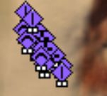
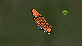
The detrimental part is seeing how many low level units are in a clump early game. In higher level ladder that's really important. That being said, I'm not really sure exactly how detrimental it is to being able to count small numbers of units if you're using the small icon sizes. Not sure what size is being used in the screenshots here.
In the above I explicitly show that a clump of T1 units with the new icons is at least as distinctive as a with the default ones. The icons are the same size after all, so where exactly should the information loss be?
Show me a picture where a unit composition is clearly visible with the default icons while barely or not at all decipherable with the modded icons.
If Blackheart is right and "this mod will completely destroy your ability to improve past a certain level" then such an example should be quite easy to find.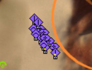
Literally a random MML pops up in the unit mix here because it was entirely blocked by the icons.

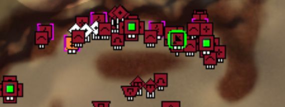
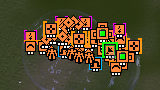
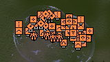
I have zero clue what is going on in the bottom screenshot, top base is significantly easier to read and if some of the other icons like the radar and mexes were ALSO default then it would ALSO be less cluttered and easier to read.
BH isn’t exaggerating, he genuinely considers the mod garbage because even with his crippled eyes he has no problem seeing and identifying things with base icons. Base icons are significantly easier to instantly read at a glance from a zoomed out level, making it immediately preferable if your goal is to be a competitive player because you want to spend as little time zoomed up as possible. This is why he strongly pushes back against it in his guide for improving since it reinforces bad habits.
I was of course not able to replicate the pictures exactly, but I think the base/unit density is roughly the same:
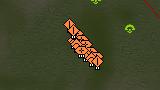
Note that any differences in my pictures are much less pronounced than in the ones you posted above. I think the reason for that is that whoever made those picture wasn't actually at the same zoom level in all of them.
For the base comparison this is definitely the case, as even though the icons are the same size, the terrain is not as can be seen by comparing e.g. width of the mountain on the right side:
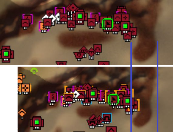
Still, while I think that the unit icons are up to personal taste I do think you can make the information loss argument for the base comparison I posted above.
While the main icon sizes are still almost the same, the colored borders of the modded icons do take up a relevant amount of space. For example: One of the sams gets hidden beneath its two neighboring ravagers.
Thanks for the constructive feedback and an actual downside of the Advanced Strategic Icon mod FTX!
-
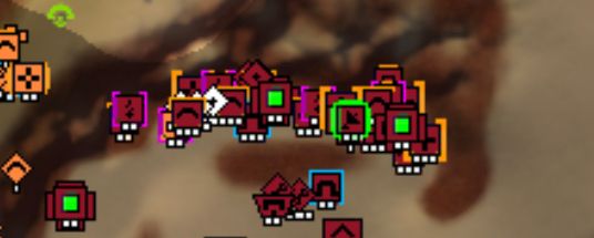
See in your base screen, the only thing that causes me to do a double-take is checking out the ringed radar right next to the 2 mexes (which is a weird place to put radar). I can easily tell the tier of mobile arty as well the count of them, I can easily tell the aa, I can easily tell the PD, and I can easily tell the tier/ringed nature of the mexes.
In the modded screen, the radar overlaps the adjacent pgens even more so I would need to zoom in to be sure that they are pgens (because again it's a weird spot for a radar). I also absolutely cannot tell what tier these units are and some of the PD icons overlap over AA.
-
Yeah I agree, the base layout with those T2 and T3 structures is quite a bit more cluttered than without the mod.
Really what you'd want is to have icons the same size as the base icons, but with some sort of color usage. The default icons are 90% the color of the player that owns them, which doesn't convey all that much information.
I understand that you really don't need any more information than what the base icons give you, so much was always clear. But for me the only really distinct parts of the default icon base are the SACUS and the arties as they have a different shape than the rest of the icons. Everything else just vanishes in a big sea of orange.
Basically the best icon set is probably something in the vain of what ThomasHiatt suggested above.
-
@jaggedappliance Oh so that what thing does
-
Do the smaller icons the in the Advanced Strategic installer overlap as well? i would think they would be same, just with the different scheme they use. Also pretty simple for people to just create a file, with only the icons they want to change, like TML, radar, nuke.
Like others said, i think its mostly an issue past 1080 res.
-
All modded screenshots above are with the small advanced strategic icons, so yes some of the T2 and T3 structures, and possibly others, do overlap a bit more than the base icons
-
@ftxcommando I play with 30 inch 2560 x 1440 monitor but I don't have any trouble with UI elements being smaller then on 1920x1080. I can't actually imagine going back to my old resolution, the screen would just feel so cluttered.
That being sad I want to incorporate Nuke and SMD icons from the mod. The amount of times I've been nuked cause I couldn't spot the launcher (eg. Finals vs Petric in Summer Inv. 2020)... -
It really helps for me to see the TML, nukes, and I even put an A over the arty icon so i could spot it at a glance.
-
WIth regards to
I think having comparison pictures that are actually at the same zoom level is a good start for an objectve comparison, lol, so thanks. I have played with modded icons for years now (but not much in general) after maybe playing without for half a year.
At the end of the day, familiarity is going to be the biggest hindrance to liking the modded icons.
Never underestimate the amount of "muscle memory" and brain stuff that is going on when you try to understand what you see in a picture. Like i would guess more than half of "how clear is that picture compared to the other picture" has nothing to do with how clear the picture actually is, but with how familiar you are with whatever the picture depicts.
And i would like a base full of ravagers and SAMs (which usually is never built in PvP in very tight clusters, area damage exits) to make it as clear as possible to me that it is full of ravagers and SAMS, so i will gladly take SLIGHTLY bigger icons / more overlap for such a case .
Now i think it could be better. Some things could be smaller. But it is right now perfectly usable in mm or anywhere else for anybody who decides to try and get used to it for some time.
-
It isn't just about muscle memory. The icons are just absurdly loud and obnoxious. Why is the T3 PD big, bold, and surrounded by a giant yellow square that now has ENTIRELY blocked the sam right next to it?
In the right game state, something like this can just lose you the game because you fly your strat from your strat rush right over a sam that was hidden like a Vietnamese guerilla fighter.
Base game for comparison:

-
While the borders are probably intended to help differentiate it at a glance, I agree that these borders aren't really necessary, or there is simply a better way to go about it. Maybe I'll try and modify the default icon set to bridge the gap between the two to find a happy medium. I wish the icons were vector based.
-
People will always have their preferences. That said, I just started using the mod about a week ago.
I've tried it before and hated it. I tried all 3 sizes. After listening to Greedy complain about the mod not working in the dev branch, I decided to give it another shot. I'm using the small size on 2560x1440p. Now that I've given it a real chance, I easily think it's a big improvement.
It's so much easier to determine what things are now. Units, TML, SMDs, Nukes, etc. It's so easy to tell at a glance whether these things are around or not, rather than searching through shit. If unit spam being a bit undistinguishable is why some people don't wanna use it, power to them but that idc about that. I'll just zoom in a bit and look if I need to.
"Oh but now you need to zoom in!" Sure. And without the mod I need to zoom in a hell of a lot more than I do with the mod.
Could they be improved further? Probably. But I like them more than the default shit so far.
-
Frankly I think it's a totally irrational position to argue that you would need to zoom in more to see literally anything with default icons. Do you need to spend more time looking for things because the icons are not as loud and you aren't used to them? Sure. But there are zero scenarios where default icons obfuscate a situation that requires zooming in while the mod doesn't. The whole point is to make icons too annoying to ignore which in turn creates lack of clarity when you have 10 of them jumbled together.
If the scenario exists, feel free to post examples.
-
The icon mod does not provide a gameplay advantage, and very likely is actually detrimental to your gameplay.
Every pro at the game either uses all default icons or mostly default icons, and the chance of the icon mod providing a gameplay advantage is slim to none, given that the pros are the best at the game precisely because they are the people most likely to take advantage of things that can provide a gameplay advantage.
As a counterexample, look at the advanced strategic priorities mod. Almost every pro uses it, and some of the very best have gone as far as to set 10+ target priority hotkeys on the most premium hotkeys. That is what would happen if the mod actually provided a gameplay advantage, so it's almost impossible that the icon mod provides a gameplay advantage and all the pros are just all sleeping on it.
If it were the case that using full icon mod was is a matter of personal preference, with no gameplay impact, you would expect some pros to use it. The fact that literally no good player uses the full icon mod should suggest that it is actually a gameplay detriment.
My personal view is that you can use whatever setup you prefer and play the game the way that you enjoy, but just be cognizant of the fact that using the full icon mod very likely provides a gameplay disadvantage.
I'll just list the people I'm aware of on each side of the debate. As far as I am concerned, there is an overwhelming consensus among experts on this topic.
People who use full icon mod:
- Ruvik
- Katharsas
- Wainan
- Cheeseberry
People who use mostly default icons (only advanced SML/SMD, etc.)
- ThomasHiatt
- me
")
- Tagada (when he gets around to it)
People who use full default icons:
- Blackheart
- JaggedAppliance
- Blodir
- Swkoll
- and literally every other top player in the game
-
Maybe "need" isn't the right word. But there are times I prefer to zoom into a part of the map or section of it, whatever, to scan it rather than look at it all the way zoomed out. I haven't noticed or felt any downsides to playing with the mod,
I mean, the game has strategic zoom for a while, so people can zoom in and out as they please. It takes next to no effort, and with Zep's minimap there's no reason not to notice shit going on outside your FOV when zoomed in. I'm constantly zooming in & out.
-
Some of us can't see sh*t wether we're zoomed in or not, so might as well at least be able to tell if there is a nuke, tml, but it's all preference. its not like we're debating on adding these icons to main game.
Hello! It looks like you're interested in this conversation, but you don't have an account yet.
Getting fed up of having to scroll through the same posts each visit? When you register for an account, you'll always come back to exactly where you were before, and choose to be notified of new replies (either via email, or push notification). You'll also be able to save bookmarks and upvote posts to show your appreciation to other community members.
With your input, this post could be even better 💗
Register Login