Downsides of the Advanced Strategic Icons mod
-
@cheeseberry said in Downsides of the Advanced Strategic Icons mod:
@exselsior said in Downsides of the Advanced Strategic Icons mod:
@cheeseberry I thought he had something more specific, but right now I'm just finding this post with screenshots and his response right after: https://forum.faforever.com/topic/1186/ui-mod-guide-for-the-improving-player/10
The detrimental part is seeing how many low level units are in a clump early game. In higher level ladder that's really important. That being said, I'm not really sure exactly how detrimental it is to being able to count small numbers of units if you're using the small icon sizes. Not sure what size is being used in the screenshots here.
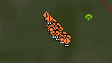
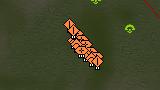
In the above I explicitly show that a clump of T1 units with the new icons is at least as distinctive as a with the default ones. The icons are the same size after all, so where exactly should the information loss be?
Show me a picture where a unit composition is clearly visible with the default icons while barely or not at all decipherable with the modded icons.
If Blackheart is right and "this mod will completely destroy your ability to improve past a certain level" then such an example should be quite easy to find.I mean I think blackheart is being a bit dramatic with how extreme he is on it, but he has a point to some extent. Even in your screenshots I personally find it easier to see how many t1 tanks there are at a glance vs the icon mod. Granted, that could just purely be because I am more used to the standard icons. There's more going on with the other icons, so even if they're the same size they have more going on and more bold features so when you pack them into tight groups it's harder to make things out.
-
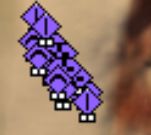
@cheeseberry https://imgur.com/a/S3ZfJ6k a collection of some screenshots I took a long time ago. Gotta right click and open the images to get them at full size.
-
@thomashiatt ty!
-
@cheeseberry said in Downsides of the Advanced Strategic Icons mod:
@exselsior said in Downsides of the Advanced Strategic Icons mod:
@cheeseberry I thought he had something more specific, but right now I'm just finding this post with screenshots and his response right after: https://forum.faforever.com/topic/1186/ui-mod-guide-for-the-improving-player/10
The detrimental part is seeing how many low level units are in a clump early game. In higher level ladder that's really important. That being said, I'm not really sure exactly how detrimental it is to being able to count small numbers of units if you're using the small icon sizes. Not sure what size is being used in the screenshots here.
In the above I explicitly show that a clump of T1 units with the new icons is at least as distinctive as a with the default ones. The icons are the same size after all, so where exactly should the information loss be?
Show me a picture where a unit composition is clearly visible with the default icons while barely or not at all decipherable with the modded icons.
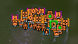
If Blackheart is right and "this mod will completely destroy your ability to improve past a certain level" then such an example should be quite easy to find.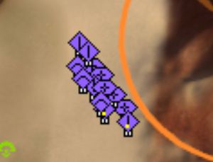
Literally a random MML pops up in the unit mix here because it was entirely blocked by the icons.

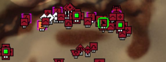
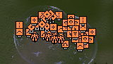
I have zero clue what is going on in the bottom screenshot, top base is significantly easier to read and if some of the other icons like the radar and mexes were ALSO default then it would ALSO be less cluttered and easier to read.
BH isn’t exaggerating, he genuinely considers the mod garbage because even with his crippled eyes he has no problem seeing and identifying things with base icons. Base icons are significantly easier to instantly read at a glance from a zoomed out level, making it immediately preferable if your goal is to be a competitive player because you want to spend as little time zoomed up as possible. This is why he strongly pushes back against it in his guide for improving since it reinforces bad habits.
-
@ftxcommando Finally, evidence, thank you!
What replay is that from?
-
Idk we had sone discussion about icon mod in the discord training channel so had a few dudes look through some random replay with the mod, with a version of the mod that changes few icons, and default icons.
-
That explains why the mex icon is changed in both. What I'm getting is that I should look at t2 and t3 land units/bases. I'll make some screenshots and come back to you on that.
Again though, thanks for posting some actual descriptive comparison pictures though! Without those we will just get stuck in endless "Its better because I say so" circles that all other threads about the post I have seen devolve into.
-
It would be nice to have control over which icons would take precedence in foreground focus. i noticed when modifying files, that sometimes the wrong thing would overlap, e.g. the mass storage would block out the mex, but i'm not sure what caused it.
-
The last built unit is in the foreground
-
ahh good to know, thought it was something else.
-
There's a parameter for it, StrategicIconSortPriority.
-
I'm interested to know, from the people who use some version of the icon mod, how long did you play before switching?
-
@jaggedappliance For me it was about half a year without it and then a bit less than a year with some version of the mod.
-
when my eyesight went to hell
-
Also with regards to resolution people could be right and it’s the one area I can sympathize with using the mod. I just don’t really know any top players that play on anything bigger than 1920x1080, which is what I also use, and everything is totally fine there with base icons. I have no frame of reference for supcom on anything bigger.
-
Yeah I think I said this in an earlier post but I liked using the icon mod when I was briefly using my 4k display because my 1080p one died. Played like that for a few months with the mod before I got tired of trying to play games in 4k in general, and finally got a new 144hz 1080p screen. Used the icon mod for a game or two on that then turned it off and never went back
-
@ftxcommando said in Downsides of the Advanced Strategic Icons mod:
@cheeseberry said in Downsides of the Advanced Strategic Icons mod:
@exselsior said in Downsides of the Advanced Strategic Icons mod:
@cheeseberry I thought he had something more specific, but right now I'm just finding this post with screenshots and his response right after: https://forum.faforever.com/topic/1186/ui-mod-guide-for-the-improving-player/10
The detrimental part is seeing how many low level units are in a clump early game. In higher level ladder that's really important. That being said, I'm not really sure exactly how detrimental it is to being able to count small numbers of units if you're using the small icon sizes. Not sure what size is being used in the screenshots here.
In the above I explicitly show that a clump of T1 units with the new icons is at least as distinctive as a with the default ones. The icons are the same size after all, so where exactly should the information loss be?
Show me a picture where a unit composition is clearly visible with the default icons while barely or not at all decipherable with the modded icons.
If Blackheart is right and "this mod will completely destroy your ability to improve past a certain level" then such an example should be quite easy to find. Literally a random MML pops up in the unit mix here because it was entirely blocked by the icons.

I have zero clue what is going on in the bottom screenshot, top base is significantly easier to read and if some of the other icons like the radar and mexes were ALSO default then it would ALSO be less cluttered and easier to read.
BH isn’t exaggerating, he genuinely considers the mod garbage because even with his crippled eyes he has no problem seeing and identifying things with base icons. Base icons are significantly easier to instantly read at a glance from a zoomed out level, making it immediately preferable if your goal is to be a competitive player because you want to spend as little time zoomed up as possible. This is why he strongly pushes back against it in his guide for improving since it reinforces bad habits.
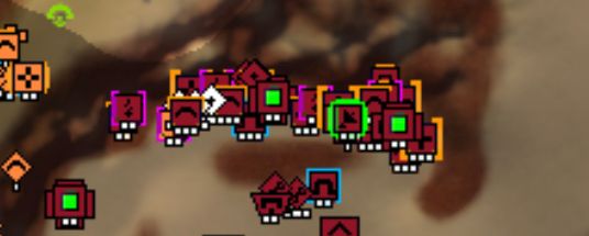
I was of course not able to replicate the pictures exactly, but I think the base/unit density is roughly the same:
Note that any differences in my pictures are much less pronounced than in the ones you posted above. I think the reason for that is that whoever made those picture wasn't actually at the same zoom level in all of them.
For the base comparison this is definitely the case, as even though the icons are the same size, the terrain is not as can be seen by comparing e.g. width of the mountain on the right side:
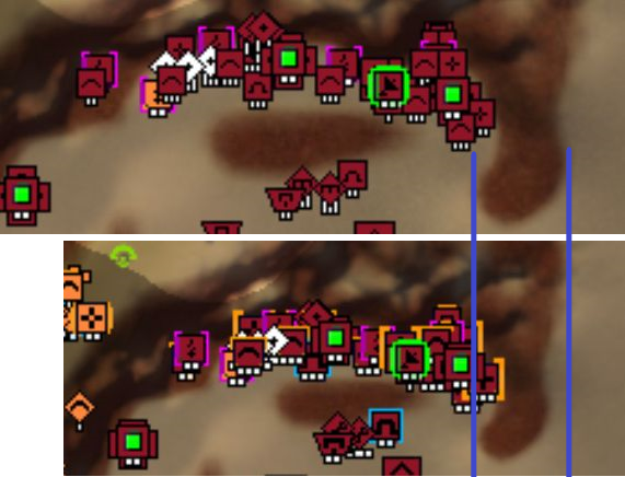
Still, while I think that the unit icons are up to personal taste I do think you can make the information loss argument for the base comparison I posted above.
While the main icon sizes are still almost the same, the colored borders of the modded icons do take up a relevant amount of space. For example: One of the sams gets hidden beneath its two neighboring ravagers.
Thanks for the constructive feedback and an actual downside of the Advanced Strategic Icon mod FTX!
-
See in your base screen, the only thing that causes me to do a double-take is checking out the ringed radar right next to the 2 mexes (which is a weird place to put radar). I can easily tell the tier of mobile arty as well the count of them, I can easily tell the aa, I can easily tell the PD, and I can easily tell the tier/ringed nature of the mexes.
In the modded screen, the radar overlaps the adjacent pgens even more so I would need to zoom in to be sure that they are pgens (because again it's a weird spot for a radar). I also absolutely cannot tell what tier these units are and some of the PD icons overlap over AA.
-
Yeah I agree, the base layout with those T2 and T3 structures is quite a bit more cluttered than without the mod.
Really what you'd want is to have icons the same size as the base icons, but with some sort of color usage. The default icons are 90% the color of the player that owns them, which doesn't convey all that much information.
I understand that you really don't need any more information than what the base icons give you, so much was always clear. But for me the only really distinct parts of the default icon base are the SACUS and the arties as they have a different shape than the rest of the icons. Everything else just vanishes in a big sea of orange.
Basically the best icon set is probably something in the vain of what ThomasHiatt suggested above.
-
@jaggedappliance Oh so that what thing does
Hello! It looks like you're interested in this conversation, but you don't have an account yet.
Getting fed up of having to scroll through the same posts each visit? When you register for an account, you'll always come back to exactly where you were before, and choose to be notified of new replies (either via email, or push notification). You'll also be able to save bookmarks and upvote posts to show your appreciation to other community members.
With your input, this post could be even better 💗
Register Login