Downsides of the Advanced Strategic Icons mod
-
They don't like it because they are grumpy and think it looks bad.
The default icons are all small, unbold, and do not make use of color. The icon mod inverts this so that all icons are large, bold, and multicolored. Both extremes are ineffective for actually providing you with information.
Ideally, icons would be sized/bolded according to their tech level, and only important things would make use of multiple colors. This is why I just made my own icons where T2 units are 1 pixel larger than T1 and T3 units are bolder than T2, then it is simple to tell them apart in mixed armies while still remaining uncluttered. All the structures remain default except the ones that are important to notice.
-
@cheeseberry I thought he had something more specific, but right now I'm just finding this post with screenshots and his response right after: https://forum.faforever.com/topic/1186/ui-mod-guide-for-the-improving-player/10
The detrimental part is seeing how many low level units are in a clump early game. In higher level ladder that's really important. That being said, I'm not really sure exactly how detrimental it is to being able to count small numbers of units if you're using the small icon sizes. Not sure what size is being used in the screenshots here.
-
Three reasons for people declaring modded icons as OBJECTIVELY bad:
-
People have often never actually tried "small" icon option for advanced strategic icons. Their opinions are based on medium usuallly, which does have a little more overlap than Vanilla.
-
Screen resolution. The more resolution you have, the bigger the icons should be or the less it matter when they are bigger. It doesnt make sense to judge icon size without taking resolution into account.
-
The more you use an icon set, the more you get used to it. It gets engrained in your brain just like flickshot muscle memory gets engrained in an FPS players brain. I guess a very good players stops seeing icons and can just directly read the screen. This works with both Vanilla and modded icon set if you stay with the same set.
However, if a player now watches a caster that uses different icons, he now longer reads the screen with as little effort as before. This is still not a good reason to claim that modded icons are somehow super bad. I use modded icons but i still have not trouble watching casts with unmodded icons. But small, maybe even subconcious inconveniences can sometimes lead very strong opinions.
-
-
@exselsior said in Downsides of the Advanced Strategic Icons mod:
@cheeseberry I thought he had something more specific, but right now I'm just finding this post with screenshots and his response right after: https://forum.faforever.com/topic/1186/ui-mod-guide-for-the-improving-player/10
The detrimental part is seeing how many low level units are in a clump early game. In higher level ladder that's really important. That being said, I'm not really sure exactly how detrimental it is to being able to count small numbers of units if you're using the small icon sizes. Not sure what size is being used in the screenshots here.
In the above I explicitly show that a clump of T1 units with the new icons is at least as distinctive as a with the default ones. The icons are the same size after all, so where exactly should the information loss be?
Show me a picture where a unit composition is clearly visible with the default icons while barely or not at all decipherable with the modded icons.
If Blackheart is right and "this mod will completely destroy your ability to improve past a certain level" then such an example should be quite easy to find. -
@thomashiatt said in Downsides of the Advanced Strategic Icons mod:
Ideally, icons would be sized/bolded according to their tech level, and only important things would make use of multiple colors. This is why I just made my own icons where T2 units are 1 pixel larger than T1 and T3 units are bolder than T2, then it is simple to tell them apart in mixed armies while still remaining uncluttered. All the structures remain default except the ones that are important to notice.
Could you post a screenshot of that? You don't need to put in the effort of publishing it as a full mod, but it would be interesting to see.
-
while i use the advanced strategic icons mods, with the medium icons and in higher resolution, the overlap can be an issue in certain situations. A big thing I didn't like with them was that the white border could be obnoxious with a lot of units, and other items such as storage around mexes was less discernible when zoomed out.
which is why i modified the icons to make them a little less garish. Where possible, I adjusted some icons to be slightly different size to differentiate tech levels, etc. other icons such as t3 gunship and t3 bomber, i changed the tactical icon because i couldn't tell them apart when zoomed out.
here is my take for anyone that wants to give it a try, just backup your original file in case you don't like. all based on medium set, since i run a higher resolution.
https://drive.google.com/file/d/1BztpHQoY-zDCZccRLE_zJ370G9kwl-fX/view?usp=sharing
-
@macdeffy nice, will give that a look!
-
@cheeseberry said in Downsides of the Advanced Strategic Icons mod:
@exselsior said in Downsides of the Advanced Strategic Icons mod:
@cheeseberry I thought he had something more specific, but right now I'm just finding this post with screenshots and his response right after: https://forum.faforever.com/topic/1186/ui-mod-guide-for-the-improving-player/10
The detrimental part is seeing how many low level units are in a clump early game. In higher level ladder that's really important. That being said, I'm not really sure exactly how detrimental it is to being able to count small numbers of units if you're using the small icon sizes. Not sure what size is being used in the screenshots here.
In the above I explicitly show that a clump of T1 units with the new icons is at least as distinctive as a with the default ones. The icons are the same size after all, so where exactly should the information loss be?
Show me a picture where a unit composition is clearly visible with the default icons while barely or not at all decipherable with the modded icons.
If Blackheart is right and "this mod will completely destroy your ability to improve past a certain level" then such an example should be quite easy to find.I mean I think blackheart is being a bit dramatic with how extreme he is on it, but he has a point to some extent. Even in your screenshots I personally find it easier to see how many t1 tanks there are at a glance vs the icon mod. Granted, that could just purely be because I am more used to the standard icons. There's more going on with the other icons, so even if they're the same size they have more going on and more bold features so when you pack them into tight groups it's harder to make things out.
-
@cheeseberry https://imgur.com/a/S3ZfJ6k a collection of some screenshots I took a long time ago. Gotta right click and open the images to get them at full size.
-
@thomashiatt ty!
-
@cheeseberry said in Downsides of the Advanced Strategic Icons mod:
@exselsior said in Downsides of the Advanced Strategic Icons mod:
@cheeseberry I thought he had something more specific, but right now I'm just finding this post with screenshots and his response right after: https://forum.faforever.com/topic/1186/ui-mod-guide-for-the-improving-player/10
The detrimental part is seeing how many low level units are in a clump early game. In higher level ladder that's really important. That being said, I'm not really sure exactly how detrimental it is to being able to count small numbers of units if you're using the small icon sizes. Not sure what size is being used in the screenshots here.
In the above I explicitly show that a clump of T1 units with the new icons is at least as distinctive as a with the default ones. The icons are the same size after all, so where exactly should the information loss be?
Show me a picture where a unit composition is clearly visible with the default icons while barely or not at all decipherable with the modded icons.
If Blackheart is right and "this mod will completely destroy your ability to improve past a certain level" then such an example should be quite easy to find.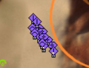
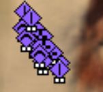
Literally a random MML pops up in the unit mix here because it was entirely blocked by the icons.

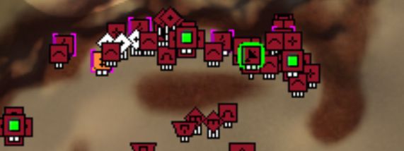
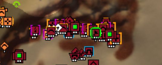
I have zero clue what is going on in the bottom screenshot, top base is significantly easier to read and if some of the other icons like the radar and mexes were ALSO default then it would ALSO be less cluttered and easier to read.
BH isn’t exaggerating, he genuinely considers the mod garbage because even with his crippled eyes he has no problem seeing and identifying things with base icons. Base icons are significantly easier to instantly read at a glance from a zoomed out level, making it immediately preferable if your goal is to be a competitive player because you want to spend as little time zoomed up as possible. This is why he strongly pushes back against it in his guide for improving since it reinforces bad habits.
-
@ftxcommando Finally, evidence, thank you!
What replay is that from?
-
Idk we had sone discussion about icon mod in the discord training channel so had a few dudes look through some random replay with the mod, with a version of the mod that changes few icons, and default icons.
-
That explains why the mex icon is changed in both. What I'm getting is that I should look at t2 and t3 land units/bases. I'll make some screenshots and come back to you on that.
Again though, thanks for posting some actual descriptive comparison pictures though! Without those we will just get stuck in endless "Its better because I say so" circles that all other threads about the post I have seen devolve into.
-
It would be nice to have control over which icons would take precedence in foreground focus. i noticed when modifying files, that sometimes the wrong thing would overlap, e.g. the mass storage would block out the mex, but i'm not sure what caused it.
-
The last built unit is in the foreground
-
ahh good to know, thought it was something else.
-
There's a parameter for it, StrategicIconSortPriority.
-
I'm interested to know, from the people who use some version of the icon mod, how long did you play before switching?
-
@jaggedappliance For me it was about half a year without it and then a bit less than a year with some version of the mod.
Hello! It looks like you're interested in this conversation, but you don't have an account yet.
Getting fed up of having to scroll through the same posts each visit? When you register for an account, you'll always come back to exactly where you were before, and choose to be notified of new replies (either via email, or push notification). You'll also be able to save bookmarks and upvote posts to show your appreciation to other community members.
With your input, this post could be even better 💗
Register Login