New version of the map generator has been released
-
good job, great improvement of the generations, i tried some of those, look even better with exp graphics
-
@ninrai said in New version of the map generator has been released:
@xiaomao
When you open with "my man" you know its gonna be hyperbolic cringe. well doneDear @Ninrai . I'm writing this post to you to let you know that the foul language I have used in my previous post is unacceptable. And as such I will refrain from using the phrase "my man" in my future correspondence with your person.
So if you will allow, please let me reiterate my last post in a more acceptable manner.
Regarding your point about reducing the contrast, it is something that I don't really agree with you as the colours used in the new version of the mapgen are now closely corresponding to the colours used not only by mappers, but also the different biomes in the game. As such I don't think it is acceptable to be pushing the blame on Blackyps who is doing his best to make sure that RMG can generate maps that not only are playable but also closely resembling polished man made maps. Instead of presenting a colourful mismatch of random colour palettes.
I also do have to raise a point about water blending in with the part traversable by land. In my rather subjective opinion it is non issue. The traversable land areas are clearly distinguished by different colouring and more importantly by different texturing of the ground. Another big giveaway of the the map having water in it is the clear as day texturing used by water(you can see as the beautiful waves roll around). If you will look at the map it's pretty clear where the water cuts itself apart from the traversable land mass.
I could understand if there was no way to distinguish submerged parts of the map from hills or ravines. But fortunately due to the amazing work of people behind RMG this is not an issue. As such, the benevolent man I am I have to ask what kind of PC are you gaming on, what kind of graphical settings are you using, what type monitor etc. Cuz' at this moment everything points that there is some kind of hardware or setting problem on your side. Which I hope we will be able to troubleshoot together in the near future so that you can fully enjoy this new iteration of map gen.
As for the HQ debate, I think that we should simply move on to other more appropriate place. Either on forum or discord, as both of those places have already an ongoing and more importantly quite substantial debate happening on this topic. As such I really do not think there is a reason to bring up this topic here.
And lastly. I'm glad that you have pointed out the issue with see through aeon shields. Unfortunately it is something that's been part of this game for years and is not aeon specific. It happen to all of the shields, but each of them suffers from it in different biome. As such it's not really something that can be fixed on RMG part, rather I would kindly ask you to forward your complaint to the art departament in the next meeting.
Sincerely Endranii.
-
I love the new colors. Great work to everyone involved.
Another improvement that wasn't mentioned is that it is now much easier to see exactly where the water surface intersects the land in the small thumbnails used throughout faf and on the lobby minimap.
I used to struggle with this on certain biomes and now it's much clearer, helping me decide whether to host or skip a map.
-
The water looks nice. I think (just based on the preview pics alone) that the snow, and to lesser extent desert, biomes are too bright.
-
@Ninrai how do you expect to win an argument if you never address the substance of it and just criticize the 'packaging'?
-
@phong
I am not here to "win" an argument. Ever since the team changed the HQs and only later claimed "there is no way we will revert the change - but we are open for SuGgEsTiOnS" with the usual people here cheering for it, it's clear that the imo circle-jerk mentality here is hard to overcome. Echo chamber deluxe. I accepted it and simply voice my opinion.
Ofc trolls like the guy above cannot handle that and give snarky dumb immature takes - revealing a significant lack of understanding of my criticism to begin with.
The color contrast of the map has been significantly altered (have a look at a color wheel). I have conducted too many eye-tracking reaction time experiments to not conclude the reaction time for grasping what is going on on the map will have been increased bc of this change.THIS is the substance: usability. In fact, I think I am one of the few on here addressing that over "awww, so shiny pretty looking now :D" (= what you call "packaging"?).
Kinda similar to the HQ change. -
I love the new change, makes the maps feel more original and less “robotic”/copies of the previous iteration.
Every little improvement comes a long way, didn’t even realize all mapgen maps always have big blue water until now. Much cooler that they will change to the correct biome!
-
@ninrai Oh I was operating under the mistaken assumption that you didn't like the changes personally, but it's so comforting to know you are looking out for the rest of us with your Objective opinions based on your vast experience with eye tracking. We really are fortunate to have you here, to protect us from our own ignorance.
Anyway, you asked if there was an option to use the old style, and while I can't answer that, I can offer an alternative, if any of the changed biomes looks even remotely acceptable to you. There is a way to only generate maps using a certain biome that you can use:
Go to the map generation panel, and double click the word Generate. A new input field will appear, labeled Command Arguments.
Some of the options for the generator must be input here now, which is a bit tedious, but you get access to new options that aren't in the UI, among them being able to choose the biome.
Here are some of the important commands:
--biome (Brimstone, Desert, EarlyAutumn, Frithen, Loki, Mars, Moonlight, Prayer, Stones, Syrtis, WindingRiver, Wonder)
--map-size (a multiple of 64. A 10x10km map is 512)
--spawn-count (number of players)So if I wanted to generate a whole lot of maps with the desert biome, I could put this in:
--biome Desert --spawn-count 10 --map-size 640If you want I can dig up the rest of the parameters and their associated values (they're listed on the right, under the map preview, syntax may differ a bit), but most of the sliders still work as expected, i think.
-
@phong said in New version of the map generator has been released:
Oh I was operating under the mistaken assumption that you didn't like the changes personally, but it's so comforting to know you are looking out for the rest of us with your Objective opinions based on your vast experience with eye tracking. We really are fortunate to have you here, to protect us from our own ignorance.
This is exactly the kind of petulant silly take reflective of the circle-jerk - proving my point exactly. Criticism is met with snarky remarks without any substance. Why even bother then?
When someone presents themselves as a spokesperson for an anonymous group, putting words in my mouth on top, its just pure cringe.
I take from this that it is best to just ignore questions you direct at me for they are stated in bad faith anyway. -
@ninrai Glad you enjoyed my post
 I hope you find it useful. I put in what effort I could to address your concern and help, even though I know it's not much. I didn't mean to come off as a spoke person for a wider group, and I apologize. What I should have said was that I feel fortunate, not that we are fortunate.
I'm positive that in time, you will be proven right, the masses of disgruntled faf players will rise up and force the devs to roll back this change, once the eye strain becomes unbearable.
-
@blodir said in New version of the map generator has been released:
The water looks nice. I think (just based on the preview pics alone) that the snow, and to lesser extent desert, biomes are too bright.
The biomes might look too bright as the pictures seem to be using the bloom setting "on", which tends to often brighten/bleach the maps a little bit too much in case of snow and desert maps.
So maybe @BlackYps could answer what settings were used, especially if bloom was "on" when making this comparison shots. As to me they look just like more than few man made maps with bloom on.
-
It would be nice if people would be less snarky when faced with disparate opinions...
Personally, I like a number of the new changes, but I do think the water should be changed again. When comparing the old and new images posted above, I actually found the old water to be more aesthetically pleasing and preferred it overall in most of those examples. The new water might look more realistic, but I find it harder on the eyes and less readable than the old water was. In particular, the new water reminds me of when I was testing water settings for mapmaking purposes and put the lerp and or sky reflection values too high.
-
@Penguin_ While I disagree about the aesthetic appeal, I appreciate the fact that you voiced your opinion and framed it as personal.
Ultimately a decision about keeping or discarding such a change should be somewhat democratic if possible, precisely because it's so subjective, and for that process to take place, the change deserves to see a wide release and get a chance to be judged by everyone. I hope you agree with that even if you yourself are not a big fan. It's also why I unironically appreciate @Ninrai's contribution to this thread, in spite of my childish behavior.
I'm also happy someone is finally taking up Sheika's challenge and stepping into this creative arena. His team worked really hard to bring mapgen from a butt-ugly prototype to the amazing state it's in now, and along the way they set up the biome system, which I've been hoping people would be more excited for, since it lowered the barrier for entry to contributors.
Even though this change isn't an entire new biome, at least someone is finally showing interest in this creative playground and I'm happy to see it, hoping for more. @BlackYps could you tell us more about the process of tweaking or creating biomes? Is this something you might consider making a tutorial about?
Further tweaks are of course still possible, provided someone is willing to make them, and to that someone I say: take a closer look at the bright red biome. While I personally don't think anything is wrong with it, it tops the list of biggest eyesore, from what I've heard.
-
Yes, all the screenshots are made with bloom on. Also keep in mind that the fog of war is off. In a real game most of the map would be significantly darker because of the fog of war.
If we wanted to have the most contrasty terrain possible, we shouldn't have multiple biomes in the first place, but only one max constrast biome. I think it's acceptable to sacrifice a little bit of readability for aesthetic value especially as the terrain is static. Once you have taken a good look where the water is - and you have enough time for this at the start of a game - then it is not important anymore to be able to tell the difference in the smallest amount of milliseconds possible as you already know where the water is.
I am actually a bit surprised that so far no mapper has taken up the task of improving the biomes. It's actually not hard to do. Every biome has a couple of files that defined the biome. Here is one water settings file for example. https://github.com/FAForever/Neroxis-Map-Generator/blob/develop/shared/src/main/resources/custom_biome/Brimstone/WaterSettings.scmwtr Essentially you make changes in the editor and then manually copy over the values from the water settings to this file. Similar files exist for e.g. the textures where you specify the texture paths and scales. The most annoying thing at the moment is that we have no editor that 100% shows the map like it is in game. So for finetuning it makes for a rather tedious trial and error proces.
But if you have a map where you know that you like the water settings, then it's very easy to do. Making completely new biomes is also easy as you just have to fill out the files, which boils down to copying over most of the map settings of a map that has lighting, water and texture settings as well as props that you like. Then it might be a question of assigning the texures to the right texture slot as the map generator uses fixed slots for certain features e.g. the mountains, but it's all no rocket science. I mean, I managed to do it with no mapping experience and basically no experience with the map generator.I didn't really increase the lerp and I in fact rather decreased the sky reflections. But I did change the water ramps and some of them have more intense coloring.
-
You don't even have to manually copy most of the stuff. I have a utility in the map generator that given a map can extract the necessary parts into the format the map generator expects.
-
Oh really, where is that?
-
It is the biomeExtractor class
-
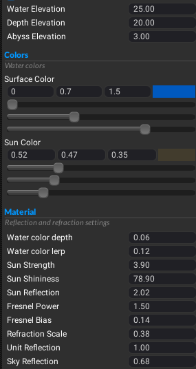
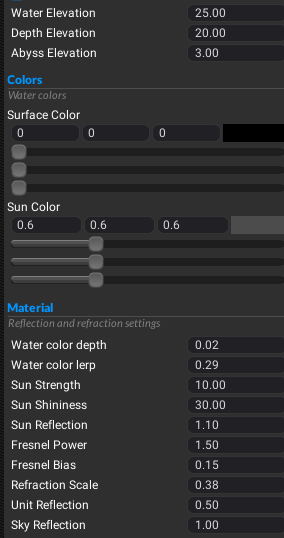
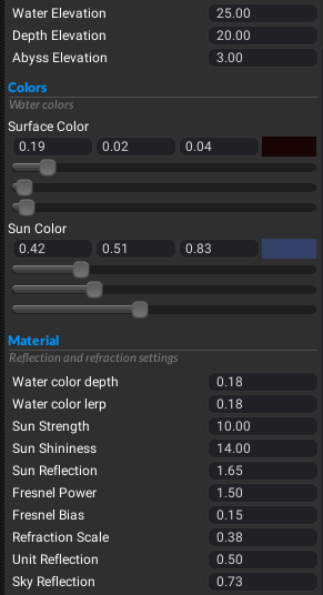
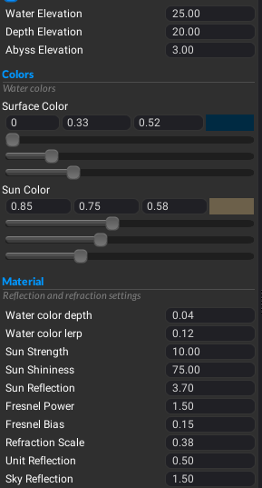
I decided to pull up the water settings for some biomes in the editor, and compared to the default, it looks like the values for lerp/sky reflections/sun strength are generally higher, and the surface colors are generally blackened. I might make a pr that makes some adjustments...
Default:

Mars:

Syrtis:

Stones:
