Caster UI Mod Functionality Brainstorming

-
vs
Would appreciate opinions on the green icons, currently the fonts are the only thing I'm going to change about them. But feel free to give your feedback
-
The first one.
-
They're not at the same zoom level, I think?
-
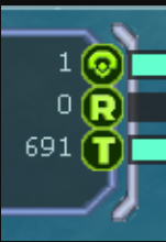
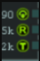
@jip Well rather than zoom its size, the bottom ones are 32x32 and the top ones are 48x48.
-
Most of the elements from the game. Also, I know this is not what you need, but I was wondering.
-
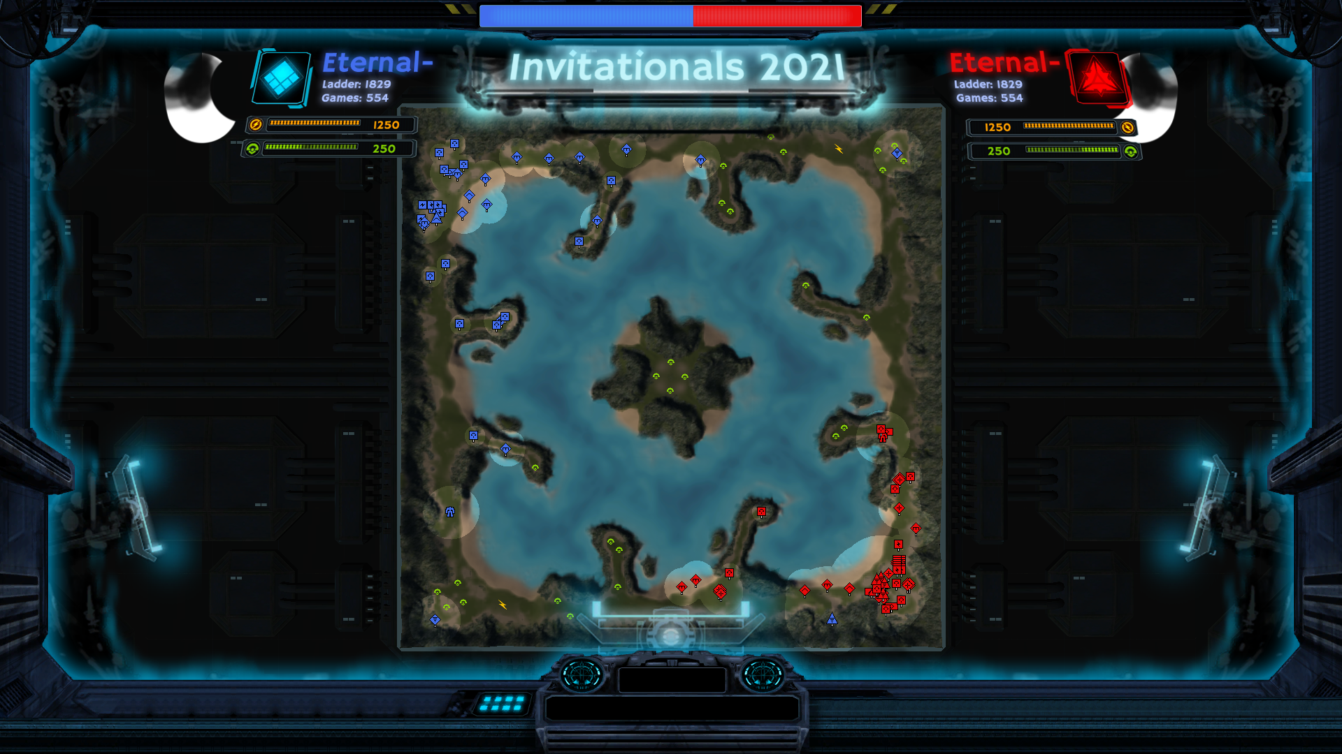
This is the UI (Its off-scale, clipping and messed up because my FAF UI being scaled to 150% throws the mod off, it will probably be fixed to scale adequately with UI)
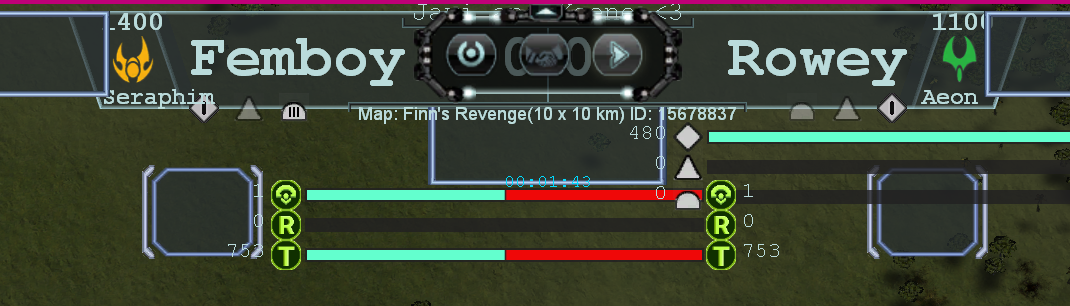
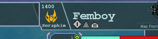
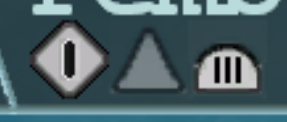
I would like opinions on what looks better between the land icon's bars and the navy ones. This feature will tell the tier level in land, air and navy. I'm updating the icons and I want to hear opinions on what do you think the new one (T1 LAND) looks compared to the old style (T3 Navy). I still have to adjust the air and naval icons/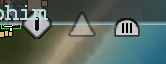
this one above has darker borders, is it better?
Also does T3 land's bars look like too much or is it good enough? -
@Eternal I like the stylization you've done! The areas around the side look too intrusive to keep on for the entire duration of the cast, but it looks really nice and might work well for an introduction.
@Javi can you please fix the scaling issues before asking for opinions?
-
I just want opinions on the icons, my work is in the UI department not in the coding xdxd.
-
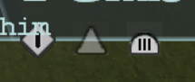
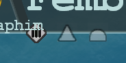
They should all be the same size. Not sure why land > air > navy in terms of icon size.
-
@keene I like it, but I think it needs a subtle marker showing the halfway point on the bars
Because otherwise it's not immediately obvious which player has more or less than 50%
I would suggest putting markers at the halfway point, and also 5/9 of the way and 4/9 of the way between the two extremes (because those marks correspond to one player having 20% more than the other player). Then it would be easier to see who has more and who has less.
People shouldn't have to read the numbers at the edge of the bars or use their eyes to guess at which bar is bigger. Come colors "pop" more than other colors, so it might be if you're bright pink at 48% to 52%, it looks like your bar is bigger than your opponent's. If there's a subtle mark at the 50% point, that takes away the ambiguity.
-
How about faf using some bucks to pay someone to design a professional looking ui
-
You should put the ui on the bottom. If you click on a unit for any reason, and you’ll be doing that during a cast: you’re now obscuring a solid third of the screen with the caster ui and the selection menu. This problem will be worse when you attempt to ghetto rig this product for anything higher than a 1v1. At least the ui functions of the game around the top of the screen can be hidden or used in synergy with the ui - because the top half of the viewport was made to be kept clear of anything outside of the most critical information.
Also someone please explain why it’s made with slab serif and no tracking LMAO
we live in a society
-
@biass It is not necessary to try to save the previous layout of the game UI. We always can move some ui to another place, and make it more presentable
-
@archsimkat Arch have you ever worked on a coding or design thing, where its almost like you dont always present an end product but a comparison between old and new or just a prototype xD?
Yes, the sizes will be the same but right now I'm asking between the new style seen in the T1 land icon and the old style between t3 navy. Are they different sizes? is something else clipping or looking meh? There is a high chance it looks like that because its a WIP and not a finished product.
Here, the t1 land has a smother shape on the edges, the bar in the middle has some edges and a small highlight behind it. The t3 navy is more simpler and the 3 bars dont have anything behind it. I'll try being more specific about this next time lol
FAF Website Developer
-
@biass I mean I think it could be possible to write code for Team 1 mass = Player1.massincome + Player2.massincome and so on, so you could get a clear view of the whole teams rather than all the players. But tbh right now we just want to finish it for 1v1 and then possibly move on towards teamgames.
Also I'm not very sure since I'm just the UI person but how would we hide the selection menu? Is that possible? or should the casting UI be placed on top of it and shadow it completely (with the ability of being minimized if someone wants to see the selection menu).
Also I didn't know about tracking until now. Thanks for letting me know about it
-
@femboy make more changes, better draw concepts based on a ready-made mod, and do not change directly in the game
-
@eternal I prefer to work more with what I already have over creating something different. Specially considering that LoTS is right around the corner and I want to get out a functioning product as fast as possible so it can be tested, get feedback and re-improve.
-
@femboy You're in too much of a hurry
Hello! It looks like you're interested in this conversation, but you don't have an account yet.
Getting fed up of having to scroll through the same posts each visit? When you register for an account, you'll always come back to exactly where you were before, and choose to be notified of new replies (either via email, or push notification). You'll also be able to save bookmarks and upvote posts to show your appreciation to other community members.
With your input, this post could be even better 💗
Register Login