TA Mapping Tournament (#6, 10x10 and under)
-
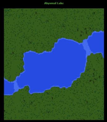
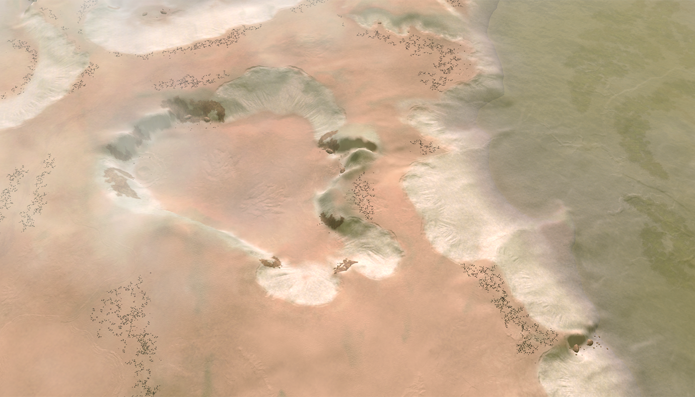
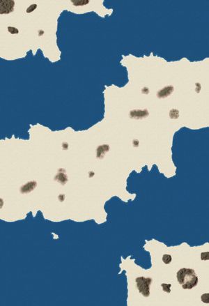
Adaptive Abusmal Lake
https://forums.faforever.com/viewtopic.php?f=26&t=19676#p186312 -
Roboust just so you know in TA, the lighter blue water/shallow water is crossable by land units. Meant to mention this awhile ago but forgot too
-
The what, Dragun - that is a huge difference!
-
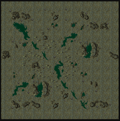
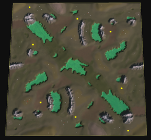
I would like to submit my map Perrote glacier, the original ta map is called etorrep glacier
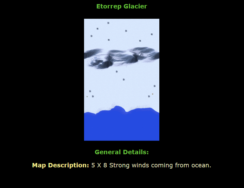
Original
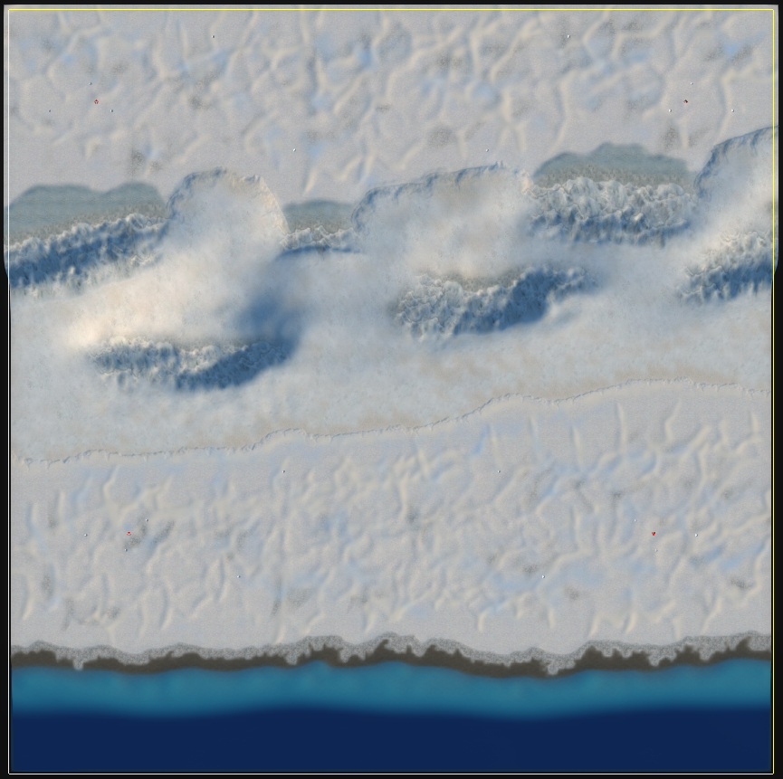
My remake
-
Supreme Conflict

Seton's Clutch

-
A reminder: a week remains.
-
My entry for this tournament.
The original TA map, Wretched Ridges :
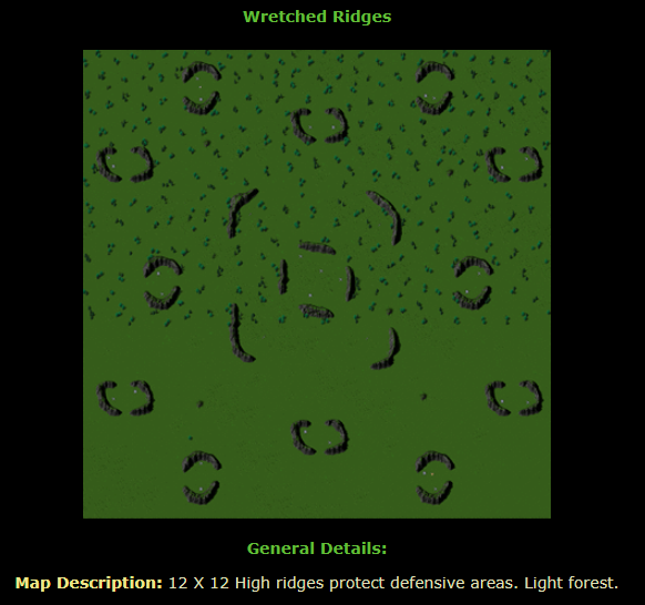
This is my reimagined map for F A :
Adaptive Wretched Ridges 10 x 10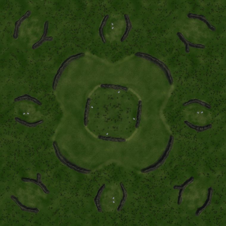
Key features:
- Trees
- Ridges
- Hydrocarbon Deposits
- Mass
- Allows for 12 Players
Vault ID = #16965
Contact me if you have troubles with this map.
-
Adaptive Long John Silver
A map for Supreme Commander: Forged Alliance (Forever)
A long forgotten salt lake that was once facilitating an experimentation facility of the Aeon faction
Statistics of the map
The map is designed to be either played as a 1 vs 1 or a 2 vs 2. Both teams start on the main land with the intention of one team member moving for the island. The mass doesn't contain any high-concentrated reclaim locations. The expansions should be clear from the design of the map.
There is reclaim on this map. This includes:
- A few rocks that are used as scenery.
- A few units (t1 tanks / t1 interceptors).
The map has various pieces of code to add additional feeling to the map. This includes:
- All initial wreckages can be on fire.
- The generation of clouds.
- The map is adaptive - using the adaptive script from the community member CookieNoob.
The map has over 2700 decals in order to make it pretty. That is a lot of them.
Overview
The water looks different in this image than how it would be rendered in gameOriginal
The map is based on the TA map Long Lakes
I do not expect to win considering my map doesn't look a whole lot like the original but still have slight optimism because of the sentence 'and lastly how you've chosen to convert the gameplay into FAF'
") .
. -
you have a great map to win
I'll leave mine unchanged for now. Because of the work, there is no time for finishing

-
I loaded up Jip's map today and man, it is a work of art. He would get my vote.
For me, this tournament provided an excellent reason to begin exploring all possibilities and options within the map editor since I had little experience to begin with. I really like this idea of recreating a map from another game. Is this a regular thing? I am not here for money.
-
mapping tournaments happen maybe twice a year, been doing some last minute tweaking today, good luck my fellow competitors
-
It's almost 3am so no fancy screenshots
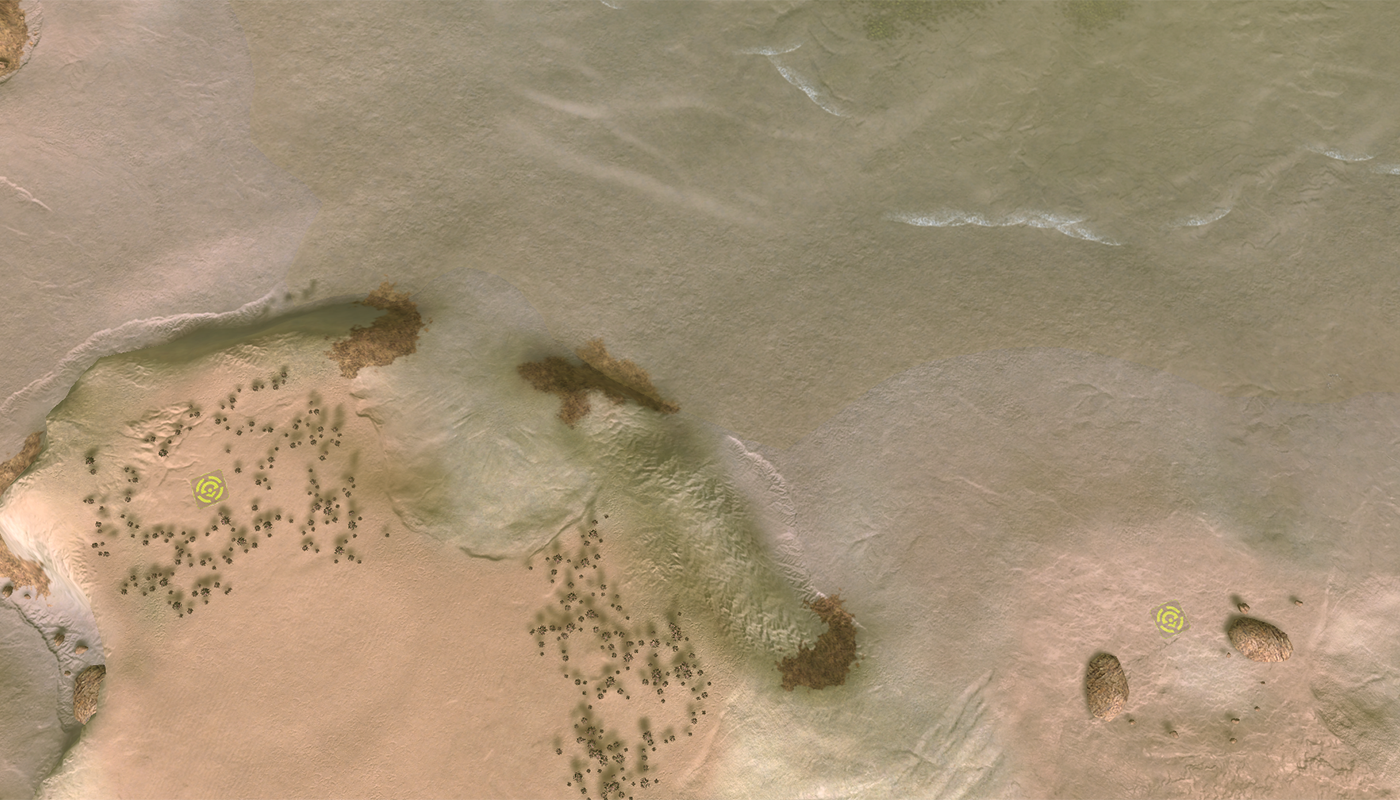
Original TA map: Acid Foursome
Map for FAF: Adaptive Acid Lakes
Map is 10x10km and made for 2v2 or 1v1 (actual 1v1 version soonTM)
The "acid" should be impassable to hover or submersible units. First map uploaded so looking forward to feedback.
Edit: adaptive version now working, disables some mexes for 1v1 config -
Submissions are closing in 8 HOURS.
@Stealth9 said in TA Mapping Tournament (#6, 10x10 and under):
Is this a regular thing?
As far as recreation goes, this would be the first one.
This is the 6th mapping tournament, I started off with a couple, and FtX also hosted a couple too. -
Just in time, submitting my map "Argon" based on the Evad River confluence


based on:

-
@Degulum argon is already a map so mb needs a rename
Looks nice though!
-
Submissions are closed boys.
I have to work tomorrow and the day after so expect the results to come in after that. If you didn’t submit and you want to help judge maps feel free to pm me, if you wanted to provide input to the authors here, feel free to do that was well.
-
Sorry to keep you waiting.
What I've done to calculate the winner is judge the maps out of 5 for:
- Faith to the original map:
- Aesthetic appearance:
- The translation of gameplay to FA:
I then gave an average score from the three and refined the scores a little to make sure they made sense when compared to one another. You should take the final score as a standard subjective opinion based rating, and use the average score as the rationale for why i've chosen it to be this way.
I will say that any person could have won the tournament if they spent another day or two on their map and this was hard to decide. I had to break mutiple ties between scores by reevaluating content. I encourage you to go back and work on your maps further, and I would want to see them in the 2v2 ladder and the TA tournament.
The score is:
1. ADAPTIVE ACID LAKES (3.4 / 2.5 / 4) = 3.3
2. ARGON (4.5 / 3.5 / 1.8) = 3.26
3. PERROTE GLACIER: (3.5 / 3.1 / 3) = 3.2
4. ADAPTIVE ABUSMAL LAKE: (4 / 2.5 / 3) = 3.16
5. ADAPTIVE LONG JOHN SILVER (2 / 2.5 / 2.9) = 2.46
6. ADAPTIVE WRETCHED RIDGES (4 / 1.5 / 1.5) = 2.33Rationale in the order I looked at the maps:
Opening statement:
Please read the rules properly before starting work on a submission next time.Also, I don’t add points to your map if you make it adaptive, as far as i'm concerned you haven't really improved the map in any way by doing so. Also if it’s a 2v2 map, why not make better 2v2 gameplay instead of trying to suit the map for 12 players? Bad choices.
ADAPTIVE ABUSMAL LAKE
I don’t know if this was spelled wrong on purpose but if it was not, please remember that the rules started you were not supposed to use the same name as the name of the original. Adding “Adaptive” to the name is not a substitute.Also, i’m not going to DQ you but the map is not odd vs even. Please make it so at your earliest convenience.This map is odd v even and I didnt realise because I thought the map was split a different way. The score didn't change due to this, but just an FYI.
Faithfulness: 4
No problems, a bit of shape lost on the middle rivers and the additions of ramps to help gameplay will force it off being a perfect 5, but nothing inherently wrong.Aesthetic: 2.5
I have a number of serious issues that will severely impact your score here.
First of all, you’ve used a decal to indicate where the ramps into the water are. This isn’t inherently an issue on it’s own because when the decals can be seen, they communicate where the points of access are. The issue is that at a high enough zoom level, the decals disappear and thus the map at times fails to communicate the ramps enough.Second, this style of texture use is something that you’ve used on another map, and while the two maps look “okay” with overscaled textures such as these, at lower zoom levels they look absolutely abysmal. I think you’ve lost a lot of detail for not a lot of benefit by doing this. You can’t force detail at higher zoom levels by making your textures bigger.
Other than that, I might have used a different texture for the seabed and use of decals appears very minimal. But I do like the direction you went for as regards to style and I do believe this is a map that could look very nice with some more time put in.
Translation of gameplay: 3
I like how you have chosen to have the two teams play out horizontally to avoid the inevitable hover spam that comes from FAF. I think you would benefit from making sure that the mexes on the shoreline can be killed off by frigates, if navy is given more value it would help to further negate hover and air spam as well.Some of the mountains in the middle provide natural cover for slots that have more mexes naturally. This means that the better slot can also contest the middle area way easier. I think you’ll find a lot of players will either instead go for an all in to contest that middle, or leave entirely, walk over the water and annoy the player on the other side of the river. This will make a for (hopefully) a good amount of variance, but I think it would be better if you made the middle easier to contest.
Final:
You finished the map way before the date, and I think it would benefit a lot if you continued to improve it. Maybe a submission for 2v2 ladder down the road if you put the time in.PERROTE GLACIER
This map is also not odds vs even.Faithfulness: 3.5
Again no issues, this map is basically a 5x5 map with a bit of useless space at the bottom though, strange choice to make it 10km but it was probably for the better.Aesthetic: 3.1
I have a number of things to mention here.First, I like how you’ve communicated that the snow actually has volume instead of it being a flat texture.
However, the big issue is that for some reason, you’ve chosen to try and fill the white space in the map with a horrendous looking terrain bump, not only will this have a severe impact on the gameplay, but it doesn't look very nice here. I can also see where you have tried to cover areas of white snow with other textures and the like - it isn’t needed.
The water area also needs more work, the transition to land is not a linear gradient along the entire shoreline and should vary at places, also if we’re on a glacier, the entire surface should be made of ice and snow and dirt shouldn’t be present. I didn't mark you down for that though.
I’ll always appreciate any work put into decals, but be cautious of your decals appearing too “man made”, you’ve done huge lines across the map that do not vary at any point and repeating patterns on decals are very visible. The use of weather is questionable, they’re cool but they impact the clarity of your map, you should move them more to the outside where they don’t make much of a problem.
I still think this is a good showing and you’ve put in some work, but make sure you know that mapmaking is an artistic process and not every inch of the map needs to “have something” on it.
Translation of gameplay: 3
I think you’ll find the top player is more important than the bottom in all cases. Bottom will probably be either too static, or a player will die trying to get the reclaim on the map that is almost linearly distributed. It’s better if you attempt to create gameplay elements (raiding, etc) instead of just scattering reclaim at random like this. Also the water area doesn’t really add anything to the map except for stalling the end of a game or sneaking some hover to raid some mexes. This might lead to some frustration.Top is going to be a better time in all cases, you’ll find the gameplay is a lot more dynamic here due to the separated terrain. You’ll probably see players trying to avoid fighting on the mountain in all cases, and resort to spamming air if they win their “lane” though.
Final:
I would have probably tried to make a tight 5x5 map here instead of a 10km one.ADAPTIVE WRETCHED RIDGES
Adding adaptive to the name is not a substitute for changing the name as was required in the rules.Faithfulness: 4
I don't have any comments here.Aesthetic: 1.5
I’m just going to use dot points here:- No decals
- Mountains are sporadically jagged, unvaried, a single texture that looks broken due to the lighting, and a single boring line.
- ground textures are okay in some places but are too randomly man made in the middle.
- Lighting appears to be the stock straight down lighting and doesn't add any personality
- Reclaim placement appears sporadic, linearly distributed and adds no personality
- Outer areas that are sloped do not have any attempts to communicate their presence.
Translation of Gameplay: 1.5
You have SEVERELY crippled your score by trying to submit a 12 player abomination into a 2v2 tournament. Mexes appear randomly distributed and sporadic, and slots 3 and 4 start with 2 mexes and not a single mex close to them. Reclaim is again, evenly distributed with no personality, and doesn't add anything to the map besides players having to lawnmower it all down to stay competitive.Final.
I know you’re new to making maps. I suggest you use your peers and the resources in the FAF Creative discord server, and you ask for feedback often. This will cut out a lot of the fat early and help you improve fast. Make sure to try and inject your soul into your work and give your creations personality and style too. FAF is the closest mapping scene to an art project than it is a 3D modelling project. Make sure to take advantage of that.ADAPTIVE LONG JOHN SILVER
Faithfulness: 2
I think it would have been better to choose a different map. This map looks more like setons than it does the original image.Aesthetic: 2.5
I want to like the map, I really do. I recognize the level of detail you’ve put in, the theme you’ve stuck with and the decal count. 2700 is a lot to add.However. Unfortunately it’s the quality of the placement of those decals that matter. It’s why decal counts on my own work have dropped to around 500 or so nowadays.
Some important things first, and a lot of people have already pointed this out, your ramps and etc are communicated VERY poorly. In some cases there is no difference between a ramp and a cliff. This is just not acceptable. Your map starts to lose nuance and appears very strange, and the gameplay impact of doing this border on unplayable. The slopes are also very clean and linear, and for a dustbowl is unnatural and strange.
This also extends to the beaches. Over all 2700 decals placed onto the map, there is no attempt to use them to communicate the transition from land to water. The water itself is difficult to understand and will benefit with some visual effects and some extra contrast.
The weather is back, and while I do think it is cool, overall it doesn’t particularly add anything. I think it is best pushed to the outside instead of sitting on top of mexes and etc. where it may cause further issues with contrast.
Prop placement is pretty superb and interacts well with the rest of the environment.
Lighting might be a bit too bright in some cases, I would have pushed the sun angle down to bring out the decals you’ve placed and make them “pop”Translation of gameplay: 2.9
I think if you wanted the players to move for the islands, you should have just made them spawn there. Putting a player on a 2 mex spawn makes the map rely more on premade map build orders and really just is not fun. I don’t think that frigates can really hit any of the mexes on the coast and without the navy being able to really cause an impact, combined with the relatively safe mex placement you’ll find players will just eco and spam air in my opinion. I think the map will benefit a lot more if you remove the blocking spots in the middle and focus on giving players multiple central locations to contest instead. Try giving the islands some worth to contest as well as the middle area.Other than that, I think the aesthetic issues will be a bigger issue for gameplay, than the gameplay itself.
Final:
It sucks to have to write out such a damming notice for what should have been a good map. I think if the issues were corrected this map could be top quality, but not a winner of a recreation tournament. It might just be better stripping the textures and decals, working on the gameplay with feedback from the ladder team and etc, and then reapplying everything again. You do have what it takes to make a banger, but the map needs to be cohesive and clear to the player.ADAPTIVE ACID LAKES
Faithfulness: 3.4
You’ve moved things around to help the gameplay on a very sporadic and asymmetric map. I accept this as a good thing but it still impacts your score.Aesthetic: 2.5
I’m going to be harsh with this first comment because I actually hate this:
Instead of telling players with an obnoxious popup that units cannot cross the lakes,
Communicate that fact on the map with your tools. Show don’t tell.You’ve struggled to really decal the lake areas and have used a weak or seemingly no texture to distinguish the difference. All it does is display a lack of attention to detail or confidence.
Other than that, everything else (texture work, decals, lighting) is a little below average. I’m sure this will only improve with more experience and time put in, but until then I don’t have much to say about it. I would read over what i’ve said about other maps because it applies here too. Nothing gamebreaking, but nothing good here.
Translation of Gameplay: 4
Clear cut expansions, reclaim that adds raiding, choice over expansion, and contestability to the map. Isolated mexes for raiding and probably some meme plays by building a cruiser in a pond. Very good. You might win the tournament on gameplay alone here.Final:
I would like to see this in 2v2 ladder if you put in work refining the aesthetics.ARGON
Faithfulness: 4.5
I can see you’ve tried to recreate the map down to each individual mountain.Aesthetics: 3.5
Your decals are a bit weak and choosing to communicate unpassable dots on the beaches instead of flattening them out is a weird choice. Everything else is pretty superb. I might have experimented with using higher resolution textures to push this map further too.Translation of Gameplay: 1.8
This one is a bit wacky and you would have had better success choosing a different map. The spawns are all over the place here. It might be fine for 2v2v2 but this is a 2v2 only tournament. Your saving grace is that the mex placement forces players towards the middle instead of pushing straight into enemy bases if they spawn next to each other. You’ll also find some places where you will get stuck on the terrain around the shore and I still think you should flatten it out.Some slots spawn next to 500 reclaim and more worth of rocks which might be fun for a friendly ffa, but not for a 2v2.
I think you’ll find navy has no value here and it will be similar to crossfire canal where you spam air and hover until you can get cruisers out
Final:
This is a good map, a great map even. Refine it and work on it and it will be an excellent map. Just not for 2v2. You might place well or even win due to your aesthetic or faithfulness scores, but it won’t be for gameplay. -
And as expected, I am far from winning the tournament
. I had a lot of fun making the map and am happy to see that @MadMax beat me to it. Congratulations to the winners!Without the intention to have a new 'grade' I'd like to discuss the feedback. The majority of this map was experimental in the sense that the idea was to 'scratch' the surface on what people deem acceptable.
One of such examples is the cliffs being 'unmarked' in some form, such as through a 'cliff' texture. To me personally I can still clearly identify what regions are walkable and which are not. I understand that from a top-level view this may be harder to see, but regardless I do not agree with your statement that the cliffs (and therefore ramps) are communicated poorly. Among others you can view them with:
- The lighting difference, the steep slopes of cliffs make the lighting react quite different.
- The perspective difference, cliffs are generally very steep and therefore visually small and when there was some form of ambiguity I put a rock decal on top of it.
- The decal difference, cliffs used rocky decals where as ramps used the erosion decals. This is done consistently and therefore is a clear give away where you can expect to walk.
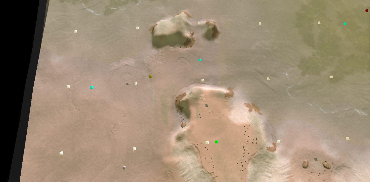
With all that said, I am the developer and am already perfectly aware of where the cliffs and ramps are. So maybe this is my tunnel vision on the matter. What do other people, from ladder, map developers or anyone else think on the matter? Because you mention that a lot of people pointed this out, but all I can recall is one perhaps two voices in the ladder-talk channel that mention it may be confusing where as I've spoken to other people that found it intriguing. As an example on how the cliffs look like to other people reading this:
I agree that the water is not communicated through decals, which was also part of some of the earlier feedback. In response I gave the water a slight tint which was sufficient in my eyes because maps like Seton's do the same. Perhaps I should've done more.
I also agree that having fewer mass extractors near the spawn makes the map rely more on premade built orders, a relation that I didn't make myself yet.
And indeed, naval play is not worth much and that is intended as such. There is a 'water bridge' between the player spawning on the beach and the island, which allows the commander to shoot while it traverses over the water and because of that blocks any navy from crossing that section of the river. The map would never be friendly to naval play considering there are two separate lakes, instead of one lake / river and the map is designed as a 2v2. Whether that necessarily forces players into progressing through air is something that may happen on a high competitive level - I honestly wouldn't know in advance.
And about the weather: yeah, weather. Haha, it doesn't add a whole lot gameplay wise. It does add the question why you can't see your base at some moments in the game. I think weather was removed from all the GPG maps with a similar rational to yours, as in some maps you can still the commented code
 .
.And last without sounding like a sore loser, I'd like to point out that one of the maps in the top 3 contains copyrighted content from another game (which is not TA) and therefore should in my opinion have been disqualified. May I ask what the rational was for not doing so?
-
Congrats to the winner it was close this time, going into it i knew the competition was going to be tight, I'm surprised i got 3rd but I was aiming for top 3 at least and am happy to have achieved that, Tbh @Jip i thought your map was good, although i would say a tournament map probably isn't the best place to experiment, but i like the idea of pushing boundary's tho, and i thought a map had to be vault legal to enter the competition and containing copy write material is against vault rules afaik, do you have any proof? and even tho you came in last place @Stealth9 don't let that discourage you entering a comp for you first map is brave.
-
A tournament entry is as good as any, I'm not here to win
.