[MOD UI] NextUI.Icons
-
NextUI.Icons - A Modern Strategic Icon Overhaul
Hi everyone!
I've been working on a new strategic icon mod, and I'd love to share it with the community.
The goal of this project is to preserve the original Forged Alliance strategic icon artwork while adding subtle, elegant visual cues that make important information easier to recognize at a glance.
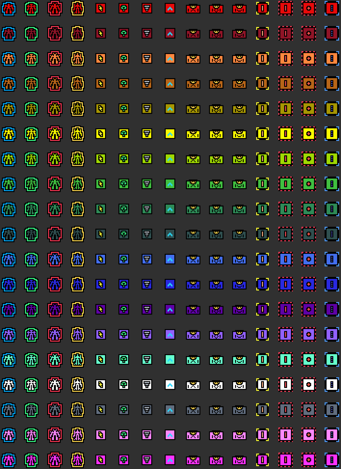
The mod will also add an upgrade animation to all the upgrading structures.
The project is open source and available at the FAF client:
And Github:
https://github.com/NextUI-FAF/Icons
The philosophy behind this mod is simple:
Keep the original FAF strategic icons while enhancing them with essential visual information without cluttering the UI.
Icon Generator
To make creating and maintaining icons easier, I also developed Icon Generator, a Python-based tool included in the repository.
It allows you to:
- Generate new strategic icons
- Modify existing ones
- Customize colors and symbols
- Automatically generate preview galleries of all icons
Complete documentation is available in the repository.
Generated previews are automatically saved to:
icon-generator/previews/
About the Colors
Finding colors that survived DXT5 compression while remaining distinguishable in-game turned out to be much harder than expected.
After a lot of testing, these are the colors that consistently produced good results:
# Working colors with DXT5 compression, tested in-game.
# These colors are safe for strategic icon symbols in the tested layouts.

black = "#000000"
white = "#ffffff"

blue_tactical_navy = "#051C33"
silver_bright = "#c9d2dc"

red_signal = "#ff4d57"
red_bright = "#ff3855"
red_orange = "#ff594d"
coral_warning = "#ff6b57"

orange_safety = "#ff9f43"
peach_bright = "#ffad80"

yellow = "#ffff33"
gold_bright = "#ffd84d"
amber_signal = "#ffbf24"
ochre_bright = "#dba82b"
sand_bright = "#e8cf91"

green = "#4dff70"
lime_energy = "#b8ff4d"
green_neon = "#39ff88"
mint_bright = "#66ffd1"
turquoise_bright = "#33e6c4"

cyan_ice = "#66f2ff"
cyan_pale = "#bffcff"

blue_light = "#27d9ff"
blue_electric = "#4d9dff"
indigo_bright = "#6670ff"
periwinkle = "#91a1ff"

pink_signal = "#ff5cce"
violet_electric = "#9d5cff"
purple_bright = "#c45cff"
magenta_vivid = "#f238ff"
lavender_bright = "#c7a6ff"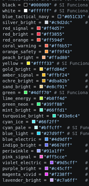
Player Color
The game replaces the following color with the owning player's color:
player_color = "#7b7d7b"Avoid using this color for custom symbols unless you intentionally want them to inherit the player's color.
Additional Candidate Colors
I didn't have time to test these in-game, but based on previous results there's a good chance they'll also survive DXT5 compression.
If anyone tests these, I'd love to hear the results.
copper_bright = "#d98245"
orange_bright = "#ffb347"
yellow_soft = "#fff066"

chartreuse_bright = "#c8ff57"
green_spring = "#57ff7a"
emerald_bright = "#4dff9a"
seafoam_bright = "#8affd1"

teal_neon = "#33ffd6"
sky_bright = "#66d9ff"
blue_ice = "#8abfff"

rose_bright = "#ff6ba8"
pink_soft = "#ff8fd8"
FAF Player Colors
For reference, these are the colors defined in
GameColors.lua.I don't recommend using them for strategic icon symbols, since they can easily be confused with player ownership or become difficult to distinguish against friendly units.
FAF_PLAYER_COLORS = {
    "cybran_red": "#e80a0a",
    "dark_red": "#901427",
    "nomads_orange": "#ff873e",
    "brown": "#b76518",
    "sera_golden": "#a79602",
    "yellow": "#fafa00",
    "order_green": "#9fd802",
    "mid_green": "#40bf40",
    "green": "#2e8b57",
    "olive_dark_green": "#2f4f4f",
    "blue": "#436eee",
    "uef_blue": "#2929e1",
    "dark_purple": "#5f01a7",
    "purple": "#9161ff",
    "aqua": "#66ffcc",
    "white": "#ffffff",
    "grey": "#616d7e",
    "pink": "#ff88ff",
    "fuschia": "#ff32ff",
}
I'd really appreciate any feedback, suggestions, or ideas for additional icons.
If you create your own icons with the generator, feel free to share them!
-
I like how the design specifically addresses gameplay issues like tml/nukes/smd/arty/omni/acus while keeping in line with the simplicity and readability (small size) of the original artwork. The configurable icon generator is also nice for people who don't like certain colors or are colorblind.
The shape of the faction-specific ACU icons is really nice (better than redux), but I don't like the faction-colored outline since that colored part blends in with player colors due to how much space the colored outline takes up, and how the outline's shape is different per-faction.
It would be cool to see your attempt at SACU icons with presets accounted for.The AA icon lacks a black outline on the light blue part so it blends in with the green and aqua player colors. I also confused its shape for air staging.
The gallery doesn't show the tech markers, but it should, I got confused with the HQ icons before I downloaded and ran the generator myself.
Also after viewing the dds files the preview images are way off: AA has an outline around the central shape, TML/SML/SMD/arty/power do not have outlines around the central shape. HQs also do not appear in the dds files. -
This looks tremendous. Please offer them in 1440p and 4k friendly sizes! I know there is a console command/setting to scale the icons, but that tends to distort them.
-
The main issue with such icons remain the compression algorithm used by the game. How do they look in the game? Aren't their color slightly off?
“Be a yardstick of quality. Some people aren’t used to an environment where excellence is expected.”
— Steve Jobs.
My UI Mods
Support me -
@nullptr They look good. Finding colors that would withstand DXT5 compression and remain distinguishable in-game proved to be much more difficult than expected.
After much testing, I included a list of the colors that gave me good results in my post.
-
@Nomander Thanks for the suggestions!
Regarding the ACU outline, my original idea was to use a different outline color for each faction. However, I agree that it can become a bit confusing when combined with the player's color. I've changed it so the outline now uses the player's color instead of the faction color.
As for the AA icons, I intentionally didn't add an outline to keep them as subtle as possible. However, you're right that they can get visually lost with certain player colors, so I've added an outline to improve their visibility.
I also removed all the T1 tech markers. My reasoning is that if an icon doesn't have a tech marker, it is implicitly T1. I found this approach surprisingly useful because it makes T2 and T3 units stand out much more at a glance. I know it feels a bit unusual at first since we're all used to seeing T1 markers, but after playing with it for a while, I found it much easier to instantly recognize when either I or my opponent has reached T2 or T3.
I also added dedicated icons for Point Defenses.
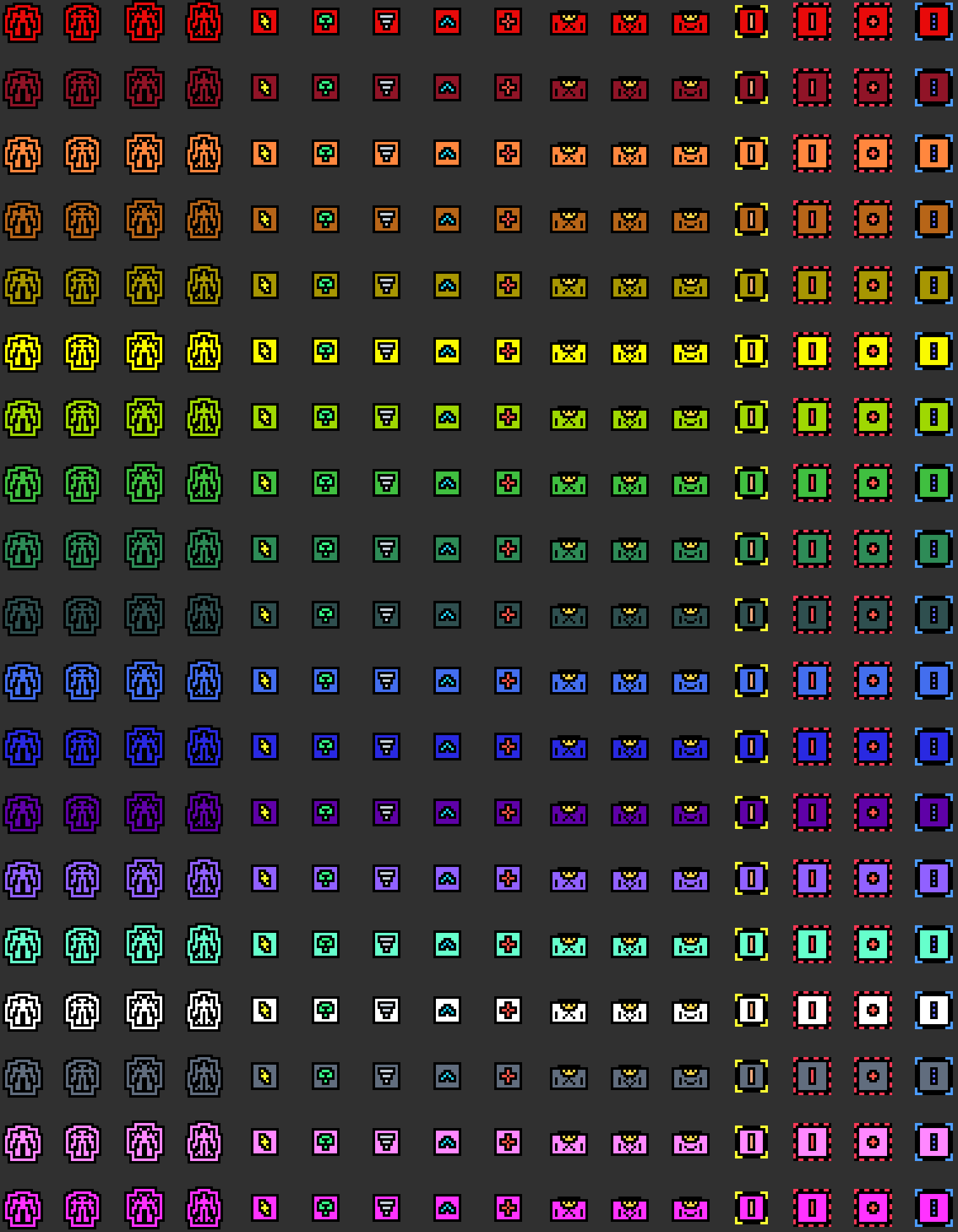
I can also update the preview gallery to include the T2 and T3 variants, so the tech markers are visible in the preview. The image will be larger, but I think it could be useful.
By the way, the HQ icon
.ddsfiles are already included in the./custom-strategic-iconsdirectory, just like all the other icons.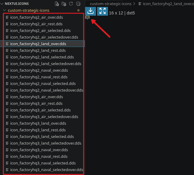
I'd recommend using the preview gallery as the main reference, since it shows every available icon in one place:
./icon-generator/previews/gallery_custom_colored_icons.png -
@HotCheeseInRear I'm not entirely sure what the best approach is for making the icons look good at 1440p and 4K yet, but I'll take a look at how other mods handle it and see what I can learn.

Hello! It looks like you're interested in this conversation, but you don't have an account yet.
Getting fed up of having to scroll through the same posts each visit? When you register for an account, you'll always come back to exactly where you were before, and choose to be notified of new replies (either via email, or push notification). You'll also be able to save bookmarks and upvote posts to show your appreciation to other community members.
With your input, this post could be even better 💗
Register Login