Redesign of the Aeon naval factory
-
You can find out about why we're making these changes and what other factories we've tackled so far in the overview topic.
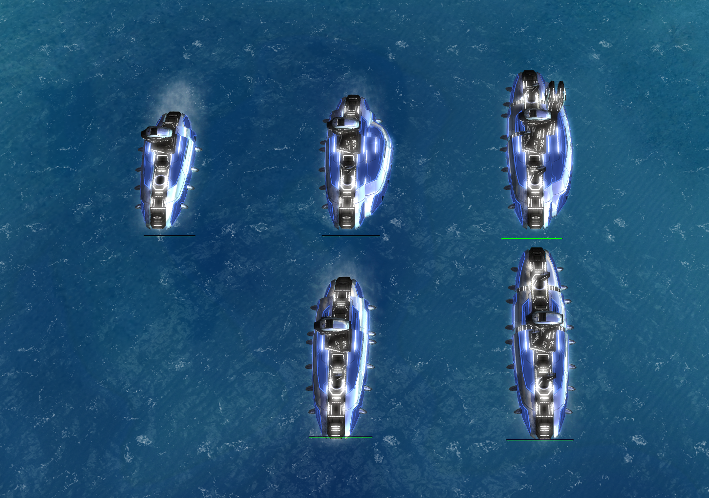
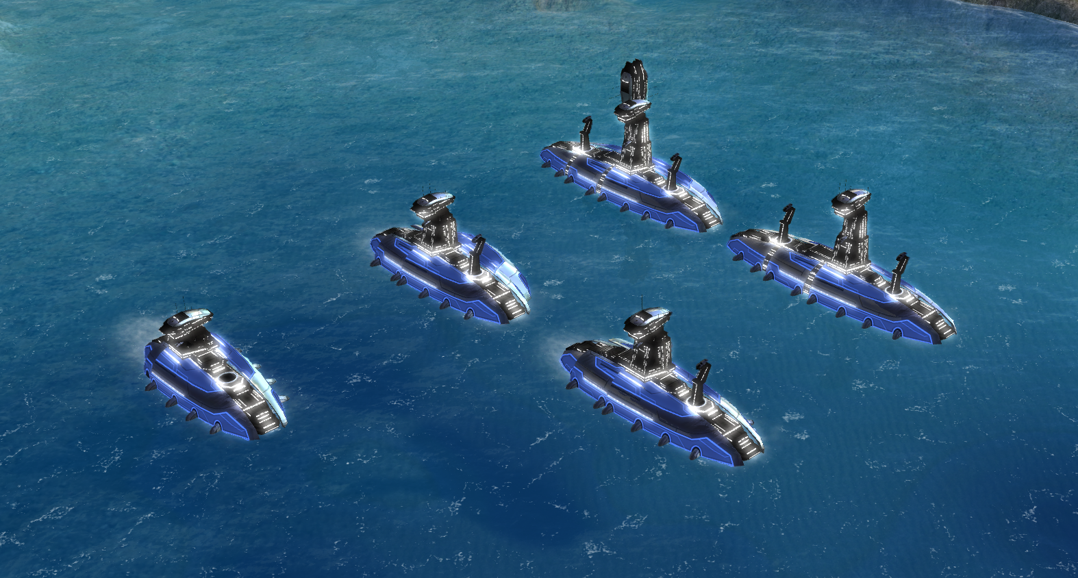
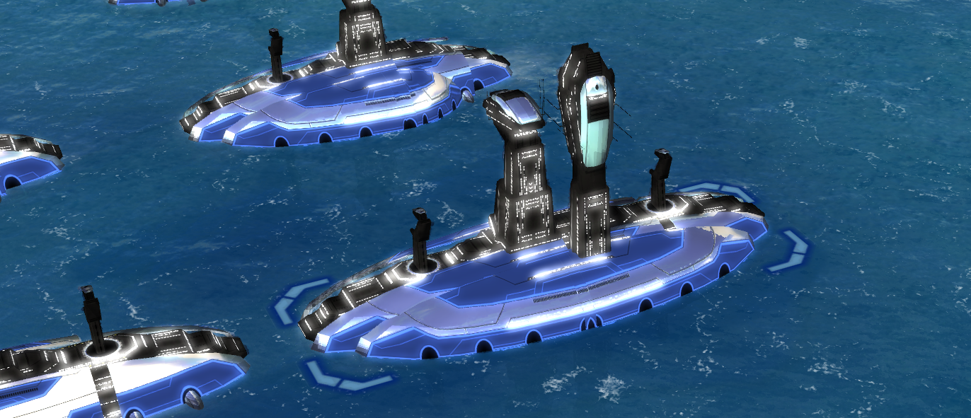
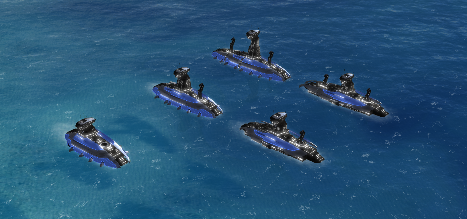
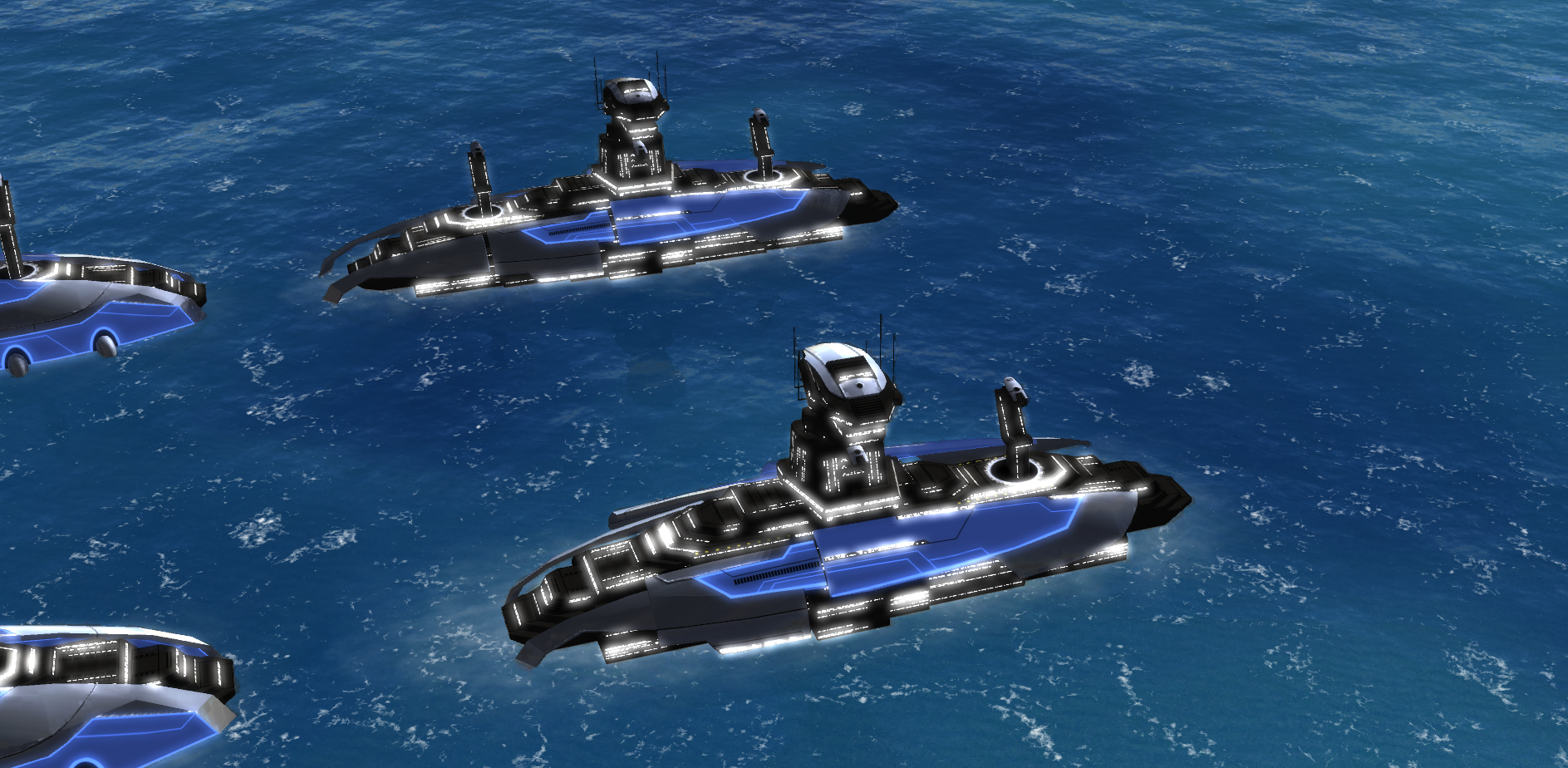
You can use this topic to discuss the design of the Aeon naval factories. The HQ is the base factory that ships with Steam FA. The support factory is the same mesh, but trimmed down. The primary features to identify it are:
- (1) It is smaller
- (2) Lacks the 'bumps' on the side
- (3) The building pillars are lower
- (4) The 'black metal box' sticking out on the south end of the factory
Summary of feedback
No feedback so far.
Old design
New design
-
 J Jip referenced this topic on
-
 J Jip referenced this topic on
-
 J Jip referenced this topic on
-
 J Jip referenced this topic on
-
 J Jip referenced this topic on
-
 J Jip referenced this topic on
-
 J Jip referenced this topic on
-
 J Jip referenced this topic on
-
 J Jip referenced this topic on
-
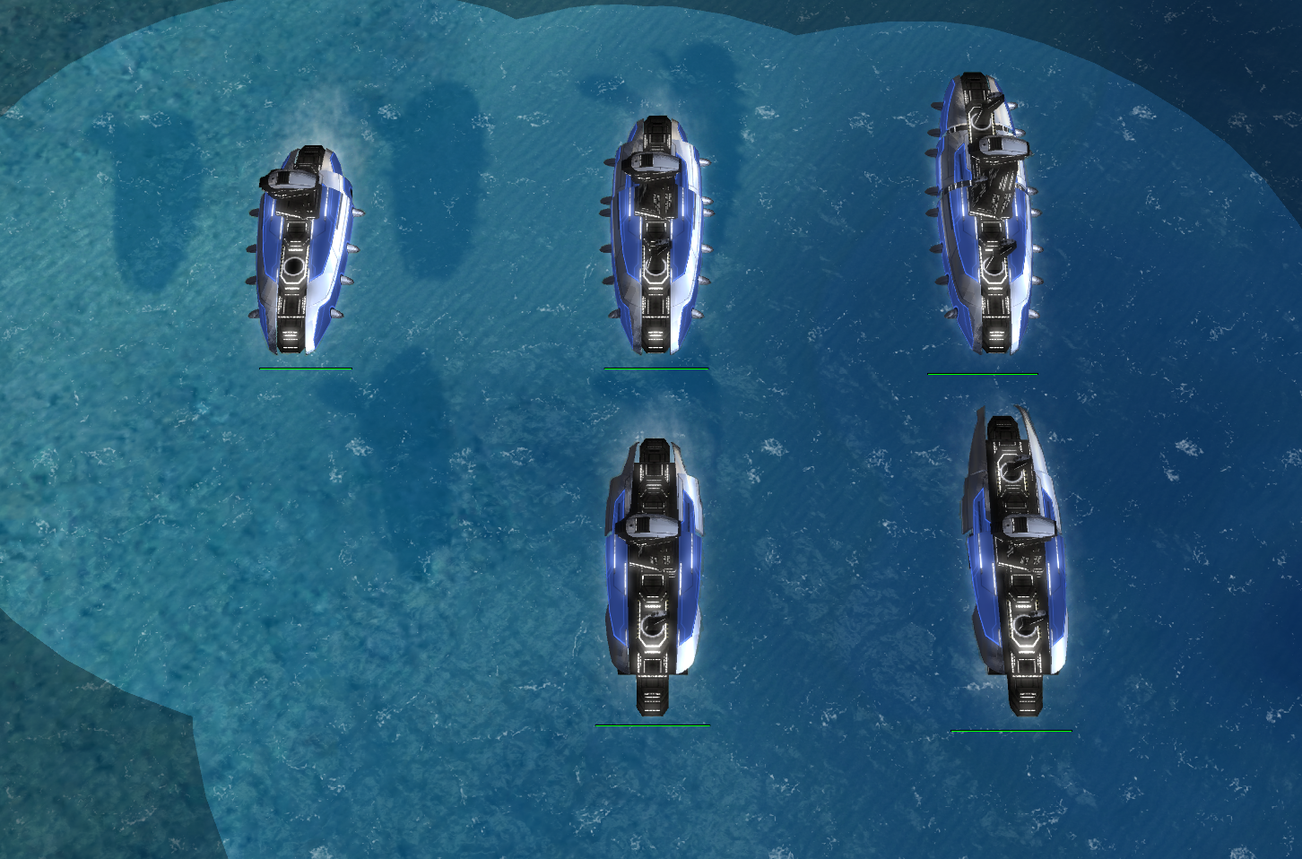
My main issue with these factories is that the support ones look unfinished. The 'black metal box' should be armoured.
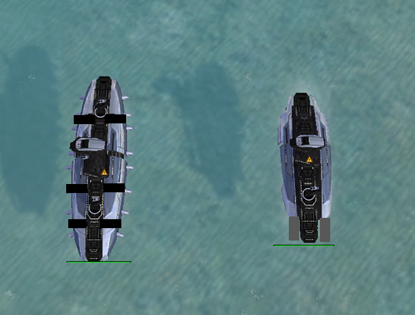
My idea is to have separation in the plates for the hqs, could have two gaps in the t2 hq, and 3 in the t3.
For the supports extend the plates to cover the end and maybe have a single split in the t3 to make it noticeably different.
-
What can I say, I understand your motives but the old design still looks way better than the new one even with stretched textures, bad ambient lightning etc... . And I agree with Angelofd347h, the new factories look unfinished. Get rid of a panel to make them different is just a cheap solution. In the old HQ factories at least there was an effort made at redesign and create a new model.
The new design is clearly not an improvement to the visuals or the game. -
The only way I would use this design style (removing parts) would be if the stripped down models start at T1 and get built up logically into either HQ style or support style
-
the old design is better i think. The Hq should be distinquishable by looking Bulkier, not the non-hq variant looking unfinished in my Opiniojn
-
Agreed (with above post). Additionally having visually striking differences between a support and HQ factory help gameplay. Making the differences too minor (or non-existent) has already been showcased with ACU's and SACU's.