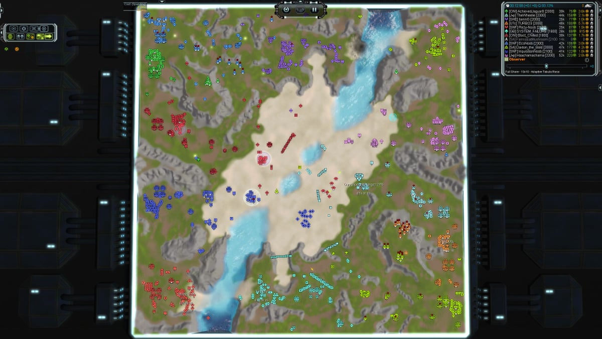
Reworked Strategic Icons
-
Hello everyone,
Today I will present to you an icon mod I made. I recently got a WQHD monitor and on that resolution the default strategic icons are just too small for my eyes. So I wanted to upscale the icons a bit and at the same time try to improve the readability even further.
The most noticable change are the tech markers. For example I found it too difficult to spot if there are T2 tanks mixed into a T1 army. So as a first step I got rid of a marker for T1 alltogether as it is redundant. The next problem I had was to distinguish T2 and T3, as it is not so easy to see at a glance if there are two or three markers under a unit. Especially when icons overlap and look like a T3 marker. So I changed the T3 marker to a bar. The noticable amount of white color in a blob of units makes it easy to immediatly recognize that these are T3.
I kept the symbols pretty vanilla for the most part, but I tried to increase the "boldness" of the symbols where possible. Originally I did this because a one pixel thick line is not so easy to spot on 1440p, but then I noticed that a different visual boldness makes the icons easier to differentiate without having to process the exact shape. Our brain is better at recognizing colors than shapes. The colors are already taken by the teamcolors, so the amount of black in the icon is the next best thing we have. Note that there is no real hirarchy in what units are bolder. This is mainly because the small pixel size restricts how the symbols can be made without looking weird. I did try to make arty and missile units bolder as I saw it fitting that these are more visible.
And that is basically all I did. I'm personally not a fan of emphasizing individual buildings like SML or TML, so I tried to keep the general feel close to the vanilla icons. If you want more of a revamp of the icons, then there are other icon mods that focus more on that.The mod will be available in the mod tab of the client as Reworked Strategic Icons once I managed to upload it.
EDIT: It is now uploaded.
I'm very interested in your feedback on this mod!
Here is a breakdown of all included icons

-
Very clean. I like the tmd icon. That is a hard one to differentiate at a glance without going wild, and i like the take on it.
-
Update: I finally managed to upload the mod!
-
Excellent icons, thanks for making this!
-
Looks nice, but much too small for me (4k).
-
This is exactly what I was after; especially true that t1 tick mark is redundant and made the other mod not nearly as useful as it could have been.
-
Due to popular demand there are now two more versions with different icon sizes uploaded to the vault. One is Reworked Strategic Icons 100 Percent and the other one is Reworked Strategic Icons 200 Percent. Here are overviews of the containing icons:


-
 J Jip referenced this topic on
-
 B BlackYps referenced this topic on
-
Hi, where is the download link. THANKS
-
My "strategy advanced icons" have disappeared. I uninstalled and reinstalled, but it didn't work.
-
You are posting in the wrong thread. What you are looking for is here: https://forum.faforever.com/topic/6646/strategic-icon/8
-
thanks you, I've found. Didn't read the description until the end.
-
Hi. When using a mod with a size 125% of the original, the icons of unknown units on the radar remain small. Is it possible to scale them too?
-
I am not sure why this is the case
-
I would hope unknown units are their own icon (that was untouched as an icon by the mod) since if they were related you could change unit icon sizes to get free intel from unknown signatures.
-
@ftxcommando Or have a custom icon pack where you have custom icons for the various undiscovered units.
-
Looks like unscouted units have their own icon.
The ASI mod scaled their size along with the regular icons when it worked.
Yeah, it would be really fun to have a separate icon pack for all unknown units. It would have definitely turned the game around)))
