Subtle Strategic Icons [UI]
-
For a long time after I first discovered them, I was your average Advanced Strategic Icons fan.
After some fairly recent discussion, see https://forum.faforever.com/topic/2543/downsides-of-the-advanced-strategic-icons-mod?_=1655984915629 I returned to using the stock icons.
Now having giving the comments and suggestions from much better players than me some thought, I am a Subtle Strategic Icons enjoyer.
The ideas for this mod have come from a few directions, one being the mantis bot icon change which led me to consider the other icon changes faf has made to base Supcom FA. In several ways this mod builds on the unit icon changes that have already been made by this community.
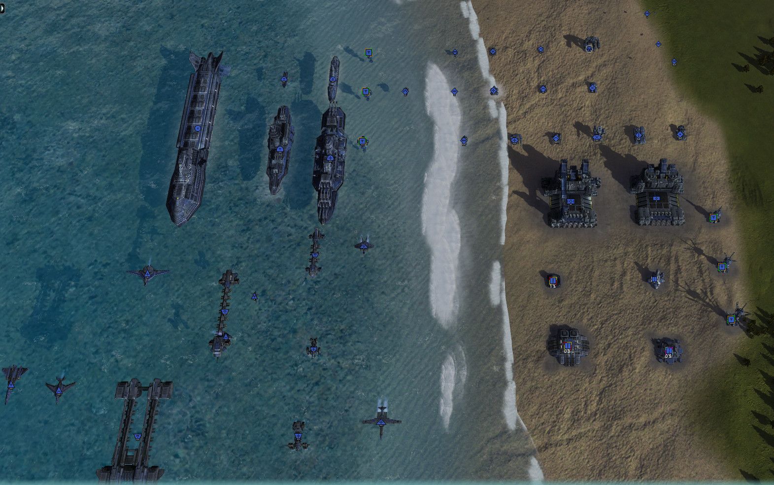
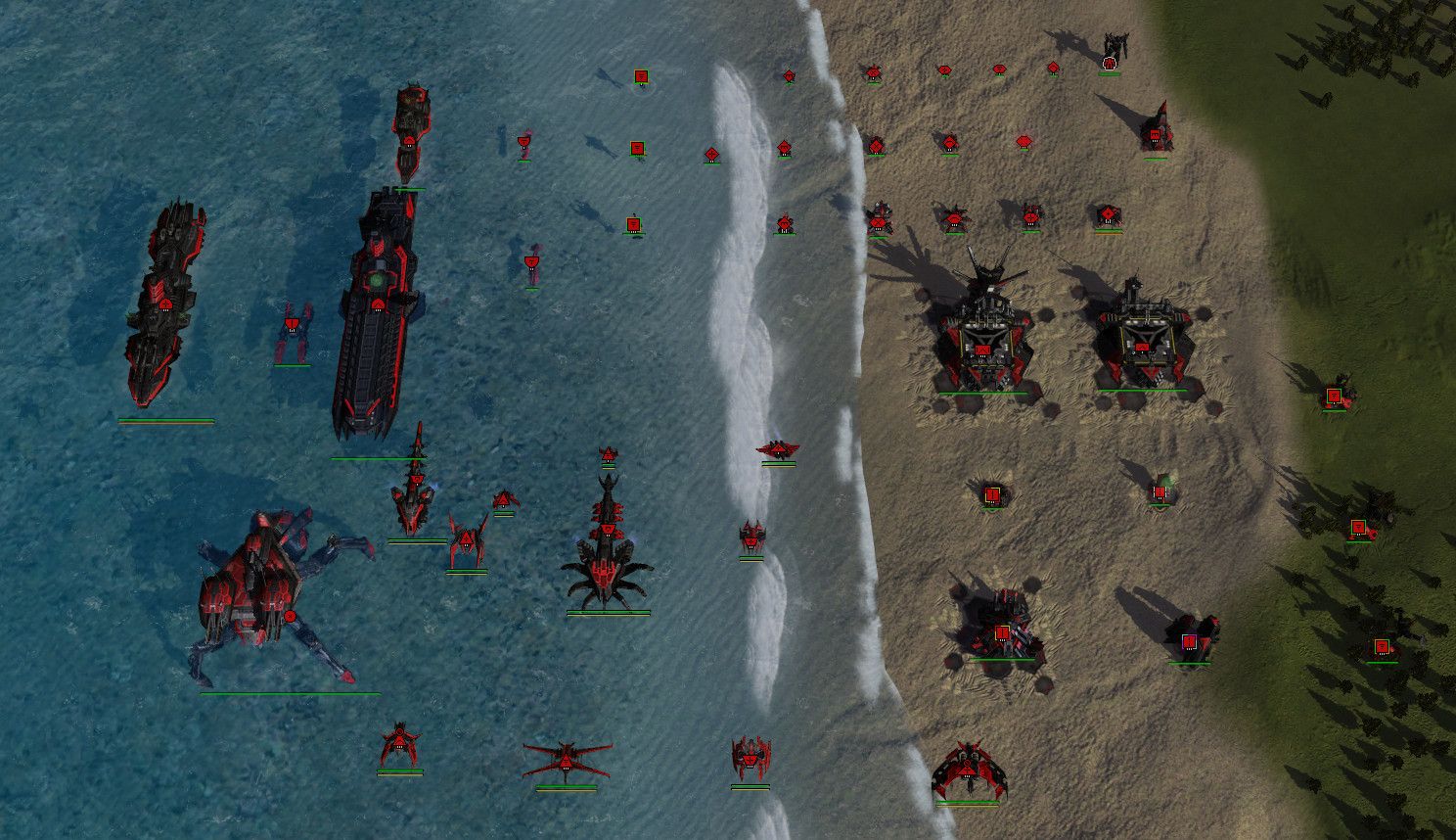
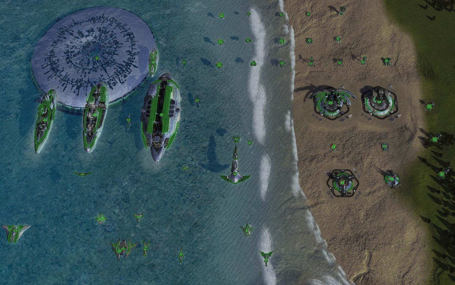
So this mod adds the 'armored' symbol to more units than just the brick and percie: in tier 2 we currently have tanks sharing the same icon, so the obsidian, rhino and pillar now have the 'armored' cross icon to represent the slower but tankier unit in their tier (for pillar it is hp/mass anyway). In response to this the fire beetle and mercy have a more 'hollow' cross icon to differentiate them.
This is extended to tier 1 so the mantis retains its bot icon but now has the cross symbol.
At this point looking at the models, I added the bot icon for those which are obviously so, being the mole, fire beetle, Seraphim t1 mobile anti air and Seraphim t3 mobile artillery. Bots will be bots in this mod, in a game of tanks vs giant stompy robots.
The next step was highlights for the most important structures that you want to notice on first glance if possible, so now intel, TMD, SMD, SML have bi-colored outlines to catch your attention regardless of player color, and the ACU and TMD have white outlines.
The last, most subtle change was to the size of icons, the idea is to again draw your attention to impactful units you want to recognize such as t2 combat air, t2 tanks, t2 subs. Higher tier engineers also become easier to pick out of your swarm of t1 engies. The t3 armored bots are also a little wider to fit their larger symbol.
As part of the progression all T3 units have larger icons, and also all Factory HQ's to help you know when you are behind ! Finally, Experimentals have a larger icon but also a small cross symbol to help catch the eye instead of being just a blank space.
So ultimately the aim of this mod is to provide the maximum amount of game-relevant information in the clearest way possible. In that spirit, some changes are added to third level hives to give them the t3 icon so you know if any are not fully upgraded. Also kennel drones, since they have no blueprints and are just raw buildpower, now have a tierless engineer icon, and the sACU drone has a t3 engineer icon.
I have included some screenshots per faction of the relevant units in-game:


Don't care for the fat strats or the thicc bricks? Not keen on the icon shape or symbol changes? I have added a lite edition of the mod with just the intel, sml/tml, smd/tmd, and the ACU highlight changes. If you are not currently using any icon mod I think this can help your game.
BW
-
 T1 air really is subtle.
 Solid outline on ACU.
 Funky engineer
What about?
- Mass extractors
- Power generators
- Support commanders
-
@photek said in Subtle Strategic Icons [UI]:
 T1 air really is subtle.
T1 air and navy is unchanged, I added some units to the screenshots for comparison purposes, T1 land has change to bot icon for a few units
 Solid outline on ACU.
 Funky engineer
good spotting !
 Forgot to mention I added a specific icon symbol for the sparkie, as a cross between engineer and direct fire
What about?
- Mass extractors
- Power generators
- Support commanders
no change to any of these - you could argue for a larger icon for t2/t3 power but trying to take the minimalist approach for this mod
-
This is really nice, I think it's very well done. Have you edited the priority order that the icons appear in?
-
@archsimkat Thanks! No change to the icon priority order - I believe this is still in the unit blueprint.lua and not exposed with the icon framework that was added.
-
Yep, that is not exposed.
-
@black_wriggler
This is done via UI Mod?
-
yes this and the other new icon set mods are all UI (changing the icon sorting priority for units would need a sim mod).
-
May I ask how does tbis interact with units with non-default icons?
-
For the sort priority it would be nice just to have pd, T2 arty, and radar priority over the pgens and wall sections. It's the main real sticking point for visibility for me personally.
As for non default icons they can be specified per unit or they will default to whatever the BP specifies, or maybe i misunderstand your question.
-
I am curious what his mod does to
them -
@dragun101 The mod just replaces strategic icons. It doesn't change which type of icon should be used for a unit (excluding the few units that have their icons altered specifically by this mod, these are listed in the opening post).
And it only replaces icons, the mod provides, everything else is left untouched.
So if a unit uses an icon, for that the mod offers no replacement, then you will just get the original icon.