Feedback page design
-
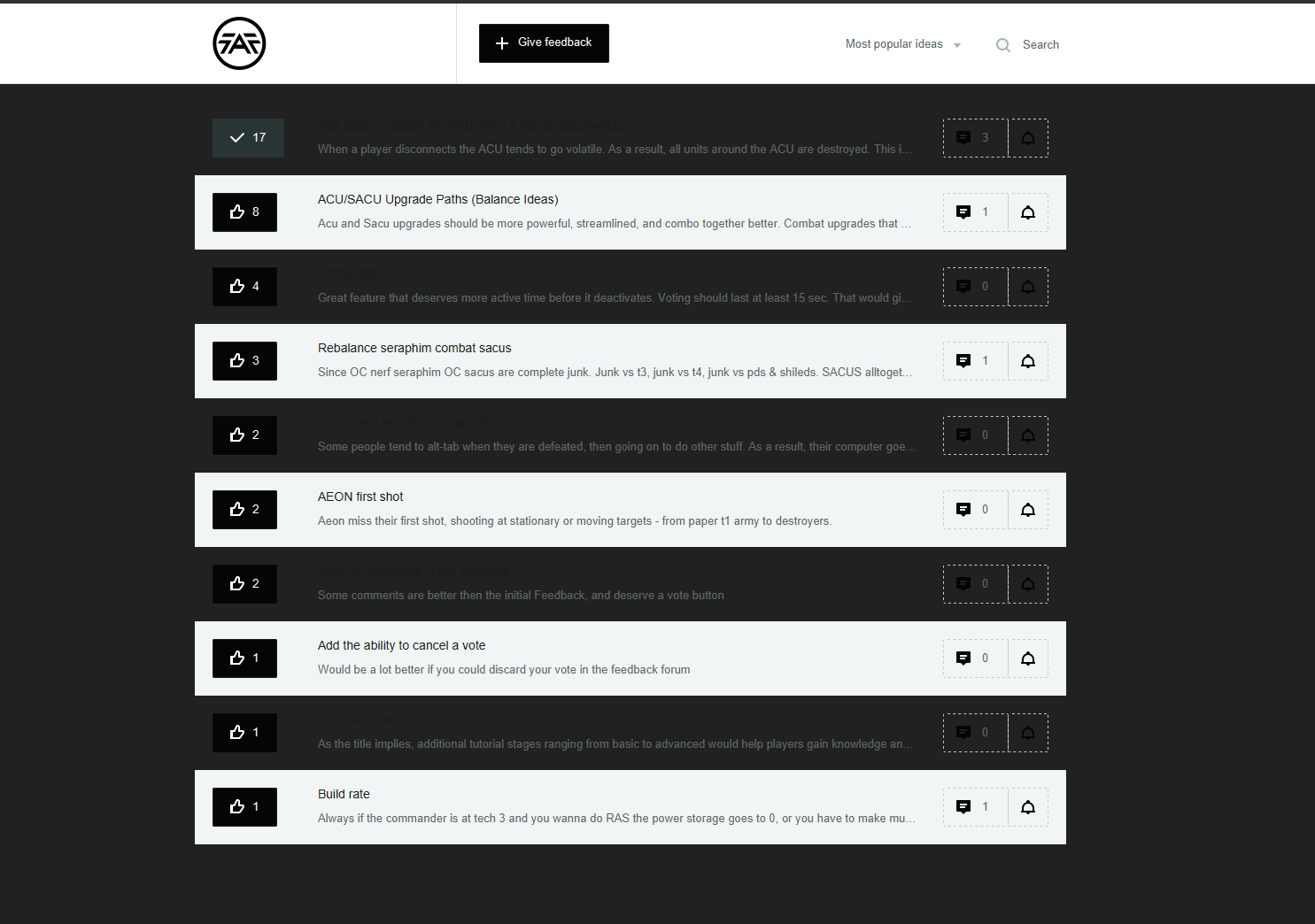
The new feeback page has a.. suboptimal design.. can't read half of it + the comments
I think it would be great if it would have a separate button at the top of the client next to "Units"
-
I do not have time to look into it right now, but I agree that it is a little suboptimal. When we tested the color layout we had only one (example) entry
") . If nothing changed in a weeks time, feel free to ping me about it again.
. If nothing changed in a weeks time, feel free to ping me about it again. -
Looking at it quickly - the issue is the default background of the client. If you open it in a browser then it shows fine:
-
Hello! It looks like you're interested in this conversation, but you don't have an account yet.
Getting fed up of having to scroll through the same posts each visit? When you register for an account, you'll always come back to exactly where you were before, and choose to be notified of new replies (either via email, or push notification). You'll also be able to save bookmarks and upvote posts to show your appreciation to other community members.
With your input, this post could be even better 💗
Register Login