Color coded strategic icons
-
I'm working on a color coded strategic icons mod. Similar exists, but only uses the color coding for some structures basically.
The general idea:
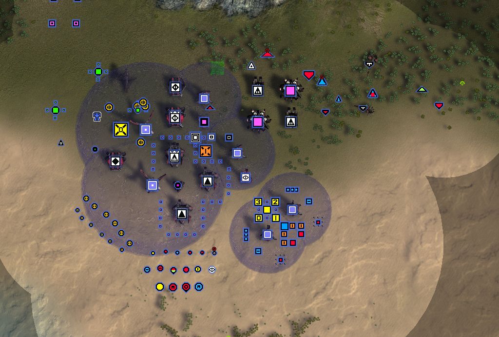
- The inside of the icon shows the capability. The colors are the same as the range rings. This makes it easy to see the composition of an army at glance. See no blue? Send in those gunships!
- The size of the icon refers to the tech level. No longer do you have to look at those tiny tech level bars.
- The player color is shown as an outside "glow"
- Units that can hover has a pointy top. Units that can move on seabed has a pointy bottom.
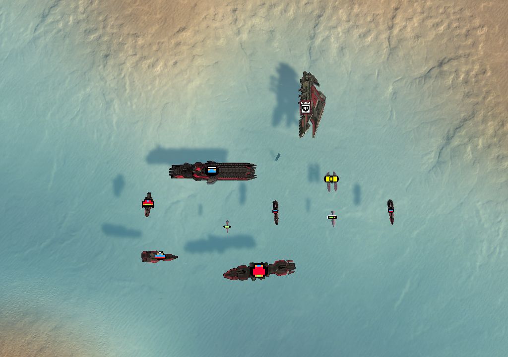
- Naval units are very different between factions, their composition is shown as a "lego"-like structure. A bit messy maybe, but I find it useful. Naval is the most recent addition, so it's a work in progress.
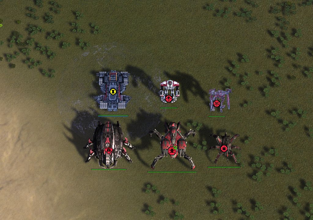
- Custom (huge) icons for Experimentals. I'm not really an artist so yeah they turned out OK at best. (HELP ME)
I also integrated overlays to show the count of silos, idle engineers etc. Idle engineers / factories blink when idle. It's a bit annoying perhaps. Ideas welcome.
Thought I'd share to see if anyone is interested, have ideas and maybe someone even want to help me finish it because I ran out of steam a bit with quite little left now.
TODO:
- Finalize the designs for all "rest" icons. Totally open for ideas. A few are not changed at all and shows the Redux version that I forked from but almost all are there.
- Naval and experimentals have no player glow yet as I am still thinking about their design, don't want to do that work double.
- When all "rest" icons are done, make the "selected" and "over" versions. I'm thinking they could be just a copy but with a white glow, or something simple.
- Final touches for the overlays.
- Probably something else I can't think of now.
It is working if you want to try it. I use it for all my games, but units use the Redux icons when selected/hovered and the hover/seabed units become invisible when selected.. as of right now.
https://github.com/FreadyFishFAF/ColorCodedStrategicIcons
If you don't know what git/github is: Just click the green "<> Code" button, download as zip, and unzip it in your mods folder like: C:\Users\YOURUSERNAME\Documents\My Games\Gas Powered Games\Supreme Commander Forged Alliance\mods\ColorCodedStrategicIcons\ (subfolders/files in here)
Let me know if you have any issues, have ideas or want to help out. If you havent worked making icons before I can help you get started, its basically like working in paint (but you use GIMP). Although, ask me, really, and show the workflow and some limitations that you need to know about
")
As a teaser I'll also let you know I have 36 mods running most of which I have customized (a lot) to add new functionality and to make them work seamlessly together. Eventually I hope to release them all as a complete package. More about that later, but, if any cool modders (I know there are a lot of you out there) want to collaborate on something like "the official FAF mega mod package" (name can be discussed lol), then let's talk.
// FreadyFish
-
The basic idea is good but personally I dislike the icons themself. Don't get me wrong, having a GC icon where the GC is literally in he icon is nice, but is it necessary? It makes reading armies a lot harder and only the dot is enough since exp. are simpy a thing you hover above one time and you know what exp it is.
Same with all the other icons. If you make two separate mods, this one keeping everything you have and another one, where you only add colors to the important things (e.g. flak) I could see ppl downloading it. e.g. personally I'd only add a color to stuff like Nuke, Smd, Game ender and then flak and if tanks have the same icons (e.g. blaze and obsidian) you could also make them a slightly dif. color, everything else will just take a lot of time to get used to meaning ppl prob don't want to change their current icon mod, especially the blinking part since depending on the size/freuency I can see it being quite annoying throughout the game.
Again, just a personal opinion, not constructive criticism. I wanna note that I use the basic icons and penguin's strategic one highlighting 3-5 buildings but that's about it.
Inactive.
-
I agree with Sladow here. Quite often less is more, which is especially true for icons. Imo, many different and colorful icons will scream to you for attention and make it kinda hard to decipher them. However, for some important structures I do find special icons useful. Personally, I am using a modfied version of the ASI mod, using only a couple of (for me) important icons like (TML/SML/SMD...) and deleted all the others (so using the base game icons). Works fine for me and doesnt clutter the screen to much.
Icons are a rather personal thing and usually come down to preference and habit. -
Cool proof of concept, but too visually busy for practical use imo.
-
@sladow-noob Haters gonna hate! Juust kidding, I appreciate the honest feedback. It started like that, most important ones. But then I just felt everything is important. Many times I've been chasing down T1 artillery only to realize they were Seraphim and can retreat over water. Now I know exactly what to expect. But hey, I salute anyone who can keep track of all those details with the traditional icons. The idle overlay will probably get two versions in the end, blinking and some simple flag much like the idle enginers mod, and ofc an option to chose either or none. The blinking is rather slow and syncronized so not super annoying, but a work in progress still.

-
Released v1
-
Congratulations on the V1 release @FreadyFish! I downloaded the mod on the vault and gave it a go. Normally I really struggle with identifying stuff with the default icons, and your mod helped me a bunch in that regard. Many thanks
My favourite features were the colour scheme matching the capabilities of the units and icon size representing tech level. These were awesome for determining how best to smash an enemy's army composition.
At first I found the navy icon ugly and weird. Now I can't live without them. They are just so FUNCTIONAL. I can tell at a glance if I need subs, gunships or frigates to counter a naval composition. It was especially nice seeing if something had torpedo's or not. I didn't know the Galaxy had them until I installed your mod!!! Wish I'd known sooner...
Some icons weren't to my taste, so I've just deleted the image file for the corresponding unit (it was the spider). Ez fix

It is really commendable that there aren't tons of obviously asymmetric icons. Many other icons on the vault have asymmetric icons which I find really distracting.
I found a few issues that I hope get addressed in the next release. It took about 10 open-then-close the game to get the shield icons to stop glowing except when zoomed out to the extreme. I also haven't been able to hot-fix the idle factories functionality. Without UI Mod Tools, the fac's show as white (and all idle monitoring also doesn't work obviously since UI Mod Tools is a required mod), while with UI Mod Tools they show as grey except when on repeat build.
Please keep soldiering on! Your mod is great and I'd love to see it in its finalised state

-
Something I've been wondering about is icon size scaling based upon camera zoom. Reduce the icon size slightly the further out you zoom so stuff isn't as cluttered in the late game.
This idea isn't specific to your mod, it could be used anywhere, but it might make for a nice feature/addition if you think it's worthwhile.
-
@arran Thanks Arran! Glad you like it!
Haha my LEGO-navy icons, as I like to call them. My favourite detail must be the legs on the Salem

Next release is coming any day (or week) now actually!
- Overlays will be optional checkboxes via UMT options menu.
- Every base game unit now has an icon, some have been updated slighly for better consistency.
After uploading the beta I realized I was in the middle of trying some stuff with the factory overlays, so yeah that's my bad. They will be working in V2. For V3 I'm thinking of having the icon change depending on what is currently being built, like when building engineers now. But color coded this time - of course.
About the shields, I am not sure what you are refering to. I haven't had any problems with them. Could you elaborate a bit, or if you have a screenshot?
Feel free to try the current version, maybe it's something I have solved unknowingly. I would also gladly hear your thoughts before the release:
https://github.com/FredrikBergelin/FAF-Mods/tree/main/ColorCodedStrategicIcons
ColorCodedStrategicIcons_V2_PRE_RELEASE.zip
I am totally up for ideas on the design. As is evident from the experimentals, I am no Picasso. Maybe they should not be depicted at all like now, instead just some generic symbol? Spider definitely deserves a cool icon (not that I am biased towards Cybran or anything..
 )
)The size/zoom thing, I have thought about it too. I don't think it's possible to solve unfortunately, for the same reason many icon mods have 1080/1444/4k versions. Everything is pixel based in a specific format, so they are not intended to scale. It might be possible to create a new set of smaller icons, and load dynamically on certain zoom breakpoints. If anyone knows some limitations here please let me know. Realisically this is a V4 feature at the earliest.
-
Yesterday I discovered that the shield issues are somehow related to the bloom setting. With bloom off, the shield icons look normal, but with bloom on, the icons look whitewashed (i.e. white squares), and you cannot see the blue(ish)/purple square part of the icon. Sadly V2 still has this problem for me.
Top is with bloom on, bottom is with bloom off.
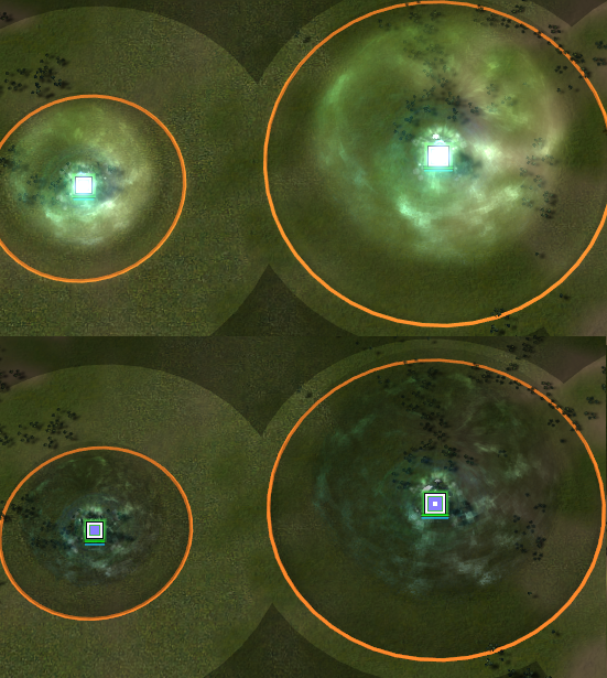
Disclaimer: This issue with bloom is being exacerbated by one of my other UI mods (I think). But even with all my other UI mods disabled, the issue persists, just not nearly as noticeably.I do wonder if this might be a problem on my end or not since the factory overlay isn't working properly either. If you can get other people to give feedback, that would be of help.
Disabling every mod except Color coded strategic icons sadly didn't get the functionality working. Your code was also too complicated for me to understand!In V2, the engineer overlays are much better, especially in regards to the SACU icons. A small suggestion might be to only have the nuke/antinuke overlays appear after they have finished construction? IDK if this is feasible or not to do.
I'd also suggest adding UI Mod Tools (uid = "ui-mod-tools-4z0t-v12") to the required mods list in the mod_info file. People might otherwise complain that the mod is "broken" when they've forgotten to add the dependencies.
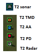
name = "Color Coded Strategic Icons"
version = 2
copyright = "Nope but feel free to let me know what you are planning and if you want to improve something."
description = "Color coded strategic icons with integrated unit overlays. Player color is shown as a surrounding glow, middle is colored based on unit class with same colors as range circles. Icon size indicates unit HP/threat level. Submersible units have pointy bottom, hover units has pointy top. Overlays for idle engineers/SACU, factories, upgrading structures, and TML/SML/SMD missile count.
Check the FAF forum thread for images and let me know what you think.
Requires UI Mod Tool (v12 tested) for overlays. Optimized for 2560x1440."
author = "FreadyFish"
url = "https://forum.faforever.com/topic/6779/color-coded-strategic-icons"
uid = ""Color-Coded-Strategic-Icons-FF-v2"
exclusive = false
ui_only = true
conflicts = {  }
requires = {"ui-mod-tools-4z0t-v12"}
before = {  }
after = {  }
icon = "/mods/ColorCodedStrategicIcons/icon.png"
Unfortunately, so far as designs go, I'm no artist either! The best I can do is spot asymmetry in icons. Like with the T2 PD, T2 AA, T2 TMD, T2 radar, T2 sonar. And in this regard something weird is happening. In the dds files, the images are perfectly fine, but when displayed above a structure, they are slightly shifted.
I also noticed that the mass storage icon (all except _rest) still uses the Redux Strategic Icon while all the other icons (so far as I can tell) all have unique icons now.For experimentals it's hard. Honestly, they aren't too bad in their current state. My only suggestions would be to reduce the size of the Ahwassa icon size to be more in line with the other air experimentals, and to increase the relative size of the depictions of the GC, Chicken, et cetera inside their red circles to make them more clearly distinguished.
Also the Neptune has a little blue strip at the top of it's icon indicating anti-air capabilities, yet it has no AA.Hopefully this feedback helps!
P.S. SMD overlay caps at 5, not 7. I also saw some code to have the number be replaced by a "+" when over some number, but that doesn't seem to be working/implemented yet.
-
 A Arran referenced this topic on
-
@arran Good catches!
The asymmetry is actually present for all icons. It seems as if its the surrounding glow that gets cut off, on the inside of the glow not the outside. Very strange. Any attempt of mine to mitigate it by changing the icon only makes it worse. When changing colors through the "use team colors" or whatever it is called, it's displayed more properly. Red works bettar than blue for example. This is the extent of my findings.
Does anyone know some more details of how to work with the icon player color? I just set it to a gray with 70% luminance and it works to show the different colors automatically. There is probably something more to it. What thresholds are used for it to count as a player color for example? Not sure where to find info on exactly how it works.
That I havent noticed the bloom problem makes sense since I am going for full performance settings (ie my computer is slow). Will experiment and see if I figure something out, but without that other mod I take it that it is still showing as purple then. I am guessing the only solution is to change the color, to something darker perhaps.
Only showing overlays after building is finished. I tried self.unit:IsBeingBuilt(), but get error: attempt to call method `IsBeingBuilt' (a nil value). Will do some digging.
I actually didnt add UMT as a required mod for two reasons, 1 it can work without it so didn't want to force anyone to download it, and 2 I guess if UMT is updated this will cause a problem. I don't think there is any dependancy management like UMT >= 12 to solve the issue. But UMT is pretty standard and I can always update my mod with new dependencies whenever there is a new UMT release so I will consider it!
Thanks Arran!
-
V2 released
-
V2 had LOG calls that will run every tick on factories, my bad. V3 uploaded and fixes this
-
V3 is the bees knees! Very cool and love it. Thank you for taking my suggestions on board and for taking the time to fix EVERYTHING*! That can't have been a small task. Seriously impressive stuff.
There is one major problem with your mod. Whenever I look at a YT cast of a game, I feel blinded by the obscurity of it all. Everything morphs into one indistinguishable blob. Totally wrecked my enjoyment of watching FAF casts
*Those idle factories and their grey outlines hovering on top of other icons is a little janky. Also SMD can't count to 7 haha.
-
@arran Ah! That's right, I forgot the SMDs! For V4 they will have graduated from elemantary school, promise!
Casts, I know.. sorry about that
 You know what, I will write some YT comments and ask if they want to try it!
 -
Hi, could you pls tell me how did you created those .dds and what export setting did you use? I have my own icons for some units in .dds, they used to work, but now they don´t for some reason

-
Oh, this is really good. I wanted to make something similar (but with preserving shapes). Some small catches:
- It would be really nice to show icons for buildings in progress (it is done for factories and tmls only now)
- On 2k monitor icons are a bit too small. Is it easy to get 1.25 version?
P.S. I see people personally dislike this, but it's just because we are not used to it. This mod provides really valuable info about army composition: no blue = no AA
-
Also, it would be nice to highlight idle engies harder as orange is not that different from white.
I am like relearning the game with new icons
-
Btw, Why the mexes are circles, not squares - it's a building! @freadyfish
Hello! It looks like you're interested in this conversation, but you don't have an account yet.
Getting fed up of having to scroll through the same posts each visit? When you register for an account, you'll always come back to exactly where you were before, and choose to be notified of new replies (either via email, or push notification). You'll also be able to save bookmarks and upvote posts to show your appreciation to other community members.
With your input, this post could be even better 💗
Register Login