Jip's maps and others
-
Updated Mellow Shallows to version 14:
- Included feedback from @nine2
Updated Pool of Entropy to version 3:
- Added option to disable the strategic launchers
-
Springtime (the map shown a lot previously) is in a finishing state! The map was made for one of the developers of the LOUD community. It was a remake of 'Valley Passage' but then more aesthetically pleasing.
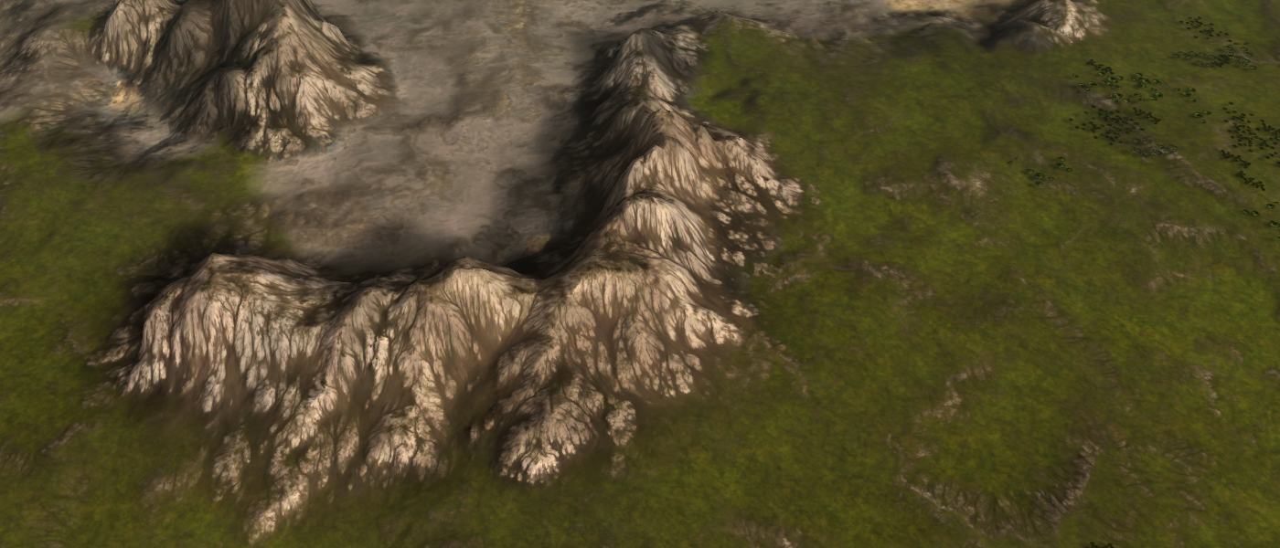
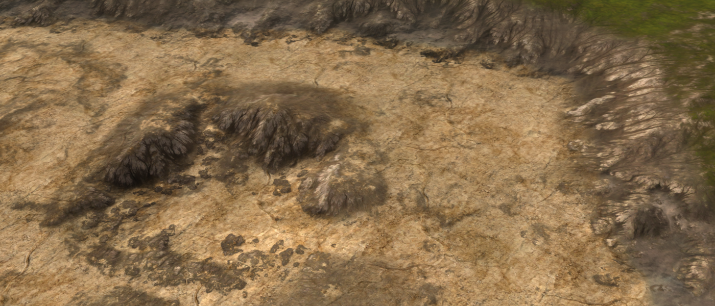
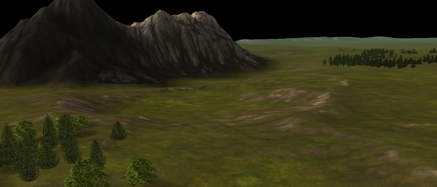
The map had a few goals in mind:
- Constructing a map layout other than in World Machine without losing the original layout / flexibility.
- Making the map competitively easy to read.
Therefore this map has a 'core' and an actual map file. The core file solely (ab)uses the ozone editor to construct the general layout and uses stratum masks to construct masks that can be used in World Machine.
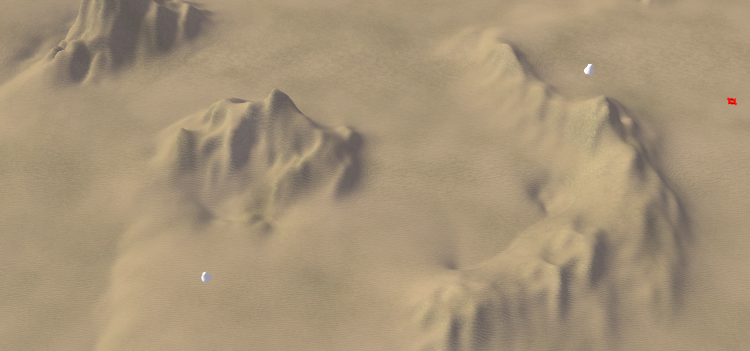
A screenshot that is taken at roughly the same location, depicting the general layout
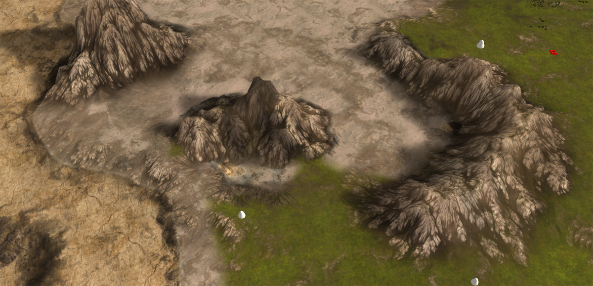
This is all fed into World Machine and then used in the actual map file. If anyone would want to 'move a mountain' later on then I'd change it in the core file, run it through the world machine template for this map and then update the actual map file accordingly. A large portion of the process is because of this procedural in a non-destructive manner.
Center of Tatsu is another map that I've been working on. It is the first design of this topic:
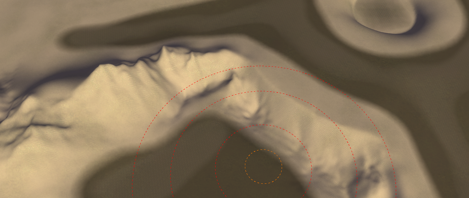
A screenshot that is taken at roughly the same location, depicting the general layout and a few stratum layers used for masks in World Machine and the according output
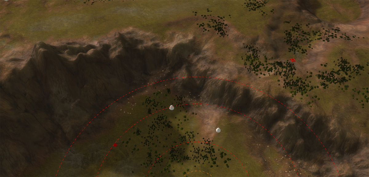
The aim of this map was to solidify the workflow. And solid it certainly became. I was able to completely remove Photoshop from the equation which is critical because Photoshop is both commercial and slow software. The workflow is more automated by the use of a script. The only reason I required Photoshop was to convert the files to the .dds format. As an alternative Image Magick is used for that in combination with a script:
#!/bin/bash

# Variables used throughout the script

resolutionMask=256
resolutionHeightmap=513

target="../center_of_tatsu.v0001/"

for entry in "output/"*;
do
    # determine old file location
    fileOld="${entry%.*}"
    ddsOld="$fileOld.dds"

    # determine new file location
    fileNew=`basename $fileOld`
    ddsNew="$target/env/decals/$fileNew.dds"

    # only change if file we want to convert is newer
    if [[ "$entry" -nt "$ddsNew" ]] || [ ! -f "$ddsNew" ]; then
        # convert the file
        echo "Converting: $entry"
        magick "$entry" -define dds:compression=dxt5 "$ddsOld"

        # move it to the new location
        mv "$ddsOld" "$ddsNew"
    else
        echo "Skipping: $entry (not updated)"
    fi
done
This is only a snippet of the script. But essentially there is no more manual labour in converting the textures to the correct format / size. Now I can click and go - go get some coffee, talk to my neighbour, study a bit, end up at the toilet and then when I'm back all the textures produced by World Machine are converted and stored at the right locations.
On top of that it is significantly faster than Photoshop - converting an 8k texture could take up to an hour in Photoshop, where as it takes about a minute with Image Magick.
When developing the map I used 2k or 4k textures rendering the generating / conversion time to at most a minute, allowing me to quickly assess the results in the old GPG editor. By using the
/EnableDiskWatchprogram argument the textures are automatically updated and therefore the results can be seen without restarting the editor. -
Back again with an update on my first map: Auralian - The Core!
To get an idea, this is how the initial version looked like:
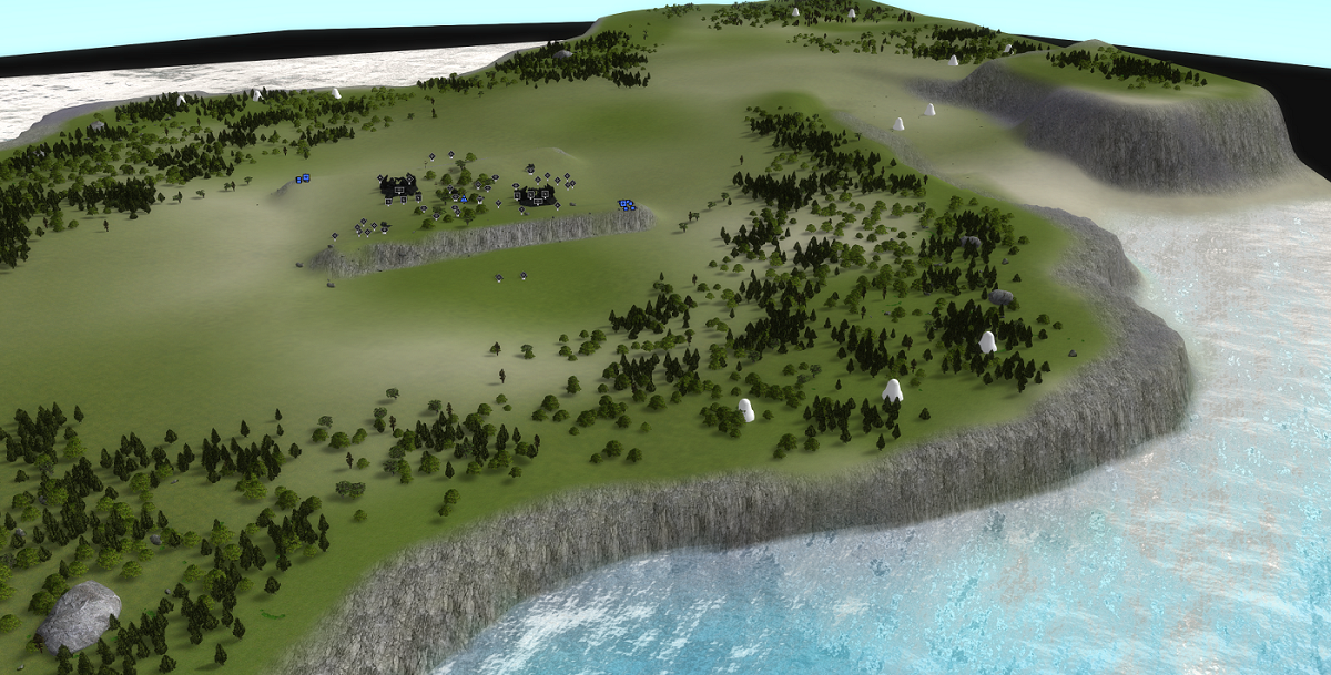
And this is how it looks like now:


The aim was to learn and apply various techniques:
- Use my understanding of how the water works to make it a one-of-a kind water
- Use world machine knowledge to make cliffs and underwater patterns. Particularly I've learned about how to control the shape of the rock formations on cliffs a lot more!
- Use general knowledge from other games (Anno 1800) to solidify the looks. An example: the hard border between rock and grass.

The map is by no means competitively interesting. But it can be a solid map for your first few games.
-
those maps visually look fantastic. How much time did it take you to create such beauty)?
-
It depends a lot
 .
.Typically there are multiple phases:
- The design phase
- The implementation phase
- The iterations phase
And all of these can take various amounts of time. The iterations phase depends on how much time was spent on the design phase. The implementation phase is typically one long sit to construct the template with the desired properties. After that it is flexible. Unless suddenly new properties need to be added.
As an example you can see this post from the mapping tournament. Archsimkat and I discussed that map in detail many times over, only to restart the design phase because we messed up the scale
 .That map has over 40 hours of work in it. Where as Auralian - The Core was not quite that time consuming. It was a remake, therefore the design was clear and it was more about making the template.
 -
Autumn and especially Mauve are frustrating to play because there are exact locations where you have to put your engineer/ACU to edge build a factory, which also has to be in the exact right spot. Sometimes there is even a tree group in the spot where you have to place the factory so it is not clear that it will work. If you mess up either placement then your units fail to edge build and go for a long walk.
Edge building is a mechanic in this game, so you have to consider if you want your cliff to be edge buildable when making maps. If you don't want people to edge build then make the terrain rough and block placement using reclaim. If you do want people to edge build then make it clear that you can, maybe put factory tarmac decals in the spots the way it is done on Owl Cliffs. Most importantly, test out all the places to make sure they work as intended.
-
@ludmilla I agree

I've been working on a way to fix this issue. As an example in Kaali:
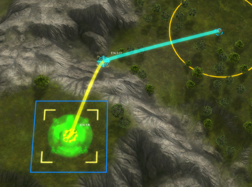
There is a small spot where you can move the engineer, and a larger spot where you can then build the factory. Slowly but surely this will be added for Autumn and Mauve too.

-
You could argue that it's up to the player to test the maps they are going to play and to look for buildable cliffs. That's part of preparation and can make some small difference between good players.
So you could have some "easy maps" where you mark the buildable spots and some "hard" and more competitive maps where people have to figure it out themselves
-
I see your perspective. And I agree that there should be some advantage to having played a map before. But these cliff building situations can be tricky and if you make a mistake it may as well cost you the game.
Some of my older maps will receive updates to support a similar feature to that of Kaali and future maps will have them too. I will make it a map option to turn it off for those that wish to play without - but it will likely be on by default (including for ladder) unless people really want it off.
-
I do not want anyone to be required to prepare to play a map. Maps should be designed well enough that you can just start playing and clearly see what is possible on the map. The strategy and decision-making parts of the game are what should be emphasized and things that get in the way of them should be reduced. Where you can and edge build or not is just a game/map rule, making the decision to edge build somewhere is actual gameplay. If you don't know the rules of a game you are unable to play or enjoy it to its full potential. It is the job of a game designer or mapper to clearly communicate the rules to the player. It is the job of the player to reason about those rules and try to make smarter decisions than their opponent. Making the rules hard to learn and forcing the player to intensely study the map or game code beforehand is just stupid.
Anytime I have to actually send an engineer/ACU to see where I can edge build, put my ACU in the water to see if it gets covered, check if a unit can travel over a hill, fire TML into a mountain to see if it works, or some similar activity I am taken away from gameplay and sent back to the rule learning phase. I consider these to be failures on the part of the mapper to effectively communicate the rules. Mappers have an extraordinary responsibility because so much of this game is map-specific. It seems to me that most of them do not understand this responsibility and just throw random stuff together.
-
That is one passive aggressive post to map makers in general

I am in the lucky position to be A, a decent player to some degree and B, have several tournament players that are willing to give their time to help work on a design carefully. You're making claims about 'responsibilities' that 95% of the mappers can never adhere to simply because they are either not A or don't have B. Claiming that they 'do not understand' this responsibility is harsh.
Of course they want to make a map that works. Why would someone spent hours on hours to make a map just to see it never being played because of some issue that appears obvious after the fact. I think your point is valid that there are some things to consider, could you make this into an effective list / guide that map makers can read? Like a checklist for common gameplay elements that the map should adhere too.
-
I figured a lot of people just think "I want to make a map for this video game" without understanding that it is a very difficult and complex game design problem with dozens of different factors to consider. I don't think being good at the game or playing in tournaments has much to do with being a good game designer. I could try making a checklist but I don't know how much good it will do because people on FAF are constantly disagreeing with even the ideas I consider to be the most simple and least controversial. This is partially my fault since I am at times trolling about things and other times very serious and people do not know the difference.
I am so passive-aggressive about it because I've spent years playing maps on ladder that I do not think are very good. It seems like anyone can throw together a map with little effort and it is guaranteed to go into the pool and I am forced to play it for months. I feel like the people choosing maps don't know what makes good maps, the people making maps don't know what makes good maps, and the players don't even know what makes good maps. There must be some level of standard game design principles that can be applied to judging maps so that maps with unclear mechanics, too much complexity, or have nothing valuable to offer can be excluded.
I think you spend a lot of time on your maps and try to consider most of the things you should be considering, more so than most other mappers, and I appreciate that. Mauve happened to become a particularly unfriendly map to play due to the multiple inconsistent and "hidden" edge building locations, the complexity introduced by civilian structures in middle, hostile flak next to the base, the large amount of tree group reclaim that needs to be incorporated into the build order, and unusual mex layout in general. All of these factors combined means a player will often not understand the map or severely mess up their start and be out of the game. I think it would be a good practice to limit yourself to just a couple of these things per map rather than including them all in one map because it quickly becomes overwhelming. (don't include edge building, significant tree reclaim, civilian bases, hostile units, and weird layout all in one map, just pick one or two factors).
All of this only applies to ladder maps which are made for competition and players are forced to play them. If people want to design maps outside of a ladder context then they can do literally anything and I will not be bothered by it.
-
@ludmilla
About your first paragraph: I think you're right. That is exactly how I started making maps. I'd still love to have that checklist, not because people may or may not agree with it but because it can provide perspectives that a (novice) map maker may otherwise not be aware of. A few examples that I learned the hard way:
- Water deeper than 25 units is unpassable for amphibious units that walk across the ocean floor, like (sub) commanders.
- Tech 1 artillery tends to not fire when it is on a slope.
- Tech 1 artillery tends to be poor at firing at something when the height difference is significant (see also this post).
- Terrain that is bumpy is aesthetically nice but terrible for gameplay.
And these are silly mistakes that are obvious after they have happened - but then it is already too late and you (as a ladder player) are going to have to deal with them for the remainder of the pool rotation.
About your second paragraph: I understand. This is a common issue in development overall: being a good player doesn't indicate you are a good designer. Or, being a good artist doesn't indicate you are a good designer. They are different jobs for a reason. I don't have the source at the moment but I recall some interview with StarCraft players that were asked what they thought was good about the game or could be improved. In general their suggestions were terrible, causing all kinds of inconsistencies. And I think this is what you are referring to here too. With regard to the design principles: again, as with the checklist, I think it is a solid idea that certainly deserves a pinned post on this forum.
About your third paragraph: thanks. I can only add that Mauve was a bit of a special map. It originated from this topic where the idea was that the community could provide feedback on the designs provided. In general the idea was that some design principles may see the day of light as people would discuss various the designs and adapt them. However, as you can see, that discussion did not really trigger and that is reason B of my previous post. It is on general difficult to get the expertise together for not just making maps, but also for learning about what makes a map good for a certain audience.
And last but not least: people want their maps in ladder / TMM because that is the only place they will get any plays at all. Regardless whether the map was aimed for a competitive audience. The custom games list is dominated by roughly five maps and if you decide to host your own then you could easily wait more than an hour to get a lobby going.
-
community could provide feedback on the designs provided. design by community almost never works out
-
Yeah - that was my point

-
@Jip Not sure if this is something players need to deal with or something for the mapmaker...
So this is just for your consideration. Feel free to say "L2p nub" if you disagree. (Picture made in sandbox)
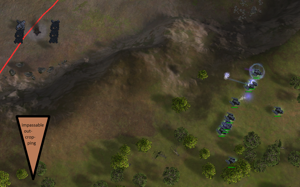
It bothers me that T1 tanks can get indefinitely stuck if you execute an attack move around the center on Mauve. Ideally the terrain would have an impassable outcropping so that (T1) units that path around the center never get into a position where the structures are in range. However, units can still get into range of the center if deliberately moved to the edge between outcroppings.
-
Interesting issue. I think you could take it into account when designing your map. It is something you don't want if it is in the center for example, as in Mauve. But I'd say it is also on the player: you could navigate them less close to the edge or not use attack move.
edit: especially because now there are neutrals there, but it could've been a mass extractor too.
-
@jip said in Jip's maps and others:
Interesting issue. I think you could take it into account when designing your map. It is something you don't want if it is in the center for example, as in Mauve. But I'd say it is also on the player: you could navigate them less close to the edge or not use attack move.
edit: especially because now there are neutrals there, but it could've been a mass extractor too.
After playing Mauve a few times, I did learn that, maintaining some distance or using moves. However, the first few games on this map had some frustrating moments. It may improve the player experience if there are fewer of these pitfalls, but it is primarily the players responsibility off course.
-
Well - it is a bit of both. If a map requires too many specific things (like Thomas hinted to) then I think the map is trying to do too much.
-
I've made a small mod to make creating cinematics easier. It is a UI mod and it can be found in the vault with the name 'Cinematics'. It is a UI mod that can be enabled before you start a replay.
Feedback on what you would like to have is welcome! If you have issues or feature requests you can either report them here in this topic, or report them on Gitlab: https://gitlab.com/supreme-commander-forged-alliance/mods/cinematics/-/issues
edit: A quick example to show what it can do: