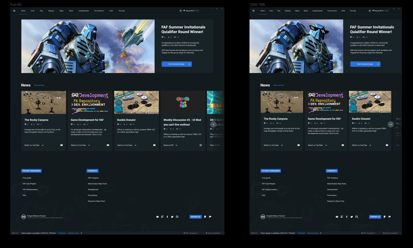
Feedback for the new client Newshub needed!
-
Borders, outlines, whatever. STOP using them, or use some darker color. Orange make to much contrast compared to bg
And I remember, they said, client-based design. No?
Also, your newshub missing place for posters
-
There was a design made by a designer, see also:

Please stick closer to it - it looks very refreshing and modern.
-
@jip Where did you find this?
-
@eternal internal messages with a designer
-
@jip you also have to remember the client shows a webpage so it also need to fit in with the theme of the website other wise if you stumbled across it on the website itself it would be a complete different contrast.
-
Then the designer we asked to design the news hub should've been made aware of that. He's doing this for his resume
 . Also, the designer is @MegaVIRUS
 -
We can have a different design on the website and then we simply don't link to the newshub the client uses
-
@jip then the guy making the newshub should have been made aware so the designer knows what the color scheme is being used. Don't know why I wasn't consulted for this if I'm the main developer of the new website?
Also the design is very square, it wont work well with a 16:9 screen, the featured image will get stretched out. Besides, the design I made is very close to the one made by the designer (and please remember, it is a WIP, not a final design).
But, I won't make it blue, it doesn't match the current color scheme of the newshub and again, I wasn't consulted for this. If I had been consulted and agreed to use what the designer made, then for sure I'd make it just like his design.
-
@eternal I agree, the outline can be darker. Posters won't be a thing in the new newshub anymore. No use for it.
-
@javi it is not about color scheme. The color can be changed