Graphic Artist Wanted
-
Issue i've with petric ones, is that it looks shitty for avatars
-
@WasserMelon progress but doesn't look good enough, I think you'll have to push this waaaaaaaaay way further.
try photorealistic silver and gold ect :

you need to occupy the pixels otherwise it'll look way too bland. -
@keyser said in Graphic Artist Wanted:
Issue i've with petric ones, is that it looks shitty for avatars
the 20x40 size, you mean?
yeah I agree, but wasn't the implication that Aeolus avator base size would be increased or did I missunderstand?
-
@tatsu said in Graphic Artist Wanted:
@keyser said in Graphic Artist Wanted:
Issue i've with petric ones, is that it looks shitty for avatars
the 20x40 size, you mean?
yeah I agree, but wasn't the implication that Aeolus avator base size would be increased or did I missunderstand?
I'm uncertain if the avatar size in aeolus can be increased, and to be honest, it's probably not a good idea.
Icons in the actual TMM party tabs as shown in screenshots around here is fair game.
-
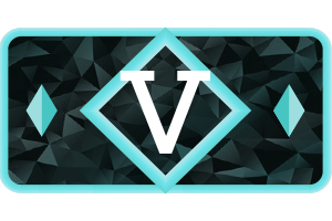
@tatsu I've made some progress with photorealistic textures as you sugested, I enjoy the outcome but would be great if the change is begin made from 40x20 to 80x40. And perhaps do you know when the deadline is?
I have to correct some stuff to make the ranking a bit more clear. Here is how they would look.
40x20

300x200

-
I still think these lack in shape.
it's a bit of a shame to use 100% of the allotted space save for rounded borders instead of playing a bit more with empty space as the above examples have done.
-
Why is there still discussion about existing proposals that aren't Petric's?
-
@archsimkat said in Graphic Artist Wanted:
Why is there still discussion about existing proposals that aren't Petric's?
I don't have a dog in this fight (although I should tbh) - I think Petric's designs are nice, but are too busy. They force the eye to make sense of them, and that's less optimal.
.
.
.
.
.
.
.
.
.PS. Did anybody ever play the arcade game Rygar? Hint hint...
-
Isnt busy the entire point of the damn Icons
-
Surely not?
-
Anyone know what kind of time frame is left to submit something?
I'd like to submit something but think it is alittle to ambitious for the time remaining.
Thanks
-
-
@Azraeel Busy would be nice if was animated, and animated would be nice if it was responsive.
Busy was nice in the 90s.
I still think there is just something simpler.
In the end, as long as there is a good winner doesn't matter how it's won, it's still for FAF!
-
@Azraeel said in Graphic Artist Wanted:
@LittleMissMurder said in Graphic Artist Wanted:
Surely not?
I Think so...
No
@WasserMelon said in Graphic Artist Wanted:
@tatsu I've made some progress with photorealistic textures as you sugested, I enjoy the outcome but would be great if the change is begin made from 40x20 to 80x40. And perhaps do you know when the deadline is?
There is no real deadline, just when one is chosen.
Also, do you have anything else to use than a slab serif? -
Changing out icons is not a development heavy task. Can basically look at anything until a week before tmm releases.
-
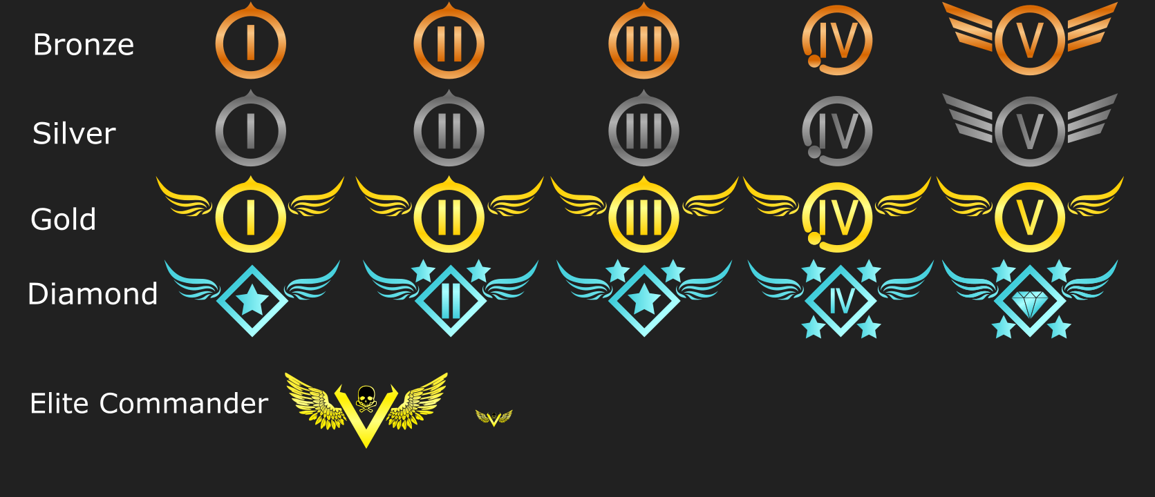
any suggestions or criticisms.


-
Oohh, I like how you used the tech icons of Supreme Commander. But perhaps do not evolve to wings or eagles? It is very amerika-isch. Perhaps you can remain in the 'flow' of Supreme Commander by using silhouettes of units as the fifth level.
-
@Jip I'd partially agree, maybe a division or two in each tier can have wings or say be swept by, not sure all.
I'm for unit icons myself, seems more for just FAF .
Thanks
-
@Mvk_
yeah, I might have overdone it with the wings but it seemed like the only thing that fit with the design I was going for. I also wanted to make sure you felt rewarded when ranking up, I felt that everything above silver had to have something unique to them while also feeling somewhat similar hence they naturally kinda just all got wings (early designs had no wings at all).As for the unit idea, I actually tried something like that. Each tier was actually a unit and as you ranked up the higher tier unit you got with 5 being an ACU but ultimately my subpar graphic skills weren't enough and I just couldn't make it work and it honestly did not look good at all. Plus there is the small issue of people complaining that their faction isn't a higher tier.
-
But perhaps do not evolve to wings or eagles? It is very amerika-isch.
Eagles have been around in heraldry for ages, it's not America specific. Especially since they were inspired by the Romans...