I prefer petric's design to my own. I'm a real sucker for the color blue plus his design really exploits the new 80x40 form factor much better (If I were to make icons for that 80x40 form factor I'd start from scratch I'd use neither of the two ideas I posted above)
@Fremy_Speeddraw
Anyways final thoughts :
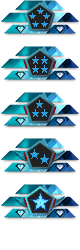
the ribon tiers are a bit funky, for example, silver tier makes alot of sense to me: 
kinda pyramid-looking, you know, whatever, it's dynamic.
Bronze (I think it should be called copper)
has a lot more contrast going because of the gap between the pentagon tier holder and the ribbon. it's utter genius.

I get what was being going for with the other upgrades I guess Diamond is the one that's most visually pleasing after those two

gold is not one people will be looking forward to in it's present state (all this is still only about the ribbons) :

granted the upper one is slightly wider but basically the eye auto-corrects it to the same width.
(you could for example exaggerate this a bit)

I think it plays off better. maybe that's silly of me.
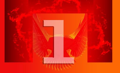
master's reeeeally funky:

funky can be nice in certain contexts, I dunno.
It just has way too much tikki mask vibe to me.
I realize this is a bit more bland but what do you think of this (sorry for the low effort msPaint edit) :

also I get the red and yellow tier marker thing, it's contrast. it makes the icon as a whole pop.
so that should probably stay but maybe be reworked.
maybe placed instead of those little wings in the same spot :

which for 90% of the tiers and subtiers are utterly invisible.
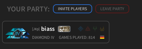
Also a big plus one to @Askaholic 's idea of stars or other makers instead of the roman numeral.


") .
.

 Use selected unique division icon" otherwise just use the unique icon by default.