Downsides of the Advanced Strategic Icons mod
-
Hello everyone,
I have a very positive opinion of the Advanced Strategic Icon mod.
Yet, whenever it gets mentioned anywhere a very vocal group of players immediately accuses the mod of being made by Satan himself, ostensibly completely ruining the gameplay of everyone who uses it.Normally I'd just ignore them and chalk it up to nostalgia or whatever, but in this case many of the game's best players are some of the mods most vocal critics.
For example, here is what Blackheart, currently ranked number 5 on the 1v1 ladder, has to say about the mod in his UI mod guide:
"Advanced Strategic Icons: Extremely strong NOT recommended. I would go as far as saying that this mod will completely destroy your ability to improve past a certain level."]I don't get it.
I have played the last year with some version of it installed, and while I'm still far away from the level of e.g. blackheart, as a 1.8k global I imagine myself to have a decent understanding of the games fundamentals.
And I still don't see the major downsides people insist the mod has.
This is what this post is about: I want people to show me proof of how and where I'm just to blind to miss the very obvious detriments of the Advanced Strategic Icons mod.
One of the most common arguments I hear is that the mod clutters the screen and makes it impossible to accurately judge army sizes and unit types. In my experience, the exact opposite is the case.
For example, lets look at the below scene captured at 1080p resolution and at the same level of zoom each time. If you want to follow along, just open the pictures in full screen but do not zoom further in. Not needing to zoom in further is exactly what distinguishes a good icon set from a bad one.
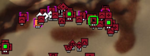
Here is the scene, ye old lategame setons with the default icons:

So what do I see? Well there is a t3 navy battle going on. The two tempests are pretty eye catching and there are obviously lots of frigates everywhere. Purple also has some battleships but without staring at it for a couple seconds I don't know if purple has 4 or 10. The red navy is even worse. I think I see a battleship in there but its really hard to distinguish it from the other ships because the damn pips are so small.
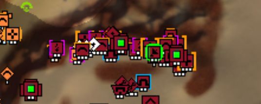
Lets see how this looks with the small icon set from the mod:

If you are unfamiliar with the modded icon set, open both pictures in separate tabs and switch back and forth a bit to see what changed. Again, no zooming in though.So what did change? Destroyers, cruisers and battleships are a lot more distinctive, especially compared to the literally unchanged frig icon. It's now much easier to see what ships are important and counting the 8 battleships from purple is a lot faster than before.
This is not even mentioning the actual strengths of the mod, like how finding and sniping purples sonar with a couple torps is now a trivial exercise or how you can easily see that teal has a smd due to the purple border added by the mod.
But, as mentioned above, I don't want to look at the upsides of the Advanced Strategic Icons mod, but at its downsides.So at least for naval combat, the modded icons are, at worst, a neutral change and up to personal preference.
"But the ground armies!", I hear the naysayers typing. "The mod makes it impossible to accurately read the size and composition of dense ground armies.", they say.
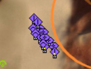
Well, lets look at the same picture again, this time at default army icons on the land bridge:

Even at fullscreen resolution, without looking at it for an embarrassing amount of time, the only thing I can really make out is that there are "like 30-40 T1 units".
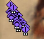
How does the icon mod fare?

Well look at that: It's now blindingly obvious that the first two rows of units are of a different type then the back rows. So now my observation is "like 30-40 T1 units, half T1 tanks and half T1 arties". As the heretic that I am, I'd say the modded icons are straight up better than the default ones in this case.
So what about the air? Lets look at the canonical "estimate army sizes quickly"-test and see if we can estimate ASF amounts any faster or slower:


So can you estimate ASF counts easier with the default icon set? I would say there is effectively no difference. In both cases all I see is that the ASF numbers are about equal, no clue who actually has more but the difference can't be huge either way.
It seems to me there are no real downsides to the Advanced Strategic Icons mod when looking at armies and lots of upsides regarding the readability of bases, especially in large team games, the latter of which I didn't even get into here.
So what's going on? Why are so many, often very good, players so strongly against using this mod?
-
When I was briefly playing the game at a 4k resolution I used this mod pack with the medium icons iirc. Made a huge positive difference, vanilla faf, at least at the time, was pretty rough in 4k without mods to fix scaling issues. I thought I saw somewhere that it’s better now, but not sure I’ve never bothered to test it on my 4k monitor since I only use my high refresh 1080p for games. Going back to 1080p I stopped using it at all because I didn’t feel that it really helped. If I weren’t lazy I’d take the nuke and smd icons from it and only use those.
Honestly I feel that part of the reason some of the really strong players don’t like it is that it’s an eyesore when you’re not used to it, and they’re so used to the stock icons and so used to deciphering what they mean, or more accurately counting them really fast, at a level and accuracy us plebs don’t match. I believe it was blackheart who had some screenshots showing how it’s harder to count groups of low numbers of t1 units which is really important information in mid/high level ladder play. That’s a really big con, but I think that’s the only actual practical con.
Edit: Basically if you like it and aren’t competing at a high level and don’t want to get there then use whatever makes you happy. I can’t see this being so detrimental that you can’t hit 2k global and 1.6k+ ladder, but I do see why it’s not great if you’re truly wanting to optimize efficiency in fights and in terms of keeping down clutter.
-
@exselsior said in Downsides of the Advanced Strategic Icons mod:
I believe it was blackheart who had some screenshots showing how it’s harder to count groups of low numbers of t1 units which is really important information in mid/high level ladder play. That’s a really big con, but I think that’s the only actual practical con.
Where? Show me! I need proof of my plebian-ness or I will never learn.
Edit: Basically if you like it and aren’t competing at a high level and don’t want to get there then use whatever makes you happy. I can’t see this being so detrimental that you can’t hit 2k global and 1.6k+ ladder, but I do see why it’s not great if you’re truly wanting to optimize efficiency in fights and in terms of keeping down clutter.
WHY? What, exactly is more efficient about using the default icons?
-
There is basically zero chance that the default icons would ever get approved for a modern game, they are awful.
The advanced icons are a significant upgrade in almost every way.
-
They don't like it because they are grumpy and think it looks bad.
The default icons are all small, unbold, and do not make use of color. The icon mod inverts this so that all icons are large, bold, and multicolored. Both extremes are ineffective for actually providing you with information.
Ideally, icons would be sized/bolded according to their tech level, and only important things would make use of multiple colors. This is why I just made my own icons where T2 units are 1 pixel larger than T1 and T3 units are bolder than T2, then it is simple to tell them apart in mixed armies while still remaining uncluttered. All the structures remain default except the ones that are important to notice.
-
@cheeseberry I thought he had something more specific, but right now I'm just finding this post with screenshots and his response right after: https://forum.faforever.com/topic/1186/ui-mod-guide-for-the-improving-player/10
The detrimental part is seeing how many low level units are in a clump early game. In higher level ladder that's really important. That being said, I'm not really sure exactly how detrimental it is to being able to count small numbers of units if you're using the small icon sizes. Not sure what size is being used in the screenshots here.
-
Three reasons for people declaring modded icons as OBJECTIVELY bad:
-
People have often never actually tried "small" icon option for advanced strategic icons. Their opinions are based on medium usuallly, which does have a little more overlap than Vanilla.
-
Screen resolution. The more resolution you have, the bigger the icons should be or the less it matter when they are bigger. It doesnt make sense to judge icon size without taking resolution into account.
-
The more you use an icon set, the more you get used to it. It gets engrained in your brain just like flickshot muscle memory gets engrained in an FPS players brain. I guess a very good players stops seeing icons and can just directly read the screen. This works with both Vanilla and modded icon set if you stay with the same set.
However, if a player now watches a caster that uses different icons, he now longer reads the screen with as little effort as before. This is still not a good reason to claim that modded icons are somehow super bad. I use modded icons but i still have not trouble watching casts with unmodded icons. But small, maybe even subconcious inconveniences can sometimes lead very strong opinions.
-
-
@exselsior said in Downsides of the Advanced Strategic Icons mod:
@cheeseberry I thought he had something more specific, but right now I'm just finding this post with screenshots and his response right after: https://forum.faforever.com/topic/1186/ui-mod-guide-for-the-improving-player/10
The detrimental part is seeing how many low level units are in a clump early game. In higher level ladder that's really important. That being said, I'm not really sure exactly how detrimental it is to being able to count small numbers of units if you're using the small icon sizes. Not sure what size is being used in the screenshots here.
In the above I explicitly show that a clump of T1 units with the new icons is at least as distinctive as a with the default ones. The icons are the same size after all, so where exactly should the information loss be?
Show me a picture where a unit composition is clearly visible with the default icons while barely or not at all decipherable with the modded icons.
If Blackheart is right and "this mod will completely destroy your ability to improve past a certain level" then such an example should be quite easy to find. -
@thomashiatt said in Downsides of the Advanced Strategic Icons mod:
Ideally, icons would be sized/bolded according to their tech level, and only important things would make use of multiple colors. This is why I just made my own icons where T2 units are 1 pixel larger than T1 and T3 units are bolder than T2, then it is simple to tell them apart in mixed armies while still remaining uncluttered. All the structures remain default except the ones that are important to notice.
Could you post a screenshot of that? You don't need to put in the effort of publishing it as a full mod, but it would be interesting to see.
-
while i use the advanced strategic icons mods, with the medium icons and in higher resolution, the overlap can be an issue in certain situations. A big thing I didn't like with them was that the white border could be obnoxious with a lot of units, and other items such as storage around mexes was less discernible when zoomed out.
which is why i modified the icons to make them a little less garish. Where possible, I adjusted some icons to be slightly different size to differentiate tech levels, etc. other icons such as t3 gunship and t3 bomber, i changed the tactical icon because i couldn't tell them apart when zoomed out.
here is my take for anyone that wants to give it a try, just backup your original file in case you don't like. all based on medium set, since i run a higher resolution.
https://drive.google.com/file/d/1BztpHQoY-zDCZccRLE_zJ370G9kwl-fX/view?usp=sharing
-
@macdeffy nice, will give that a look!
-
@cheeseberry said in Downsides of the Advanced Strategic Icons mod:
@exselsior said in Downsides of the Advanced Strategic Icons mod:
@cheeseberry I thought he had something more specific, but right now I'm just finding this post with screenshots and his response right after: https://forum.faforever.com/topic/1186/ui-mod-guide-for-the-improving-player/10
The detrimental part is seeing how many low level units are in a clump early game. In higher level ladder that's really important. That being said, I'm not really sure exactly how detrimental it is to being able to count small numbers of units if you're using the small icon sizes. Not sure what size is being used in the screenshots here.
In the above I explicitly show that a clump of T1 units with the new icons is at least as distinctive as a with the default ones. The icons are the same size after all, so where exactly should the information loss be?
Show me a picture where a unit composition is clearly visible with the default icons while barely or not at all decipherable with the modded icons.
If Blackheart is right and "this mod will completely destroy your ability to improve past a certain level" then such an example should be quite easy to find.I mean I think blackheart is being a bit dramatic with how extreme he is on it, but he has a point to some extent. Even in your screenshots I personally find it easier to see how many t1 tanks there are at a glance vs the icon mod. Granted, that could just purely be because I am more used to the standard icons. There's more going on with the other icons, so even if they're the same size they have more going on and more bold features so when you pack them into tight groups it's harder to make things out.
-
@cheeseberry https://imgur.com/a/S3ZfJ6k a collection of some screenshots I took a long time ago. Gotta right click and open the images to get them at full size.
-
@thomashiatt ty!
-
@cheeseberry said in Downsides of the Advanced Strategic Icons mod:
@exselsior said in Downsides of the Advanced Strategic Icons mod:
@cheeseberry I thought he had something more specific, but right now I'm just finding this post with screenshots and his response right after: https://forum.faforever.com/topic/1186/ui-mod-guide-for-the-improving-player/10
The detrimental part is seeing how many low level units are in a clump early game. In higher level ladder that's really important. That being said, I'm not really sure exactly how detrimental it is to being able to count small numbers of units if you're using the small icon sizes. Not sure what size is being used in the screenshots here.
In the above I explicitly show that a clump of T1 units with the new icons is at least as distinctive as a with the default ones. The icons are the same size after all, so where exactly should the information loss be?
Show me a picture where a unit composition is clearly visible with the default icons while barely or not at all decipherable with the modded icons.
If Blackheart is right and "this mod will completely destroy your ability to improve past a certain level" then such an example should be quite easy to find.

Literally a random MML pops up in the unit mix here because it was entirely blocked by the icons.


I have zero clue what is going on in the bottom screenshot, top base is significantly easier to read and if some of the other icons like the radar and mexes were ALSO default then it would ALSO be less cluttered and easier to read.
BH isn’t exaggerating, he genuinely considers the mod garbage because even with his crippled eyes he has no problem seeing and identifying things with base icons. Base icons are significantly easier to instantly read at a glance from a zoomed out level, making it immediately preferable if your goal is to be a competitive player because you want to spend as little time zoomed up as possible. This is why he strongly pushes back against it in his guide for improving since it reinforces bad habits.
-
@ftxcommando Finally, evidence, thank you!
What replay is that from?
-
Idk we had sone discussion about icon mod in the discord training channel so had a few dudes look through some random replay with the mod, with a version of the mod that changes few icons, and default icons.
-
That explains why the mex icon is changed in both. What I'm getting is that I should look at t2 and t3 land units/bases. I'll make some screenshots and come back to you on that.
Again though, thanks for posting some actual descriptive comparison pictures though! Without those we will just get stuck in endless "Its better because I say so" circles that all other threads about the post I have seen devolve into.
-
It would be nice to have control over which icons would take precedence in foreground focus. i noticed when modifying files, that sometimes the wrong thing would overlap, e.g. the mass storage would block out the mex, but i'm not sure what caused it.
-
The last built unit is in the foreground