Scaled resource panel [UI]
-
This post is deleted! -
This post is deleted! -
Version 4
Improvements:
- Fixed the bug with bug black rectangle on background of each texture, now the whole textures have a little bigger opacity
Old

New
-
This post is deleted! -
Version 1 Remastered Edition
Changelog:
- fix: adaptive layout switching
Search in vaults [ScaledResourcePanel]
or
ScaledResourcePanel

-
Ops, i broke the code with new mod name xDDD sry.
I will fix it fast as possible -
Version 2 Remastered Edition
Changelog:
- fix: broken code
- fix: hard code
Search in vaults [ScaledResourcePanel]
or
ScaledResourcePanel -
Minor suggestion, an option to change the color red to something else like pink would be useful to me and possibly others. I am using a mini-mod for that EMperor Penguin made for me:
https://forum.faforever.com/topic/2612/let-ui-scaling-affect-economic-overlay/5 -
@valki okay, i will try to do smt. But i cant guarantee i will finish it quickly. Because this mod will not compatible with others then.
-
@valki you can use this mod for editing colors. Did some code cleanup
Economy UI Colors v2 (click to download)

@Emperor_Penguin update mod on vaults

Also, i think it is possible to do menu->options->interfaces options for colors, but it will take some time and i don`t know how to do it. Maybe late i will give a try
-
What if we add the option to change the relevant colors for various color blindness to the game repo, as part as a game option? I don't know enough about color blindness to indicate which ones are relevant and what colors they should use - it isn't difficult to implement however.
-
@jip i thought about list of colors and possibility to edit them with editing existed in menu options. But it will require overloading economy layouts
-
@jip said in Scaled resource panel [UI]:
I don't know enough about color blindness to indicate which ones are relevant and what colors they should use
I would think you are right as I am not (significantly) colorblind, and my doctor said that with bad vision red normally is the first to go. Color accessibility options basically allow someone to tune various colors to generate a contrast that works for them.
On the other hand, Windows has 6 options instead of free control over colors.
- Inverted
- Grayscale
- Inverted grayscale
- Green weakened
- Red weakened
- Blue-Yellow
I used red weakened until I got my UI changed, first by myself, then with Emperor_Penguins help. I still use it on those red maps.
-
I was more on about these versions of color blindness, see also the section 'Causes'. That way anything relevant (like eco, hp bars, etc) can be made friendly towards each and everyone's color blindness.
-
@eternal Nice improvements. The mod has now been updated on the vault

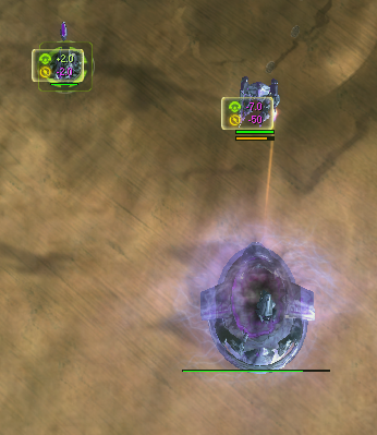
@jip said in Scaled resource panel [UI]:
What if we add the option to change the relevant colors for various color blindness to the game repo, as part as a game option? I don't know enough about color blindness to indicate which ones are relevant and what colors they should use - it isn't difficult to implement however.
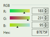
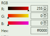
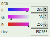
That sounds like a good idea. Btw, regarding choosing colors that are good for colorblind users; the regular red and green that supcom use (for resource income/expense) have similar levels of red and blue but very different levels of green. I tried out various different colors in trying to get a good alternate for red. The pink I chose for the mod looked reasonable enough to me and has a much higher level of blue, which makes it more distinct from the supcom green for certain colorblind users. I included RGB levels and hex codes below for perspective. I'm not an expert though, so there might be better approaches/colors to use, but I'd figure that generally giving options for making R, G, and B values distinct in relatively important color-coded information might be the way to go to give options that work for people with different types of colorblindness. It would probably be good to see what more colorblind users think...
After talking more with Valki, I think that we might want to have options that also avoid having relatively important color-coded information with colors that have 0's (or near 0's) in two of the channels (R, G, or B) as that can potentially adversely impact readability of text/numbers in cases of color-weakness.
Supcom green
Supcom red
Modded pink
For more perspective, here's some different examples of how the UI looks when missing color channels:
Regular UI - green removed

Regular UI - blue removed

Regular UI - red removed (this picture has all the same numbers as the others do, but without red, many numbers blend in here...)

Modded UI - green removed

Modded UI - blue removed (this looks very similar to the regular UI because the regular UI didn't use much blue here)

Modded UI - red removed

-
I was thinking of copying the colors used in other games, but I'm not familiar with a game that has an extensive set of color blind modes. Any suggestions? With a bit of luck I can add it to the patch of November

-
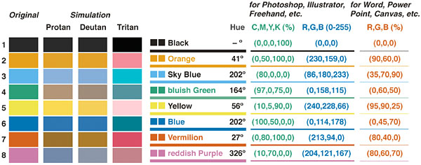
You might find this image useful
-
How do I interpret that image?
-
it's 8 colours (9 if you include white) that are easy to tell apart for all types of colour blindness, I'm also looking up existing implementations but so far I've only found gripes rather than good practice
-
the issue
https://imgur.com/vI9W4ZYmods I use currently
https://imgur.com/vx6Hm1S