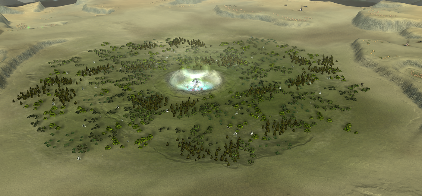
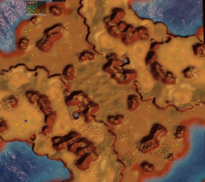
Jip's maps and others
-
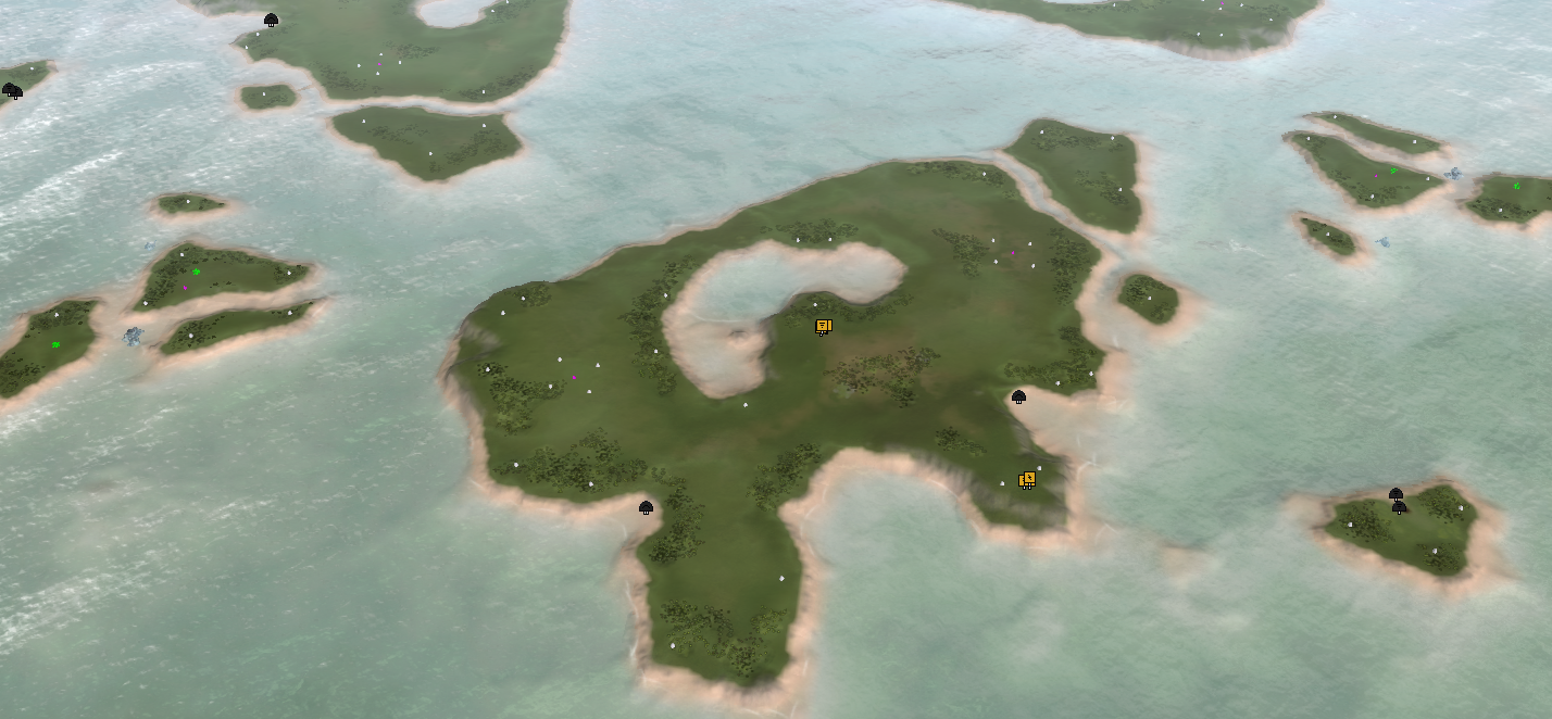
"About the river-delta thing: this is erosion and is in nature quite common!"
I get that, but perhaps being realistic shouldnt be the goal. Shouldn't the primary goals be something like:
- map makes interesting game play
- balanced
- easy for player to understand
- looks good
then way down the list at position 20:
- is realistic portrayal of earth
"what would make a beach instantly recognizable? Or a piece of mountain / unwalkable geometry?"
simple obvious consistent predictable terrain without unique obfuscating detail overload
like if you look at what the do in mapgen, looks like cliffs are a different texture. Plus the texture in the middle is a darker colour - you can instinctively get a feel for the chunks of land. so you can instantly play a map you have never played before, even if it quite complex.
i'm not trying to say that you should turn your maps into that. its great to have maps in your style and we should keep them. im just saying that its also good to have maps in the other style -> easy to understand. probably too hard to have your cake and eat it too?
-
you mentioned the moon map - that looks great too. Can I understand it a glance zoomed out? Not really ... I'd need to zoom in / experiment with units to work out exactly where they can walk. And now instead of focusing on gameplay I'm spending time on map-deciphering
-
I understand and I agree - the visuals should support the gameplay. Visual cues (cliff = unwalkable) and supporting the magic circle (holding up the illusion of the game / experience) are critical components of that! In that sense Mellow Shallows is a terrible example overall - there are no cliffs and those that do exist are walkable
 , haha. That was part of the original map however, this is just a remaster.
Everything that you mention (thank you for that) is certainly possible with the techniques I use now! It really helps with understanding where to take things to - right now the world machine file is quite basic and it can do with various more masks to communicate various pieces of information (visual cues such as cliffs, shores, elevations via color coding, etc).
So in this case - the cake can be made and eaten
") .
.I'm experimenting next on a LOUD map (another Supreme Commander community) that resembles springtime (melting snow) - I'll try and 'encapsulate' this idea of visual cues in that map. Once that is done I start with a map for Sanctuary.
(edit) As an example with a different style:
Rainmakers with (top) and without (bottom) a map-wide normal map
The visual cues are not 100% incorporated here yet - I'm working on it all
. -
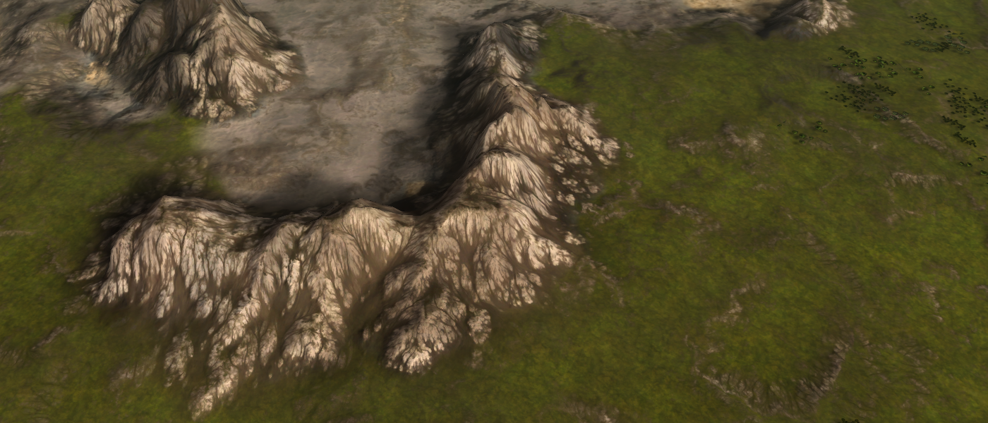
@nine2 I've changed the rock texture:
It looks a lot more natural with this version
. All the cracks are gone too - they were part of the rock texture that had a very strong normal map. -
looks nicer
-
I think there are people who would appreciate both styles of maps.
The larger, more realistic maps allow a person who's playing single player or maybe Co-Op to become immersed and create a narrative on their own during the course of the battle. Perhaps positions that are at a disadvantage from the start, so that can challenge is created just by the terrain.
And there is definitely a need for balance maps to be used for, let's call it "competitive" play. These are basically chess boards.
-
That is the idea for the remaster of Rainmakers - making it the most pretty survival out there
. As I've said before - I don't think this is a trade off. You can have both - pretty and competitive! We'll see what the future brings - more experimentation!Edit: and soon an update to the templates that Svenni and me make available - including albedo decals!
-
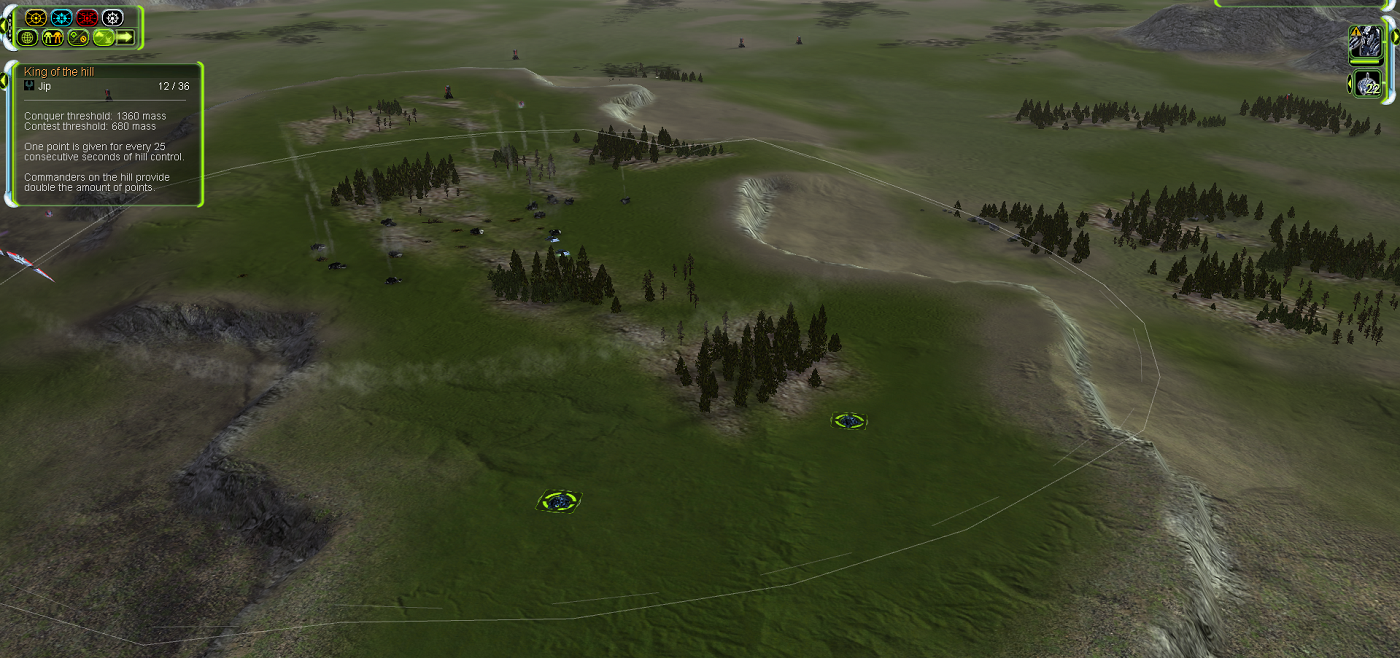
Updated King of the Hill & Bounty Hunting:
- Fixed a critical bug that would prevent you from receiving any UI notification / UI updates when you have the mods
Zeps Minimapfrom Zep orRevealed Positionsfrom Myxir on.
- Fixed a critical bug that would prevent you from receiving any UI notification / UI updates when you have the mods
-
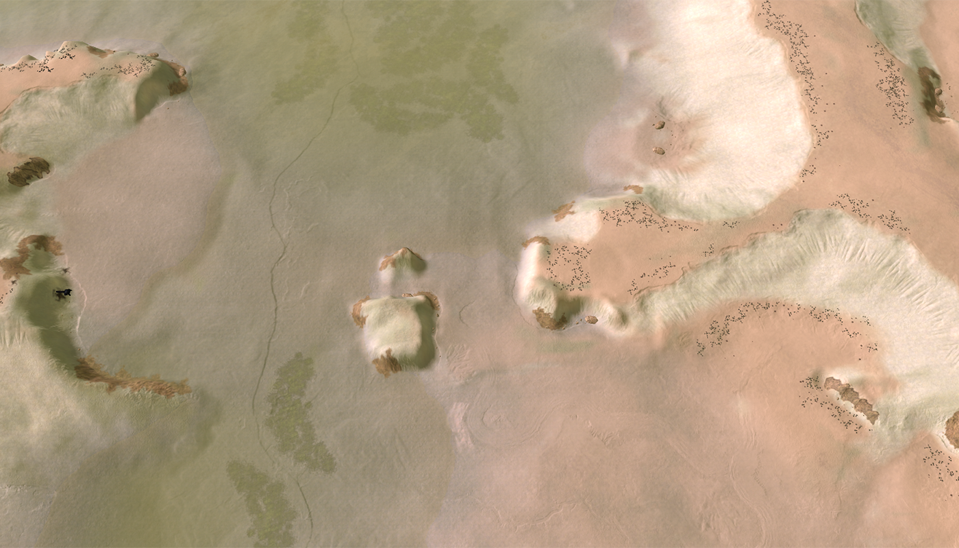
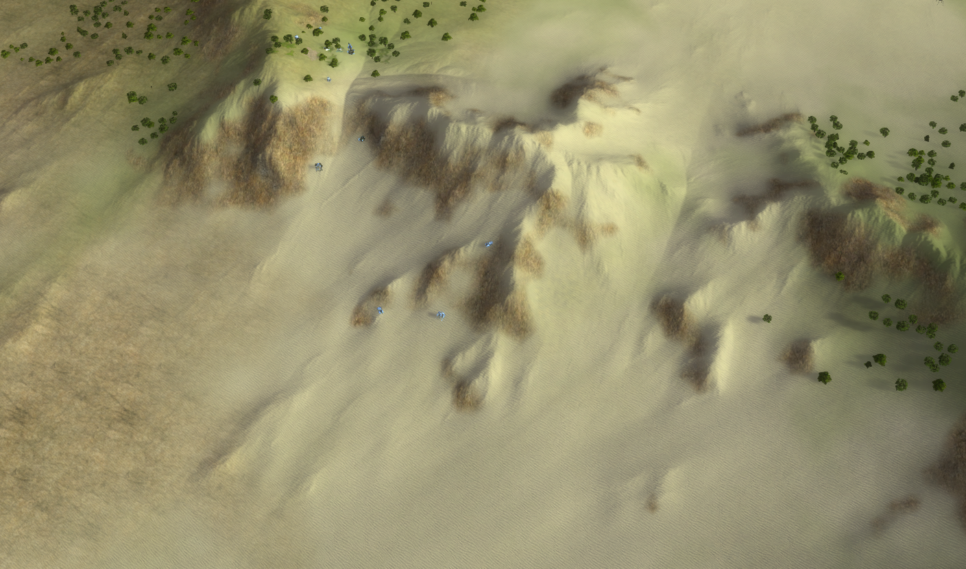
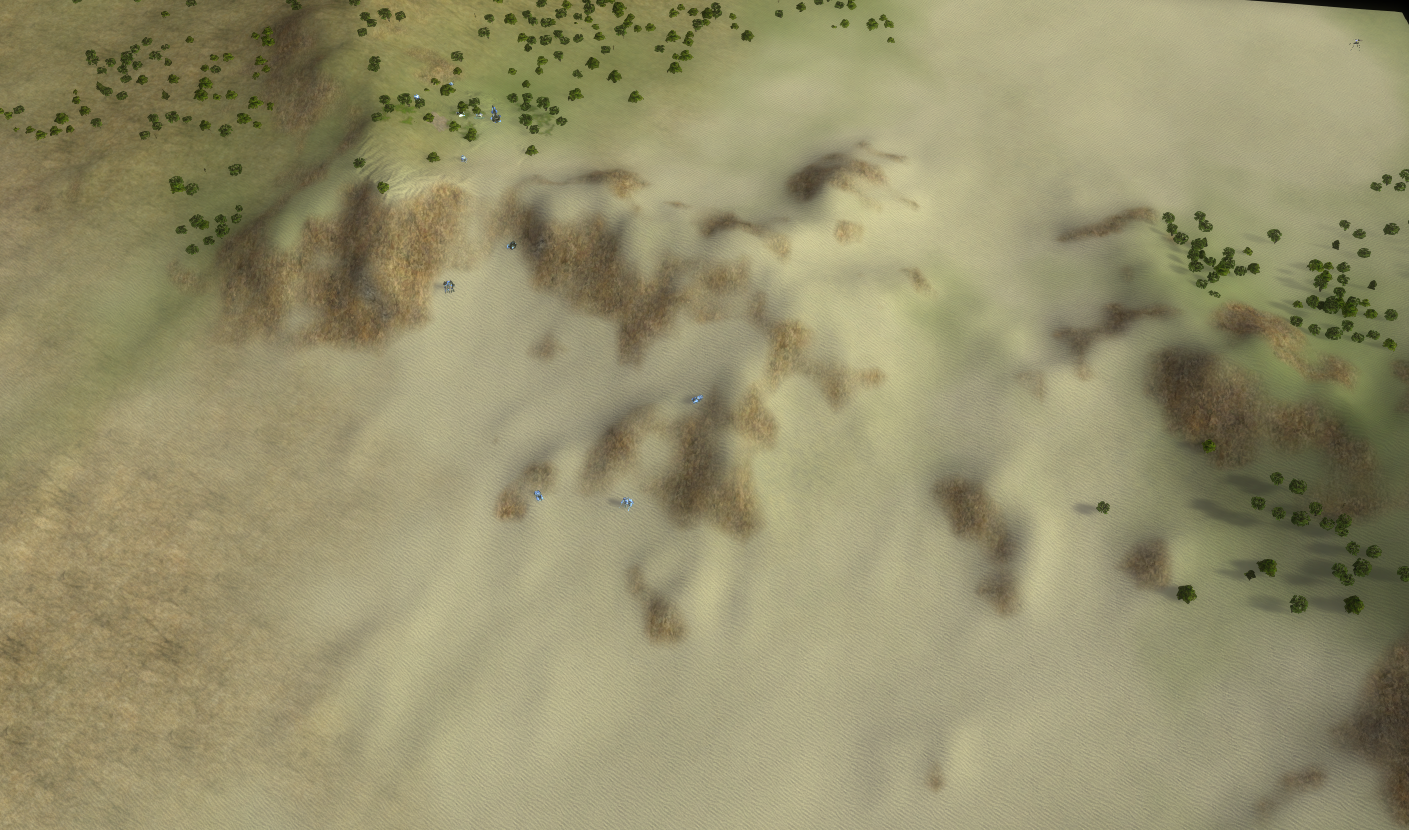
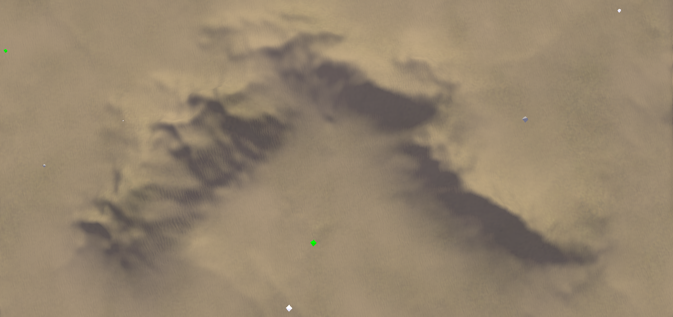
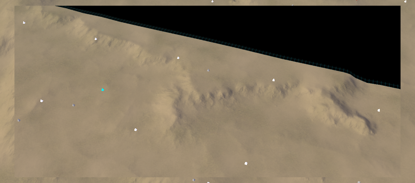
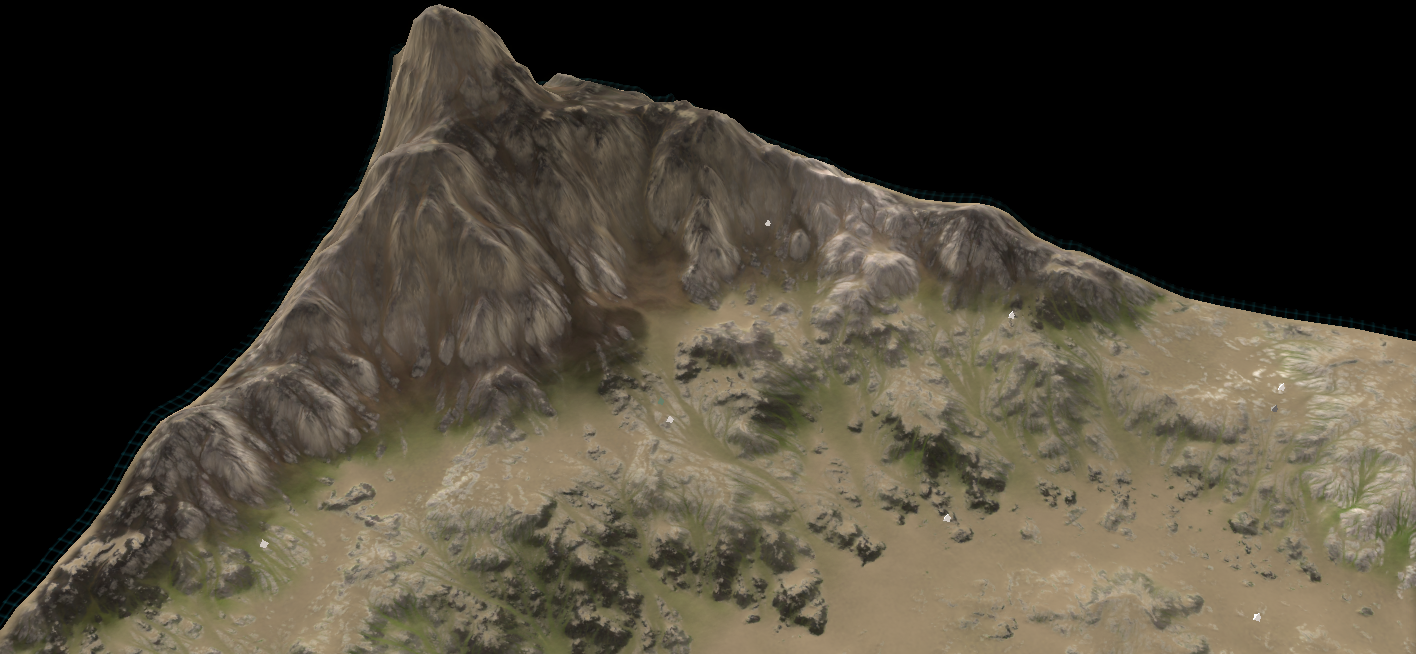
@nine2 I found out what caused all the river delta's - it was the global intensifier that simulates long intensive erosion. It also introduced a ton of artifacts, glad to have it out! Instead I now use channeled erosion (erosion on top of erosion) that generates better, less river-delta-isch results. I'll have a screenshot (of another map) in a hour of that
.
edit, terrain with (above) and without (below)
After more inspection it is not perfect yet - but neither is the input heightmap. I think there is only so much I can achieve with a poor heightmap as input.
I think the erosion may need a mask to not erode or erode less on flat area's - those appear to be buggy. I'm trying to counteract it by adding a bit of noise everywhere, but to no avail at times
-
Oooooooo!! peeeeerty!
-
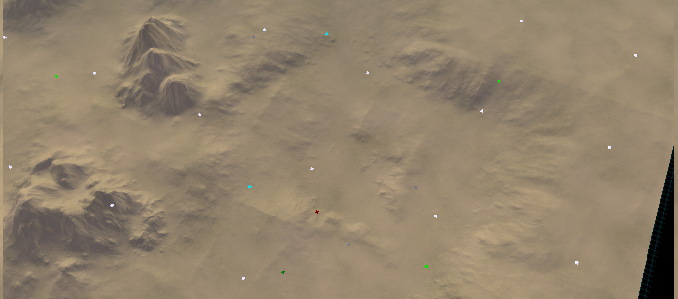
is the top screenshot the new erosion style? in which case i love it
-
Yes it is - I'm still experimenting with it but that is the idea :). The pipeline is quite different:
-- MANUAL --
- I model the heightmap manually in the ozone editor.
- I paint some parts of the terrain that I want to erode more / less or to have certain properties, such as additional noise, etc.
-- PROCEDURAL --
- I model 'hard-to-do-things' in World Machine, such as ramps that both go up / down and rotate.
- I then erode, etc, the terrain to my liking.
- I use a lowered resolution of the eroded terrain as my heightmap
- I use a high resolution of the eroded terrain as a normal map
This is a similar approach to how models have their normals 'baked' into - you start with a high-res mesh, you then make a low-res mesh and bake in the details of the high-res mesh. In turn, the smaller details come out quite nicely and I can actually create sharp ridges because the normal resolution is 8x (at 20x20) the heightmap resolution!
The image above doesn't have (yet):
- More refined normals (manual placement)
- Stratum layers (just sand right now)
- Albedo decals
- Specular decals
- Lighting decals (shadow / ambient)
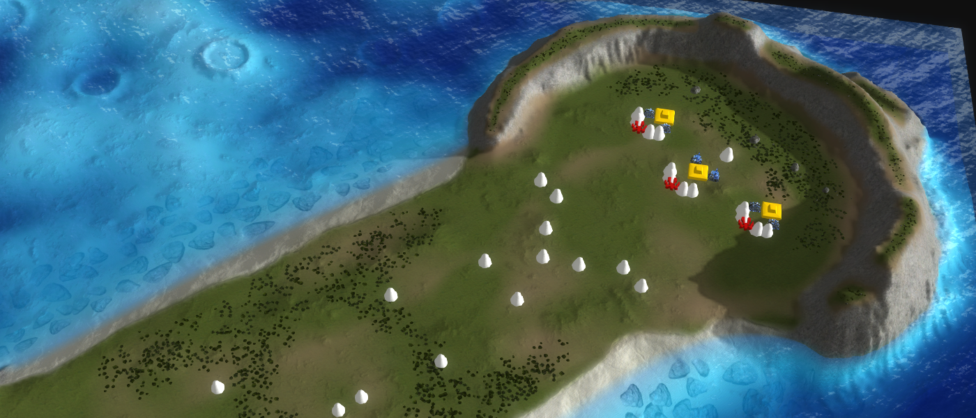
Edit: to show off why the normal map is so important:
Normal map with flat terrain from a eagle-view (above) and from a human-view (below)
Literally all the detail is in the normal map. Accidentally did this by moving the decal. @biass I just accidentally found out how to make pretty normal maps
. -
@nine2 I got it just right now

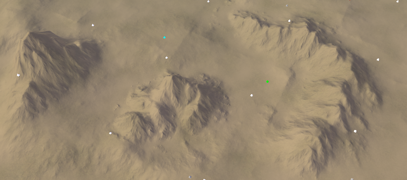
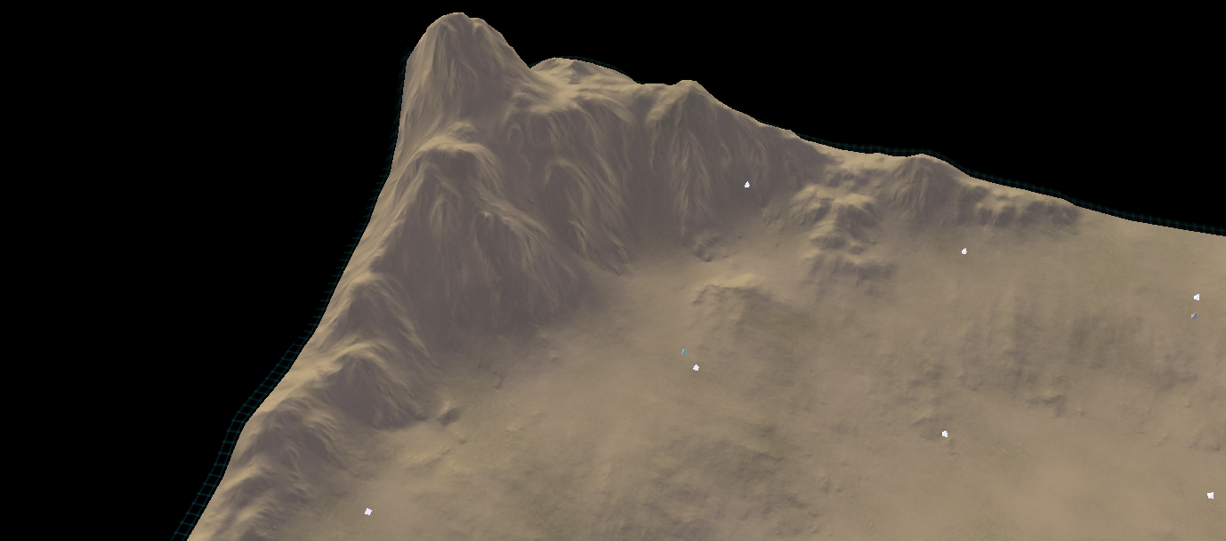
The last one is a bit of a close up :D.
Edit: after inspecting, there are still a few artifacts. But a lot less visible than the previous set of artifacts.
-
This is in the GPG editor
 ! It doesn't use any stratum layers yet so there is still loads to gain.
I discovered what caused the artifacts: terrain that is too 'perfect' or 'smooth' causes the sediment to pile up. The piled up sediment causes artifacts.
I think the boundaries straight-line are some artifact from how the erosion splits up the terrain into blocks, allowing it to run on multiple threads. But that is just a guess.
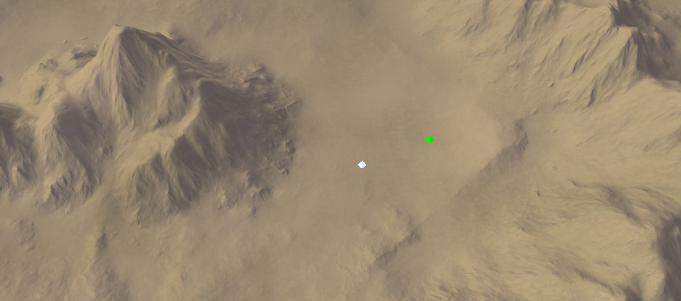
The same location, but now without those artifacts
. -
It's hard to believe this is supreme commander! The mapping revolution has begun.
-
wow that last one looks utterly incredible.
-
WOW !!! Can't wait !
-
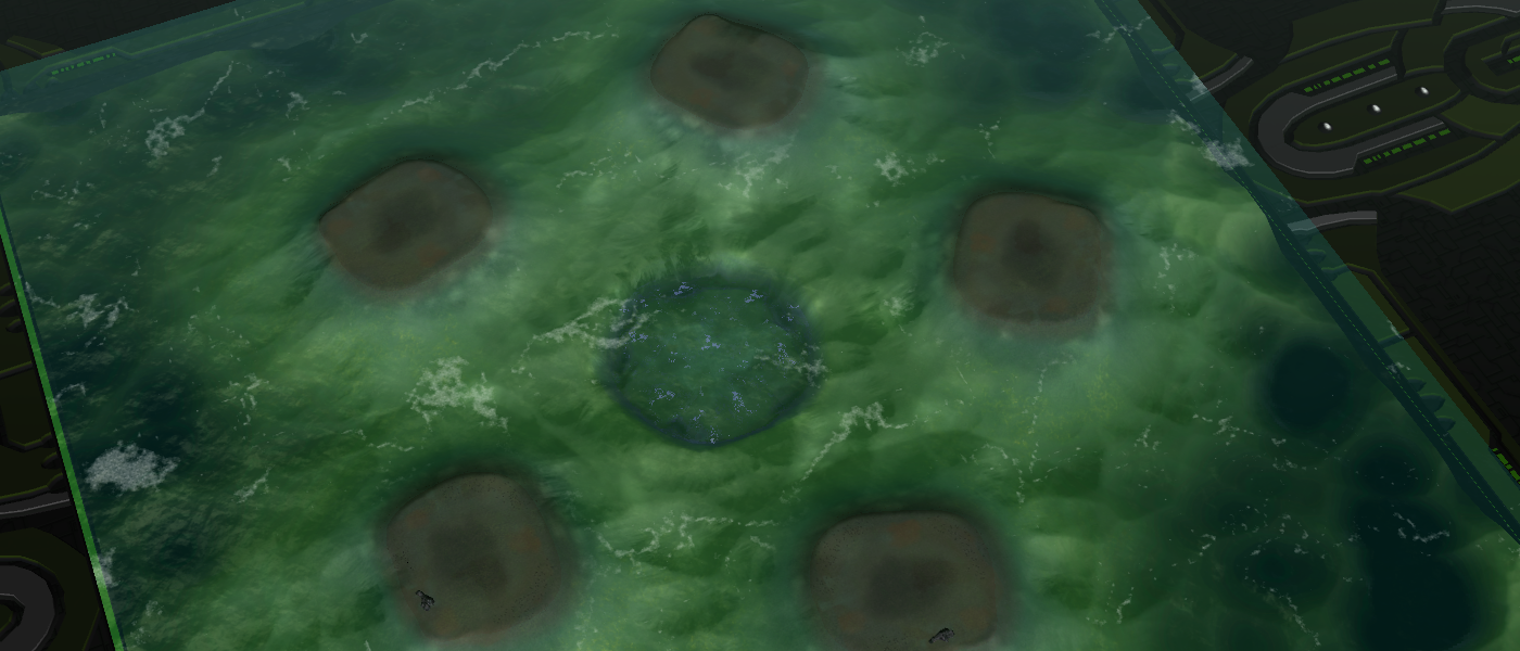
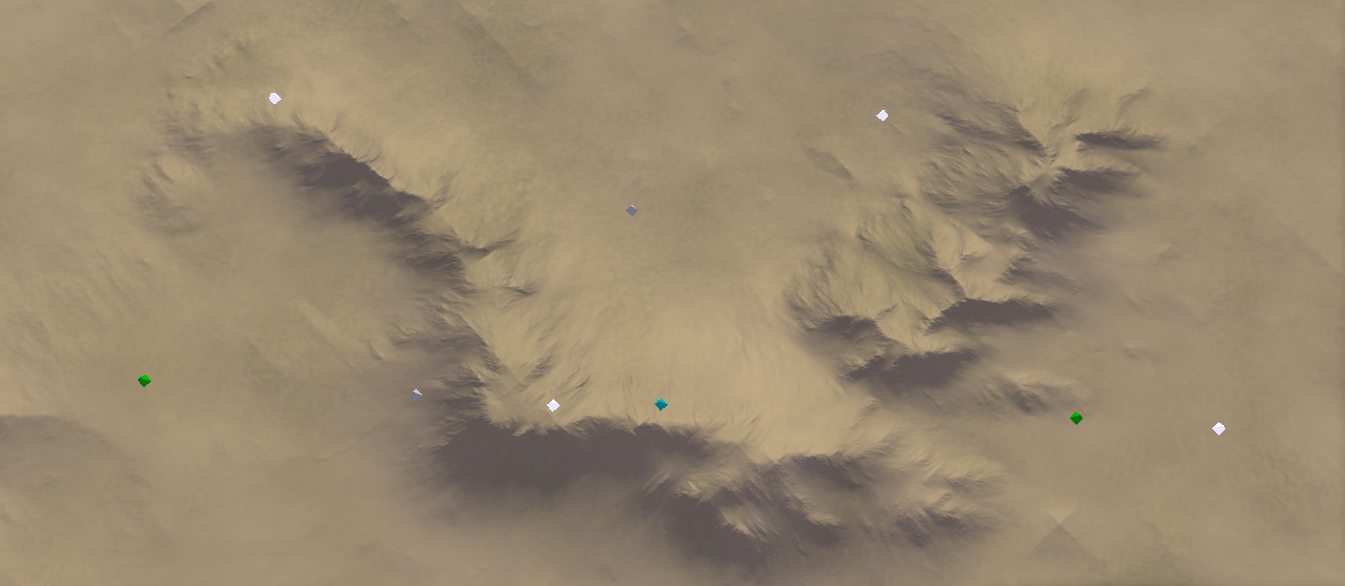
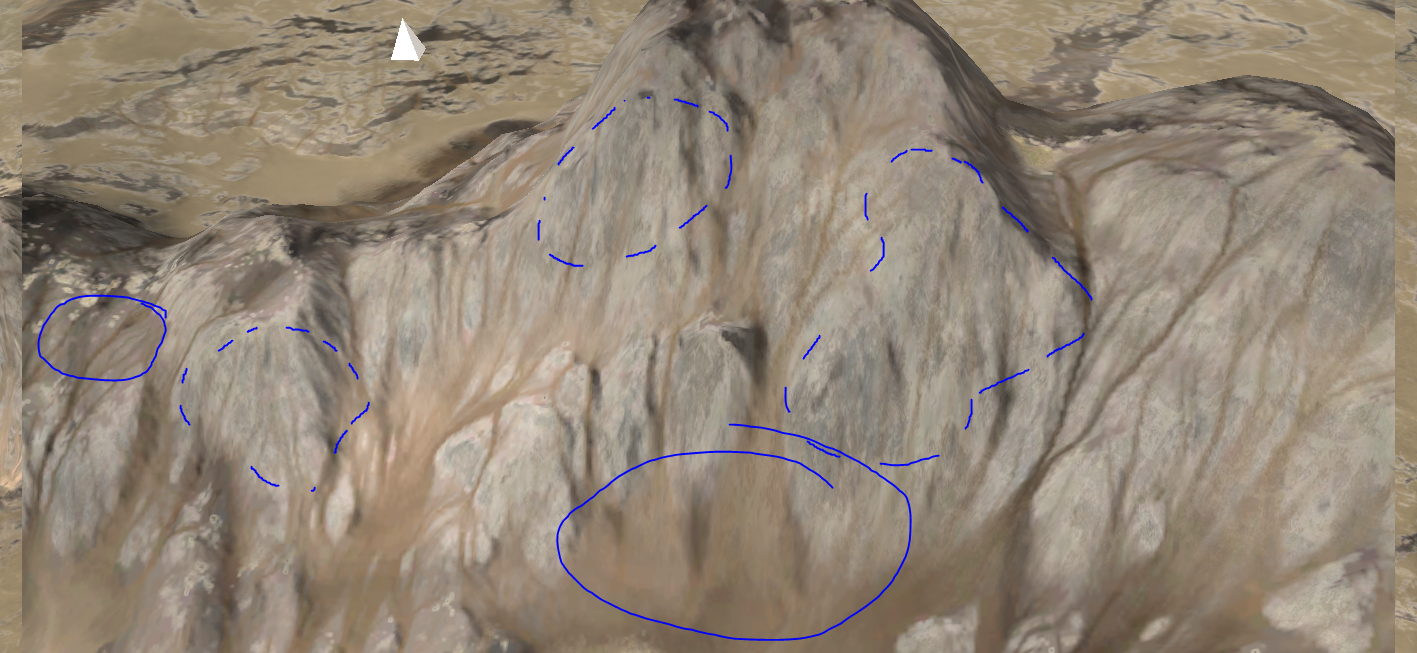
@nine2 the river delta's are back but that is not the point - I'm trying to incorporate the idea of visual cues that you mentioned. I've just figured out how to make the decal stop suddenly without it looking strange, clearly indication that a piece of terrain can be considered flat from that point onwards
. It is done via applying masks at the right places before and after eroding.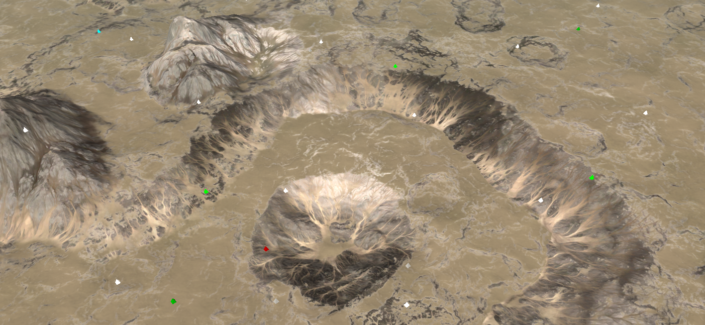
I've also been experimenting with allowing a stratum layer to 'leak through' so that there is detail up close. As an example the dotted circles have a stratum layer just slightly going through, where as the completed circles do not. The different is a significant boost in detail when you're zoomed in.
It does provide more 'control' over the color of the decal, which is a double edged sword: it allows you to more easily tweak it but its harder to see the end result without having everything together in the GPG editor.
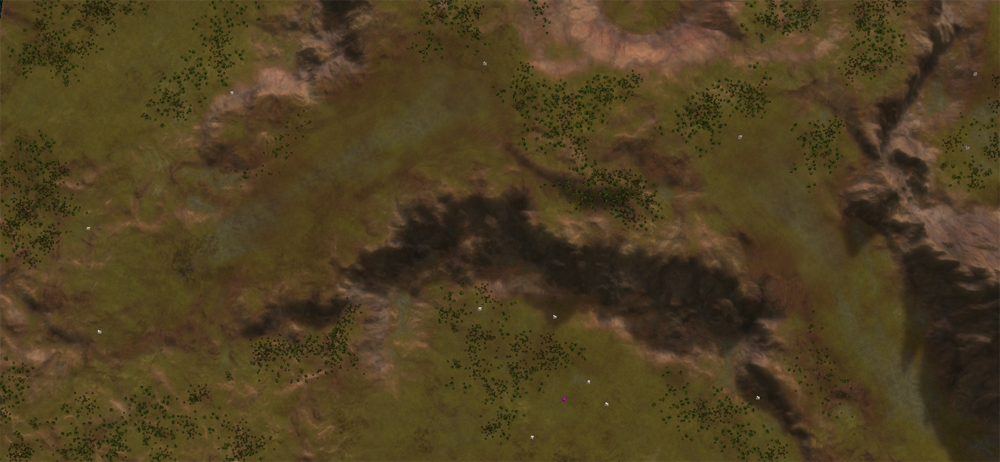
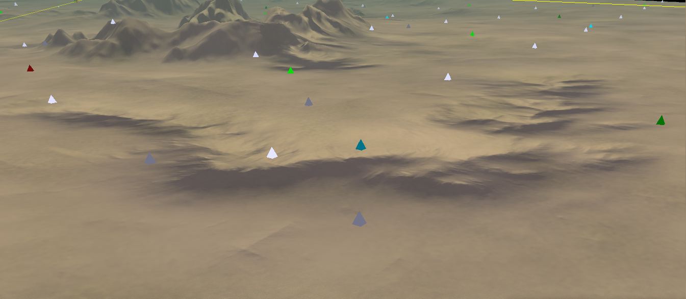
Without all the additional noise and at a lower resolution:
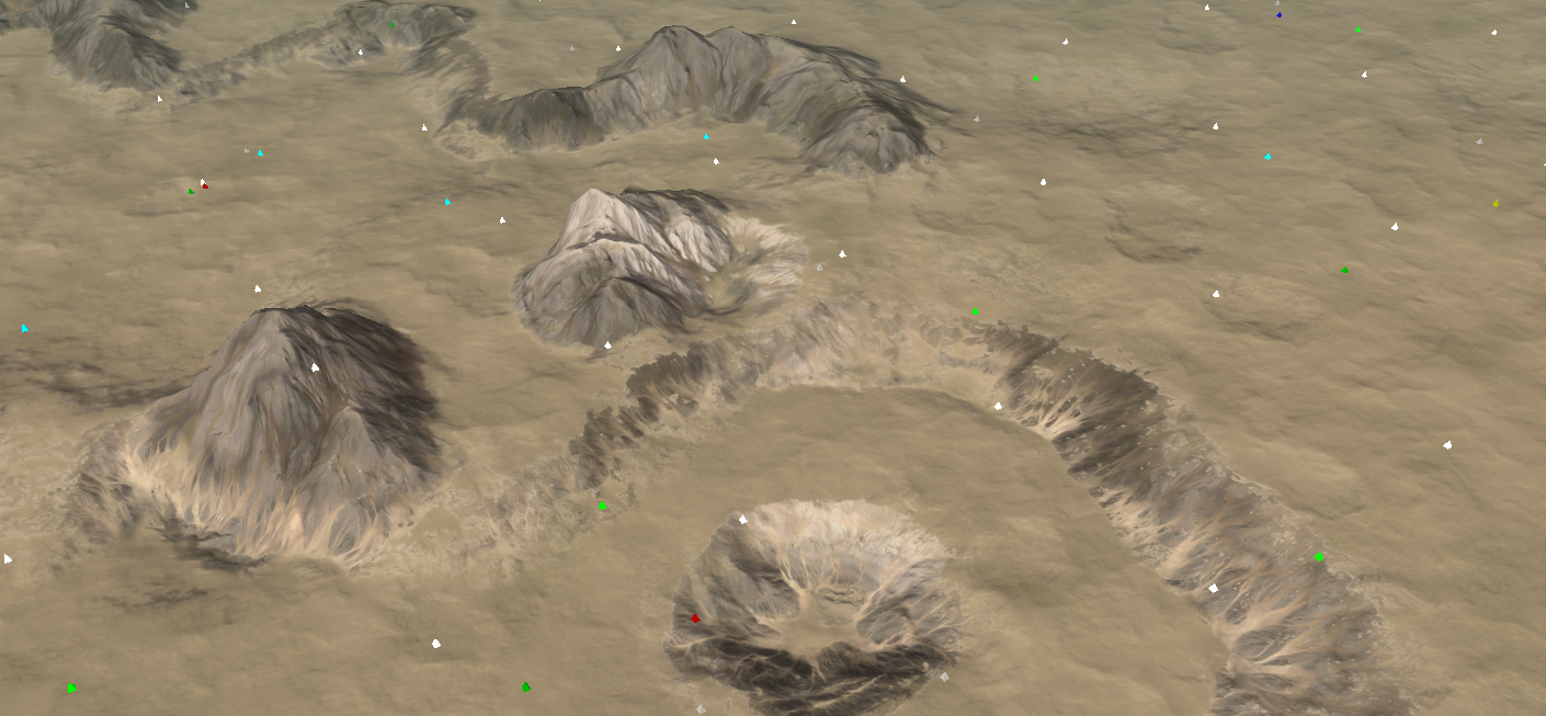
Clearly shows where the ramps are
- perhaps I can color tone the ramps a bit more so that they are more easily identifiable from mountains -
Can you even call this FA anymore?
-
You've outdone yourself. How can I see this in a working map?
Hello! It looks like you're interested in this conversation, but you don't have an account yet.
Getting fed up of having to scroll through the same posts each visit? When you register for an account, you'll always come back to exactly where you were before, and choose to be notified of new replies (either via email, or push notification). You'll also be able to save bookmarks and upvote posts to show your appreciation to other community members.
With your input, this post could be even better 💗
Register Login