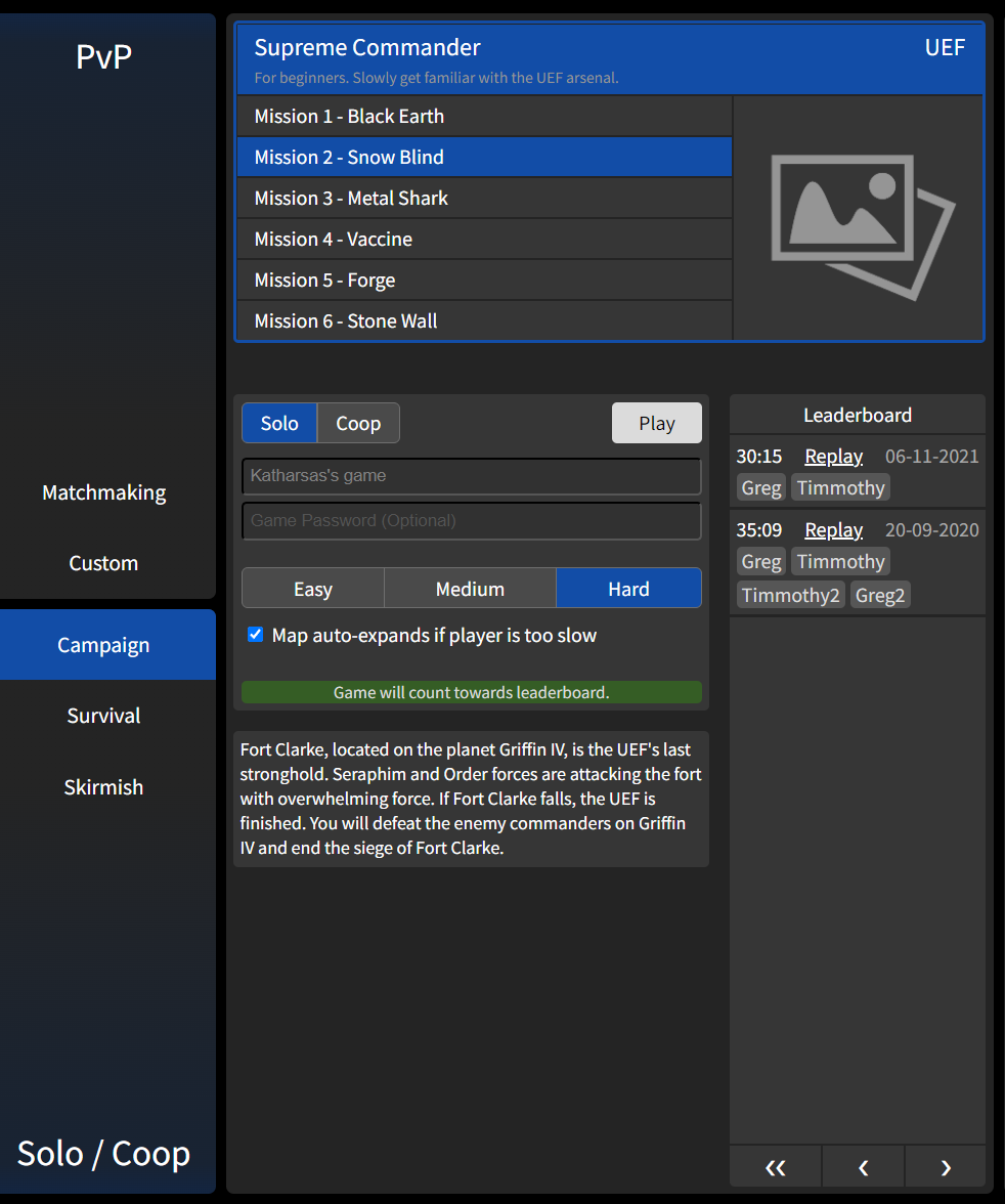
Coop campaigns order
-
@melanol said in Coop campaigns order:
@brutus5000 said in Coop campaigns order:
The coop value of the original campaign is very low, your units are massively restricted etc.
If people start into coop with that they will probably lose interest in it.Looks like you have never played games.
Have you seen any game that throws at new players everything all at once?
I'm not sure if this is supposed to be an insult? Anyway.
We are talking about coop. Yes it is pretty annoying if you can barely build anything at the beginning and then do it with 2-4 players. If you want to bore yourself through the campaign you can do it in single player, you don't need FAF for that.
For coop players who know the game the original campaign just sucks.
-
@Brutus5000 could you get us numbers of plays per missions from the db? versions combined
To see the favourite missions are -
Here is my current mockup (you can try it for yourself). It's still missing mission descriptions and faction logos and some other stuff (like the actual create game dialog).
-
@brutus5000 said in Coop campaigns order:
The coop value of the original campaign is very low, your units are massively restricted etc.
If people start into coop with that they will probably lose interest in it.@speed2 said in Coop campaigns order:
FAF is based around FA, so it make sense to have FA campaign first.
Then make the first co-op mission on the list the SECOND FA campaign mission. That one is super easy/chill.
"Black Day" was adjusted to boost the difficulty. It's ridiculous to put that as people's first experience in co-op if they don't know any better.
-
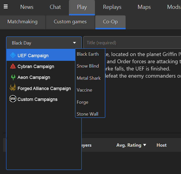
Here's the mockup I made when I made a GitHub issue about this last month.
-
@arma473 said in Coop campaigns order:
@brutus5000 said in Coop campaigns order:
The coop value of the original campaign is very low, your units are massively restricted etc.
If people start into coop with that they will probably lose interest in it.@speed2 said in Coop campaigns order:
FAF is based around FA, so it make sense to have FA campaign first.
Then make the first co-op mission on the list the SECOND FA campaign mission. That one is super easy/chill.
"Black Day" was adjusted to boost the difficulty. It's ridiculous to put that as people's first experience in co-op if they don't know any better.
First of all s the start if the Black day is much easier than start of the Dawn, especially if you play in coop.
Changing the order of the campaign missions is a bad solution, double that with the fact that the briefings are gonna be available soon, so there will be more of the story to enjoy for the players.
-
The problem is not the difficulty of the first mission, as speed sad, the start of the second mission is not easy at all for new players.
The problem is, AGAIN, the UI. What makes the first mission difficult for people new to FAF, is that the "Timed expansions" option added by FAF makes the main way to cheese the missions impossible (cheese: waiting and building up before comleting objectives).
This option is on by default and hidden somewhere in the lobby settings and not found by new players because they don't know it exists. It should be, together with difficulty selection, an option tht is put into the center of attention of the player, directly in the client in the "Create game" dialog if technically feasable. My mockup will included that when i make the game creation section.
@Deribus
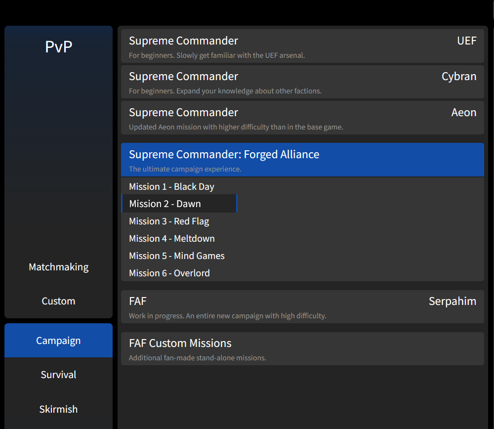
Anything that groups the missions is already better than we already have, so that is nice in your mockup.However, i think the ideal UI should present a clear hierarchy and selection order to the player:
- First, select the base game (Vanilla, FA, or FAF Fan-made?)
- Then, select subgroup (only for Vanillar: UEF, Aeon or Cybran)
- Then, select the mission
I tried to display all of these things in exactly that order, and without any nested dropdowns. But your mockup is of course much closer to what we currently have, so potentially easier to do and and would already be a substantial improvement.
And i think the small campaign descriptions i added are really important to allow new players to orient themselves and choose a campaign that suits them best.
-
@Katharsas one more thing to think about in your mockup is that we have the coop leaderboards. In order for the replay to count for the leaderboard you need to play with default settings. That includes Hard difficulty and Timed expansion enabled.
Those two options arent exactly new players friendly. But they are set as default, because there is currently no way of telling the players if the replay would count towards the leaderboards. -
@speed2 Ill try to come up with a good solution, thanks for the reminder, i didnt know that!
-
I don't think timed expansions are a bad thing, the story missions are originally flawed in that not completing objectives and instead safely building up to dozes of experimentals and then stomping everything is always the best course of action in every situation, rather than playing the mission, making every mission basically the same
with timed expansions this is neutralized and imo only thing needed is some kind of indicator ingame when timed expansions happen so it isn't an unwelcome surprise (such as "15 minutes until seraphim attack"), of course players would still wait until timer runs out before completing objectives, but at least they can't wait literal hours nor be taken by surprise they didn't know about
-
 M maudlin27 referenced this topic on
-
 M maudlin27 referenced this topic on
-
